- Published on
Practical Guide: Build A Steps with colors With Tailwind CSS
- What is Tailwind CSS?
- The description of Steps with colors ui component
- Why use Tailwind CSS to create a Steps with colors ui component?
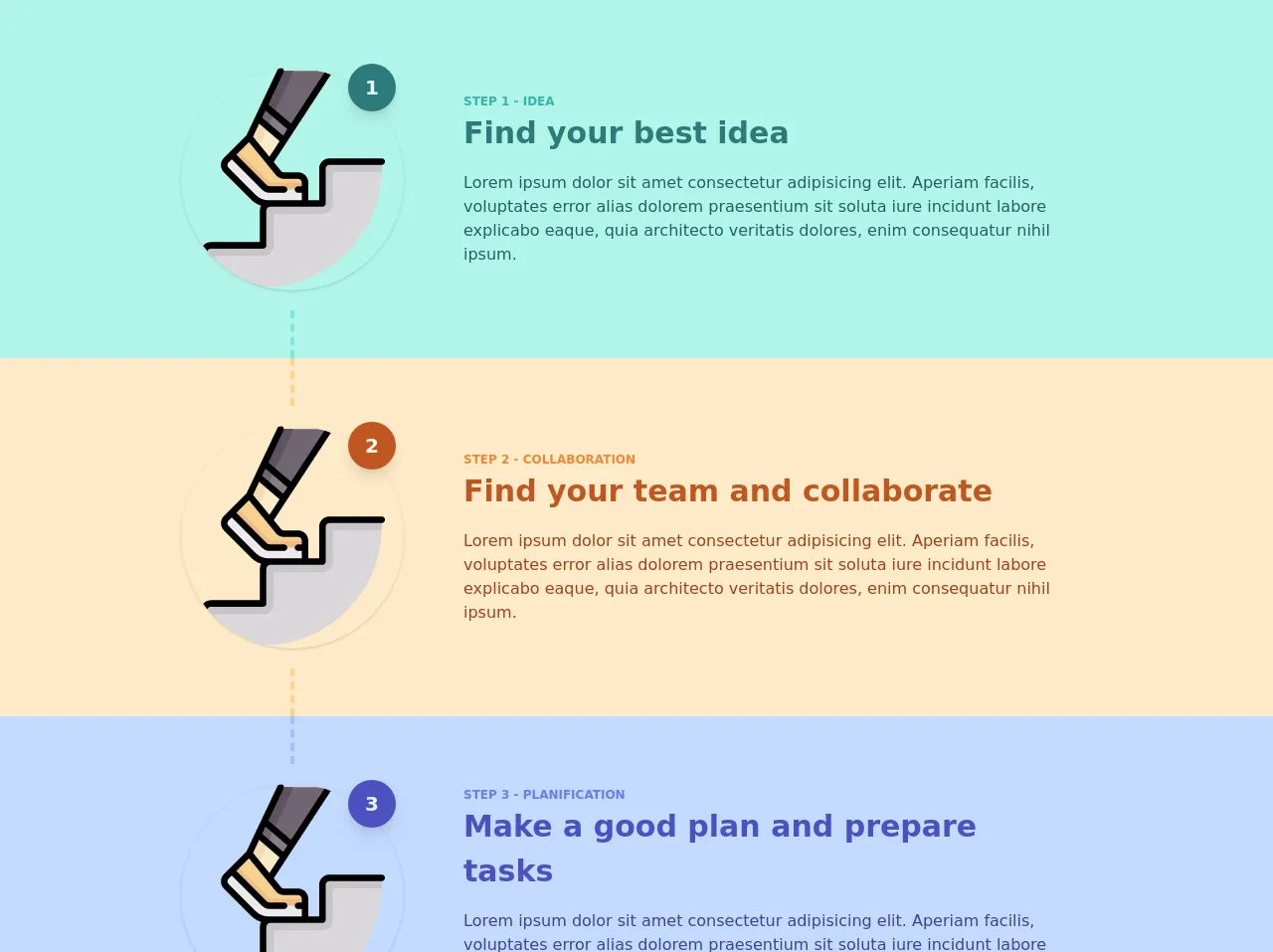
- The preview of Steps with colors ui component.
- The source code of Steps with colors ui component.
- How to create a Steps with colors with Tailwind CSS?
- Conclusion
What is Tailwind CSS?
Tailwind CSS is a utility-first CSS framework that provides a set of pre-defined classes to help you quickly build custom user interfaces. It's designed to be highly customizable, allowing you to create unique designs without writing any custom CSS.
The description of Steps with colors ui component
A Steps with colors ui component is a user interface element that displays a set of steps or stages in a process. Each step is represented by a colored dot or icon, and the current step is highlighted to indicate progress.
Why use Tailwind CSS to create a Steps with colors ui component?
Tailwind CSS provides a set of pre-defined classes for creating buttons, forms, and other user interface elements. This makes it easy to create a Steps with colors ui component without writing any custom CSS.
In addition, Tailwind CSS is highly customizable, allowing you to easily modify the colors, spacing, and other properties of the Steps with colors ui component to match your design requirements.
The preview of Steps with colors ui component.
To create a Steps with colors ui component with Tailwind CSS, we'll start by defining a container element to hold the steps. We'll then create a set of colored dots or icons to represent each step.
Free download of the Steps with colors's source code
The source code of Steps with colors ui component.
Here's the source code for the Steps with colors ui component:
<div class="flex flex-col justify-center m-auto">
   <div class="flex md:flex-row flex-col bg-teal-200 justify-center md:text-left text-center">
      <div class="flex flex-col justify-center items-center relative">
         <div class="w-56 h-12 md:flex hidden justify-center">
            <div class="h-full  border-teal-300 border-dashed"></div>
         </div>
         <div class="rounded-full w-12 h-12 text-xl text-teal-100 bg-teal-700 font-black flex justify-center items-center absolute top-0 right-0 mt-16 shadow-lg mr-2">1</div>
         <img alt="step1" class="w-56 h-56 rounded-full shadow my-5 object-scale-down" src="https://image.flaticon.com/icons/svg/1330/1330216.svg">
         <div class="w-56 h-12 md:flex hidden justify-center">
            <div class="h-full border-r-4 border-teal-300 border-dashed"></div>
         </div>
      </div>
      <div class="ml-5 p-10 flex flex-col justify-center max-w-2xl rounded bg-teal-200">
         <div class="text-xs uppercase font-bold text-teal-500">Step 1 - Idea</div>
         <div class="md:text-3xl text-xl font-bold text-teal-700">Find your best idea</div>
         <div class="mt-4 text-teal-800">Lorem ipsum dolor sit amet consectetur adipisicing elit. Aperiam facilis, voluptates error alias dolorem praesentium sit soluta iure incidunt labore explicabo eaque, quia architecto veritatis dolores, enim consequatur nihil ipsum.</div>
      </div>
   </div>
   <div class="flex md:flex-row flex-col bg-orange-200 justify-center md:text-left text-center">
      <div class="flex flex-col justify-center items-center relative">
         <div class="w-56 h-12 md:flex hidden justify-center">
            <div class="h-full border-r-4 border-orange-300 border-dashed"></div>
         </div>
         <div class="rounded-full w-12 h-12 text-xl text-orange-100 bg-orange-700 font-black flex justify-center items-center absolute top-0 right-0 mt-16 shadow-lg mr-2">2</div>
         <img alt="step2" class="w-56 h-56 rounded-full shadow my-5 object-scale-down" src="https://image.flaticon.com/icons/svg/1330/1330216.svg">
         <div class="w-56 h-12 md:flex hidden justify-center">
            <div class="h-full border-r-4 border-orange-300 border-dashed"></div>
         </div>
      </div>
      <div class="ml-5 p-10 flex flex-col justify-center max-w-2xl rounded bg-orange-200">
         <div class="text-xs uppercase font-bold text-orange-500">Step 2 - Collaboration</div>
         <div class="md:text-3xl text-xl font-bold text-orange-700">Find your team and collaborate</div>
         <div class="mt-4 text-orange-800">Lorem ipsum dolor sit amet consectetur adipisicing elit. Aperiam facilis, voluptates error alias dolorem praesentium sit soluta iure incidunt labore explicabo eaque, quia architecto veritatis dolores, enim consequatur nihil ipsum.</div>
      </div>
   </div>
   <div class="flex md:flex-row flex-col bg-indigo-200 justify-center md:text-left text-center">
      <div class="flex flex-col justify-center items-center relative">
         <div class="w-56 h-12 md:flex hidden justify-center">
            <div class="h-full border-r-4 border-indigo-300 border-dashed"></div>
         </div>
         <div class="rounded-full w-12 h-12 text-xl text-indigo-100 bg-indigo-700 font-black flex justify-center items-center absolute top-0 right-0 mt-16 shadow-lg mr-2">3</div>
         <img alt="step3" class="w-56 h-56 rounded-full shadow my-5 object-scale-down" src="https://image.flaticon.com/icons/svg/1330/1330216.svg">
         <div class="w-56 h-12 md:flex hidden justify-center">
            <div class="h-full border-r-4 border-indigo-300 border-dashed"></div>
         </div>
      </div>
      <div class="ml-5 p-10 flex flex-col justify-center max-w-2xl rounded bg-indigo-200">
         <div class="text-xs uppercase font-bold text-indigo-500">Step 3 - Planification</div>
         <div class="md:text-3xl text-xl font-bold text-indigo-700">Make a good plan and prepare tasks</div>
         <div class="mt-4 text-indigo-800">Lorem ipsum dolor sit amet consectetur adipisicing elit. Aperiam facilis, voluptates error alias dolorem praesentium sit soluta iure incidunt labore explicabo eaque, quia architecto veritatis dolores, enim consequatur nihil ipsum.</div>
      </div>
   </div>
   <div class="flex md:flex-row flex-col bg-pink-200 justify-center md:text-left text-center">
      <div class="flex flex-col justify-center items-center relative">
         <div class="w-56 h-12 md:flex hidden justify-center">
            <div class="h-full border-r-4 border-pink-300 border-dashed"></div>
         </div>
         <div class="rounded-full w-12 h-12 text-xl text-pink-100 bg-pink-700 font-black flex justify-center items-center absolute top-0 right-0 mt-16 shadow-lg mr-2">4</div>
         <img alt="step4" class="w-56 h-56 rounded-full shadow my-5 object-scale-down" src="https://image.flaticon.com/icons/svg/1330/1330216.svg">
         <div class="w-56 h-12 md:flex hidden justify-center">
            <div class="h-full  border-pink-300 border-dashed"></div>
         </div>
      </div>
      <div class="ml-5 p-10 flex flex-col justify-center max-w-2xl rounded bg-pink-200">
         <div class="text-xs uppercase font-bold text-pink-500">Step 4 - Implementation</div>
         <div class="md:text-3xl text-xl font-bold text-pink-700">Execute, impletement your solution</div>
         <div class="mt-4 text-pink-800">Lorem ipsum dolor sit amet consectetur adipisicing elit. Aperiam facilis, voluptates error alias dolorem praesentium sit soluta iure incidunt labore explicabo eaque, quia architecto veritatis dolores, enim consequatur nihil ipsum.</div>
      </div>
   </div>
</div>
How to create a Steps with colors with Tailwind CSS?
- Define a container element to hold the steps.
<div class="flex justify-center">
  <div class="flex items-center">
    <!-- Steps go here -->
  </div>
</div>
- Create a set of colored dots or icons to represent each step.
<div class="flex justify-center">
  <div class="flex items-center">
    <div class="flex items-center">
      <div class="h-2 w-2 rounded-full bg-gray-400"></div>
      <div class="ml-2 text-gray-700">Step 1</div>
    </div>
    <div class="flex items-center ml-6">
      <div class="h-2 w-2 rounded-full bg-blue-500"></div>
      <div class="ml-2 text-gray-700">Step 2</div>
    </div>
    <div class="flex items-center ml-6">
      <div class="h-2 w-2 rounded-full bg-gray-400"></div>
      <div class="ml-2 text-gray-700">Step 3</div>
    </div>
  </div>
</div>
- Customize the colors and spacing of the Steps with colors ui component.
<div class="flex justify-center">
  <div class="flex items-center">
    <div class="flex items-center">
      <div class="h-2 w-2 rounded-full bg-purple-500"></div>
      <div class="ml-2 text-gray-700 font-bold">Step 1</div>
    </div>
    <div class="flex items-center ml-6">
      <div class="h-2 w-2 rounded-full bg-blue-500"></div>
      <div class="ml-2 text-gray-700 font-bold">Step 2</div>
    </div>
    <div class="flex items-center ml-6">
      <div class="h-2 w-2 rounded-full bg-green-500"></div>
      <div class="ml-2 text-gray-700 font-bold">Step 3</div>
    </div>
  </div>
</div>
- Add animation effects to the Steps with colors ui component.
<div class="flex justify-center">
  <div class="flex items-center">
    <div class="flex items-center">
      <div class="h-2 w-2 rounded-full bg-purple-500 animate-pulse"></div>
      <div class="ml-2 text-gray-700 font-bold">Step 1</div>
    </div>
    <div class="flex items-center ml-6">
      <div class="h-2 w-2 rounded-full bg-blue-500 animate-pulse"></div>
      <div class="ml-2 text-gray-700 font-bold">Step 2</div>
    </div>
    <div class="flex items-center ml-6">
      <div class="h-2 w-2 rounded-full bg-green-500 animate-pulse"></div>
      <div class="ml-2 text-gray-700 font-bold">Step 3</div>
    </div>
  </div>
</div>
Conclusion
In this article, we've shown you how to create a Steps with colors ui component using Tailwind CSS. With its pre-defined classes and highly customizable nature, Tailwind CSS makes it easy to create unique and visually appealing user interfaces. By following the steps outlined in this article, you'll be able to create your own Steps with colors ui component in no time.