- Published on
How to Build A Spotify - Playlist Card With Tailwind CSS?
- What is Tailwind CSS?
- The description of Spotify - Playlist Card ui component
- Why use Tailwind CSS to create a Spotify - Playlist Card ui component?
- The preview of Spotify - Playlist Card ui component
- The source code of Spotify - Playlist Card ui component
- How to create a Spotify - Playlist Card with Tailwind CSS?
- Step 1: Set up your HTML structure
- Step 2: Define your Tailwind CSS classes
- Step 3: Add your HTML and CSS to your project
- Conclusion
What is Tailwind CSS?
Tailwind CSS is a utility-first CSS framework that provides a set of pre-defined classes to style your HTML elements. It allows you to create custom designs without writing any CSS code from scratch. The framework is designed to be highly customizable so that you can easily modify the styles to fit your needs.
The description of Spotify - Playlist Card ui component
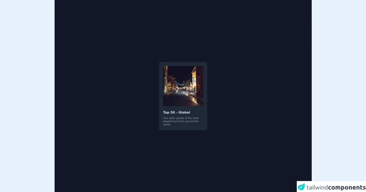
The Spotify - Playlist Card is a UI component that displays a playlist's cover image, title, and description. It is a simple and elegant way to showcase a playlist and entice users to listen to it.
Why use Tailwind CSS to create a Spotify - Playlist Card ui component?
Tailwind CSS is an excellent choice for creating a Spotify - Playlist Card UI component. It provides a set of pre-defined classes that you can use to style your HTML elements. This means that you don't have to write any CSS code from scratch, which saves you time and effort.
Tailwind CSS is also highly customizable, which means that you can easily modify the styles to fit your needs. This is important because the Spotify - Playlist Card UI component needs to match the branding and style of the Spotify platform.
The preview of Spotify - Playlist Card ui component
To create a Spotify - Playlist Card UI component with Tailwind CSS, we will use a combination of HTML and CSS. The HTML will define the structure of the component, while the CSS will define the styles.
Free download of the Spotify - Playlist Card's source code
The source code of Spotify - Playlist Card ui component
The source code for the Spotify - Playlist Card UI component is relatively simple. We will use HTML to define the structure of the component, and CSS to style it.
<div class="h-screen flex items-center justify-center bg-gray-900">

  <!-- Card -->
  <a class="hover:bg-gray-700 delay-50 duration-100 bg-gray-800 p-5 rounded-lg w-60 group" href="">

    <!-- Image Cover -->
    <img src="https://picsum.photos/250/250" class="w-full rounded shadow" />

    <!-- Title -->
    <h3 class="text-gray-200 font-bold mt-5"> Top 50 - Global</h3>

    <!-- Description -->
    <p class="text-gray-400 font-light mt-2 text-xs"> Your daily update of the most played track from around the world...</p>

  </a>

</div>
How to create a Spotify - Playlist Card with Tailwind CSS?
To create a Spotify - Playlist Card with Tailwind CSS, follow the steps below:
Step 1: Set up your HTML structure
The first step is to set up your HTML structure. Here is an example of what your HTML code should look like:
<div class="playlist-card">
  <img src="playlist-cover.jpg" alt="Playlist Cover">
  <div class="playlist-info">
    <h3 class="playlist-title">Playlist Title</h3>
    <p class="playlist-description">Playlist Description</p>
  </div>
</div>
Step 2: Define your Tailwind CSS classes
The next step is to define your Tailwind CSS classes. Here is an example of what your CSS code should look like:
.playlist-card {
  display: flex;
  flex-direction: column;
  align-items: center;
  background-color: #fff;
  border-radius: 10px;
  box-shadow: 0px 0px 10px rgba(0, 0, 0, 0.2);
  padding: 20px;
}

.playlist-card img {
  width: 100%;
  border-radius: 10px;
  margin-bottom: 20px;
}

.playlist-info {
  text-align: center;
}

.playlist-title {
  font-size: 24px;
  font-weight: bold;
  margin-bottom: 10px;
}

.playlist-description {
  font-size: 16px;
  color: #999;
}
Step 3: Add your HTML and CSS to your project
The final step is to add your HTML and CSS to your project. You can do this by creating a new HTML file and linking to your CSS file.
Conclusion
In this article, we have learned how to create a Spotify - Playlist Card UI component with Tailwind CSS. We have seen how Tailwind CSS can save us time and effort by providing pre-defined classes that we can use to style our HTML elements. We have also seen how Tailwind CSS is highly customizable, which allows us to modify the styles to fit our needs. By following the steps outlined in this article, you can create your own Spotify - Playlist Card UI component with ease.