- Published on
6 Tips To Build A Spinner Loading With Tailwind CSS
- What is Tailwind CSS?
- The description of Spinner Loading UI component
- Why use Tailwind CSS to create a Spinner Loading UI component?
- The preview of Spinner Loading UI component
- The source code of Spinner Loading UI component
- How to create a Spinner Loading with Tailwind CSS?
- 1. Define the Spinner Container
- 2. Define the Spinner
- 3. Add Animation
- 4. Customize the Spinner
- 5. Use Different Sizes
- 6. Use Different Styles
- Conclusion
In today's fast-paced world, users expect websites to load quickly. A spinner loading UI component is an essential element of any website that indicates the loading process. In this article, we'll discuss how to create a spinner loading with Tailwind CSS, a popular utility-first CSS framework.
What is Tailwind CSS?
Tailwind CSS is a utility-first CSS framework that provides a set of pre-defined CSS classes to quickly build custom user interfaces. It is designed to be highly customizable, making it ideal for developers who want to create unique designs without writing custom CSS.
The description of Spinner Loading UI component
A spinner loading UI component is a visual indicator that shows the loading process of a website or application. It typically consists of a circular shape that rotates continuously until the loading process is complete.
Why use Tailwind CSS to create a Spinner Loading UI component?
Tailwind CSS provides a set of pre-defined CSS classes that make it easy to create a spinner loading UI component. It also allows developers to customize the component's appearance and behavior using its utility classes.
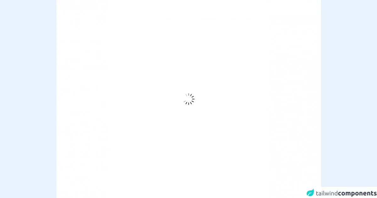
The preview of Spinner Loading UI component
Creating a spinner loading UI component with Tailwind CSS is straightforward. Here's what the final result will look like:
Free download of the Spinner Loading's source code
The source code of Spinner Loading UI component
To create a spinner loading UI component with Tailwind CSS, you'll need to define a few CSS classes. Here's an example of the source code:
<div class="h-screen bg-white">
<div class="flex justify-center items-center h-full">
  <img class="h-16 w-16" src="https://icons8.com/preloaders/preloaders/1488/Iphone-spinner-2.gif" alt="">
</div>
</div>
How to create a Spinner Loading with Tailwind CSS?
Here are six tips to help you create a spinner loading with Tailwind CSS:
1. Define the Spinner Container
The first step is to define the container for the spinner. You can use the flex and justify-center classes to center the spinner horizontally and vertically.
<div class="flex justify-center items-center h-screen">
  <!-- Spinner goes here -->
</div>
2. Define the Spinner
Next, you need to define the spinner itself. You can use the border and border-gray-200 classes to create a circular shape with a light gray border.
<div class="flex justify-center items-center h-screen">
  <div class="border-4 border-gray-200 rounded-full w-12 h-12"></div>
</div>
3. Add Animation
To make the spinner rotate continuously, you can use the animate-spin class. This class applies a CSS animation that rotates the spinner 360 degrees.
<div class="flex justify-center items-center h-screen">
  <div class="border-4 border-gray-200 rounded-full w-12 h-12 animate-spin"></div>
</div>
4. Customize the Spinner
Tailwind CSS provides a set of utility classes that allow you to customize the spinner's appearance. For example, you can change the spinner's color using the border-blue-500 class.
<div class="flex justify-center items-center h-screen">
  <div class="border-4 border-blue-500 rounded-full w-12 h-12 animate-spin"></div>
</div>
5. Use Different Sizes
You can also use different sizes for the spinner by changing the w and h classes. For example, you can create a larger spinner using the w-16 and h-16 classes.
<div class="flex justify-center items-center h-screen">
  <div class="border-4 border-blue-500 rounded-full w-16 h-16 animate-spin"></div>
</div>
6. Use Different Styles
Finally, you can use different styles for the spinner by changing the border and rounded-full classes. For example, you can create a square spinner using the border-4 and rounded-none classes.
<div class="flex justify-center items-center h-screen">
  <div class="border-4 border-blue-500 rounded-none w-16 h-16 animate-spin"></div>
</div>
Conclusion
Creating a spinner loading with Tailwind CSS is easy and straightforward. By following the tips outlined in this article, you can create a custom spinner loading UI component that fits your website's design and branding. With Tailwind CSS's utility classes, you can quickly customize the spinner's appearance and behavior without writing custom CSS.