- Published on
What You Need To Make A Solid alert With Tailwind CSS
- What is Tailwind CSS?
- The description of Solid alert ui component
- Why use Tailwind CSS to create a Solid alert ui component?
- The preview of Solid alert ui component
- The source code of Solid alert ui component
- How to create a Solid alert with Tailwind CSS?
- Conclusion
What is Tailwind CSS?
Tailwind CSS is a utility-first CSS framework that provides a set of pre-defined classes to help you quickly build custom user interfaces. It is designed to be highly customizable and easy to use, allowing developers to create complex layouts and designs with minimal effort.
Tailwind CSS is different from other CSS frameworks in that it does not provide pre-built components like buttons, forms, and alerts. Instead, it provides a set of low-level utility classes that can be combined to create custom components.
The description of Solid alert ui component
A Solid alert is a user interface component that displays a message to the user. It is typically used to inform the user of an error, warning, or success message. The Solid alert component is a simple and effective way to display these messages in a clear and concise manner.
The Solid alert component is made up of a container element that contains the message text and an optional close button. The container element has a background color that indicates the type of message being displayed (e.g. green for success, red for error, etc.).
Why use Tailwind CSS to create a Solid alert ui component?
Tailwind CSS is an excellent choice for creating a Solid alert ui component because it provides a wide range of utility classes that can be used to style the component. This means that you can create a custom alert component that matches the design of your website or application without having to write a lot of custom CSS.
In addition, Tailwind CSS makes it easy to create responsive designs that work well on different screen sizes and devices. This is important for an alert component because it needs to be visible and easy to read on all devices.
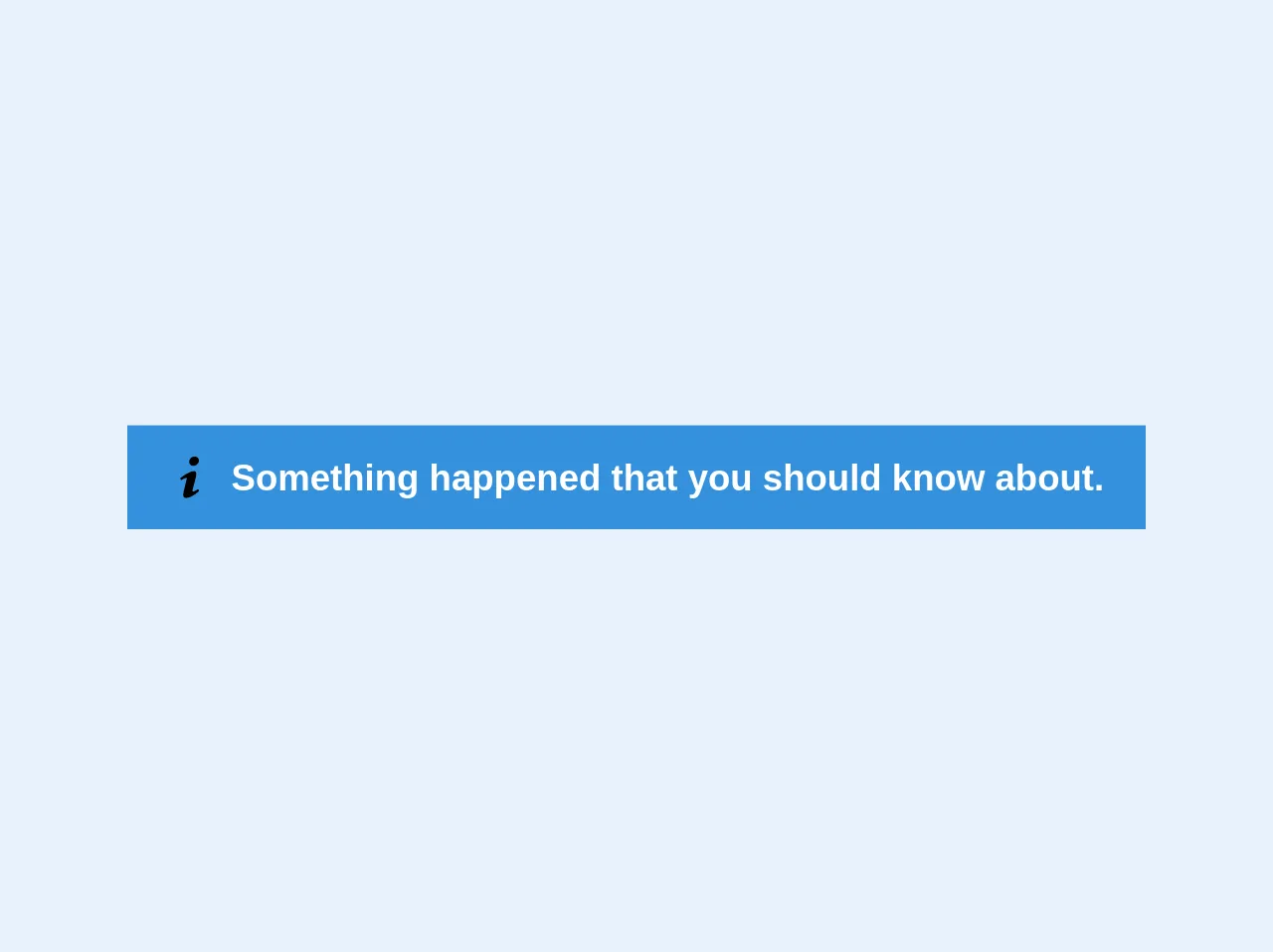
The preview of Solid alert ui component
To create a Solid alert ui component with Tailwind CSS, you will need to use a combination of utility classes to style the container element and the message text. Here's an example of what a Solid alert ui component might look like:
<div class="bg-green-100 border border-green-400 text-green-700 px-4 py-3 rounded relative" role="alert">
  <strong class="font-bold">Success!</strong>
  <span class="block sm:inline">Your account has been updated.</span>
  <span class="absolute top-0 bottom-0 right-0 px-4 py-3">
    <svg class="fill-current h-6 w-6 text-green-500" role="button" xmlns="http://www.w3.org/2000/svg" viewBox="0 0 20 20"><title>Close</title><path d="M14.348 5.652a1 1 0 00-1.414 0L10 8.586 6.066 4.652a1 1 0 00-1.414 1.414L8.586 10l-3.934 3.934a1 1 0 001.414 1.414L10 11.414l3.934 3.934a1 1 0 001.414-1.414L11.414 10l3.934-3.934a1 1 0 000-1.414z"/></svg>
  </span>
</div>
Free download of the Solid alert's source code
The source code of Solid alert ui component
To create a Solid alert ui component with Tailwind CSS, you will need to use a combination of utility classes to style the container element and the message text. Here's an example of the HTML and CSS code that you can use to create a Solid alert ui component:
<div class="bg-red-100 border border-red-400 text-red-700 px-4 py-3 rounded relative" role="alert">
  <strong class="font-bold">Error!</strong>
  <span class="block sm:inline">Something went wrong.</span>
  <span class="absolute top-0 bottom-0 right-0 px-4 py-3">
    <svg class="fill-current h-6 w-6 text-red-500" role="button" xmlns="http://www.w3.org/2000/svg" viewBox="0 0 20 20"><title>Close</title><path d="M14.348 5.652a1 1 0 00-1.414 0L10 8.586 6.066 4.652a1 1 0 00-1.414 1.414L8.586 10l-3.934 3.934a1 1 0 001.414 1.414L10 11.414l3.934 3.934a1 1 0 001.414-1.414L11.414 10l3.934-3.934a1 1 0 000-1.414z"/></svg>
  </span>
</div>

<style>
  .bg-red-100 {
    background-color: #fed7d7;
  }
  .border-red-400 {
    border-color: #feb2b2;
  }
  .text-red-700 {
    color: #c53030;
  }
  .text-red-700 strong {
    color: #c53030;
  }
  .text-red-700 svg:hover {
    cursor: pointer;
  }
</style>
<div class="flex items-center bg-blue text-white text-sm font-bold px-4 py-3" role="alert">
  <svg class="w-4 h-4 mr-2" xmlns="http://www.w3.org/2000/svg" viewBox="0 0 20 20"><path d="M12.432 0c1.34 0 2.01.912 2.01 1.957 0 1.305-1.164 2.512-2.679 2.512-1.269 0-2.009-.75-1.974-1.99C9.789 1.436 10.67 0 12.432 0zM8.309 20c-1.058 0-1.833-.652-1.093-3.524l1.214-5.092c.211-.814.246-1.141 0-1.141-.317 0-1.689.562-2.502 1.117l-.528-.88c2.572-2.186 5.531-3.467 6.801-3.467 1.057 0 1.233 1.273.705 3.23l-1.391 5.352c-.246.945-.141 1.271.106 1.271.317 0 1.357-.392 2.379-1.207l.6.814C12.098 19.02 9.365 20 8.309 20z"/></svg>
  <p>Something happened that you should know about.</p>
</div>
How to create a Solid alert with Tailwind CSS?
To create a Solid alert with Tailwind CSS, you will need to follow these steps:
- Create a container element for the alert message using the
divtag. - Add the
bg-{color}-100class to set the background color of the container. Replace{color}with the name of the color you want to use (e.g. green, red, yellow, etc.). - Add the
borderandborder-{color}-400classes to add a border to the container and set the border color. Replace{color}with the name of the color you want to use. - Add the
text-{color}-700class to set the color of the message text. Replace{color}with the name of the color you want to use. - Add the
px-4andpy-3classes to add padding to the container. - Add the
roundedclass to round the corners of the container. - Add the
relativeclass to make the container position relative. - Add the message text using the
strongandspantags. - Add the close button using the
svgtag and theabsolute,top-0,bottom-0,right-0,px-4, andpy-3classes to position the button in the top-right corner of the container. - Add custom CSS styles to further customize the appearance of the alert.
Conclusion
In conclusion, Tailwind CSS is an excellent choice for creating a Solid alert ui component because it provides a wide range of utility classes that can be used to style the component. By following the steps outlined in this article, you can create a custom Solid alert that matches the design of your website or application. With Tailwind CSS, creating custom user interface components has never been easier.