- Published on
Ways To Build A Social cards template With Tailwind CSS In 60 Minutes
- What is Tailwind CSS?
- The Description of Social Cards Template UI Component
- Why use Tailwind CSS to create a Social Cards Template UI Component?
- The Preview of Social Cards Template UI Component
- The Source Code of Social Cards Template UI Component
- How to Create a Social Cards Template with Tailwind CSS?
- Step 1: Set Up Your Project
- Step 2: Define the Structure of the Social Cards Template
- Step 3: Style the Social Cards Template with Tailwind CSS
- Step 4: Repeat for Multiple Social Cards
- Conclusion
Are you looking for a way to create a social cards template with ease and speed? Look no further than Tailwind CSS. In this article, we will explore the benefits of using Tailwind CSS to create a social cards template and provide a step-by-step guide on how to do so in just 60 minutes.
What is Tailwind CSS?
Tailwind CSS is a utility-first CSS framework that provides pre-defined classes for common CSS properties. It allows developers to create complex layouts and designs with minimal custom CSS. Tailwind CSS is highly customizable and can be configured to match any design system.
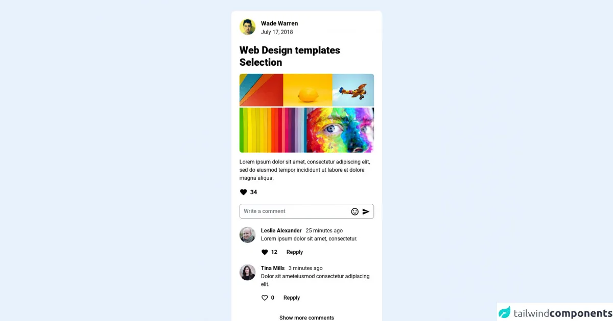
The Description of Social Cards Template UI Component
A social card is a UI component that displays a preview of content from a social media platform such as Twitter or Facebook. It typically includes an image, title, description, and other metadata such as the author and date. Social cards are commonly used in web applications to display previews of shared content.
Why use Tailwind CSS to create a Social Cards Template UI Component?
Tailwind CSS provides a fast and efficient way to create a social cards template. Its pre-defined classes allow developers to quickly style and layout the component without the need for custom CSS. This saves time and reduces the complexity of the codebase.
The Preview of Social Cards Template UI Component
To create a social cards template, we will use Tailwind CSS to style and layout the component. The template will include an image, title, description, and metadata.
Free download of the Social cards template's source code
The Source Code of Social Cards Template UI Component
To create the social cards template, we will use HTML and Tailwind CSS. The HTML will define the structure of the component, while Tailwind CSS will provide the styling.
<link href="https://fonts.googleapis.com/css2?family=Roboto:wght@300;400;500;700;900&display=swap" rel="stylesheet" />
<style>
html,
body {
font-family: "Roboto", sans-serif;
}
.break-inside {
-moz-column-break-inside: avoid;
break-inside: avoid;
}
</style>
<div class="flex py-8 items-center flex-col min-h-screen bg-slate-300">
<!-- Wrapper-->
<div class="wrapper">
<!-- Content grid -->
<div
class="box-border max-w-7xl mx-4 sm:columns-1 md:columns-2 lg:columns-3 xl:columns-3"
>
<!-- Card-->
<article
class="mb-4 break-inside break-inside-avoid p-6 rounded-xl bg-white flex flex-col bg-clip-border max-w-md"
>
<div class="flex pb-6 items-center justify-between">
<div class="flex">
<a class="inline-block mr-4" href="#">
<img
class="rounded-full max-w-none w-12 h-12"
src="https://randomuser.me/api/portraits/men/35.jpg"
/>
</a>
<div class="flex flex-col">
<div>
<a class="inline-block text-lg font-bold" href="#"
>Wade Warren</a
>
</div>
<div class="text-slate-500">
July 17, 2018
</div>
</div>
</div>
</div>
<h2 class="text-3xl font-extrabold">
Web Design templates Selection
</h2>
<div class="py-4">
<div class="flex justify-between gap-1 mb-1">
<a class="flex" href="#">
<img
class="max-w-full rounded-tl-lg"
src="https://images.pexels.com/photos/2457278/pexels-photo-2457278.jpeg?auto=compress&cs=tinysrgb&dpr=2&h=750&w=1260"
/>
</a>
<a class="flex" href="#">
<img
class="max-w-full"
src="https://images.pexels.com/photos/1343537/pexels-photo-1343537.jpeg?auto=compress&cs=tinysrgb&dpr=2&h=750&w=1260"
/>
</a>
<a class="flex" href="#">
<img
class="max-w-full rounded-tr-lg"
src="https://images.pexels.com/photos/327331/pexels-photo-327331.jpeg?auto=compress&cs=tinysrgb&dpr=2&h=750&w=1260"
/>
</a>
</div>
<div class="flex justify-between gap-1">
<a class="flex" href="#">
<img
class="max-w-full rounded-bl-lg"
src="https://images.pexels.com/photos/1279813/pexels-photo-1279813.jpeg?auto=compress&cs=tinysrgb&dpr=2&h=750&w=1260"
/>
</a>
<a class="flex" href="#">
<img
class="max-w-full rounded-br-lg"
src="https://images.pexels.com/photos/1209843/pexels-photo-1209843.jpeg?auto=compress&cs=tinysrgb&dpr=2&h=750&w=1260"
/>
</a>
</div>
</div>
<p>
Lorem ipsum dolor sit amet, consectetur adipiscing elit, sed do
eiusmod tempor incididunt ut labore et dolore magna aliqua.
</p>
<div class="py-4">
<a class="inline-flex items-center" href="#">
<span class="mr-2">
<svg
class="fill-rose-600"
style="width: 24px; height: 24px;"
viewBox="0 0 24 24"
>
<path
d="M12,21.35L10.55,20.03C5.4,15.36 2,12.27 2,8.5C2,5.41 4.42,3 7.5,3C9.24,3 10.91,3.81 12,5.08C13.09,3.81 14.76,3 16.5,3C19.58,3 22,5.41 22,8.5C22,12.27 18.6,15.36 13.45,20.03L12,21.35Z"
></path>
</svg>
</span>
<span class="text-lg font-bold">34</span>
</a>
</div>
<div class="relative">
<input
class="pt-2 pb-2 pl-3 w-full h-11 bg-slate-100 rounded-lg placeholder:text-slate-600 font-medium pr-20"
type="text"
placeholder="Write a comment"
/>
<span class="flex absolute right-3 top-2/4 -mt-3 items-center">
<svg
class="mr-2"
style="width: 26px; height: 26px;"
viewBox="0 0 24 24"
>
<path
fill="currentColor"
d="M20,12A8,8 0 0,0 12,4A8,8 0 0,0 4,12A8,8 0 0,0 12,20A8,8 0 0,0 20,12M22,12A10,10 0 0,1 12,22A10,10 0 0,1 2,12A10,10 0 0,1 12,2A10,10 0 0,1 22,12M10,9.5C10,10.3 9.3,11 8.5,11C7.7,11 7,10.3 7,9.5C7,8.7 7.7,8 8.5,8C9.3,8 10,8.7 10,9.5M17,9.5C17,10.3 16.3,11 15.5,11C14.7,11 14,10.3 14,9.5C14,8.7 14.7,8 15.5,8C16.3,8 17,8.7 17,9.5M12,17.23C10.25,17.23 8.71,16.5 7.81,15.42L9.23,14C9.68,14.72 10.75,15.23 12,15.23C13.25,15.23 14.32,14.72 14.77,14L16.19,15.42C15.29,16.5 13.75,17.23 12,17.23Z"
></path>
</svg>
<svg
class="fill-blue-500"
style="width: 24px; height: 24px;"
viewBox="0 0 24 24"
>
<path d="M2,21L23,12L2,3V10L17,12L2,14V21Z"></path>
</svg>
</span>
</div>
<!-- Comments content -->
<div class="pt-6">
<!-- Comment row -->
<div class="media flex pb-4">
<a class="mr-4" href="#">
<img
class="rounded-full max-w-none w-12 h-12"
src="https://randomuser.me/api/portraits/men/82.jpg"
/>
</a>
<div class="media-body">
<div>
<a class="inline-block text-base font-bold mr-2" href="#"
>Leslie Alexander</a
>
<span class="text-slate-500">25 minutes ago</span>
</div>
<p>Lorem ipsum dolor sit amet, consectetur.</p>
<div class="mt-2 flex items-center">
<a class="inline-flex items-center py-2 mr-3" href="#">
<span class="mr-2">
<svg
class="fill-rose-600"
style="width: 22px; height: 22px;"
viewBox="0 0 24 24"
>
<path
d="M12,21.35L10.55,20.03C5.4,15.36 2,12.27 2,8.5C2,5.41 4.42,3 7.5,3C9.24,3 10.91,3.81 12,5.08C13.09,3.81 14.76,3 16.5,3C19.58,3 22,5.41 22,8.5C22,12.27 18.6,15.36 13.45,20.03L12,21.35Z"
></path>
</svg>
</span>
<span class="text-base font-bold">12</span>
</a>
<button
class="py-2 px-4 font-medium hover:bg-slate-50 rounded-lg transition"
>
Repply
</button>
</div>
</div>
</div>
<!-- End comments row -->
<!-- comments row -->
<div class="media flex pb-4">
<a class="inline-block mr-4" href="#">
<img
class="rounded-full max-w-none w-12 h-12"
src="https://randomuser.me/api/portraits/women/76.jpg"
/>
</a>
<div class="media-body">
<div>
<a class="inline-block text-base font-bold mr-2" href="#"
>Tina Mills</a
>
<span class="text-slate-500">3 minutes ago</span>
</div>
<p>Dolor sit ameteiusmod consectetur adipiscing elit.</p>
<div class="mt-2 flex items-center">
<a class="inline-flex items-center py-2 mr-3" href="#">
<span class="mr-2">
<svg
class="fill-rose-600"
style="width: 22px; height: 22px;"
viewBox="0 0 24 24"
>
<path
d="M12.1 18.55L12 18.65L11.89 18.55C7.14 14.24 4 11.39 4 8.5C4 6.5 5.5 5 7.5 5C9.04 5 10.54 6 11.07 7.36H12.93C13.46 6 14.96 5 16.5 5C18.5 5 20 6.5 20 8.5C20 11.39 16.86 14.24 12.1 18.55M16.5 3C14.76 3 13.09 3.81 12 5.08C10.91 3.81 9.24 3 7.5 3C4.42 3 2 5.41 2 8.5C2 12.27 5.4 15.36 10.55 20.03L12 21.35L13.45 20.03C18.6 15.36 22 12.27 22 8.5C22 5.41 19.58 3 16.5 3Z"
></path>
</svg>
</span>
<span class="text-base font-bold">0</span>
</a>
<button
class="py-2 px-4 font-medium hover:bg-slate-50 rounded-lg transition"
>
Repply
</button>
</div>
</div>
</div>
<!-- End comments row -->
<!-- More comments -->
<div class="w-full">
<a
href="#"
class="py-3 px-4 w-full block bg-slate-100 text-center rounded-lg font-medium hover:bg-slate-200 transition ease-in-out delay-75"
>Show more comments</a
>
</div>
<!-- End More comments -->
</div>
<!-- End Comments content -->
</article>
<!-- Card-->
<article
class="mb-4 break-inside break-inside-avoid p-6 rounded-xl bg-white flex flex-col bg-clip-border max-w-md"
>
<div class="flex pb-6 items-center justify-between">
<div class="flex">
<a class="inline-block mr-4" href="#">
<img
class="rounded-full max-w-none w-14 h-14"
src="https://randomuser.me/api/portraits/women/9.jpg"
/>
</a>
<div class="flex flex-col">
<div class="flex items-center">
<a class="inline-block text-lg font-bold mr-2" href="#"
>Esther Howard</a
>
<span>
<svg class="fill-blue-500 w-5 h-5" viewBox="0 0 24 24">
<path
d="M10,17L5,12L6.41,10.58L10,14.17L17.59,6.58L19,8M12,2A10,10 0 0,0 2,12A10,10 0 0,0 12,22A10,10 0 0,0 22,12A10,10 0 0,0 12,2Z"
></path>
</svg>
</span>
</div>
<div class="text-slate-500">
January 22, 2021
</div>
</div>
</div>
</div>
<h2 class="text-3xl font-extrabold">
Web Design templates Selection
</h2>
<div class="py-4">
<a class="flex" href="#">
<img
class="max-w-full rounded-lg"
src="https://images.pexels.com/photos/3682153/pexels-photo-3682153.jpeg?auto=compress&cs=tinysrgb&dpr=2&h=750&w=1260"
/>
</a>
</div>
<p>
Lorem ipsum dolor sit amet, consectetur adipiscing elit, sed do
eiusmod tempor incididunt ut labore et dolore magna aliqua.
</p>
<div class="py-4">
<a class="inline-flex items-center" href="#">
<span class="mr-2">
<svg
class="fill-rose-600"
style="width: 24px; height: 24px;"
viewBox="0 0 24 24"
>
<path
d="M12,21.35L10.55,20.03C5.4,15.36 2,12.27 2,8.5C2,5.41 4.42,3 7.5,3C9.24,3 10.91,3.81 12,5.08C13.09,3.81 14.76,3 16.5,3C19.58,3 22,5.41 22,8.5C22,12.27 18.6,15.36 13.45,20.03L12,21.35Z"
></path>
</svg>
</span>
<span class="text-lg font-bold">68</span>
</a>
</div>
<div class="relative">
<input
class="pt-2 pb-2 pl-3 w-full h-11 bg-slate-100 rounded-lg placeholder:text-slate-600 font-medium pr-20"
type="text"
placeholder="Write a comment"
/>
<span class="flex absolute right-3 top-2/4 -mt-3 items-center">
<svg
class="mr-2"
style="width: 26px; height: 26px;"
viewBox="0 0 24 24"
>
<path
fill="currentColor"
d="M20,12A8,8 0 0,0 12,4A8,8 0 0,0 4,12A8,8 0 0,0 12,20A8,8 0 0,0 20,12M22,12A10,10 0 0,1 12,22A10,10 0 0,1 2,12A10,10 0 0,1 12,2A10,10 0 0,1 22,12M10,9.5C10,10.3 9.3,11 8.5,11C7.7,11 7,10.3 7,9.5C7,8.7 7.7,8 8.5,8C9.3,8 10,8.7 10,9.5M17,9.5C17,10.3 16.3,11 15.5,11C14.7,11 14,10.3 14,9.5C14,8.7 14.7,8 15.5,8C16.3,8 17,8.7 17,9.5M12,17.23C10.25,17.23 8.71,16.5 7.81,15.42L9.23,14C9.68,14.72 10.75,15.23 12,15.23C13.25,15.23 14.32,14.72 14.77,14L16.19,15.42C15.29,16.5 13.75,17.23 12,17.23Z"
></path>
</svg>
<svg
class="fill-blue-500"
style="width: 24px; height: 24px;"
viewBox="0 0 24 24"
>
<path d="M2,21L23,12L2,3V10L17,12L2,14V21Z"></path>
</svg>
</span>
</div>
<!-- Comments content -->
<div class="pt-6">
<!-- Comment row -->
<div class="media flex pb-4">
<a class="mr-4" href="#">
<img
class="rounded-full max-w-none w-12 h-12"
src="https://randomuser.me/api/portraits/men/83.jpg"
/>
</a>
<div class="media-body">
<div>
<a class="inline-block text-base font-bold mr-2" href="#"
>Ronald Richards</a
>
<span class="text-slate-500">25 minutes ago</span>
</div>
<p>
Lorem ipsum dolor sit amet, consectetur adipiscing elit sed do
eiusmod 😀😀😀
</p>
<div class="mt-2 flex items-center">
<a class="inline-flex items-center py-2 mr-3" href="#">
<span class="mr-2">
<svg
class="fill-rose-600"
style="width: 22px; height: 22px;"
viewBox="0 0 24 24"
>
<path
d="M12,21.35L10.55,20.03C5.4,15.36 2,12.27 2,8.5C2,5.41 4.42,3 7.5,3C9.24,3 10.91,3.81 12,5.08C13.09,3.81 14.76,3 16.5,3C19.58,3 22,5.41 22,8.5C22,12.27 18.6,15.36 13.45,20.03L12,21.35Z"
></path>
</svg>
</span>
<span class="text-base font-bold">2</span>
</a>
<button
class="py-2 px-4 font-medium hover:bg-slate-50 rounded-lg transition"
>
Repply
</button>
</div>
</div>
</div>
<!-- End comments row -->
<!-- comments row -->
<div class="media flex pb-4">
<a class="inline-block mr-4" href="#">
<img
class="rounded-full max-w-none w-12 h-12"
src="https://randomuser.me/api/portraits/women/74.jpg"
/>
</a>
<div class="media-body">
<div>
<a class="inline-block text-base font-bold mr-2" href="#"
>Natalia Jímenez</a
>
<span class="text-slate-500">3 minutes ago</span>
</div>
<p>Dolor sit ameteiusmod consectetur adipiscing elit.</p>
<div class="mt-2 flex items-center">
<a class="inline-flex items-center py-2 mr-3" href="#">
<span class="mr-2">
<svg
class="fill-rose-600"
style="width: 22px; height: 22px;"
viewBox="0 0 24 24"
>
<path
d="M12,21.35L10.55,20.03C5.4,15.36 2,12.27 2,8.5C2,5.41 4.42,3 7.5,3C9.24,3 10.91,3.81 12,5.08C13.09,3.81 14.76,3 16.5,3C19.58,3 22,5.41 22,8.5C22,12.27 18.6,15.36 13.45,20.03L12,21.35Z"
></path>
</svg>
</span>
<span class="text-base font-bold">2</span>
</a>
<button
class="py-2 px-4 font-medium hover:bg-slate-50 rounded-lg transition"
>
Repply
</button>
</div>
</div>
</div>
<!-- End comments row -->
<!-- More comments -->
<div class="w-full">
<a
href="#"
class="py-3 px-4 w-full block bg-slate-100 text-center rounded-lg font-medium hover:bg-slate-200 transition ease-in-out delay-75"
>Show more comments</a
>
</div>
<!-- End More comments -->
</div>
<!-- End Comments content -->
</article>
<!-- Close Card -->
<!-- Card-->
<article
class="mb-4 break-inside break-inside-avoid p-6 rounded-xl bg-white flex flex-col bg-clip-border max-w-md"
>
<div class="flex pb-6 items-center justify-between">
<div class="flex">
<a class="inline-block mr-4" href="#">
<img
class="rounded-full max-w-none w-14 h-14"
src="https://randomuser.me/api/portraits/men/33.jpg"
/>
</a>
<div class="flex flex-col">
<div class="flex items-center">
<a class="inline-block text-lg font-bold mr-2" href="#"
>Leonard Isom</a
>
</div>
<div class="text-slate-500">
Medical Assistant
</div>
</div>
</div>
</div>
<div class="py-4">
<div class="flex justify-between gap-1 mb-1">
<a class="flex" href="#">
<img
class="max-w-full rounded-l-lg"
src="https://images.pexels.com/photos/2128028/pexels-photo-2128028.jpeg?auto=compress&cs=tinysrgb&dpr=2&h=750&w=1260"
/>
</a>
<a class="flex" href="#">
<img
class="max-w-full rounded-r-lg"
src="https://images.pexels.com/photos/6145852/pexels-photo-6145852.jpeg?auto=compress&cs=tinysrgb&dpr=2&h=750&w=1260"
/>
</a>
</div>
</div>
<h2 class="text-3xl font-extrabold">
Web Design templates Selection
</h2>
<div class="py-4">
<p>
Lorem ipsum dolor sit amet, consectetur adipiscing elit, sed do
eiusmod tempor incididunt ut labore et dolore magna aliqua.
</p>
</div>
<div class="py-4">
<a class="inline-flex items-center" href="#">
<span class="mr-2">
<svg
class="fill-rose-600"
style="width: 24px; height: 24px;"
viewBox="0 0 24 24"
>
<path
d="M12,21.35L10.55,20.03C5.4,15.36 2,12.27 2,8.5C2,5.41 4.42,3 7.5,3C9.24,3 10.91,3.81 12,5.08C13.09,3.81 14.76,3 16.5,3C19.58,3 22,5.41 22,8.5C22,12.27 18.6,15.36 13.45,20.03L12,21.35Z"
></path>
</svg>
</span>
<span class="text-lg font-bold">15</span>
</a>
</div>
<div class="relative">
<input
class="pt-2 pb-2 pl-3 w-full h-11 bg-slate-100 rounded-lg placeholder:text-slate-600 font-medium pr-20"
type="text"
placeholder="Write a comment"
/>
<span class="flex absolute right-3 top-2/4 -mt-3 items-center">
<svg
class="mr-2"
style="width: 26px; height: 26px;"
viewBox="0 0 24 24"
>
<path
fill="currentColor"
d="M20,12A8,8 0 0,0 12,4A8,8 0 0,0 4,12A8,8 0 0,0 12,20A8,8 0 0,0 20,12M22,12A10,10 0 0,1 12,22A10,10 0 0,1 2,12A10,10 0 0,1 12,2A10,10 0 0,1 22,12M10,9.5C10,10.3 9.3,11 8.5,11C7.7,11 7,10.3 7,9.5C7,8.7 7.7,8 8.5,8C9.3,8 10,8.7 10,9.5M17,9.5C17,10.3 16.3,11 15.5,11C14.7,11 14,10.3 14,9.5C14,8.7 14.7,8 15.5,8C16.3,8 17,8.7 17,9.5M12,17.23C10.25,17.23 8.71,16.5 7.81,15.42L9.23,14C9.68,14.72 10.75,15.23 12,15.23C13.25,15.23 14.32,14.72 14.77,14L16.19,15.42C15.29,16.5 13.75,17.23 12,17.23Z"
></path>
</svg>
<svg
class="fill-blue-500"
style="width: 24px; height: 24px;"
viewBox="0 0 24 24"
>
<path d="M2,21L23,12L2,3V10L17,12L2,14V21Z"></path>
</svg>
</span>
</div>
</article>
<!-- End Card -->
<!-- Card-->
<article
class="mb-4 break-inside break-inside-avoid p-6 rounded-xl bg-white flex flex-col bg-clip-border max-w-md"
>
<div class="flex pb-6 items-center justify-between">
<div class="flex">
<a class="inline-block mr-4" href="#">
<img
class="rounded-full max-w-none w-14 h-14"
src="https://randomuser.me/api/portraits/men/9.jpg"
/>
</a>
<div class="flex flex-col">
<div class="flex items-center">
<a class="inline-block text-lg font-bold mr-2" href="#"
>Eduardo</a
>
<span class="text-slate-500">25 minutes ago</span>
</div>
<div class="text-slate-500">
General Electric
</div>
</div>
</div>
</div>
<h2 class="text-3xl font-extrabold">
Web Design templates Selection
</h2>
<div class="py-4">
<p>
Lorem ipsum dolor sit amet, consectetur adipiscing elit, sed do
eiusmod tempor incididunt ut labore et dolore magna aliqua.
</p>
</div>
<div class="py-4">
<a class="inline-flex items-center" href="#">
<span class="mr-2">
<svg
class="fill-rose-600"
style="width: 24px; height: 24px;"
viewBox="0 0 24 24"
>
<path
d="M12,21.35L10.55,20.03C5.4,15.36 2,12.27 2,8.5C2,5.41 4.42,3 7.5,3C9.24,3 10.91,3.81 12,5.08C13.09,3.81 14.76,3 16.5,3C19.58,3 22,5.41 22,8.5C22,12.27 18.6,15.36 13.45,20.03L12,21.35Z"
></path>
</svg>
</span>
<span class="text-lg font-bold">34</span>
</a>
</div>
<div class="relative">
<input
class="pt-2 pb-2 pl-3 w-full h-11 bg-slate-100 rounded-lg placeholder:text-slate-600 font-medium pr-20"
type="text"
placeholder="Write a comment"
/>
<span class="flex absolute right-3 top-2/4 -mt-3 items-center">
<svg
class="mr-2"
style="width: 26px; height: 26px;"
viewBox="0 0 24 24"
>
<path
fill="currentColor"
d="M20,12A8,8 0 0,0 12,4A8,8 0 0,0 4,12A8,8 0 0,0 12,20A8,8 0 0,0 20,12M22,12A10,10 0 0,1 12,22A10,10 0 0,1 2,12A10,10 0 0,1 12,2A10,10 0 0,1 22,12M10,9.5C10,10.3 9.3,11 8.5,11C7.7,11 7,10.3 7,9.5C7,8.7 7.7,8 8.5,8C9.3,8 10,8.7 10,9.5M17,9.5C17,10.3 16.3,11 15.5,11C14.7,11 14,10.3 14,9.5C14,8.7 14.7,8 15.5,8C16.3,8 17,8.7 17,9.5M12,17.23C10.25,17.23 8.71,16.5 7.81,15.42L9.23,14C9.68,14.72 10.75,15.23 12,15.23C13.25,15.23 14.32,14.72 14.77,14L16.19,15.42C15.29,16.5 13.75,17.23 12,17.23Z"
></path>
</svg>
<svg
class="fill-blue-500"
style="width: 24px; height: 24px;"
viewBox="0 0 24 24"
>
<path d="M2,21L23,12L2,3V10L17,12L2,14V21Z"></path>
</svg>
</span>
</div>
<!-- Comments content -->
<div class="pt-6">
<!-- Comment row -->
<div class="media flex pb-4">
<a class="mr-4" href="#">
<img
class="rounded-full max-w-none w-12 h-12"
src="https://randomuser.me/api/portraits/men/54.jpg"
/>
</a>
<div class="media-body">
<div>
<a class="inline-block text-base font-bold mr-2" href="#"
>Shawn</a
>
<span class="text-slate-500">2 days ago</span>
</div>
<p>
Lorem ipsum dolor sit amet, consectetur adipiscing elit sed do
eiusmod.
</p>
<div class="mt-2 flex items-center">
<a class="inline-flex items-center py-2 mr-3" href="#">
<span class="mr-2">
<svg
class="fill-rose-600"
style="width: 22px; height: 22px;"
viewBox="0 0 24 24"
>
<path
d="M12,21.35L10.55,20.03C5.4,15.36 2,12.27 2,8.5C2,5.41 4.42,3 7.5,3C9.24,3 10.91,3.81 12,5.08C13.09,3.81 14.76,3 16.5,3C19.58,3 22,5.41 22,8.5C22,12.27 18.6,15.36 13.45,20.03L12,21.35Z"
></path>
</svg>
</span>
<span class="text-base font-bold">2</span>
</a>
<button
class="py-2 px-4 font-medium hover:bg-slate-50 rounded-lg transition"
>
Repply
</button>
</div>
</div>
</div>
<!-- End comments row -->
<!-- comments row -->
<div class="media flex pb-4">
<a class="inline-block mr-4" href="#">
<img
class="rounded-full max-w-none w-12 h-12"
src="https://randomuser.me/api/portraits/women/54.jpg"
/>
</a>
<div class="media-body">
<div>
<a class="inline-block text-base font-bold mr-2" href="#"
>Dianne Russell</a
>
<span class="text-slate-500">3 minutes ago</span>
</div>
<p>
Dolor sit ameteiusmod Dolor sit ameteiusmod
😍😍✌🤪consectetur adipiscing elitconsectetur adipiscing
elit.
</p>
<div class="mt-2 flex items-center">
<a class="inline-flex items-center py-2 mr-3" href="#">
<span class="mr-2">
<svg
class="fill-rose-600"
style="width: 22px; height: 22px;"
viewBox="0 0 24 24"
>
<path
d="M12,21.35L10.55,20.03C5.4,15.36 2,12.27 2,8.5C2,5.41 4.42,3 7.5,3C9.24,3 10.91,3.81 12,5.08C13.09,3.81 14.76,3 16.5,3C19.58,3 22,5.41 22,8.5C22,12.27 18.6,15.36 13.45,20.03L12,21.35Z"
></path>
</svg>
</span>
<span class="text-base font-bold">2</span>
</a>
<button
class="py-2 px-4 font-medium hover:bg-slate-50 rounded-lg transition"
>
Repply
</button>
</div>
</div>
</div>
<!-- End comments row -->
<!-- More comments -->
<div class="w-full">
<a
href="#"
class="py-3 px-4 w-full block bg-slate-100 text-center rounded-lg font-medium hover:bg-slate-200 transition ease-in-out delay-75"
>Show more comments</a
>
</div>
<!-- End More comments -->
</div>
<!-- End Comments content -->
</article>
<!-- Close card -->
<!-- Card-->
<article
class="mb-4 break-inside break-inside-avoid p-6 rounded-xl bg-white flex flex-col bg-clip-border max-w-md"
>
<div class="flex pb-6 items-center justify-between">
<div class="flex">
<a class="inline-block mr-4" href="#">
<img
class="rounded-full max-w-none w-14 h-14"
src="https://randomuser.me/api/portraits/women/43.jpg"
/>
</a>
<div class="flex flex-col">
<div class="flex items-center">
<a class="inline-block text-lg font-bold mr-2" href="#"
>Anna Bernal</a
>
<span class="text-slate-500">Johnson & Johnson</span>
</div>
<div class="text-slate-500">
General Electric
</div>
</div>
</div>
</div>
<div class="my-4 flex gap-1">
<div class="flex flex-col gap-1 flex-1">
<a class="flex h-2/4" href="#">
<img
class="max-w-full rounded-tl-lg object-fill"
src="https://images.pexels.com/photos/327331/pexels-photo-327331.jpeg?auto=compress&cs=tinysrgb&dpr=2&h=750&w=1260"
/>
</a>
<a class="flex h-2/4" href="#">
<img
class="max-w-full rounded-bl-lg object-fill"
src="https://images.pexels.com/photos/92866/pexels-photo-92866.jpeg?auto=compress&cs=tinysrgb&dpr=2&h=750&w=1260"
/>
</a>
</div>
<div class="flex flex-col gap-1 flex-1">
<a class="flex h-full" href="#">
<img
class="max-w-full rounded-tr-lg rounded-br-lg object-contain"
src="https://images.pexels.com/photos/247931/pexels-photo-247931.jpeg?auto=compress&cs=tinysrgb&dpr=2&h=750&w=1260"
/>
</a>
</div>
</div>
<h2 class="text-3xl font-extrabold">
Web Design templates Selection
</h2>
<div class="py-4">
<p>
Lorem ipsum dolor sit amet, consectetur adipiscing elit, sed do
eiusmod tempor incididunt ut labore et dolore magna aliqua.
</p>
</div>
<div class="py-4">
<a class="inline-flex items-center" href="#">
<span class="mr-2">
<svg
class="fill-rose-600"
style="width: 24px; height: 24px;"
viewBox="0 0 24 24"
>
<path
d="M12,21.35L10.55,20.03C5.4,15.36 2,12.27 2,8.5C2,5.41 4.42,3 7.5,3C9.24,3 10.91,3.81 12,5.08C13.09,3.81 14.76,3 16.5,3C19.58,3 22,5.41 22,8.5C22,12.27 18.6,15.36 13.45,20.03L12,21.35Z"
></path>
</svg>
</span>
<span class="text-lg font-bold">34</span>
</a>
</div>
<div class="relative">
<input
class="pt-2 pb-2 pl-3 w-full h-11 bg-slate-100 rounded-lg placeholder:text-slate-600 font-medium pr-20"
type="text"
placeholder="Write a comment"
/>
<span class="flex absolute right-3 top-2/4 -mt-3 items-center">
<svg
class="mr-2"
style="width: 26px; height: 26px;"
viewBox="0 0 24 24"
>
<path
fill="currentColor"
d="M20,12A8,8 0 0,0 12,4A8,8 0 0,0 4,12A8,8 0 0,0 12,20A8,8 0 0,0 20,12M22,12A10,10 0 0,1 12,22A10,10 0 0,1 2,12A10,10 0 0,1 12,2A10,10 0 0,1 22,12M10,9.5C10,10.3 9.3,11 8.5,11C7.7,11 7,10.3 7,9.5C7,8.7 7.7,8 8.5,8C9.3,8 10,8.7 10,9.5M17,9.5C17,10.3 16.3,11 15.5,11C14.7,11 14,10.3 14,9.5C14,8.7 14.7,8 15.5,8C16.3,8 17,8.7 17,9.5M12,17.23C10.25,17.23 8.71,16.5 7.81,15.42L9.23,14C9.68,14.72 10.75,15.23 12,15.23C13.25,15.23 14.32,14.72 14.77,14L16.19,15.42C15.29,16.5 13.75,17.23 12,17.23Z"
></path>
</svg>
<svg
class="fill-blue-500"
style="width: 24px; height: 24px;"
viewBox="0 0 24 24"
>
<path d="M2,21L23,12L2,3V10L17,12L2,14V21Z"></path>
</svg>
</span>
</div>
<!-- Comments content -->
<div class="pt-6">
<!-- Comment row -->
<div class="media flex pb-4">
<a class="mr-4" href="#">
<img
class="rounded-full max-w-none w-12 h-12"
src="https://randomuser.me/api/portraits/women/23.jpg"
/>
</a>
<div class="media-body">
<div>
<a class="inline-block text-base font-bold mr-2" href="#"
>Jerome Bell</a
>
<span class="text-slate-500">2 days ago</span>
</div>
<p>
Lorem ipsum dolor sit amet, consectetur adipiscing elit sed do
eiusmod.
</p>
<div class="mt-2 flex items-center">
<a class="inline-flex items-center py-2 mr-3" href="#">
<span class="mr-2">
<svg
class="fill-rose-600"
style="width: 22px; height: 22px;"
viewBox="0 0 24 24"
>
<path
d="M12,21.35L10.55,20.03C5.4,15.36 2,12.27 2,8.5C2,5.41 4.42,3 7.5,3C9.24,3 10.91,3.81 12,5.08C13.09,3.81 14.76,3 16.5,3C19.58,3 22,5.41 22,8.5C22,12.27 18.6,15.36 13.45,20.03L12,21.35Z"
></path>
</svg>
</span>
<span class="text-base font-bold">2</span>
</a>
<button
class="py-2 px-4 font-medium hover:bg-slate-50 rounded-lg transition"
>
Repply
</button>
</div>
</div>
</div>
<!-- End comments row -->
<!-- comments row -->
<div class="media flex pb-4">
<a class="inline-block mr-4" href="#">
<img
class="rounded-full max-w-none w-12 h-12"
src="https://randomuser.me/api/portraits/women/59.jpg"
/>
</a>
<div class="media-body">
<div>
<a class="inline-block text-base font-bold mr-2" href="#"
>Eleanor Pena</a
>
<span class="text-slate-500">3 minutes ago</span>
</div>
<p>
Dolor sit ameteiusmod Dolor sit ameteiusmod
😍😍✌🤪consectetur adipiscing elitconsectetur adipiscing
elit.
</p>
<div class="mt-2 flex items-center">
<a class="inline-flex items-center py-2 mr-3" href="#">
<span class="mr-2">
<svg
class="fill-rose-600"
style="width: 22px; height: 22px;"
viewBox="0 0 24 24"
>
<path
d="M12,21.35L10.55,20.03C5.4,15.36 2,12.27 2,8.5C2,5.41 4.42,3 7.5,3C9.24,3 10.91,3.81 12,5.08C13.09,3.81 14.76,3 16.5,3C19.58,3 22,5.41 22,8.5C22,12.27 18.6,15.36 13.45,20.03L12,21.35Z"
></path>
</svg>
</span>
<span class="text-base font-bold">2</span>
</a>
<button
class="py-2 px-4 font-medium hover:bg-slate-50 rounded-lg transition"
>
Repply
</button>
</div>
<!-- Repply content -->
<div class="mt-4">
<!-- Comment row -->
<div class="media flex pb-4">
<a class="mr-4" href="#">
<img
class="rounded-full max-w-none w-10 h-10"
src="https://randomuser.me/api/portraits/men/23.jpg"
/>
</a>
<div class="media-body">
<div>
<a
class="inline-block text-base font-bold mr-2"
href="#"
>Joseph Diaz</a
>
<span class="text-slate-500">5 minutes ago</span>
</div>
<p>Dolor sit ameteiusmod consectetur.</p>
<div class="mt-2 flex items-center">
<a class="inline-flex items-center py-2 mr-3" href="#">
<span class="mr-2">
<svg
class="fill-rose-600"
style="width: 22px; height: 22px;"
viewBox="0 0 24 24"
>
<path
d="M12,21.35L10.55,20.03C5.4,15.36 2,12.27 2,8.5C2,5.41 4.42,3 7.5,3C9.24,3 10.91,3.81 12,5.08C13.09,3.81 14.76,3 16.5,3C19.58,3 22,5.41 22,8.5C22,12.27 18.6,15.36 13.45,20.03L12,21.35Z"
></path>
</svg>
</span>
<span class="text-base font-bold">8</span>
</a>
<button
class="py-2 px-4 font-medium hover:bg-slate-50 rounded-lg transition"
>
Repply
</button>
</div>
</div>
</div>
<!-- End comments row -->
</div>
<!-- End repply content -->
</div>
</div>
<!-- End comments row -->
<!-- More comments -->
<div class="w-full">
<a
href="#"
class="py-3 px-4 w-full block bg-slate-100 text-center rounded-lg font-medium hover:bg-slate-200 transition ease-in-out delay-75"
>Show more comments</a
>
</div>
<!-- End More comments -->
</div>
<!-- End Comments content -->
</article>
<!-- Close card -->
<!-- Card-->
<article
class="mb-4 break-inside break-inside-avoid p-6 rounded-xl bg-white flex flex-col bg-clip-border max-w-md"
>
<div class="flex pb-6 items-center justify-between">
<div class="flex">
<a class="inline-block mr-4" href="#">
<img
class="rounded-full max-w-none w-14 h-14"
src="https://randomuser.me/api/portraits/men/32.jpg"
/>
</a>
<div class="flex flex-col">
<div class="flex items-center">
<a class="inline-block text-lg font-bold mr-2" href="#"
>Savannah Nguyen</a
>
</div>
<div class="text-slate-500">
January 22, 2021
</div>
</div>
</div>
</div>
<h2 class="text-3xl font-extrabold">
Web Design templates Selection
</h2>
<div class="py-4">
<p>
Lorem ipsum dolor sit amet, consectetur adipiscing elit, sed do
eiusmod tempor incididunt ut labore et dolore magna aliqua.
</p>
</div>
<div class="py-4">
<a class="inline-flex items-center" href="#">
<span class="mr-2">
<svg
class="fill-rose-600"
style="width: 24px; height: 24px;"
viewBox="0 0 24 24"
>
<path
d="M12,21.35L10.55,20.03C5.4,15.36 2,12.27 2,8.5C2,5.41 4.42,3 7.5,3C9.24,3 10.91,3.81 12,5.08C13.09,3.81 14.76,3 16.5,3C19.58,3 22,5.41 22,8.5C22,12.27 18.6,15.36 13.45,20.03L12,21.35Z"
></path>
</svg>
</span>
<span class="text-lg font-bold">15</span>
</a>
</div>
<div class="relative">
<input
class="pt-2 pb-2 pl-3 w-full h-11 bg-slate-100 rounded-lg placeholder:text-slate-600 font-medium pr-20"
type="text"
placeholder="Write a comment"
/>
<span class="flex absolute right-3 top-2/4 -mt-3 items-center">
<svg
class="mr-2"
style="width: 26px; height: 26px;"
viewBox="0 0 24 24"
>
<path
fill="currentColor"
d="M20,12A8,8 0 0,0 12,4A8,8 0 0,0 4,12A8,8 0 0,0 12,20A8,8 0 0,0 20,12M22,12A10,10 0 0,1 12,22A10,10 0 0,1 2,12A10,10 0 0,1 12,2A10,10 0 0,1 22,12M10,9.5C10,10.3 9.3,11 8.5,11C7.7,11 7,10.3 7,9.5C7,8.7 7.7,8 8.5,8C9.3,8 10,8.7 10,9.5M17,9.5C17,10.3 16.3,11 15.5,11C14.7,11 14,10.3 14,9.5C14,8.7 14.7,8 15.5,8C16.3,8 17,8.7 17,9.5M12,17.23C10.25,17.23 8.71,16.5 7.81,15.42L9.23,14C9.68,14.72 10.75,15.23 12,15.23C13.25,15.23 14.32,14.72 14.77,14L16.19,15.42C15.29,16.5 13.75,17.23 12,17.23Z"
></path>
</svg>
<svg
class="fill-blue-500"
style="width: 24px; height: 24px;"
viewBox="0 0 24 24"
>
<path d="M2,21L23,12L2,3V10L17,12L2,14V21Z"></path>
</svg>
</span>
</div>
</article>
<!-- End Card -->
<!-- Card-->
<article
class="mb-4 break-inside break-inside-avoid rounded-xl bg-white flex flex-col bg-clip-border max-w-md"
>
<div class="flex p-6 items-center justify-between">
<div class="flex">
<a class="inline-block mr-4" href="#">
<img
class="rounded-full max-w-none w-14 h-14"
src="https://randomuser.me/api/portraits/women/47.jpg"
/>
</a>
<div class="flex flex-col">
<div class="flex items-center">
<a class="inline-block text-lg font-bold mr-2" href="#"
>Annette Black</a
>
<span class="text-slate-500">3 minutes ago</span>
</div>
<div class="text-slate-500">
Medical Assistant
</div>
</div>
</div>
</div>
<div class="p-6 bg-violet-500">
<h2 class="text-3xl font-extrabold text-white">
Web Design templates Selection
</h2>
</div>
<div class="p-6">
<div class="flex justify-between items-center">
<a class="inline-flex items-center" href="#">
<span class="-m-1 rounded-full border-2 border-white">
<img
class="w-6"
src="https://cdn.iconscout.com/icon/free/png-256/like-2387659-1991059.png"
/>
</span>
<span class="-m-1 rounded-full border-2 border-white">
<img
class="w-6"
src="https://cdn.iconscout.com/icon/free/png-256/love-2387666-1991064.png"
/>
</span>
<span class="-m-1 rounded-full border-2 border-white">
<img
class="w-6"
src="https://cdn.iconscout.com/icon/free/png-256/haha-2387660-1991060.png"
/>
</span>
<span class="text-lg font-bold ml-3">237</span>
</a>
<a class="ml-auto" href="#">23 comentarios</a>
</div>
<div class="mt-6 mb-6 h-px bg-slate-200"></div>
<div class="flex items-center justify-between mb-6">
<button
class="py-2 px-4 font-medium hover:bg-slate-50 rounded-lg transition"
>
Me gusta
</button>
<button
class="py-2 px-4 font-medium hover:bg-slate-50 rounded-lg transition"
>
Comentar
</button>
<button
class="py-2 px-4 font-medium hover:bg-slate-50 rounded-lg transition"
>
Compartir
</button>
</div>
<div class="relative">
<input
class="pt-2 pb-2 pl-3 w-full h-11 bg-slate-100 rounded-lg placeholder:text-slate-600 font-medium pr-20"
type="text"
placeholder="Write a comment"
/>
<span class="flex absolute right-3 top-2/4 -mt-3 items-center">
<svg
class="mr-2"
style="width: 26px; height: 26px;"
viewBox="0 0 24 24"
>
<path
fill="currentColor"
d="M20,12A8,8 0 0,0 12,4A8,8 0 0,0 4,12A8,8 0 0,0 12,20A8,8 0 0,0 20,12M22,12A10,10 0 0,1 12,22A10,10 0 0,1 2,12A10,10 0 0,1 12,2A10,10 0 0,1 22,12M10,9.5C10,10.3 9.3,11 8.5,11C7.7,11 7,10.3 7,9.5C7,8.7 7.7,8 8.5,8C9.3,8 10,8.7 10,9.5M17,9.5C17,10.3 16.3,11 15.5,11C14.7,11 14,10.3 14,9.5C14,8.7 14.7,8 15.5,8C16.3,8 17,8.7 17,9.5M12,17.23C10.25,17.23 8.71,16.5 7.81,15.42L9.23,14C9.68,14.72 10.75,15.23 12,15.23C13.25,15.23 14.32,14.72 14.77,14L16.19,15.42C15.29,16.5 13.75,17.23 12,17.23Z"
></path>
</svg>
<svg
class="fill-blue-500"
style="width: 24px; height: 24px;"
viewBox="0 0 24 24"
>
<path d="M2,21L23,12L2,3V10L17,12L2,14V21Z"></path>
</svg>
</span>
</div>
</div>
</article>
<!-- End Card -->
<!-- Card-->
<article
class="mb-4 break-inside break-inside-avoid rounded-xl bg-white flex flex-col bg-clip-border max-w-md"
>
<div class="flex p-6 items-center justify-between">
<div class="flex">
<a class="inline-block mr-4" href="#">
<img
class="rounded-full max-w-none w-14 h-14"
src="https://randomuser.me/api/portraits/women/33.jpg"
/>
</a>
<div class="flex flex-col">
<div class="flex items-center">
<a class="inline-block text-lg font-bold mr-2" href="#"
>Cameron Williamson</a
>
<span>
<svg class="fill-blue-500 w-5 h-5" viewBox="0 0 24 24">
<path
d="M10,17L5,12L6.41,10.58L10,14.17L17.59,6.58L19,8M12,2A10,10 0 0,0 2,12A10,10 0 0,0 12,22A10,10 0 0,0 22,12A10,10 0 0,0 12,2Z"
></path>
</svg>
</span>
</div>
<div class="text-slate-500">
Software Development Manager
</div>
</div>
</div>
</div>
<p class="pr-6 pl-6 pb-6">
Lorem ipsum dolor sit amet, consectetur adipiscing elit, sed do
eiusmod tempor incididunt ut labore et dolore magna aliqua.
</p>
<div class="p-6 bg-gradient-to-r from-cyan-500 to-blue-500">
<h2 class="text-3xl text-white font-extrabold">
Lorem ipsum dolor sit amet consectetur adipiscing elit sed do
eiusmod.
</h2>
</div>
<div class="p-6">
<a class="inline-flex items-center" href="#">
<span class="mr-2">
<svg
class="fill-rose-600"
style="width: 24px; height: 24px;"
viewBox="0 0 24 24"
>
<path
d="M12,21.35L10.55,20.03C5.4,15.36 2,12.27 2,8.5C2,5.41 4.42,3 7.5,3C9.24,3 10.91,3.81 12,5.08C13.09,3.81 14.76,3 16.5,3C19.58,3 22,5.41 22,8.5C22,12.27 18.6,15.36 13.45,20.03L12,21.35Z"
></path>
</svg>
</span>
<span class="text-lg font-bold">68</span>
</a>
</div>
<div class="px-6">
<div class="relative">
<input
class="pt-2 pb-2 pl-3 w-full h-11 bg-slate-100 rounded-lg placeholder:text-slate-600 font-medium pr-20"
type="text"
placeholder="Write a comment"
/>
<span class="flex absolute right-3 top-2/4 -mt-3 items-center">
<svg
class="mr-2"
style="width: 26px; height: 26px;"
viewBox="0 0 24 24"
>
<path
fill="currentColor"
d="M20,12A8,8 0 0,0 12,4A8,8 0 0,0 4,12A8,8 0 0,0 12,20A8,8 0 0,0 20,12M22,12A10,10 0 0,1 12,22A10,10 0 0,1 2,12A10,10 0 0,1 12,2A10,10 0 0,1 22,12M10,9.5C10,10.3 9.3,11 8.5,11C7.7,11 7,10.3 7,9.5C7,8.7 7.7,8 8.5,8C9.3,8 10,8.7 10,9.5M17,9.5C17,10.3 16.3,11 15.5,11C14.7,11 14,10.3 14,9.5C14,8.7 14.7,8 15.5,8C16.3,8 17,8.7 17,9.5M12,17.23C10.25,17.23 8.71,16.5 7.81,15.42L9.23,14C9.68,14.72 10.75,15.23 12,15.23C13.25,15.23 14.32,14.72 14.77,14L16.19,15.42C15.29,16.5 13.75,17.23 12,17.23Z"
></path>
</svg>
<svg
class="fill-blue-500"
style="width: 24px; height: 24px;"
viewBox="0 0 24 24"
>
<path d="M2,21L23,12L2,3V10L17,12L2,14V21Z"></path>
</svg>
</span>
</div>
</div>
<!-- Comments content -->
<div class="p-6">
<!-- Comment row -->
<div class="media flex pb-4">
<a class="mr-4" href="#">
<img
class="rounded-full max-w-none w-12 h-12"
src="https://randomuser.me/api/portraits/women/83.jpg"
/>
</a>
<div class="media-body">
<div>
<a class="inline-block text-base font-bold mr-2" href="#"
>Kristin Watson</a
>
<span class="text-slate-500">25 minutes ago</span>
</div>
<p>
Lorem ipsum dolor sit amet, consectetur adipiscing elit seddo
</p>
<div class="mt-2 flex items-center">
<a class="inline-flex items-center py-2 mr-3" href="#">
<span class="mr-2">
<svg
class="fill-rose-600"
style="width: 22px; height: 22px;"
viewBox="0 0 24 24"
>
<path
d="M12.1 18.55L12 18.65L11.89 18.55C7.14 14.24 4 11.39 4 8.5C4 6.5 5.5 5 7.5 5C9.04 5 10.54 6 11.07 7.36H12.93C13.46 6 14.96 5 16.5 5C18.5 5 20 6.5 20 8.5C20 11.39 16.86 14.24 12.1 18.55M16.5 3C14.76 3 13.09 3.81 12 5.08C10.91 3.81 9.24 3 7.5 3C4.42 3 2 5.41 2 8.5C2 12.27 5.4 15.36 10.55 20.03L12 21.35L13.45 20.03C18.6 15.36 22 12.27 22 8.5C22 5.41 19.58 3 16.5 3Z"
></path>
</svg>
</span>
<span class="text-base font-bold">0</span>
</a>
<button
class="py-2 px-4 font-medium hover:bg-slate-50 rounded-lg transition"
>
Repply
</button>
</div>
</div>
</div>
<!-- End comments row -->
<!-- comments row -->
<div class="media flex pb-4">
<a class="inline-block mr-4" href="#">
<img
class="rounded-full max-w-none w-12 h-12"
src="https://randomuser.me/api/portraits/women/74.jpg"
/>
</a>
<div class="media-body">
<div>
<a class="inline-block text-base font-bold mr-2" href="#"
>Melvin D. Goodman</a
>
<span class="text-slate-500">3 minutes ago</span>
</div>
<p>Dolor sit ameteiusmod consectetur adipiscing elit.</p>
<div class="mt-2 flex items-center">
<a class="inline-flex items-center py-2 mr-3" href="#">
<span class="mr-2">
<svg
class="fill-rose-600"
style="width: 22px; height: 22px;"
viewBox="0 0 24 24"
>
<path
d="M12,21.35L10.55,20.03C5.4,15.36 2,12.27 2,8.5C2,5.41 4.42,3 7.5,3C9.24,3 10.91,3.81 12,5.08C13.09,3.81 14.76,3 16.5,3C19.58,3 22,5.41 22,8.5C22,12.27 18.6,15.36 13.45,20.03L12,21.35Z"
></path>
</svg>
</span>
<span class="text-base font-bold">23</span>
</a>
<button
class="py-2 px-4 font-medium hover:bg-slate-50 rounded-lg transition"
>
Repply
</button>
</div>
</div>
</div>
<!-- End comments row -->
<!-- comments row -->
<div class="media flex pb-4">
<a class="inline-block mr-4" href="#">
<img
class="rounded-full max-w-none w-12 h-12"
src="https://randomuser.me/api/portraits/men/7.jpg"
/>
</a>
<div class="media-body">
<div>
<a class="inline-block text-base font-bold mr-2" href="#"
>Erik Moore</a
>
<span class="text-slate-500">3 minutes ago</span>
</div>
<p>Dolor sit ameteiusmod consectetur adipiscing elit.</p>
<div class="py-4">
<a class="flex" href="#">
<img
class="max-w-full rounded-lg"
src="https://images.pexels.com/photos/61381/pexels-photo-61381.jpeg?auto=compress&cs=tinysrgb&dpr=2&h=750&w=1260"
/>
</a>
</div>
<div class="mt-2 flex items-center">
<a class="inline-flex items-center py-2 mr-3" href="#">
<span class="mr-2">
<svg
class="fill-rose-600"
style="width: 22px; height: 22px;"
viewBox="0 0 24 24"
>
<path
d="M12,21.35L10.55,20.03C5.4,15.36 2,12.27 2,8.5C2,5.41 4.42,3 7.5,3C9.24,3 10.91,3.81 12,5.08C13.09,3.81 14.76,3 16.5,3C19.58,3 22,5.41 22,8.5C22,12.27 18.6,15.36 13.45,20.03L12,21.35Z"
></path>
</svg>
</span>
<span class="text-base font-bold">23</span>
</a>
<button
class="py-2 px-4 font-medium hover:bg-slate-50 rounded-lg transition"
>
Repply
</button>
</div>
</div>
</div>
<!-- End comments row -->
<!-- More comments -->
<div class="w-full">
<a
href="#"
class="py-3 px-4 w-full block bg-slate-100 text-center rounded-lg font-medium hover:bg-slate-200 transition ease-in-out delay-75"
>Show more comments</a
>
</div>
<!-- End More comments -->
</div>
<!-- End Comments content -->
</article>
<!-- Close Card -->
<!-- Card-->
<article
class="mb-4 break-inside break-inside-avoid rounded-xl bg-white flex flex-col bg-clip-border max-w-md"
>
<div class="flex p-6 items-center justify-between">
<div class="flex">
<a class="inline-block mr-4" href="#">
<img
class="rounded-full max-w-none w-14 h-14"
src="https://randomuser.me/api/portraits/women/67.jpg"
/>
</a>
<div class="flex flex-col">
<div class="flex items-center">
<a class="inline-block text-lg font-bold mr-2" href="#"
>Marylin B. Bechtol</a
>
<span class="text-slate-500">3 minutes ago</span>
</div>
<div class="text-slate-500">
Marketing Coordinator
</div>
</div>
</div>
</div>
<p class="pr-6 pl-6 pb-6">
Lorem ipsum dolor sit amet, consectetur adipiscing elit sed do
eiusmodelit sed do eiusmodelit sed do eiusmodelit sed do eiusmod
<a href="#" class="font-medium text-blue-700">#ui</a>
<a href="#" class="font-medium text-blue-700">#uxui</a>
<a href="#" class="font-medium text-blue-700">#userinterface</a>
<a href="#" class="font-medium text-blue-700">#webdeveloper</a>
<a href="#" class="font-medium text-blue-700">#card</a>
</p>
<div class="p-6 bg-yellow-500">
<h2 class="text-3xl font-extrabold text-black">
Web Design templates Selection
</h2>
</div>
<div class="p-6">
<div class="flex justify-between items-center">
<a class="inline-flex items-center" href="#">
<span class="-m-1 rounded-full border-2 border-white">
<img
class="w-6"
src="https://cdn.iconscout.com/icon/free/png-256/like-2387659-1991059.png"
/>
</span>
<span class="-m-1 rounded-full border-2 border-white">
<img
class="w-6"
src="https://cdn.iconscout.com/icon/free/png-256/angry-2387661-1991061.png"
/>
</span>
<span class="-m-1 rounded-full border-2 border-white">
<img
class="w-6"
src="https://cdn.iconscout.com/icon/free/png-256/wow-2387663-1991062.png"
/>
</span>
<span class="text-lg font-bold ml-3">237</span>
</a>
<a class="ml-auto" href="#">23 comentarios</a>
</div>
<div class="mt-6 mb-6 h-px bg-slate-200"></div>
<div class="flex items-center justify-between mb-6">
<button
class="py-2 px-4 font-medium hover:bg-slate-50 rounded-lg transition"
>
Me gusta
</button>
<button
class="py-2 px-4 font-medium hover:bg-slate-50 rounded-lg transition"
>
Comentar
</button>
<button
class="py-2 px-4 font-medium hover:bg-slate-50 rounded-lg transition"
>
Compartir
</button>
</div>
<div class="relative">
<input
class="pt-2 pb-2 pl-3 w-full h-11 bg-slate-100 rounded-lg placeholder:text-slate-600 font-medium pr-20"
type="text"
placeholder="Write a comment"
/>
<span class="flex absolute right-3 top-2/4 -mt-3 items-center">
<svg
class="mr-2"
style="width: 26px; height: 26px;"
viewBox="0 0 24 24"
>
<path
fill="currentColor"
d="M20,12A8,8 0 0,0 12,4A8,8 0 0,0 4,12A8,8 0 0,0 12,20A8,8 0 0,0 20,12M22,12A10,10 0 0,1 12,22A10,10 0 0,1 2,12A10,10 0 0,1 12,2A10,10 0 0,1 22,12M10,9.5C10,10.3 9.3,11 8.5,11C7.7,11 7,10.3 7,9.5C7,8.7 7.7,8 8.5,8C9.3,8 10,8.7 10,9.5M17,9.5C17,10.3 16.3,11 15.5,11C14.7,11 14,10.3 14,9.5C14,8.7 14.7,8 15.5,8C16.3,8 17,8.7 17,9.5M12,17.23C10.25,17.23 8.71,16.5 7.81,15.42L9.23,14C9.68,14.72 10.75,15.23 12,15.23C13.25,15.23 14.32,14.72 14.77,14L16.19,15.42C15.29,16.5 13.75,17.23 12,17.23Z"
></path>
</svg>
<svg
class="fill-blue-500"
style="width: 24px; height: 24px;"
viewBox="0 0 24 24"
>
<path d="M2,21L23,12L2,3V10L17,12L2,14V21Z"></path>
</svg>
</span>
</div>
</div>
</article>
<!-- End Card -->
</div>
</div>
<!-- End Wrapper-->
<!-- Footer-->
<footer class="w-full flex justify-center flex-col py-4 text-center mt-14">
<p class="mb-1">
Built by
<a class="font-medium underline" href="https://codepen.io/frankuxui">
Frank Esteban</a
>
</p>
<p class="mb-3">
Contact me on the different platforms and social networks
</p>
<div class="flex items-center justify-center">
<a
class="w-12 h-12 flex justify-center items-center rounded-full hover:bg-slate-300 transition"
href="https://codepen.io/frankuxui"
target="__blank"
>
<svg
xmlns="http://www.w3.org/2000/svg"
width="25"
height="25"
xmlns:xlink="http://www.w3.org/1999/xlink"
version="1.1"
viewBox="0 0 24 24"
>
<path
fill="currentColor"
d="M8.21 12L6.88 12.89V11.11L8.21 12M11.47 9.82V7.34L7.31 10.12L9.16 11.36L11.47 9.82M16.7 10.12L12.53 7.34V9.82L14.84 11.36L16.7 10.12M7.31 13.88L11.47 16.66V14.18L9.16 12.64L7.31 13.88M12.53 14.18V16.66L16.7 13.88L14.84 12.64L12.53 14.18M12 10.74L10.12 12L12 13.26L13.88 12L12 10.74M22 12C22 17.5 17.5 22 12 22C6.5 22 2 17.5 2 12C2 6.5 6.5 2 12 2C17.5 2 22 6.5 22 12M18.18 10.12C18.18 10.09 18.18 10.07 18.18 10.05L18.17 10L18.17 10L18.16 9.95C18.15 9.94 18.15 9.93 18.14 9.91L18.13 9.89L18.11 9.85L18.1 9.83L18.08 9.8L18.06 9.77L18.03 9.74L18 9.72L18 9.7L17.96 9.68L17.95 9.67L12.3 5.91C12.12 5.79 11.89 5.79 11.71 5.91L6.05 9.67L6.05 9.68L6 9.7C6 9.71 6 9.72 6 9.72L5.97 9.74L5.94 9.77L5.93 9.8L5.9 9.83L5.89 9.85L5.87 9.89L5.86 9.91L5.84 9.95L5.84 10L5.83 10L5.82 10.05C5.82 10.07 5.82 10.09 5.82 10.12V13.88C5.82 13.91 5.82 13.93 5.82 13.95L5.83 14L5.84 14L5.84 14.05C5.85 14.06 5.85 14.07 5.86 14.09L5.87 14.11L5.89 14.15L5.9 14.17L5.92 14.2L5.94 14.23C5.95 14.24 5.96 14.25 5.97 14.26L6 14.28L6 14.3L6.04 14.32L6.05 14.33L11.71 18.1C11.79 18.16 11.9 18.18 12 18.18C12.1 18.18 12.21 18.15 12.3 18.1L17.95 14.33L17.96 14.32L18 14.3L18 14.28L18.03 14.26L18.06 14.23L18.08 14.2L18.1 14.17L18.11 14.15L18.13 14.11L18.14 14.09L18.16 14.05L18.16 14L18.17 14L18.18 13.95C18.18 13.93 18.18 13.91 18.18 13.88V10.12M17.12 12.89V11.11L15.79 12L17.12 12.89Z"
></path>
</svg>
</a>
<a
class="w-12 h-12 flex justify-center items-center rounded-full hover:bg-slate-300 transition"
href="https://codesandbox.io/u/frankuxui"
target="__blank"
>
<svg
xmlns="http://www.w3.org/2000/svg"
width="25"
height="25"
xmlns:xlink="http://www.w3.org/1999/xlink"
version="1.1"
viewBox="0 0 24 24"
>
<path
fill="currentColor"
d="M2 6l10.455-6L22.91 6 23 17.95 12.455 24 2 18V6zm2.088 2.481v4.757l3.345 1.86v3.516l3.972 2.296v-8.272L4.088 8.481zm16.739 0l-7.317 4.157v8.272l3.972-2.296V15.1l3.345-1.861V8.48zM5.134 6.601l7.303 4.144 7.32-4.18-3.871-2.197-3.41 1.945-3.43-1.968L5.133 6.6z"
></path>
</svg>
</a>
<a
class="w-12 h-12 flex justify-center items-center rounded-full hover:bg-slate-300 transition"
href="https://github.com/frankuxui"
target="__blank"
>
<svg
xmlns="http://www.w3.org/2000/svg"
width="25"
height="25"
xmlns:xlink="http://www.w3.org/1999/xlink"
version="1.1"
viewBox="0 0 24 24"
>
<path
fill="currentColor"
d="M12,2A10,10 0 0,0 2,12C2,16.42 4.87,20.17 8.84,21.5C9.34,21.58 9.5,21.27 9.5,21C9.5,20.77 9.5,20.14 9.5,19.31C6.73,19.91 6.14,17.97 6.14,17.97C5.68,16.81 5.03,16.5 5.03,16.5C4.12,15.88 5.1,15.9 5.1,15.9C6.1,15.97 6.63,16.93 6.63,16.93C7.5,18.45 8.97,18 9.54,17.76C9.63,17.11 9.89,16.67 10.17,16.42C7.95,16.17 5.62,15.31 5.62,11.5C5.62,10.39 6,9.5 6.65,8.79C6.55,8.54 6.2,7.5 6.75,6.15C6.75,6.15 7.59,5.88 9.5,7.17C10.29,6.95 11.15,6.84 12,6.84C12.85,6.84 13.71,6.95 14.5,7.17C16.41,5.88 17.25,6.15 17.25,6.15C17.8,7.5 17.45,8.54 17.35,8.79C18,9.5 18.38,10.39 18.38,11.5C18.38,15.32 16.04,16.16 13.81,16.41C14.17,16.72 14.5,17.33 14.5,18.26C14.5,19.6 14.5,20.68 14.5,21C14.5,21.27 14.66,21.59 15.17,21.5C19.14,20.16 22,16.42 22,12A10,10 0 0,0 12,2Z"
></path>
</svg>
</a>
<a
class="w-12 h-12 flex justify-center items-center rounded-full hover:bg-slate-300 transition"
href="https://twitter.com/frankuxui"
target="__blank"
>
<svg
xmlns="http://www.w3.org/2000/svg"
width="25"
height="25"
xmlns:xlink="http://www.w3.org/1999/xlink"
version="1.1"
viewBox="0 0 24 24"
>
<path
fill="currentColor"
d="M22.46,6C21.69,6.35 20.86,6.58 20,6.69C20.88,6.16 21.56,5.32 21.88,4.31C21.05,4.81 20.13,5.16 19.16,5.36C18.37,4.5 17.26,4 16,4C13.65,4 11.73,5.92 11.73,8.29C11.73,8.63 11.77,8.96 11.84,9.27C8.28,9.09 5.11,7.38 3,4.79C2.63,5.42 2.42,6.16 2.42,6.94C2.42,8.43 3.17,9.75 4.33,10.5C3.62,10.5 2.96,10.3 2.38,10C2.38,10 2.38,10 2.38,10.03C2.38,12.11 3.86,13.85 5.82,14.24C5.46,14.34 5.08,14.39 4.69,14.39C4.42,14.39 4.15,14.36 3.89,14.31C4.43,16 6,17.26 7.89,17.29C6.43,18.45 4.58,19.13 2.56,19.13C2.22,19.13 1.88,19.11 1.54,19.07C3.44,20.29 5.7,21 8.12,21C16,21 20.33,14.46 20.33,8.79C20.33,8.6 20.33,8.42 20.32,8.23C21.16,7.63 21.88,6.87 22.46,6Z"
></path>
</svg>
</a>
<a
class="w-12 h-12 flex justify-center items-center rounded-full hover:bg-slate-300 transition"
href="https://dribbble.com/frankuxui"
target="__blank"
>
<svg
xmlns="http://www.w3.org/2000/svg"
width="25"
height="25"
xmlns:xlink="http://www.w3.org/1999/xlink"
version="1.1"
viewBox="0 0 24 24"
>
<path
fill="currentColor"
d="M13.01 13.188c.617 1.613 1.072 3.273 1.361 4.973-2.232.861-4.635.444-6.428-.955 1.313-2.058 2.989-3.398 5.067-4.018zm-.53-1.286c-.143-.32-.291-.638-.447-.955-1.853.584-4.068.879-6.633.883l-.01.17c0 1.604.576 3.077 1.531 4.223 1.448-2.173 3.306-3.616 5.559-4.321zm-3.462-5.792c-1.698.863-2.969 2.434-3.432 4.325 2.236-.016 4.17-.261 5.791-.737-.686-1.229-1.471-2.426-2.359-3.588zm7.011.663c-1.117-.862-2.511-1.382-4.029-1.382-.561 0-1.102.078-1.621.21.873 1.174 1.648 2.384 2.326 3.625 1.412-.598 2.52-1.417 3.324-2.453zm7.971-1.773v14c0 2.761-2.238 5-5 5h-14c-2.762 0-5-2.239-5-5v-14c0-2.761 2.238-5 5-5h14c2.762 0 5 2.239 5 5zm-4 7c0-4.418-3.582-8-8-8s-8 3.582-8 8 3.582 8 8 8 8-3.582 8-8zm-6.656-1.542c.18.371.348.745.512 1.12 1.439-.248 3.018-.233 4.734.049-.084-1.478-.648-2.827-1.547-3.89-.922 1.149-2.16 2.055-3.699 2.721zm1.045 2.437c.559 1.496.988 3.03 1.279 4.598 1.5-1.005 2.561-2.61 2.854-4.467-1.506-.261-2.883-.307-4.133-.131z"
></path>
</svg>
</a>
</div>
</footer>
</div>
How to Create a Social Cards Template with Tailwind CSS?
To create a social cards template with Tailwind CSS, follow these steps:
Step 1: Set Up Your Project
Create a new HTML file and link to the Tailwind CSS stylesheet. You can either download the stylesheet or link to it using a CDN.
<!DOCTYPE html>
<html lang="en">
  <head>
    <meta charset="UTF-8" />
    <meta name="viewport" content="width=device-width, initial-scale=1.0" />
    <title>Social Cards Template</title>
    <link
      rel="stylesheet"
      href="https://cdn.jsdelivr.net/npm/tailwindcss/dist/tailwind.min.css"
    />
  </head>
  <body>
    <!-- Your HTML code here -->
  </body>
</html>
Step 2: Define the Structure of the Social Cards Template
Define the structure of the social cards template using HTML. The template should include an image, title, description, and metadata.
<div class="max-w-sm rounded overflow-hidden shadow-lg">
  <img class="w-full" src="https://source.unsplash.com/random" alt="Sunset in the mountains">
  <div class="px-6 py-4">
    <div class="font-bold text-xl mb-2">The Coldest Sunset</div>
    <p class="text-gray-700 text-base">
      Lorem ipsum dolor sit amet, consectetur adipisicing elit. Voluptatibus quia, nulla! Maiores et perferendis eaque, exercitationem praesentium nihil.
    </p>
  </div>
  <div class="px-6 pt-4 pb-2">
    <span class="inline-block bg-gray-200 rounded-full px-3 py-1 text-sm font-semibold text-gray-700 mr-2">#photography</span>
    <span class="inline-block bg-gray-200 rounded-full px-3 py-1 text-sm font-semibold text-gray-700 mr-2">#travel</span>
    <span class="inline-block bg-gray-200 rounded-full px-3 py-1 text-sm font-semibold text-gray-700">#winter</span>
  </div>
</div>
Step 3: Style the Social Cards Template with Tailwind CSS
Style the social cards template using Tailwind CSS classes. You can customize the colors, fonts, and spacing to match your design system.
<div class="max-w-sm rounded overflow-hidden shadow-lg">
  <img class="w-full" src="https://source.unsplash.com/random" alt="Sunset in the mountains">
  <div class="px-6 py-4">
    <div class="font-bold text-xl mb-2 text-gray-800">The Coldest Sunset</div>
    <p class="text-gray-700 text-base">
      Lorem ipsum dolor sit amet, consectetur adipisicing elit. Voluptatibus quia, nulla! Maiores et perferendis eaque, exercitationem praesentium nihil.
    </p>
  </div>
  <div class="px-6 pt-4 pb-2">
    <span class="inline-block bg-gray-200 rounded-full px-3 py-1 text-sm font-semibold text-gray-700 mr-2">#photography</span>
    <span class="inline-block bg-gray-200 rounded-full px-3 py-1 text-sm font-semibold text-gray-700 mr-2">#travel</span>
    <span class="inline-block bg-gray-200 rounded-full px-3 py-1 text-sm font-semibold text-gray-700">#winter</span>
  </div>
</div>
Step 4: Repeat for Multiple Social Cards
Repeat steps 2 and 3 for each social card you want to display. You can use a loop or copy and paste the HTML and Tailwind CSS for each card.
Conclusion
In this article, we explored the benefits of using Tailwind CSS to create a social cards template and provided a step-by-step guide on how to do so in just 60 minutes. With Tailwind CSS, you can create complex layouts and designs with minimal custom CSS, saving time and reducing the complexity of the codebase. Try it out for yourself and see how easy it is to create beautiful social cards templates.