- Published on
A Complete Guide To Make A Social Share Button with Dropdown-Menu With Tailwind CSS
- What is Tailwind CSS?
- The description of Social Share Button with Dropdown-Menu UI component
- Why use Tailwind CSS to create a Social Share Button with Dropdown-Menu UI component?
- The preview of Social Share Button with Dropdown-Menu UI component
- The source code of Social Share Button with Dropdown-Menu UI component
- How to create a Social Share Button with Dropdown-Menu with Tailwind CSS?
- Step 1: Create the HTML structure
- Step 2: Create the Dropdown Menu
- Step 3: Style the Dropdown Menu
- Step 4: Add Interactivity
- Conclusion
In today's world, social media is an essential part of our lives. We share our thoughts, ideas, and experiences with our friends and family on various social media platforms. As a web developer, you may want to add social share buttons to your website to allow your users to share your content on social media platforms. In this article, we will show you how to create a Social Share Button with Dropdown-Menu UI component using Tailwind CSS.
What is Tailwind CSS?
Tailwind CSS is a utility-first CSS framework that allows you to quickly build custom user interfaces. It provides a set of pre-defined CSS classes that you can use to style your HTML elements. With Tailwind CSS, you can create complex layouts and responsive designs without writing custom CSS.
The description of Social Share Button with Dropdown-Menu UI component
A Social Share Button with Dropdown-Menu UI component is a button that allows users to share your content on various social media platforms. When the user clicks on the button, a dropdown menu appears with a list of social media platforms. The user can then click on the platform they want to share your content on.
Why use Tailwind CSS to create a Social Share Button with Dropdown-Menu UI component?
Tailwind CSS provides a set of pre-defined CSS classes that you can use to style your HTML elements. This makes it easy to create custom user interfaces without writing custom CSS. With Tailwind CSS, you can create a Social Share Button with Dropdown-Menu UI component quickly and easily.
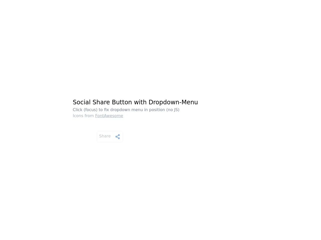
The preview of Social Share Button with Dropdown-Menu UI component
To create a Social Share Button with Dropdown-Menu UI component, we will use Tailwind CSS. The button will have a blue background color, white text, and a dropdown menu with a list of social media platforms.
Free download of the Social Share Button with Dropdown-Menu's source code
The source code of Social Share Button with Dropdown-Menu UI component
To create a Social Share Button with Dropdown-Menu UI component, we will use HTML, CSS, and Tailwind CSS. The HTML code will define the structure of the button, and the CSS code will style the button. We will use Tailwind CSS to add custom styles to the button.
<div class="flex justify-center h-screen bg-white">
  <!-- original button inspiration from khatabwedaa [https://www.tailwindcsscomponent.com/button-with-menu]-->
  <div class="flex flex-wrap items-center my-auto">
    <div class="w-full mb-12">
      <h1 class="text-2xl">Social Share Button with Dropdown-Menu</h1>
      <p class="text-gray-600">Click (focus) to fix dropdown menu in position (no JS)</p>
      <p class="text-gray-500">Icons from <a class="underline" href="https://fontawesome.com/" title="all credit and copyrights belongs to them">FontAwesome</a></p>
    </div>
     <div class="relative ml-24">
      <button class="sharebtn relative flex z-10 bg-white border rounded-md p-2 opacity-50 hover:opacity-100 focus:outline-none focus:border-blue-400" title="click to enable menu">
          <span class="inline-block pr-4 text-gray-600">Share</span>
          <svg xmlns="http://www.w3.org/2000/svg" viewBox="0 0 448 512" class="h-5 w-6 my-1 text-blue-700">
            <path fill="currentColor" d="M352 320c-22.608 0-43.387 7.819-59.79 20.895l-102.486-64.054a96.551 96.551 0 0 0 0-41.683l102.486-64.054C308.613 184.181 329.392 192 352 192c53.019 0 96-42.981 96-96S405.019 0 352 0s-96 42.981-96 96c0 7.158.79 14.13 2.276 20.841L155.79 180.895C139.387 167.819 118.608 160 96 160c-53.019 0-96 42.981-96 96s42.981 96 96 96c22.608 0 43.387-7.819 59.79-20.895l102.486 64.054A96.301 96.301 0 0 0 256 416c0 53.019 42.981 96 96 96s96-42.981 96-96-42.981-96-96-96z">
            </path>
          </svg>
      </button>
      <div class="sharebtn-dropdown absolute right-0 mt-0 w-48 bg-white rounded-sm overflow-hidden shadow-lg z-20 hidden border border-gray-100">
        <a href="#" title="Share on Facebook (NB! does not work in this demo)" class="flex px-4 py-2 text-sm text-gray-800 border-b hover:bg-blue-100">
          <svg aria-hidden="true" focusable="false" data-prefix="fab" data-icon="facebook-messenger" class="w-5 h-5 mr-4 text-blue-500" role="img" xmlns="http://www.w3.org/2000/svg" viewBox="0 0 512 512"><path fill="currentColor" d="M256.55 8C116.52 8 8 110.34 8 248.57c0 72.3 29.71 134.78 78.07 177.94 8.35 7.51 6.63 11.86 8.05 58.23A19.92 19.92 0 0 0 122 502.31c52.91-23.3 53.59-25.14 62.56-22.7C337.85 521.8 504 423.7 504 248.57 504 110.34 396.59 8 256.55 8zm149.24 185.13l-73 115.57a37.37 37.37 0 0 1-53.91 9.93l-58.08-43.47a15 15 0 0 0-18 0l-78.37 59.44c-10.46 7.93-24.16-4.6-17.11-15.67l73-115.57a37.36 37.36 0 0 1 53.91-9.93l58.06 43.46a15 15 0 0 0 18 0l78.41-59.38c10.44-7.98 24.14 4.54 17.09 15.62z"></path></svg>
          <span class="text-gray-600">Facebook</span>
        </a>
        <a href="#" title="Share on Twitter (NB! does not work in this demo)" class="flex px-4 py-2 text-sm text-gray-800 border-b hover:bg-blue-100">
          <svg aria-hidden="true" focusable="false" data-prefix="fab" data-icon="twitter-square" class="w-5 h-5 mr-4 text-blue-500" role="img" xmlns="http://www.w3.org/2000/svg" viewBox="0 0 448 512"><path fill="currentColor" d="M400 32H48C21.5 32 0 53.5 0 80v352c0 26.5 21.5 48 48 48h352c26.5 0 48-21.5 48-48V80c0-26.5-21.5-48-48-48zm-48.9 158.8c.2 2.8.2 5.7.2 8.5 0 86.7-66 186.6-186.6 186.6-37.2 0-71.7-10.8-100.7-29.4 5.3.6 10.4.8 15.8.8 30.7 0 58.9-10.4 81.4-28-28.8-.6-53-19.5-61.3-45.5 10.1 1.5 19.2 1.5 29.6-1.2-30-6.1-52.5-32.5-52.5-64.4v-.8c8.7 4.9 18.9 7.9 29.6 8.3a65.447 65.447 0 0 1-29.2-54.6c0-12.2 3.2-23.4 8.9-33.1 32.3 39.8 80.8 65.8 135.2 68.6-9.3-44.5 24-80.6 64-80.6 18.9 0 35.9 7.9 47.9 20.7 14.8-2.8 29-8.3 41.6-15.8-4.9 15.2-15.2 28-28.8 36.1 13.2-1.4 26-5.1 37.8-10.2-8.9 13.1-20.1 24.7-32.9 34z"></path></svg>
          <span class="text-gray-600">Twitter</span>
        </a>
        <a href="#" title="Share on LinkedIn (NB! does not work in this demo)" class="flex px-4 py-2 text-sm text-gray-800 border-b hover:bg-blue-100">
          <svg aria-hidden="true" focusable="false" data-prefix="fab" data-icon="linkedin" class="w-5 h-5 mr-4 text-blue-500" role="img" xmlns="http://www.w3.org/2000/svg" viewBox="0 0 448 512"><path fill="currentColor" d="M416 32H31.9C14.3 32 0 46.5 0 64.3v383.4C0 465.5 14.3 480 31.9 480H416c17.6 0 32-14.5 32-32.3V64.3c0-17.8-14.4-32.3-32-32.3zM135.4 416H69V202.2h66.5V416zm-33.2-243c-21.3 0-38.5-17.3-38.5-38.5S80.9 96 102.2 96c21.2 0 38.5 17.3 38.5 38.5 0 21.3-17.2 38.5-38.5 38.5zm282.1 243h-66.4V312c0-24.8-.5-56.7-34.5-56.7-34.6 0-39.9 27-39.9 54.9V416h-66.4V202.2h63.7v29.2h.9c8.9-16.8 30.6-34.5 62.9-34.5 67.2 0 79.7 44.3 79.7 101.9V416z"></path></svg>
          <span class="text-gray-600">LinkedIn</span>
        </a>
       </div>
    </div>
  </div>
</div>


<style lang="postcss">
.sharebtn {
  /* @apply relative flex z-10 bg-white border rounded-md p-2 opacity-50 hover:opacity-100 focus:outline-none focus:border-blue-400; */
}

.sharebtn:hover + .sharebtn-dropdown,
.sharebtn:focus + .sharebtn-dropdown {
  display: block;
}

.sharebtn-dropdown {
  /* @apply absolute right-0 mt-0 w-48 bg-white rounded-sm overflow-hidden shadow-lg z-20 hidden border border-gray-100; */
}
</style>
How to create a Social Share Button with Dropdown-Menu with Tailwind CSS?
To create a Social Share Button with Dropdown-Menu with Tailwind CSS, follow the steps below:
Step 1: Create the HTML structure
The first step is to create the HTML structure of the button. We will create a div element with a class of "relative" to position the dropdown menu. Inside the div element, we will create a button element with a class of "flex items-center justify-center w-32 h-10 rounded-lg bg-blue-500 text-white font-semibold". This will create a button with a blue background color, white text, and a rounded border.
<div class="relative">
  <button class="flex items-center justify-center w-32 h-10 rounded-lg bg-blue-500 text-white font-semibold">
    Share
  </button>
</div>
Step 2: Create the Dropdown Menu
The next step is to create the dropdown menu. We will create a div element with a class of "absolute right-0 mt-2 w-48 bg-white rounded-md shadow-lg z-10". This will create a dropdown menu with a white background color, rounded corners, and a shadow. Inside the div element, we will create a ul element with a class of "py-1". This will create a list of social media platforms.
<div class="relative">
  <button class="flex items-center justify-center w-32 h-10 rounded-lg bg-blue-500 text-white font-semibold">
    Share
  </button>
  <div class="absolute right-0 mt-2 w-48 bg-white rounded-md shadow-lg z-10">
    <ul class="py-1">
      <li>
        <a href="#" class="block px-4 py-2 text-gray-800 hover:bg-gray-100">
          Facebook
        </a>
      </li>
      <li>
        <a href="#" class="block px-4 py-2 text-gray-800 hover:bg-gray-100">
          Twitter
        </a>
      </li>
      <li>
        <a href="#" class="block px-4 py-2 text-gray-800 hover:bg-gray-100">
          LinkedIn
        </a>
      </li>
    </ul>
  </div>
</div>
Step 3: Style the Dropdown Menu
The next step is to style the dropdown menu. We will add some custom styles to the dropdown menu to make it look better. We will add a border to the dropdown menu, change the font size, and add some padding to the list items.
<div class="relative">
  <button class="flex items-center justify-center w-32 h-10 rounded-lg bg-blue-500 text-white font-semibold">
    Share
  </button>
  <div class="absolute right-0 mt-2 w-48 bg-white rounded-md shadow-lg z-10 border border-gray-200">
    <ul class="py-1">
      <li>
        <a href="#" class="block px-4 py-2 text-gray-800 hover:bg-gray-100 text-sm">
          Facebook
        </a>
      </li>
      <li>
        <a href="#" class="block px-4 py-2 text-gray-800 hover:bg-gray-100 text-sm">
          Twitter
        </a>
      </li>
      <li>
        <a href="#" class="block px-4 py-2 text-gray-800 hover:bg-gray-100 text-sm">
          LinkedIn
        </a>
      </li>
    </ul>
  </div>
</div>
Step 4: Add Interactivity
The final step is to add interactivity to the button. We will use JavaScript to toggle the visibility of the dropdown menu when the user clicks on the button.
<div class="relative">
  <button class="flex items-center justify-center w-32 h-10 rounded-lg bg-blue-500 text-white font-semibold" onclick="toggleDropdown()">
    Share
  </button>
  <div class="absolute right-0 mt-2 w-48 bg-white rounded-md shadow-lg z-10 border border-gray-200 hidden" id="dropdown">
    <ul class="py-1">
      <li>
        <a href="#" class="block px-4 py-2 text-gray-800 hover:bg-gray-100 text-sm">
          Facebook
        </a>
      </li>
      <li>
        <a href="#" class="block px-4 py-2 text-gray-800 hover:bg-gray-100 text-sm">
          Twitter
        </a>
      </li>
      <li>
        <a href="#" class="block px-4 py-2 text-gray-800 hover:bg-gray-100 text-sm">
          LinkedIn
        </a>
      </li>
    </ul>
  </div>
</div>

<script>
  function toggleDropdown() {
    var dropdown = document.getElementById("dropdown");
    if (dropdown.classList.contains("hidden")) {
      dropdown.classList.remove("hidden");
    } else {
      dropdown.classList.add("hidden");
    }
  }
</script>
Conclusion
In this article, we showed you how to create a Social Share Button with Dropdown-Menu UI component using Tailwind CSS. We used HTML, CSS, and Tailwind CSS to create the button and added interactivity using JavaScript. With Tailwind CSS, you can create custom user interfaces quickly and easily. We hope this article helps you create beautiful and functional UI components for your website.