- Published on
6 Easy Ways To Create A Social ntwrk With Tailwind CSS Without Even Thinking About It
- What is Tailwind CSS?
- The description of Social ntwrk UI component
- Why use Tailwind CSS to create a Social ntwrk UI component?
- The preview of Social ntwrk UI component
- The source code of Social ntwrk UI component
- How to create a Social ntwrk with Tailwind CSS?
- Step 1: Set up your project
- Step 2: Define the HTML structure
- Step 3: Style your UI component
- Step 4: Customize your styles
- Step 5: Add interactivity
- Conclusion
As a front-end developer, you may have heard about Tailwind CSS, a utility-first CSS framework that helps you quickly build custom designs. In this article, we will explore how to create a social network UI component with Tailwind CSS without even thinking about it.
What is Tailwind CSS?
Tailwind CSS is a utility-first CSS framework that provides you with a set of pre-defined classes that you can use to style your HTML elements. It's designed to help you quickly build custom designs without writing custom CSS code.
The description of Social ntwrk UI component
A social network UI component is a collection of UI elements that are commonly used in social networking applications. These elements include profile cards, activity feeds, chat boxes, and more.
Why use Tailwind CSS to create a Social ntwrk UI component?
Tailwind CSS provides you with a set of pre-defined classes that you can use to quickly style your UI components. It also allows you to easily customize your styles by modifying the configuration file.
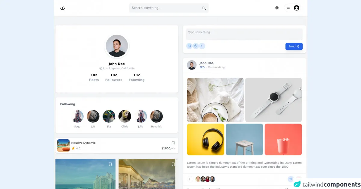
The preview of Social ntwrk UI component
To create a social network UI component with Tailwind CSS, we will use a combination of pre-defined classes and custom styles. The end result will be a beautiful and functional UI component that you can use in your social networking applications.
Free download of the Social ntwrk's source code
The source code of Social ntwrk UI component
To create a social network UI component with Tailwind CSS, you will need to write HTML and CSS code. The HTML code will define the structure of the UI component, while the CSS code will style it.
<div class="app bg-gray-100">
<nav class="bg-white w-full flex relative shadow justify-between items-center px-8 h-20">
<!-- logo -->
<div class="inline-flex">
<a class="_o6689fn" href="/">
<svg viewBox="0 0 24 24" width="24" height="24" stroke="currentColor" stroke-width="2" fill="none" stroke-linecap="round" stroke-linejoin="round" class="css-i6dzq1"><circle cx="12" cy="5" r="3"></circle><line x1="12" y1="22" x2="12" y2="8"></line><path d="M5 12H2a10 10 0 0 0 20 0h-3"></path></svg>
</a>
</div>
<!-- end logo -->
<!-- search bar -->
<!-- <div class="hidden sm:block flex-shrink flex-grow-0 justify-start px-2"> -->
<div class="relative hidden sm:block flex-shrink flex-grow-0">
<input type="text" class="bg-purple-white bg-gray-100 rounded-lg border-0 p-3 w-full" placeholder="Search somthing..." style="min-width:400px;">
<div class="absolute top-0 right-0 p-4 pr-3 text-purple-lighter">
<svg xmlns="http://www.w3.org/2000/svg" class="h-5 w-5" fill="none" viewBox="0 0 24 24" stroke="currentColor">
<path stroke-linecap="round" stroke-linejoin="round" stroke-width="2" d="M21 21l-6-6m2-5a7 7 0 11-14 0 7 7 0 0114 0z"></path>
</svg>
</div>
</div>
<!-- end search bar -->
<!-- login -->
<div class="flex-initial">
<div class="flex justify-end items-center relative">
<div class="flex mr-4 items-center">
<div class="block relative">
<button type="button" class="inline-block py-2 px-3 hover:bg-gray-200 rounded-full relative ">
<div class="flex items-center h-5">
<div class="_xpkakx">
<svg viewBox="0 0 16 16" xmlns="http://www.w3.org/2000/svg" aria-hidden="true" role="presentation" focusable="false" style="display: block; height: 16px; width: 16px; fill: currentcolor;"><path d="m8.002.25a7.77 7.77 0 0 1 7.748 7.776 7.75 7.75 0 0 1 -7.521 7.72l-.246.004a7.75 7.75 0 0 1 -7.73-7.513l-.003-.245a7.75 7.75 0 0 1 7.752-7.742zm1.949 8.5h-3.903c.155 2.897 1.176 5.343 1.886 5.493l.068.007c.68-.002 1.72-2.365 1.932-5.23zm4.255 0h-2.752c-.091 1.96-.53 3.783-1.188 5.076a6.257 6.257 0 0 0 3.905-4.829zm-9.661 0h-2.75a6.257 6.257 0 0 0 3.934 5.075c-.615-1.208-1.036-2.875-1.162-4.686l-.022-.39zm1.188-6.576-.115.046a6.257 6.257 0 0 0 -3.823 5.03h2.75c.085-1.83.471-3.54 1.059-4.81zm2.262-.424c-.702.002-1.784 2.512-1.947 5.5h3.904c-.156-2.903-1.178-5.343-1.892-5.494l-.065-.007zm2.28.432.023.05c.643 1.288 1.069 3.084 1.157 5.018h2.748a6.275 6.275 0 0 0 -3.929-5.068z"></path></svg>
</div>
</div>
</button>
</div>
</div>
<div class="block">
<div class="inline relative">
<button type="button" class="inline-flex items-center relative px-2 border rounded-full hover:shadow-lg">
<div class="pl-1">
<svg viewBox="0 0 32 32" xmlns="http://www.w3.org/2000/svg" aria-hidden="true" role="presentation" focusable="false" style="display: block; fill: none; height: 16px; width: 16px; stroke: currentcolor; stroke-width: 3; overflow: visible;">
<g fill="none" fill-rule="nonzero">
<path d="m2 16h28"></path>
<path d="m2 24h28"></path>
<path d="m2 8h28"></path>
</g>
</svg>
</div>
<div class="block flex-grow-0 flex-shrink-0 h-10 w-12 pl-5">
<svg viewBox="0 0 32 32" xmlns="http://www.w3.org/2000/svg" aria-hidden="true" role="presentation" focusable="false" style="display: block; height: 100%; width: 100%; fill: currentcolor;">
<path d="m16 .7c-8.437 0-15.3 6.863-15.3 15.3s6.863 15.3 15.3 15.3 15.3-6.863 15.3-15.3-6.863-15.3-15.3-15.3zm0 28c-4.021 0-7.605-1.884-9.933-4.81a12.425 12.425 0 0 1 6.451-4.4 6.507 6.507 0 0 1 -3.018-5.49c0-3.584 2.916-6.5 6.5-6.5s6.5 2.916 6.5 6.5a6.513 6.513 0 0 1 -3.019 5.491 12.42 12.42 0 0 1 6.452 4.4c-2.328 2.925-5.912 4.809-9.933 4.809z"></path>
</svg>
</div>
</button>
</div>
</div>
</div>
</div>
<!-- end login -->
</nav>
<main class="grid grid-cols-1 lg:grid-cols-2 gap-6 my-12 mx-12 w-2xl container px-2 mx-auto">
<aside class="">
<div class="bg-white shadow rounded-lg p-10">
<div class="flex flex-col gap-1 text-center items-center">
<img class="h-32 w-32 bg-white p-2 rounded-full shadow mb-4" src="https://images.unsplash.com/photo-1535713875002-d1d0cf377fde?ixid=MnwxMjA3fDB8MHxwaG90by1wYWdlfHx8fGVufDB8fHx8&ixlib=rb-1.2.1&auto=format&fit=crop&w=2000&q=80" alt="">
<p class="font-semibold">John Doe</p>
<div class="text-sm leading-normal text-gray-400 flex justify-center items-center">
<svg viewBox="0 0 24 24" class="mr-1" width="16" height="16" stroke="currentColor" stroke-width="2" fill="none" stroke-linecap="round" stroke-linejoin="round"><path d="M21 10c0 7-9 13-9 13s-9-6-9-13a9 9 0 0 1 18 0z"></path><circle cx="12" cy="10" r="3"></circle></svg>
Los Angeles, California
</div>
</div>
<div class="flex justify-center items-center gap-2 my-3">
<div class="font-semibold text-center mx-4">
<p class="text-black">102</p>
<span class="text-gray-400">Posts</span>
</div>
<div class="font-semibold text-center mx-4">
<p class="text-black">102</p>
<span class="text-gray-400">Followers</span>
</div>
<div class="font-semibold text-center mx-4">
<p class="text-black">102</p>
<span class="text-gray-400">Folowing</span>
</div>
</div>
</div>
<div class="bg-white shadow mt-6 rounded-lg p-6">
<h3 class="text-gray-600 text-sm font-semibold mb-4">Following</h3>
<ul class="flex items-center justify-center space-x-2">
<!-- Story #1 -->
<li class="flex flex-col items-center space-y-2">
<!-- Ring -->
<a class="block bg-white p-1 rounded-full" href="#">
<img class="w-16 rounded-full" src="https://images.unsplash.com/photo-1638612913771-8f00622b96fb?ixlib=rb-1.2.1&ixid=MnwxMjA3fDB8MHxwaG90by1wYWdlfHx8fGVufDB8fHx8&auto=format&fit=crop&w=200&h=200&q=80">
</a>
<!-- Username -->
<span class="text-xs text-gray-500">
Sage
</span>
</li>
<!-- Story #1 -->
<li class="flex flex-col items-center space-y-2">
<!-- Ring -->
<a class="block bg-white p-1 rounded-full" href="#">
<img class="w-16 rounded-full" src="https://images.unsplash.com/photo-1638649602320-450b717fa622?ixlib=rb-1.2.1&ixid=MnwxMjA3fDB8MHxwaG90by1wYWdlfHx8fGVufDB8fHx8&auto=format&fit=crop&w=200&h=200&q=80">
</a>
<!-- Username -->
<span class="text-xs text-gray-500">
Jett
</span>
</li>
<!-- Story #2 -->
<li class="flex flex-col items-center space-y-2">
<!-- Ring -->
<a class="block bg-white p-1 rounded-full" href="#">
<!-- Thumbnail -->
<img class="w-16 rounded-full" src="https://images.unsplash.com/photo-1638708644743-2502f38000a0?ixlib=rb-1.2.1&ixid=MnwxMjA3fDB8MHxwaG90by1wYWdlfHx8fGVufDB8fHx8&auto=format&fit=crop&w=200&h=200&q=80">
</a>
<!-- Username -->
<span class="text-xs text-gray-500">
Sky
</span>
</li>
<!-- Story #3 -->
<li class="flex flex-col items-center space-y-2">
<!-- Ring -->
<a class="block bg-white p-1 rounded-full" href="#">
<!-- Thumbnail -->
<img class="w-16 rounded-full" src="https://images.unsplash.com/photo-1638691899851-0e955bceba1f?ixlib=rb-1.2.1&ixid=MnwxMjA3fDB8MHxwaG90by1wYWdlfHx8fGVufDB8fHx8&auto=format&fit=crop&w=200&h=200&q=80">
</a>
<!-- Username -->
<span class="text-xs text-gray-500">
Olivia
</span>
</li>
<!-- Story #4 -->
<li class="flex flex-col items-center space-y-2">
<!-- Ring -->
<a class="block bg-white p-1 rounded-full" href="#">
<img class="w-16 rounded-full" src="https://images.unsplash.com/photo-1638612913771-8f00622b96fb?ixlib=rb-1.2.1&ixid=MnwxMjA3fDB8MHxwaG90by1wYWdlfHx8fGVufDB8fHx8&auto=format&fit=crop&w=200&h=200&q=80">
</a>
<!-- Username -->
<span class="text-xs text-gray-500">
Julia
</span>
</li>
<!-- Story #1 -->
<li class="flex flex-col items-center space-y-2">
<!-- Ring -->
<a class="block bg-white p-1 rounded-full" href="#">
<!-- Thumbnail -->
<img class="w-16 rounded-full" src="https://images.unsplash.com/photo-1638649602320-450b717fa622?ixlib=rb-1.2.1&ixid=MnwxMjA3fDB8MHxwaG90by1wYWdlfHx8fGVufDB8fHx8&auto=format&fit=crop&w=200&h=200&q=80">
</a>
<!-- Username -->
<span class="text-xs text-gray-500">
Hendrick
</span>
</li>
</ul>
</div>
<div class="flex bg-white shadow mt-6 rounded-lg p-2">
<img src="https://images.unsplash.com/photo-1439130490301-25e322d88054?ixid=MnwxMjA3fDB8MHxwaG90by1wYWdlfHx8fGVufDB8fHx8&ixlib=rb-1.2.1&auto=format&fit=crop&w=1189&q=80" alt="Just a flower" class=" w-16 object-cover h-16 rounded-xl">
<div class="flex flex-col justify-center w-full px-2 py-1">
<div class="flex justify-between items-center ">
<div class="flex flex-col">
<h2 class="text-sm font-medium">Massive Dynamic</h2>
</div>
<svg xmlns="http://www.w3.org/2000/svg" class="h-5 w-5 text-gray-500 hover:text-blue-400 cursor-pointer" fill="none" viewBox="0 0 24 24" stroke="currentColor">
<path stroke-linecap="round" stroke-linejoin="round" stroke-width="2" d="M5 5a2 2 0 012-2h10a2 2 0 012 2v16l-7-3.5L5 21V5z"></path>
</svg>
</div>
<div class="flex pt-2 text-sm text-gray-400">
<div class="flex items-center mr-auto">
<svg xmlns="http://www.w3.org/2000/svg" class="h-5 w-5 text-yellow-500 mr-1" viewBox="0 0 20 20" fill="currentColor">
<path d="M9.049 2.927c.3-.921 1.603-.921 1.902 0l1.07 3.292a1 1 0 00.95.69h3.462c.969 0 1.371 1.24.588 1.81l-2.8 2.034a1 1 0 00-.364 1.118l1.07 3.292c.3.921-.755 1.688-1.54 1.118l-2.8-2.034a1 1 0 00-1.175 0l-2.8 2.034c-.784.57-1.838-.197-1.539-1.118l1.07-3.292a1 1 0 00-.364-1.118L2.98 8.72c-.783-.57-.38-1.81.588-1.81h3.461a1 1 0 00.951-.69l1.07-3.292z">
</path>
</svg>
<p class="font-normal">4.5</p>
</div>
<div class="flex items-center font-medium text-gray-900 ">
$1800
<span class="text-gray-400 text-sm font-normal"> /wk</span>
</div>
</div>
</div>
</div>
<div class="grid mt-5 grid-cols-2 space-x-4 overflow-y-scroll flex justify-center items-center w-full ">
<div class="relative flex flex-col justify-between bg-white shadow-md rounded-3xl bg-cover text-gray-800 overflow-hidden cursor-pointer w-full object-cover object-center rounded shadow-md h-64 my-2" style="background-image:url('https://images.unsplash.com/reserve/8T8J12VQxyqCiQFGa2ct_bahamas-atlantis.jpg?ixlib=rb-1.2.1&ixid=MnwxMjA3fDB8MHxwaG90by1wYWdlfHx8fGVufDB8fHx8&auto=format&fit=crop&w=1050&q=80')">
<div class="absolute bg-gradient-to-t from-green-400 to-blue-400 opacity-50 inset-0 z-0"></div>
<div class="relative flex flex-row items-end h-72 w-full ">
<div class="absolute right-0 top-0 m-2">
<svg xmlns="http://www.w3.org/2000/svg" class="h-9 w-9 p-2 text-gray-200 hover:text-blue-400 rounded-full hover:bg-white transition ease-in duration-200 " fill="none" viewBox="0 0 24 24" stroke="currentColor">
<path stroke-linecap="round" stroke-linejoin="round" stroke-width="2" d="M5 5a2 2 0 012-2h10a2 2 0 012 2v16l-7-3.5L5 21V5z"></path>
</svg>
</div>
<div class="p-6 rounded-lg flex flex-col w-full z-10 ">
<h4 class="mt-1 text-white text-xl font-semibold leading-tight truncate">Loremipsum..
</h4>
<div class="flex justify-between items-center ">
<div class="flex flex-col">
<h2 class="text-sm flex items-center text-gray-300 font-normal">
<svg xmlns="http://www.w3.org/2000/svg" class="h-4 w-4 mr-1" fill="none" viewBox="0 0 24 24" stroke="currentColor">
<path stroke-linecap="round" stroke-linejoin="round" stroke-width="2" d="M17.657 16.657L13.414 20.9a1.998 1.998 0 01-2.827 0l-4.244-4.243a8 8 0 1111.314 0z">
</path>
<path stroke-linecap="round" stroke-linejoin="round" stroke-width="2" d="M15 11a3 3 0 11-6 0 3 3 0 016 0z"></path>
</svg>
Dubai
</h2>
</div>
</div>
<div class="flex pt-4 text-sm text-gray-300">
<div class="flex items-center mr-auto">
<svg xmlns="http://www.w3.org/2000/svg" class="h-5 w-5 text-yellow-500 mr-1" viewBox="0 0 20 20" fill="currentColor">
<path d="M9.049 2.927c.3-.921 1.603-.921 1.902 0l1.07 3.292a1 1 0 00.95.69h3.462c.969 0 1.371 1.24.588 1.81l-2.8 2.034a1 1 0 00-.364 1.118l1.07 3.292c.3.921-.755 1.688-1.54 1.118l-2.8-2.034a1 1 0 00-1.175 0l-2.8 2.034c-.784.57-1.838-.197-1.539-1.118l1.07-3.292a1 1 0 00-.364-1.118L2.98 8.72c-.783-.57-.38-1.81.588-1.81h3.461a1 1 0 00.951-.69l1.07-3.292z">
</path>
</svg>
<p class="font-normal">4.5</p>
</div>
<div class="flex items-center font-medium text-white ">
$1800
<span class="text-gray-300 text-sm font-normal"> /wk</span>
</div>
</div>
</div>
</div>
</div>
<div class="relative flex flex-col justify-between bg-white shadow-md rounded-3xl bg-cover text-gray-800 overflow-hidden cursor-pointer w-full object-cover object-center rounded shadow-md h-64 my-2" style="background-image:url('https://images.unsplash.com/photo-1571896349842-33c89424de2d?ixlib=rb-1.2.1&ixid=MnwxMjA3fDB8MHxwaG90by1wYWdlfHx8fGVufDB8fHx8&auto=format&fit=crop&w=800&q=80')">
<div class="absolute bg-gradient-to-t from-blue-500 to-yellow-400 opacity-50 inset-0 z-0"></div>
<div class="relative flex flex-row items-end h-72 w-full ">
<div class="absolute right-0 top-0 m-2">
<svg xmlns="http://www.w3.org/2000/svg" class="h-9 w-9 p-2 text-gray-200 hover:text-blue-400 rounded-full hover:bg-white transition ease-in duration-200 " fill="none" viewBox="0 0 24 24" stroke="currentColor">
<path stroke-linecap="round" stroke-linejoin="round" stroke-width="2" d="M5 5a2 2 0 012-2h10a2 2 0 012 2v16l-7-3.5L5 21V5z"></path>
</svg>
</div>
<div class="p-5 rounded-lg flex flex-col w-full z-10 ">
<h4 class="mt-1 text-white text-xl font-semibold leading-tight truncate">Loremipsum..
</h4>
<div class="flex justify-between items-center ">
<div class="flex flex-col">
<h2 class="text-sm flex items-center text-gray-300 font-normal">
<svg xmlns="http://www.w3.org/2000/svg" class="h-4 w-4 mr-1" fill="none" viewBox="0 0 24 24" stroke="currentColor">
<path stroke-linecap="round" stroke-linejoin="round" stroke-width="2" d="M17.657 16.657L13.414 20.9a1.998 1.998 0 01-2.827 0l-4.244-4.243a8 8 0 1111.314 0z">
</path>
<path stroke-linecap="round" stroke-linejoin="round" stroke-width="2" d="M15 11a3 3 0 11-6 0 3 3 0 016 0z"></path>
</svg>
India
</h2>
</div>
</div>
<div class="flex pt-4 text-sm text-gray-300">
<div class="flex items-center mr-auto">
<svg xmlns="http://www.w3.org/2000/svg" class="h-5 w-5 text-yellow-500 mr-1" viewBox="0 0 20 20" fill="currentColor">
<path d="M9.049 2.927c.3-.921 1.603-.921 1.902 0l1.07 3.292a1 1 0 00.95.69h3.462c.969 0 1.371 1.24.588 1.81l-2.8 2.034a1 1 0 00-.364 1.118l1.07 3.292c.3.921-.755 1.688-1.54 1.118l-2.8-2.034a1 1 0 00-1.175 0l-2.8 2.034c-.784.57-1.838-.197-1.539-1.118l1.07-3.292a1 1 0 00-.364-1.118L2.98 8.72c-.783-.57-.38-1.81.588-1.81h3.461a1 1 0 00.951-.69l1.07-3.292z">
</path>
</svg>
<p class="font-normal">4.5</p>
</div>
<div class="flex items-center font-medium text-white ">
$1800
<span class="text-gray-300 text-sm font-normal"> /wk</span>
</div>
</div>
</div>
</div>
</div>
</div>
</aside>
<article class="">
<form class="bg-white shadow rounded-lg mb-6 p-4">
<textarea name="message" placeholder="Type something..." class="w-full rounded-lg p-2 text-sm bg-gray-100 border border-transparent appearance-none rounded-tg placeholder-gray-400"></textarea>
<footer class="flex justify-between mt-2">
<div class="flex gap-2">
<span class="flex items-center transition ease-out duration-300 hover:bg-blue-500 hover:text-white bg-blue-100 w-8 h-8 px-2 rounded-full text-blue-400 cursor-pointer">
<svg viewBox="0 0 24 24" width="24" height="24" stroke="currentColor" stroke-width="2" fill="none" stroke-linecap="round" stroke-linejoin="round" class="css-i6dzq1"><rect x="3" y="3" width="18" height="18" rx="2" ry="2"></rect><circle cx="8.5" cy="8.5" r="1.5"></circle><polyline points="21 15 16 10 5 21"></polyline></svg>
</span>
<span class="flex items-center transition ease-out duration-300 hover:bg-blue-500 hover:text-white bg-blue-100 w-8 h-8 px-2 rounded-full text-blue-400 cursor-pointer">
<svg viewBox="0 0 24 24" width="24" height="24" stroke="currentColor" stroke-width="2" fill="none" stroke-linecap="round" stroke-linejoin="round" class="css-i6dzq1"><path d="M21 10c0 7-9 13-9 13s-9-6-9-13a9 9 0 0 1 18 0z"></path><circle cx="12" cy="10" r="3"></circle></svg>
</span>
<span class="flex items-center transition ease-out duration-300 hover:bg-blue-500 hover:text-white bg-blue-100 w-8 h-8 px-2 rounded-full text-blue-400 cursor-pointer">
<svg viewBox="0 0 24 24" width="24" height="24" stroke="currentColor" stroke-width="2" fill="none" stroke-linecap="round" stroke-linejoin="round" class="css-i6dzq1"><polyline points="4 17 10 11 4 5"></polyline><line x1="12" y1="19" x2="20" y2="19"></line></svg>
</span>
</div>
<button class="flex items-center py-2 px-4 rounded-lg text-sm bg-blue-600 text-white shadow-lg">Send
<svg class="ml-1" viewBox="0 0 24 24" width="16" height="16" stroke="currentColor" stroke-width="2" fill="none" stroke-linecap="round" stroke-linejoin="round"><line x1="22" y1="2" x2="11" y2="13"></line><polygon points="22 2 15 22 11 13 2 9 22 2"></polygon></svg>
</button>
</footer>
</form>
<div class="bg-white shadow rounded-lg mb-6">
<div class="flex flex-row px-2 py-3 mx-3">
<div class="w-auto h-auto rounded-full">
<img class="w-12 h-12 object-cover rounded-full shadow cursor-pointer" alt="User avatar" src="https://images.unsplash.com/photo-1535713875002-d1d0cf377fde?ixid=MnwxMjA3fDB8MHxwaG90by1wYWdlfHx8fGVufDB8fHx8&ixlib=rb-1.2.1&auto=format&fit=crop&w=2000&q=80">
</div>
<div class="flex flex-col mb-2 ml-4 mt-1">
<div class="text-gray-600 text-sm font-semibold">John Doe</div>
<div class="flex w-full mt-1">
<div class="text-blue-700 font-base text-xs mr-1 cursor-pointer">
SEO
</div>
<div class="text-gray-400 font-thin text-xs">
• 30 seconds ago
</div>
</div>
</div>
</div>
<div class="border-b border-gray-100"></div>
<div class="text-gray-400 font-medium text-sm mb-7 mt-6 mx-3 px-2">
<div class="grid grid-cols-6 col-span-2 gap-2 ">
<div class=" overflow-hidden rounded-xl col-span-3 max-h-[14rem]">
<img class="h-full w-full object-cover " src="https://images.unsplash.com/photo-1517487881594-2787fef5ebf7?ixlib=rb-1.2.1&ixid=MnwxMjA3fDB8MHxwaG90by1wYWdlfHx8fGVufDB8fHx8&auto=format&fit=crop&w=735&q=80" alt="">
</div>
<div class=" overflow-hidden rounded-xl col-span-3 max-h-[14rem]">
<img class="h-full w-full object-cover " src="https://images.unsplash.com/photo-1523275335684-37898b6baf30?ixlib=rb-1.2.1&ixid=MnwxMjA3fDB8MHxwaG90by1wYWdlfHx8fGVufDB8fHx8&auto=format&fit=crop&w=1399&q=80" alt="">
</div>
<div class=" overflow-hidden rounded-xl col-span-2 max-h-[10rem]">
<img class="h-full w-full object-cover " src="https://images.unsplash.com/photo-1505740420928-5e560c06d30e?ixlib=rb-1.2.1&ixid=MnwxMjA3fDB8MHxwaG90by1wYWdlfHx8fGVufDB8fHx8&auto=format&fit=crop&w=1470&q=80" alt="">
</div>
<div class=" overflow-hidden rounded-xl col-span-2 max-h-[10rem]">
<img class="h-full w-full object-cover " src="https://images.unsplash.com/photo-1503602642458-232111445657?ixlib=rb-1.2.1&ixid=MnwxMjA3fDB8MHxwaG90by1wYWdlfHx8fGVufDB8fHx8&auto=format&fit=crop&w=687&q=80" alt="">
</div>
<div class="relative overflow-hidden rounded-xl col-span-2 max-h-[10rem]">
<div class="text-white text-xl absolute inset-0 bg-slate-900/80 flex justify-center items-center">
+ 23
</div>
<img class="h-full w-full object-cover " src="https://images.unsplash.com/photo-1560393464-5c69a73c5770?ixlib=rb-1.2.1&ixid=MnwxMjA3fDB8MHxwaG90by1wYWdlfHx8fGVufDB8fHx8&auto=format&fit=crop&w=765&q=80" alt="">
</div>
</div>
</div>
<div class="text-gray-500 text-sm mb-6 mx-3 px-2">Lorem Ipsum is simply dummy text of the printing and typesetting industry. Lorem Ipsum has been the industry's standard dummy text ever since the 1500</div>
<div class="flex justify-start mb-4 border-t border-gray-100">
<div class="flex w-full mt-1 pt-2 pl-5">
<span class="bg-white transition ease-out duration-300 hover:text-red-500 border w-8 h-8 px-2 pt-2 text-center rounded-full text-gray-400 cursor-pointer mr-2">
<svg xmlns="http://www.w3.org/2000/svg" fill="none" width="14px" viewBox="0 0 24 24" stroke="currentColor">
<path stroke-linecap="round" stroke-linejoin="round" stroke-width="2" d="M5 5a2 2 0 012-2h10a2 2 0 012 2v16l-7-3.5L5 21V5z"></path>
</svg>
</span>
<img class="inline-block object-cover w-8 h-8 text-white border-2 border-white rounded-full shadow-sm cursor-pointer" src="https://images.unsplash.com/photo-1491528323818-fdd1faba62cc?ixlib=rb-1.2.1&ixid=eyJhcHBfaWQiOjEyMDd9&auto=format&fit=facearea&facepad=2&w=256&h=256&q=80" alt="">
<img class="inline-block object-cover w-8 h-8 -ml-2 text-white border-2 border-white rounded-full shadow-sm cursor-pointer" src="https://images.unsplash.com/photo-1550525811-e5869dd03032?ixlib=rb-1.2.1&auto=format&fit=facearea&facepad=2&w=256&h=256&q=80" alt="">
<img class="inline-block object-cover w-8 h-8 -ml-2 text-white border-2 border-white rounded-full shadow-sm cursor-pointer" src="https://images.unsplash.com/photo-1494790108377-be9c29b29330?ixlib=rb-1.2.1&ixid=eyJhcHBfaWQiOjEyMDd9&auto=format&fit=crop&w=634&q=80" alt="">
<img class="inline-block object-cover w-8 h-8 -ml-2 text-white border-2 border-white rounded-full shadow-sm cursor-pointer" src="https://images.unsplash.com/photo-1500648767791-00dcc994a43e?ixlib=rb-1.2.1&ixid=eyJhcHBfaWQiOjEyMDd9&auto=format&fit=facearea&facepad=2.25&w=256&h=256&q=80" alt="">
</div>
<div class="flex justify-end w-full mt-1 pt-2 pr-5">
<span class="transition ease-out duration-300 hover:bg-blue-50 bg-blue-100 w-8 h-8 px-2 py-2 text-center rounded-full text-blue-400 cursor-pointer mr-2">
<svg xmlns="http://www.w3.org/2000/svg" fill="none" width="14px" viewBox="0 0 24 24" stroke="currentColor">
<path stroke-linecap="round" stroke-linejoin="round" stroke-width="2" d="M8.684 13.342C8.886 12.938 9 12.482 9 12c0-.482-.114-.938-.316-1.342m0 2.684a3 3 0 110-2.684m0 2.684l6.632 3.316m-6.632-6l6.632-3.316m0 0a3 3 0 105.367-2.684 3 3 0 00-5.367 2.684zm0 9.316a3 3 0 105.368 2.684 3 3 0 00-5.368-2.684z"></path>
</svg>
</span>
<span class="transition ease-out duration-300 hover:bg-gray-50 bg-gray-100 h-8 px-2 py-2 text-center rounded-full text-gray-100 cursor-pointer">
<svg class="h-4 w-4 text-red-500" fill="none" viewBox="0 0 24 24" stroke="currentColor" stroke-width="2">
<path stroke-linecap="round" stroke-linejoin="round" d="M20.84 4.61a5.5 5.5 0 00-7.78 0L12 5.67l-1.06-1.06a5.5 5.5 0 00-7.78 7.78l1.06 1.06L12 21.23l7.78-7.78 1.06-1.06a5.5 5.5 0 000-7.78z"></path>
</svg>
</span>
</div>
</div>
<div class="flex w-full border-t border-gray-100">
<div class="mt-3 mx-5 flex flex-row text-xs">
<div class="flex text-gray-700 font-normal rounded-md mb-2 mr-4 items-center">Comments:<div class="ml-1 text-gray-400 text-ms"> 30</div></div>
<div class="flex text-gray-700 font-normal rounded-md mb-2 mr-4 items-center">Views: <div class="ml-1 text-gray-400 text-ms"> 60k</div></div>
</div>
<div class="mt-3 mx-5 w-full flex justify-end text-xs">
<div class="flex text-gray-700 rounded-md mb-2 mr-4 items-center">Likes: <div class="ml-1 text-gray-400 text-ms"> 120k</div></div>
</div>
</div>
<div class="text-black p-4 antialiased flex">
<img class="rounded-full h-8 w-8 mr-2 mt-1 " src="https://picsum.photos/id/1027/200/200">
<div>
<div class="bg-gray-100 rounded-lg px-4 pt-2 pb-2.5">
<div class="font-semibold text-sm leading-relaxed">Sara Lauren</div>
<div class="text-xs leading-snug md:leading-normal">Lorem ipsum dolor sit amet, consectetur adipiscing elit, sed do eiusmod tempor incididunt ut labore et dolore magna aliqua. Ut enim ad minim veniam, quis nostrud exercitation ullamco laboris nisi ut aliquip ex ea commodo consequat.</div>
</div>
<div class="text-xs mt-0.5 text-gray-500">14 w</div>
<div class="bg-white border border-white rounded-full float-right -mt-8 mr-0.5 flex shadow items-center ">
<svg class="p-0.5 h-5 w-5 rounded-full z-20 bg-white" xmlns="http://www.w3.org/2000/svg" xmlns:xlink="http://www.w3.org/1999/xlink" viewBox="0 0 16 16"><defs><linearGradient id="a1" x1="50%" x2="50%" y1="0%" y2="100%"><stop offset="0%" stop-color="#18AFFF"></stop><stop offset="100%" stop-color="#0062DF"></stop></linearGradient><filter id="c1" width="118.8%" height="118.8%" x="-9.4%" y="-9.4%" filterUnits="objectBoundingBox"><feGaussianBlur in="SourceAlpha" result="shadowBlurInner1" stdDeviation="1"></feGaussianBlur><feOffset dy="-1" in="shadowBlurInner1" result="shadowOffsetInner1"></feOffset><feComposite in="shadowOffsetInner1" in2="SourceAlpha" k2="-1" k3="1" operator="arithmetic" result="shadowInnerInner1"></feComposite><feColorMatrix in="shadowInnerInner1" values="0 0 0 0 0 0 0 0 0 0.299356041 0 0 0 0 0.681187726 0 0 0 0.3495684 0"></feColorMatrix></filter><path id="b1" d="M8 0a8 8 0 00-8 8 8 8 0 1016 0 8 8 0 00-8-8z"></path></defs><g fill="none"><use fill="url(#a1)" xlink:href="#b1"></use><use fill="black" filter="url(#c1)" xlink:href="#b1"></use><path fill="white" d="M12.162 7.338c.176.123.338.245.338.674 0 .43-.229.604-.474.725a.73.73 0 01.089.546c-.077.344-.392.611-.672.69.121.194.159.385.015.62-.185.295-.346.407-1.058.407H7.5c-.988 0-1.5-.546-1.5-1V7.665c0-1.23 1.467-2.275 1.467-3.13L7.361 3.47c-.005-.065.008-.224.058-.27.08-.079.301-.2.635-.2.218 0 .363.041.534.123.581.277.732.978.732 1.542 0 .271-.414 1.083-.47 1.364 0 0 .867-.192 1.879-.199 1.061-.006 1.749.19 1.749.842 0 .261-.219.523-.316.666zM3.6 7h.8a.6.6 0 01.6.6v3.8a.6.6 0 01-.6.6h-.8a.6.6 0 01-.6-.6V7.6a.6.6 0 01.6-.6z"></path></g></svg>
<svg class="p-0.5 h-5 w-5 rounded-full -ml-1.5 bg-white" xmlns="http://www.w3.org/2000/svg" xmlns:xlink="http://www.w3.org/1999/xlink" viewBox="0 0 16 16"><defs><linearGradient id="a2" x1="50%" x2="50%" y1="0%" y2="100%"><stop offset="0%" stop-color="#FF6680"></stop><stop offset="100%" stop-color="#E61739"></stop></linearGradient><filter id="c2" width="118.8%" height="118.8%" x="-9.4%" y="-9.4%" filterUnits="objectBoundingBox"><feGaussianBlur in="SourceAlpha" result="shadowBlurInner1" stdDeviation="1"></feGaussianBlur><feOffset dy="-1" in="shadowBlurInner1" result="shadowOffsetInner1"></feOffset><feComposite in="shadowOffsetInner1" in2="SourceAlpha" k2="-1" k3="1" operator="arithmetic" result="shadowInnerInner1"></feComposite><feColorMatrix in="shadowInnerInner1" values="0 0 0 0 0.710144928 0 0 0 0 0 0 0 0 0 0.117780134 0 0 0 0.349786932 0"></feColorMatrix></filter><path id="b2" d="M8 0a8 8 0 100 16A8 8 0 008 0z"></path></defs><g fill="none"><use fill="url(#a2)" xlink:href="#b2"></use><use fill="black" filter="url(#c2)" xlink:href="#b2"></use><path fill="white" d="M10.473 4C8.275 4 8 5.824 8 5.824S7.726 4 5.528 4c-2.114 0-2.73 2.222-2.472 3.41C3.736 10.55 8 12.75 8 12.75s4.265-2.2 4.945-5.34c.257-1.188-.36-3.41-2.472-3.41"></path></g></svg>
<span class="text-sm ml-1 pr-1.5 text-gray-500">3</span>
</div>
</div>
</div>
<div class="relative flex items-center self-center w-full max-w-xl p-4 overflow-hidden text-gray-600 focus-within:text-gray-400">
<img class="w-10 h-10 object-cover rounded-full shadow mr-2 cursor-pointer" alt="User avatar" src="https://images.unsplash.com/photo-1535713875002-d1d0cf377fde?ixid=MnwxMjA3fDB8MHxwaG90by1wYWdlfHx8fGVufDB8fHx8&ixlib=rb-1.2.1&auto=format&fit=crop&w=2000&q=80">
<span class="absolute inset-y-0 right-0 flex items-center pr-6">
<button type="submit" class="p-1 focus:outline-none focus:shadow-none hover:text-blue-500">
<svg class="w-6 h-6 transition ease-out duration-300 hover:text-blue-500 text-gray-400" xmlns="http://www.w3.org/2000/svg" fill="none" viewBox="0 0 24 24" stroke="currentColor">
<path stroke-linecap="round" stroke-linejoin="round" stroke-width="2" d="M14.828 14.828a4 4 0 01-5.656 0M9 10h.01M15 10h.01M21 12a9 9 0 11-18 0 9 9 0 0118 0z"></path>
</svg>
</button>
</span>
<input type="search" class="w-full py-2 pl-4 pr-10 text-sm bg-gray-100 border border-transparent appearance-none rounded-tg placeholder-gray-400" style="border-radius: 25px" placeholder="Post a comment..." autocomplete="off">
</div>
</div>
<div class="bg-white shadow rounded-lg">
<div class="flex flex-row px-2 py-3 mx-3">
<div class="w-auto h-auto rounded-full border-2 border-green-500">
<img class="w-12 h-12 object-cover rounded-full shadow cursor-pointer" alt="User avatar" src="https://images.unsplash.com/photo-1477118476589-bff2c5c4cfbb?ixlib=rb-1.2.1&ixid=eyJhcHBfaWQiOjEyMDd9&auto=format&fit=crop&w=200&q=200">
</div>
<div class="flex flex-col mb-2 ml-4 mt-1">
<div class="text-gray-600 text-sm font-semibold">Sara Lauren</div>
<div class="flex w-full mt-1">
<div class="text-blue-700 font-base text-xs mr-1 cursor-pointer">
UX Design
</div>
<div class="text-gray-400 font-thin text-xs">
• 1 day ago
</div>
</div>
</div>
</div>
<div class="border-b border-gray-100"></div>
<div class="text-gray-400 font-medium text-sm mb-7 mt-6 mx-3 px-2">
<img class="rounded w-full" src="https://picsum.photos/536/354">
</div>
<div class="text-gray-600 font-semibold mb-2 mx-3 px-2">Dummy text of the printing and typesetting industry</div>
<div class="text-gray-500 text-sm mb-6 mx-3 px-2">Lorem Ipsum is simply dummy text of the printing and typesetting industry. Lorem Ipsum has been the industry's standard dummy text ever since the 1500</div>
<div class="flex justify-start mb-4 border-t border-gray-100">
<div class="flex w-full mt-1 pt-2 pl-5">
<span class="bg-white transition ease-out duration-300 hover:text-red-500 border w-8 h-8 px-2 pt-2 text-center rounded-full text-gray-400 cursor-pointer mr-2">
<svg xmlns="http://www.w3.org/2000/svg" fill="none" width="14px" viewBox="0 0 24 24" stroke="currentColor">
<path stroke-linecap="round" stroke-linejoin="round" stroke-width="2" d="M5 5a2 2 0 012-2h10a2 2 0 012 2v16l-7-3.5L5 21V5z"></path>
</svg>
</span>
<img class="inline-block object-cover w-8 h-8 text-white border-2 border-white rounded-full shadow-sm cursor-pointer" src="https://images.unsplash.com/photo-1491528323818-fdd1faba62cc?ixlib=rb-1.2.1&ixid=eyJhcHBfaWQiOjEyMDd9&auto=format&fit=facearea&facepad=2&w=256&h=256&q=80" alt="">
<img class="inline-block object-cover w-8 h-8 -ml-2 text-white border-2 border-white rounded-full shadow-sm cursor-pointer" src="https://images.unsplash.com/photo-1550525811-e5869dd03032?ixlib=rb-1.2.1&auto=format&fit=facearea&facepad=2&w=256&h=256&q=80" alt="">
<img class="inline-block object-cover w-8 h-8 -ml-2 text-white border-2 border-white rounded-full shadow-sm cursor-pointer" src="https://images.unsplash.com/photo-1494790108377-be9c29b29330?ixlib=rb-1.2.1&ixid=eyJhcHBfaWQiOjEyMDd9&auto=format&fit=crop&w=634&q=80" alt="">
<img class="inline-block object-cover w-8 h-8 -ml-2 text-white border-2 border-white rounded-full shadow-sm cursor-pointer" src="https://images.unsplash.com/photo-1500648767791-00dcc994a43e?ixlib=rb-1.2.1&ixid=eyJhcHBfaWQiOjEyMDd9&auto=format&fit=facearea&facepad=2.25&w=256&h=256&q=80" alt="">
</div>
<div class="flex justify-end w-full mt-1 pt-2 pr-5">
<span class="transition ease-out duration-300 hover:bg-blue-50 bg-blue-100 w-8 h-8 px-2 py-2 text-center rounded-full text-blue-400 cursor-pointer mr-2">
<svg xmlns="http://www.w3.org/2000/svg" fill="none" width="14px" viewBox="0 0 24 24" stroke="currentColor">
<path stroke-linecap="round" stroke-linejoin="round" stroke-width="2" d="M8.684 13.342C8.886 12.938 9 12.482 9 12c0-.482-.114-.938-.316-1.342m0 2.684a3 3 0 110-2.684m0 2.684l6.632 3.316m-6.632-6l6.632-3.316m0 0a3 3 0 105.367-2.684 3 3 0 00-5.367 2.684zm0 9.316a3 3 0 105.368 2.684 3 3 0 00-5.368-2.684z"></path>
</svg>
</span>
<span class="transition ease-out duration-300 hover:bg-gray-50 bg-gray-100 h-8 px-2 py-2 text-center rounded-full text-gray-100 cursor-pointer">
<svg class="h-4 w-4 text-red-500" fill="none" viewBox="0 0 24 24" stroke="currentColor" stroke-width="2">
<path stroke-linecap="round" stroke-linejoin="round" d="M20.84 4.61a5.5 5.5 0 00-7.78 0L12 5.67l-1.06-1.06a5.5 5.5 0 00-7.78 7.78l1.06 1.06L12 21.23l7.78-7.78 1.06-1.06a5.5 5.5 0 000-7.78z"></path>
</svg>
</span>
</div>
</div>
<div class="flex w-full border-t border-gray-100">
<div class="mt-3 mx-5 flex flex-row text-xs">
<div class="flex text-gray-700 font-normal rounded-md mb-2 mr-4 items-center">Comments:<div class="ml-1 text-gray-400 text-ms"> 30</div></div>
<div class="flex text-gray-700 font-normal rounded-md mb-2 mr-4 items-center">Views: <div class="ml-1 text-gray-400 text-ms"> 60k</div></div>
</div>
<div class="mt-3 mx-5 w-full flex justify-end text-xs">
<div class="flex text-gray-700 rounded-md mb-2 mr-4 items-center">Likes: <div class="ml-1 text-gray-400 text-ms"> 120k</div></div>
</div>
</div>
<div class="relative flex items-center self-center w-full max-w-xl p-4 overflow-hidden text-gray-600 focus-within:text-gray-400">
<img class="w-10 h-10 object-cover rounded-full shadow mr-2 cursor-pointer" alt="User avatar" src="https://images.unsplash.com/photo-1535713875002-d1d0cf377fde?ixid=MnwxMjA3fDB8MHxwaG90by1wYWdlfHx8fGVufDB8fHx8&ixlib=rb-1.2.1&auto=format&fit=crop&w=2000&q=80">
<span class="absolute inset-y-0 right-0 flex items-center pr-6">
<button type="submit" class="p-1 focus:outline-none focus:shadow-none hover:text-blue-500">
<svg class="w-6 h-6 transition ease-out duration-300 hover:text-blue-500 text-gray-400" xmlns="http://www.w3.org/2000/svg" fill="none" viewBox="0 0 24 24" stroke="currentColor">
<path stroke-linecap="round" stroke-linejoin="round" stroke-width="2" d="M14.828 14.828a4 4 0 01-5.656 0M9 10h.01M15 10h.01M21 12a9 9 0 11-18 0 9 9 0 0118 0z"></path>
</svg>
</button>
</span>
<input type="search" class="w-full py-2 pl-4 pr-10 text-sm bg-gray-100 border border-transparent appearance-none rounded-tg placeholder-gray-400 focus:bg-white focus:outline-none focus:border-blue-500 focus:text-gray-900 focus:shadow-outline-blue" style="border-radius: 25px" placeholder="Post a comment..." autocomplete="off">
</div>
</div>
</article>
</main>
</div>
How to create a Social ntwrk with Tailwind CSS?
Now that we have a basic understanding of what Tailwind CSS is and why it's useful, let's dive into the steps to create a social network UI component with Tailwind CSS.
Step 1: Set up your project
To get started, you will need to set up a new project. You can do this by creating a new HTML file and linking to the Tailwind CSS stylesheet.
<!DOCTYPE html>
<html>
  <head>
    <meta charset="utf-8">
    <title>Social Network UI Component</title>
    <link rel="stylesheet" href="https://cdn.jsdelivr.net/npm/[email protected]/dist/tailwind.min.css">
  </head>
  <body>
    <!-- Your HTML code goes here -->
  </body>
</html>
Step 2: Define the HTML structure
Next, you will need to define the HTML structure of your social network UI component. This will include elements such as profile cards, activity feeds, and chat boxes.
<div class="container mx-auto">
  <div class="grid grid-cols-3 gap-4">
    <div class="bg-white p-4 rounded-lg shadow-md">
      <!-- Profile card -->
    </div>
    <div class="bg-white p-4 rounded-lg shadow-md">
      <!-- Activity feed -->
    </div>
    <div class="bg-white p-4 rounded-lg shadow-md">
      <!-- Chat box -->
    </div>
  </div>
</div>
Step 3: Style your UI component
Once you have defined the HTML structure of your social network UI component, you can start styling it using Tailwind CSS classes.
<div class="container mx-auto">
  <div class="grid grid-cols-3 gap-4">
    <div class="bg-white p-4 rounded-lg shadow-md">
      <div class="flex items-center">
        <img src="https://via.placeholder.com/50" alt="Profile picture" class="w-12 h-12 rounded-full mr-4">
        <div>
          <h2 class="text-lg font-medium">John Doe</h2>
          <p class="text-gray-500">@johndoe</p>
        </div>
      </div>
      <div class="mt-4">
        <p class="text-gray-500">Lorem ipsum dolor sit amet, consectetur adipiscing elit. Sed euismod, quam a tincidunt blandit, velit velit placerat enim, eget feugiat sapien nulla ac leo. Nulla facilisi. Ut vel nunc id elit lacinia laoreet. Sed eget aliquet dolor. Nullam nec nulla sed nisl molestie tristique. </p>
      </div>
    </div>
    <div class="bg-white p-4 rounded-lg shadow-md">
      <ul class="list-none">
        <li class="mb-4">
          <div class="flex items-center">
            <img src="https://via.placeholder.com/50" alt="Profile picture" class="w-8 h-8 rounded-full mr-2">
            <div>
              <h3 class="text-gray-900 font-medium">Jane Doe</h3>
              <p class="text-gray-500">liked your post</p>
              <p class="text-gray-500">2 hours ago</p>
            </div>
          </div>
        </li>
        <li class="mb-4">
          <div class="flex items-center">
            <img src="https://via.placeholder.com/50" alt="Profile picture" class="w-8 h-8 rounded-full mr-2">
            <div>
              <h3 class="text-gray-900 font-medium">Bob Smith</h3>
              <p class="text-gray-500">commented on your post</p>
              <p class="text-gray-500">3 hours ago</p>
            </div>
          </div>
        </li>
      </ul>
    </div>
    <div class="bg-white p-4 rounded-lg shadow-md">
      <div class="flex items-center">
        <img src="https://via.placeholder.com/50" alt="Profile picture" class="w-12 h-12 rounded-full mr-4">
        <div>
          <h2 class="text-lg font-medium">Jane Doe</h2>
          <p class="text-gray-500">@janedoe</p>
        </div>
      </div>
      <div class="mt-4">
        <form>
          <div class="mb-4">
            <label for="message" class="sr-only">Message</label>
            <textarea id="message" name="message" rows="3" class="w-full px-3 py-2 border border-gray-400 rounded-lg focus:outline-none focus:ring-2 focus:ring-blue-500 focus:border-transparent" placeholder="Type your message here"></textarea>
          </div>
          <div>
            <button type="submit" class="bg-blue-500 text-white px-4 py-2 rounded-lg hover:bg-blue-600">Send</button>
          </div>
        </form>
      </div>
    </div>
  </div>
</div>
Step 4: Customize your styles
If you want to customize your styles further, you can modify the Tailwind CSS configuration file. This file allows you to change the default colors, fonts, and spacing values used by Tailwind CSS.
// tailwind.config.js
module.exports = {
  theme: {
    extend: {
      colors: {
        primary: '#1DA1F2',
        secondary: '#14171A',
      },
      fontFamily: {
        sans: ['Inter', 'sans-serif'],
      },
      spacing: {
        '72': '18rem',
        '84': '21rem',
      },
    },
  },
  variants: {},
  plugins: [],
}
Step 5: Add interactivity
Finally, you can add interactivity to your social network UI component using JavaScript. This can include features such as real-time updates, notifications, and more.
Conclusion
In this article, we explored how to create a social network UI component with Tailwind CSS without even thinking about it. We learned about the benefits of using Tailwind CSS and how to use it to quickly style our UI components. With these skills, you can create beautiful and functional UI components for your social networking applications.