- Published on
3 Things You Must Know To Build A Social Media Template With Tailwind CSS
- What is Tailwind CSS?
- The description of Social Media Template ui component
- Why use Tailwind CSS to create a Social Media Template ui component?
- The preview of Social Media Template ui component.
- The source code of Social Media Template ui component.
- How to create a Social Media Template with Tailwind CSS?
- Conclusion
If you're looking to build a social media template, you're in the right place. In this article, we'll discuss the three things you need to know to create a social media template with Tailwind CSS.
What is Tailwind CSS?
Tailwind CSS is a utility-first CSS framework that makes it easy to create custom designs without writing any CSS. It provides a set of pre-defined classes that you can use to style your HTML elements.
Tailwind CSS is a popular choice among developers because it allows them to create responsive designs quickly and easily. It also provides a consistent design language across the entire application, making it easier to maintain.
The description of Social Media Template ui component
A social media template is a UI component that is used to display social media content. It typically includes a header, a content section, and a footer. The header usually contains the profile picture, username, and other relevant information. The content section displays the social media post, and the footer contains buttons for liking, commenting, and sharing the post.
Why use Tailwind CSS to create a Social Media Template ui component?
Tailwind CSS is an excellent choice for creating a social media template because it provides a set of pre-defined classes that you can use to style your UI components quickly and easily. It also allows you to create responsive designs without writing any CSS.
Using Tailwind CSS can save you a lot of time and effort, especially if you're new to CSS. It also provides a consistent design language across the entire application, making it easier to maintain.
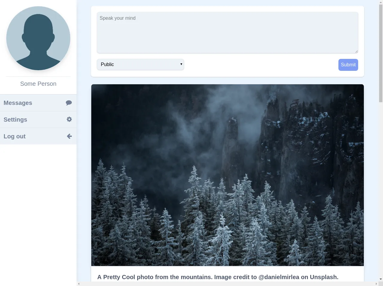
The preview of Social Media Template ui component.
To create a social media template with Tailwind CSS, you can use the following HTML structure:
<div class="bg-white shadow rounded-lg overflow-hidden">
  <div class="p-4">
    <div class="flex items-center">
      <img class="h-12 w-12 rounded-full object-cover" src="{{__placeholder1__}}" alt="Profile picture">
      <div class="ml-4">
        <h2 class="text-lg font-bold">Username</h2>
        <p class="text-gray-600">Date</p>
      </div>
    </div>
    <p class="mt-4 text-gray-800">Lorem ipsum dolor sit amet, consectetur adipiscing elit. Sed euismod ante vel enim consequat, eu bibendum erat aliquam. Donec euismod, sapien vel bibendum euismod, nisl ex feugiat enim, nec blandit odio orci id libero. </p>
  </div>
  <div class="flex justify-between px-4 py-2 bg-gray-100">
    <button class="text-gray-600 hover:text-gray-800">
      <svg xmlns="http://www.w3.org/2000/svg" class="h-6 w-6" fill="none" viewBox="0 0 24 24" stroke="currentColor">
        <path stroke-linecap="round" stroke-linejoin="round" stroke-width="2" d="M4 8h16M4 16h16"></path>
      </svg>
      <span class="ml-2">Like</span>
    </button>
    <button class="text-gray-600 hover:text-gray-800">
      <svg xmlns="http://www.w3.org/2000/svg" class="h-6 w-6" fill="none" viewBox="0 0 24 24" stroke="currentColor">
        <path stroke-linecap="round" stroke-linejoin="round" stroke-width="2" d="M4 6h16M4 12h16M4 18h16"></path>
      </svg>
      <span class="ml-2">Comment</span>
    </button>
    <button class="text-gray-600 hover:text-gray-800">
      <svg xmlns="http://www.w3.org/2000/svg" class="h-6 w-6" fill="none" viewBox="0 0 24 24" stroke="currentColor">
        <path stroke-linecap="round" stroke-linejoin="round" stroke-width="2" d="M15 12a3 3 0 11-6 0 3 3 0 016 0z"></path>
        <path stroke-linecap="round" stroke-linejoin="round" stroke-width="2" d="M15 12a3 3 0 11-6 0 3 3 0 016 0z"></path>
        <path stroke-linecap="round" stroke-linejoin="round" stroke-width="2" d="M15 12a3 3 0 11-6 0 3 3 0 016 0z"></path>
      </svg>
      <span class="ml-2">Share</span>
    </button>
  </div>
</div>
Free download of the Social Media Template's source code
The source code of Social Media Template ui component.
To create a social media template with Tailwind CSS, you can use the following classes:
bg-white- sets the background color to whiteshadow- adds a shadow to the elementrounded-lg- rounds the corners of the elementoverflow-hidden- hides any content that overflows the elementp-4- adds padding to the elementflex- sets the display property to flexitems-center- centers the items horizontally and verticallyh-12- sets the height of the element to 12 pixelsw-12- sets the width of the element to 12 pixelsrounded-full- rounds the corners of the element to make it circularobject-cover- scales the image to cover the entire elementml-4- adds margin to the left of the elementtext-lg- sets the font size to largefont-bold- sets the font weight to boldtext-gray-600- sets the text color to graymt-4- adds margin to the top of the elementtext-gray-800- sets the text color to dark grayjustify-between- evenly distributes the items along the horizontal axispx-4- adds padding to the left and right of the elementpy-2- adds padding to the top and bottom of the elementbg-gray-100- sets the background color to light graytext-gray-600- sets the text color to grayhover:text-gray-800- changes the text color to dark gray when the element is hovered over
<div class="w-full flex flex-row flex-wrap">
  <link rel="stylesheet" type="text/css" href="https://stackpath.bootstrapcdn.com/font-awesome/4.7.0/css/font-awesome.min.css">
  <style>
  .round {
    border-radius: 50%;
  }
</style>


<div class="w-full bg-indigo-100 h-screen flex flex-row flex-wrap justify-center ">

  <!-- Begin Navbar -->

  <div class="bg-white shadow-lg border-t-4 border-indigo-500 absolute bottom-0 w-full md:w-0 md:hidden flex flex-row flex-wrap">
    <div class="w-full text-right"><button class="p-2 fa fa-bars text-4xl text-gray-600"></button></div>
  </div>

  <div class="w-0 md:w-1/4 lg:w-1/5 h-0 md:h-screen overflow-y-hidden bg-white shadow-lg">
    <div class="p-5 bg-white sticky top-0">
      <img class="border border-indigo-100 shadow-lg round" src="http://lilithaengineering.co.za/wp-content/uploads/2017/08/person-placeholder.jpg">
      <div class="pt-2 border-t mt-5 w-full text-center text-xl text-gray-600">
        Some Person
      </div>
    </div>
    <div class="w-full h-screen antialiased flex flex-col hover:cursor-pointer">
      <a class="hover:bg-gray-300 bg-gray-200 border-t-2 p-3 w-full text-xl text-left text-gray-600 font-semibold" href=""><i class="fa fa-comment text-gray-600 text-2xl pr-1 pt-1 float-right"></i>Messages</a>
      <a class="hover:bg-gray-300 bg-gray-200 border-t-2 p-3 w-full text-xl text-left text-gray-600 font-semibold" href=""><i class="fa fa-cog text-gray-600 text-2xl pr-1 pt-1 float-right"></i>Settings</a>
      <a class="hover:bg-gray-300 bg-gray-200 border-t-2 p-3 w-full text-xl text-left text-gray-600 font-semibold" href=""><i class="fa fa-arrow-left text-gray-600 text-2xl pr-1 pt-1 float-right"></i>Log out</a>
    </div>
  </div>

  <!-- End Navbar -->

  <div class="w-full md:w-3/4 lg:w-4/5 p-5 md:px-12 lg:24 h-full overflow-x-scroll antialiased">
    <div class="bg-white w-full shadow rounded-lg p-5">
      <textarea class="bg-gray-200 w-full rounded-lg shadow border p-2" rows="5" placeholder="Speak your mind"></textarea>

      <div class="w-full flex flex-row flex-wrap mt-3">
        <div class="w-1/3">
          <select class="w-full p-2 rounded-lg bg-gray-200 shadow border float-left">
            <option>Public</option>
            <option>Private</option>
          </select>
        </div>
        <div class="w-2/3">
          <button type="button" class="float-right bg-indigo-400 hover:bg-indigo-300 text-white p-2 rounded-lg">Submit</button>
        </div>
      </div>
    </div>

    <div class="mt-3 flex flex-col">


      <div class="bg-white mt-3">
        <img class="border rounded-t-lg shadow-lg " src="https://images.unsplash.com/photo-1572817519612-d8fadd929b00?ixlib=rb-1.2.1&ixid=eyJhcHBfaWQiOjEyMDd9&auto=format&fit=crop&w=1950&q=80">
        <div class="bg-white border shadow p-5 text-xl text-gray-700 font-semibold">
          A Pretty Cool photo from the mountains. Image credit to @danielmirlea on Unsplash.
        </div>
        <div class="bg-white p-1 border shadow flex flex-row flex-wrap">
          <div class="w-1/3 hover:bg-gray-200 text-center text-xl text-gray-700 font-semibold">Like</div>
          <div class="w-1/3 hover:bg-gray-200 border-l-4 border-r- text-center text-xl text-gray-700 font-semibold">Share</div>
          <div class="w-1/3 hover:bg-gray-200 border-l-4 text-center text-xl text-gray-700 font-semibold">Comment</div>
        </div>

        <div class="bg-white border-4 bg-gray-300 border-white rounded-b-lg shadow p-5 text-xl text-gray-700 content-center font-semibold flex flex-row flex-wrap">
          <div class="w-full">
            <div class="w-full text-left text-xl text-gray-600">
              @Some Person
            </div>
            A Pretty Cool photo from the mountains. Image credit to @danielmirlea on Unsplash.
            A Pretty Cool photo from the mountains. Image credit to @danielmirlea on Unsplash.
          </div>
        </div>
      </div>


      <div class="bg-white mt-3">
        <img class="border rounded-t-lg shadow-lg " src="https://images.unsplash.com/photo-1572817519612-d8fadd929b00?ixlib=rb-1.2.1&ixid=eyJhcHBfaWQiOjEyMDd9&auto=format&fit=crop&w=1950&q=80">
        <div class="bg-white border shadow p-5 text-xl text-gray-700 font-semibold">
          A Pretty Cool photo from the mountains. Image credit to @danielmirlea on Unsplash.
        </div>
        <div class="bg-white p-1 rounded-b-lg border shadow flex flex-row flex-wrap">
          <div class="w-1/3 hover:bg-gray-200 text-center text-xl text-gray-700 font-semibold">Like</div>
          <div class="w-1/3 hover:bg-gray-200 border-l-4 border-r- text-center text-xl text-gray-700 font-semibold">Share</div>
          <div class="w-1/3 hover:bg-gray-200 border-l-4 text-center text-xl text-gray-700 font-semibold">Comment</div>
        </div>
      </div>
    </div>
  </div>
</div>

</div>
How to create a Social Media Template with Tailwind CSS?
To create a social media template with Tailwind CSS, follow these steps:
- Create a new HTML file and add the HTML structure shown above.
- Replace the
{{__placeholder1__}}with the URL of the profile picture. - Customize the content section to display the social media post.
- Customize the buttons to add functionality to the template.
Conclusion
In this article, we discussed the three things you need to know to create a social media template with Tailwind CSS. We talked about what Tailwind CSS is, the description of a social media template UI component, and why you should use Tailwind CSS to create a social media template. We also provided a preview of the social media template and the source code. By following the steps outlined in this article, you can create a beautiful and functional social media template with ease.