- Published on
Here Are 6 Ways To Make A Social Media Landing Page With Tailwind CSS
- What is Tailwind CSS?
- The description of Social Media Landing Page ui component
- Why use Tailwind CSS to create a Social Media Landing Page ui component?
- The preview of Social Media Landing Page ui component.
- The source code of Social Media Landing Page ui component.
- How to create a Social Media Landing Page with Tailwind CSS?
- Step 1: Set up your project
- Step 2: Create the header section
- Step 3: Create the content section
- Step 4: Create the footer section
- Step 5: Add custom styles
- Conclusion
What is Tailwind CSS?
Tailwind CSS is a utility-first CSS framework that helps you create custom designs quickly. It provides a set of pre-defined classes that you can use to style your HTML elements. With Tailwind CSS, you can easily create responsive and mobile-first designs without writing any custom CSS.
The description of Social Media Landing Page ui component
A social media landing page is a web page that is designed to promote a social media account or a social media campaign. It typically includes a header section, a content section, and a footer section. The header section usually contains a logo, a navigation menu, and a call-to-action button. The content section contains information about the social media account or campaign, including images, videos, and text. The footer section usually contains links to other pages or social media accounts.
Why use Tailwind CSS to create a Social Media Landing Page ui component?
Tailwind CSS provides a set of pre-defined classes that you can use to style your HTML elements. This makes it easy to create custom designs quickly without writing any custom CSS. With Tailwind CSS, you can also create responsive and mobile-first designs that look great on any device.
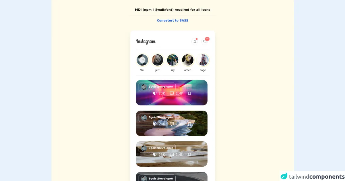
The preview of Social Media Landing Page ui component.
Here's a preview of what our Social Media Landing Page will look like:
Free download of the Social Media Landing Page's source code
The source code of Social Media Landing Page ui component.
Here's the source code for our Social Media Landing Page:
<!-- MDI Icons -->
<link rel="stylesheet" href="https://cdn.materialdesignicons.com/6.5.95/css/materialdesignicons.min.css">
<style>
.red-dot {
height: 10px;
width: 10px;
}
.red-dot-count {
font-size: 8px;
right: -11px;
top: -5px;
}
.story-ring {
padding: 2px;
}
.story-text {
font-size: 13px;
}
.post-container {
height: 650px !important;
overflow: hidden;
padding-right: 10px;
}
.post-container:hover {
overflow: auto;
padding-right: 0px;
}
.post-container::-webkit-scrollbar {
width: 10px;
height: 10px;
}
.post-container::-webkit-scrollbar-track {
border-radius: 100vh;
background: #edf2f7;
}
.post-container::-webkit-scrollbar-thumb {
background: #cbd5e0;
border-radius: 100vh;
border: 3px solid #edf2f7;
}
.post-container::-webkit-scrollbar-thumb:hover {
background: #a0aec0;
}
</style>
<!-- Page Container -->
<div class="flex items-center justify-center min-h-screen from-yellow-50 via-teal-300 to-yellow-50 bg-gradient-to-br">
<div class="flex flex-col">
<span class="text-center font-bold my-10">
MDI (npm i @mdi/font) reuqired for all icons
<hr class="my-4">
<a href="https://egoistdeveloper.github.io/twcss-to-sass-playground/" target="_blank" class="text-blue-600">
Convetert to SASS
</a>
</span>
<div class="w-full max-w-md px-7 py-10 mx-auto bg-white rounded-2xl shadow-xl">
<div class='max-w-md mx-auto space-y-6'>
<div class="flex flex-col relative">
<!-- App Header -->
<div class="flex mb-5 border-b pb-5 border-gray-100">
<div class="flex-1">
<!-- Logo -->
<img
src="//upload.wikimedia.org/wikipedia/commons/thumb/2/2a/Instagram_logo.svg/800px-Instagram_logo.svg.png">
</div>
<div class="flex-1 w-64"></div>
<!-- Notification Area -->
<div class="flex-1 w-full">
<div class="grid grid-cols-12 gap-4">
<div class="col-end-7">
<div class="relative flex space-x-5 place-items-end">
<!-- Notifications Button -->
<div class="relative">
<!-- Red Dot -->
<div
class="red-dot p-1 absolute right-0 bg-red-400 rounded-full cursor-pointer">
</div>
<button class="p-1 border border-gray-200 rounded-full
hover:bg-gray-50 focus:outline-none focus:ring-2 focus:ring-blue-200
transition-all duration-150 delay-100">
<i class="mdi mdi-bell-outline mdi-18px mx-1 text-gray-500"></i>
</button>
</div>
<!-- Messages Button -->
<div class="relative">
<!-- Red Dot With Counts -->
<div
class="red-dot-count p-1 absolute right-0 bg-red-400 rounded-full text-white cursor-pointer">
99+
</div>
<button class="p-1 border border-gray-200 rounded-full
hover:bg-gray-50 focus:outline-none focus:ring-2 focus:ring-blue-200
transition-all duration-150 delay-100">
<i
class="mdi mdi-message-reply-outline mdi-18px mx-1 text-gray-500"></i>
</button>
</div>
</div>
</div>
</div>
</div>
</div>
<!-- Story Bar Section -->
<div class="flex mb-5 border-b pb-5 border-gray-100">
<!-- Story Bar -->
<ul class="flex items-center justify-center space-x-2">
<!-- Add Story -->
<li class="flex flex-col items-center space-y-2">
<!-- Ring -->
<div class="story-ring flex justify-center items-center
bg-gradient-to-tl from-yellow-200 to-orange-500
rounded-full relative cursor-pointer
hover:from-orange-300 hover:to-red-400
transition-all duration-150 delay-100">
<a class="block bg-white p-1 rounded-full" href="#">
<!-- Thumbnail -->
<img class="w-16 rounded-full"
src="https://images.unsplash.com/photo-1638687110777-b3fcdf2f9c57?ixlib=rb-1.2.1&ixid=MnwxMjA3fDB8MHxwaG90by1wYWdlfHx8fGVufDB8fHx8&auto=format&fit=crop&w=200&h=200&q=80">
</a>
<button class="absolute transition duration-500 bg-white border-gray-400
h-8 w-8 rounded-full text-white border-2
border-white flex justify-center items-center opacity-80
hover:opacity-60">
</button>
<i class="absolute mdi mdi-plus mdi-18px mx-1 text-gray-500"></i>
</div>
<!-- Story Text -->
<span class="story-text font-medium">
You
</span>
</li>
<!-- Story #1 -->
<li class="flex flex-col items-center space-y-2">
<!-- Ring -->
<div class="story-ring flex justify-center items-center
bg-gradient-to-tl from-yellow-200 to-orange-500
rounded-full relative cursor-pointer
hover:from-orange-300 hover:to-red-400
transition-all duration-150 delay-100">
<a class="block bg-white p-1 rounded-full" href="#">
<!-- Thumbnail -->
<img class="w-16 rounded-full"
src="https://images.unsplash.com/photo-1638649602320-450b717fa622?ixlib=rb-1.2.1&ixid=MnwxMjA3fDB8MHxwaG90by1wYWdlfHx8fGVufDB8fHx8&auto=format&fit=crop&w=200&h=200&q=80">
</a>
</div>
<!-- Story Text -->
<span class="story-text">
jett
</span>
</li>
<!-- Story #2 -->
<li class="flex flex-col items-center space-y-2">
<!-- Ring -->
<div class="story-ring flex justify-center items-center
bg-gradient-to-tl from-yellow-200 to-orange-500
rounded-full relative cursor-pointer
hover:from-orange-300 hover:to-red-400
transition-all duration-150 delay-100">
<a class="block bg-white p-1 rounded-full" href="#">
<!-- Thumbnail -->
<img class="w-16 rounded-full"
src="https://images.unsplash.com/photo-1638708644743-2502f38000a0?ixlib=rb-1.2.1&ixid=MnwxMjA3fDB8MHxwaG90by1wYWdlfHx8fGVufDB8fHx8&auto=format&fit=crop&w=200&h=200&q=80">
</a>
</div>
<!-- Story Text -->
<span class="story-text">
sky
</span>
</li>
<!-- Story #3 -->
<li class="flex flex-col items-center space-y-2">
<!-- Ring -->
<div class="story-ring flex justify-center items-center
bg-gradient-to-tl from-yellow-200 to-orange-500
rounded-full relative cursor-pointer
hover:from-orange-300 hover:to-red-400
transition-all duration-150 delay-100">
<a class="block bg-white p-1 rounded-full" href="#">
<!-- Thumbnail -->
<img class="w-16 rounded-full"
src="https://images.unsplash.com/photo-1638691899851-0e955bceba1f?ixlib=rb-1.2.1&ixid=MnwxMjA3fDB8MHxwaG90by1wYWdlfHx8fGVufDB8fHx8&auto=format&fit=crop&w=200&h=200&q=80">
</a>
</div>
<!-- Story Text -->
<span class="story-text">
omen
</span>
</li>
<!-- Story #4 -->
<li class="flex flex-col items-center space-y-2">
<!-- Ring -->
<div class="story-ring flex justify-center items-center
bg-gradient-to-tl from-yellow-200 to-orange-500
rounded-full relative cursor-pointer
hover:from-orange-300 hover:to-red-400
transition-all duration-150 delay-100
hover:animate-pulse">
<a class="block bg-white p-1 rounded-full" href="#">
<img class="w-16 rounded-full"
src="https://images.unsplash.com/photo-1638612913771-8f00622b96fb?ixlib=rb-1.2.1&ixid=MnwxMjA3fDB8MHxwaG90by1wYWdlfHx8fGVufDB8fHx8&auto=format&fit=crop&w=200&h=200&q=80">
</a>
</div>
<!-- Story Text -->
<span class="story-text">
sage
</span>
</li>
</ul>
</div>
<!-- Post Section -->
<div class="post-container flex flex-col flex-grow h-full">
<!-- Post -->
<div class="story-ring flex justify-center items-center
relative cursor-pointer mb-6
transition-all duration-150 delay-100">
<!-- Post Item -->
<img class="h-full w-full rounded-3xl"
src="https://images.unsplash.com/photo-1500462918059-b1a0cb512f1d?ixlib=rb-1.2.1&ixid=MnwxMjA3fDB8MHxwaG90by1wYWdlfHx8fGVufDB8fHx8&auto=format&fit=crop&w=774&q=80">
<!-- Post Owner -->
<div class="left-4 top-4 absolute backdrop-blur-lg rounded-xl border border-gray-300">
<a href="#" class="flex p-1.5 px-3">
<img src="https://images.unsplash.com/photo-1638687110777-b3fcdf2f9c57?ixlib=rb-1.2.1&ixid=MnwxMjA3fDB8MHxwaG90by1wYWdlfHx8fGVufDB8fHx8&auto=format&fit=crop&w=200&h=200&q=80"
class="mr-2 w-8 h-8 rounded-full border border-gray-400">
<div class="text-gray-600 font-bold text-sm text-gray-50 hover:underline mt-1">
EgoistDeveloper
</div>
</a>
</div>
<!-- Post Counts -->
<div class="flex mx-auto bottom-10 absolute backdrop-blur-md rounded-xl p-2
hover:backdrop-blur-xl transition-all duration-150 delay-100">
<div class="flex text-gray-600 font-light text-lg text-gray-50 mx-6">
<i class="mdi mdi-heart-half-full mdi-24px text-gray-100 mr-2"></i>
23K
</div>
<div class="flex text-gray-600 font-light text-lg text-gray-50">
<i class="mdi mdi-comment-processing-outline mdi-24px text-gray-100 mr-2"></i>
1.4K
</div>
<div class="text-gray-600 font-light text-lg text-gray-50 mx-4">
<i class="mdi mdi-bookmark-outline mdi-24px mx-1 text-gray-100 mt-3"></i>
</div>
</div>
</div>
<!-- Post -->
<div class="story-ring flex justify-center items-center
relative cursor-pointer mb-6
transition-all duration-150 delay-100">
<!-- Post Item -->
<img class="h-full w-full rounded-3xl"
src="https://images.unsplash.com/photo-1621184455862-c163dfb30e0f?ixlib=rb-1.2.1&ixid=MnwxMjA3fDB8MHxwaG90by1wYWdlfHx8fGVufDB8fHx8&auto=format&fit=crop&w=774&q=80">
<!-- Post Owner -->
<div class="left-4 top-4 absolute backdrop-blur-lg rounded-xl border border-gray-300">
<a href="#" class="flex p-1.5 px-3">
<img src="https://images.unsplash.com/photo-1638687110777-b3fcdf2f9c57?ixlib=rb-1.2.1&ixid=MnwxMjA3fDB8MHxwaG90by1wYWdlfHx8fGVufDB8fHx8&auto=format&fit=crop&w=200&h=200&q=80"
class="mr-2 w-8 h-8 rounded-full border border-gray-400">
<div class="text-gray-600 font-bold text-sm text-gray-50 hover:underline mt-1">
EgoistDeveloper
</div>
</a>
</div>
<!-- Post Counts -->
<div class="flex mx-auto bottom-10 absolute backdrop-blur-md rounded-xl p-2
hover:backdrop-blur-xl transition-all duration-150 delay-100">
<div class="flex text-gray-600 font-light text-lg text-gray-50 mx-6">
<i class="mdi mdi-heart-half-full mdi-24px text-gray-100 mr-2"></i>
23K
</div>
<div class="flex text-gray-600 font-light text-lg text-gray-50">
<i class="mdi mdi-comment-processing-outline mdi-24px text-gray-100 mr-2"></i>
1.4K
</div>
<div class="text-gray-600 font-light text-lg text-gray-50 mx-4">
<i class="mdi mdi-bookmark-outline mdi-24px mx-1 text-gray-100 mt-3"></i>
</div>
</div>
</div>
<!-- Post -->
<div class="story-ring flex justify-center items-center
relative cursor-pointer mb-6
transition-all duration-150 delay-100">
<!-- Post Item -->
<img class="h-full w-full rounded-3xl"
src="https://images.unsplash.com/photo-1612405199572-aa74dfbad7d0?ixlib=rb-1.2.1&ixid=MnwxMjA3fDB8MHxwaG90by1wYWdlfHx8fGVufDB8fHx8&auto=format&fit=crop&w=774&q=80">
<!-- Post Owner -->
<div class="left-4 top-4 absolute backdrop-blur-lg rounded-xl border border-gray-300">
<a href="#" class="flex p-1.5 px-3">
<img src="https://images.unsplash.com/photo-1638687110777-b3fcdf2f9c57?ixlib=rb-1.2.1&ixid=MnwxMjA3fDB8MHxwaG90by1wYWdlfHx8fGVufDB8fHx8&auto=format&fit=crop&w=200&h=200&q=80"
class="mr-2 w-8 h-8 rounded-full border border-gray-400">
<div class="text-gray-600 font-bold text-sm text-gray-50 hover:underline mt-1">
EgoistDeveloper
</div>
</a>
</div>
<!-- Post Counts -->
<div class="flex mx-auto bottom-10 absolute backdrop-blur-md rounded-xl p-2
hover:backdrop-blur-xl transition-all duration-150 delay-100">
<div class="flex text-gray-600 font-light text-lg text-gray-50 mx-6">
<i class="mdi mdi-heart-half-full mdi-24px text-gray-100 mr-2"></i>
23K
</div>
<div class="flex text-gray-600 font-light text-lg text-gray-50">
<i class="mdi mdi-comment-processing-outline mdi-24px text-gray-100 mr-2"></i>
1.4K
</div>
<div class="text-gray-600 font-light text-lg text-gray-50 mx-4">
<i class="mdi mdi-bookmark-outline mdi-24px mx-1 text-gray-100 mt-3"></i>
</div>
</div>
</div>
<!-- Post -->
<div class="story-ring flex justify-center items-center
relative cursor-pointer mb-6
transition-all duration-150 delay-100">
<!-- Post Item -->
<img class="h-full w-full rounded-3xl"
src="https://images.unsplash.com/photo-1517442952015-85a8427cd6f9?ixlib=rb-1.2.1&ixid=MnwxMjA3fDB8MHxwaG90by1wYWdlfHx8fGVufDB8fHx8&auto=format&fit=crop&w=768&q=80">
<!-- Post Owner -->
<div class="left-4 top-4 absolute backdrop-blur-lg rounded-xl border border-gray-300">
<a href="#" class="flex p-1.5 px-3">
<img src="https://images.unsplash.com/photo-1638687110777-b3fcdf2f9c57?ixlib=rb-1.2.1&ixid=MnwxMjA3fDB8MHxwaG90by1wYWdlfHx8fGVufDB8fHx8&auto=format&fit=crop&w=200&h=200&q=80"
class="mr-2 w-8 h-8 rounded-full border border-gray-400">
<div class="text-gray-600 font-bold text-sm text-gray-50 hover:underline mt-1">
EgoistDeveloper
</div>
</a>
</div>
<!-- Post Counts -->
<div class="flex mx-auto bottom-10 absolute backdrop-blur-md rounded-xl p-2
hover:backdrop-blur-xl transition-all duration-150 delay-100">
<div class="flex text-gray-600 font-light text-lg text-gray-50 mx-6">
<i class="mdi mdi-heart-half-full mdi-24px text-gray-100 mr-2"></i>
23K
</div>
<div class="flex text-gray-600 font-light text-lg text-gray-50">
<i class="mdi mdi-comment-processing-outline mdi-24px text-gray-100 mr-2"></i>
1.4K
</div>
<div class="text-gray-600 font-light text-lg text-gray-50 mx-4">
<i class="mdi mdi-bookmark-outline mdi-24px mx-1 text-gray-100 mt-3"></i>
</div>
</div>
</div>
</div>
<!-- Navigation Bar -->
<div class="absolute -bottom-1 -left-2">
<div class="px-7 pt-3 bg-white shadow-lg rounded-2xl">
<div class="flex flex-row space-x-3">
<!-- Item #1 -->
<div class="flex group">
<a href="#" class="p-3 text-gray-400 hover:text-yellow-500">
<span class="flex flex-col items-center">
<!-- Icon -->
<i class="mdi mdi-home-outline mdi-24px mx-1 text-gray-500 group-hover:text-gray-700
transition-color duration-200"></i>
<!-- Text -->
<span class="text-xs mb-2 transition-all duration-200">
Home
</span>
<!-- Focus Dot -->
<span class="h-2 w-2 rounded-full group-hover:bg-yellow-500
transition-all duration-150 delay-100"></span>
</span>
</a>
</div>
<!-- Item #2 -->
<div class="flex group">
<a href="#" class="p-3 text-gray-400 hover:text-yellow-500">
<span class="flex flex-col items-center">
<!-- Icon -->
<i class="mdi mdi-compass-outline mdi-24px mx-1 text-gray-500 group-hover:text-gray-700
transition-color duration-200"></i>
<!-- Text -->
<span class="text-xs mb-2 transition-all duration-200">
Explore
</span>
<!-- Focus Dot -->
<span class="h-2 w-2 rounded-full group-hover:bg-yellow-500
transition-all duration-150 delay-100"></span>
</span>
</a>
</div>
<!-- Item #3 Active -->
<div class="flex group">
<a href="#" class="p-3 text-yellow-500 hover:text-yellow-500">
<span class="flex flex-col items-center">
<!-- Icon -->
<i class="mdi mdi-layers-outline mdi-24px mx-1 text-gray-700 group-hover:text-gray-700
transition-color duration-200"></i>
<!-- Text -->
<span class="text-xs mb-2 transition-all duration-200">
Feeds
</span>
<!-- Focus Dot -->
<span class="h-1 w-5 rounded-full bg-yellow-500 group-hover:bg-yellow-500
hover:h-3 hover:w-3 transition-all duration-150 delay-100"></span>
</span>
</a>
</div>
<!-- Item #4 -->
<div class="flex group">
<a href="#" class="p-3 text-gray-400 hover:text-yellow-500">
<span class="flex flex-col items-center">
<!-- Icon -->
<i class="mdi mdi-basket-plus-outline mdi-24px mx-1 text-gray-500 group-hover:text-gray-700
transition-color duration-200"></i>
<!-- Text -->
<span class="text-xs mb-2 transition-all duration-200">
Cart
</span>
<!-- Focus Dot -->
<span class="h-2 w-2 rounded-full group-hover:bg-yellow-500
transition-all duration-150 delay-100"></span>
</span>
</a>
</div>
<!-- Item #5 -->
<div class="flex group">
<a href="#" class="p-3 text-gray-400 hover:text-yellow-500">
<span class="flex flex-col items-center">
<!-- Icon -->
<i class="mdi mdi-account-circle-outline mdi-24px mx-1 text-gray-500 group-hover:text-gray-700
transition-color duration-200"></i>
<!-- Text -->
<span class="text-xs mb-2 transition-all duration-200">
Account
</span>
<!-- Focus Dot -->
<span class="h-2 w-2 rounded-full group-hover:bg-yellow-500
transition-all duration-150 delay-100"></span>
</span>
</a>
</div>
</div>
</div>
</div>
</div>
</div>
</div>
</div>
</div>
How to create a Social Media Landing Page with Tailwind CSS?
Now that we know what a Social Media Landing Page is and why we should use Tailwind CSS to create it, let's dive into the steps to create one.
Step 1: Set up your project
To get started, create a new HTML file and link to the Tailwind CSS stylesheet in the head section of your HTML file:
<!DOCTYPE html>
<html>
  <head>
    <link rel="stylesheet" href="https://cdn.jsdelivr.net/npm/[email protected]/dist/tailwind.min.css">
  </head>
  <body>
    <!-- Your HTML code goes here -->
  </body>
</html>
Step 2: Create the header section
The header section usually contains a logo, a navigation menu, and a call-to-action button. Here's an example of how to create the header section using Tailwind CSS:
<header class="bg-gray-900 text-white">
  <div class="container mx-auto flex justify-between items-center py-4">
    <div class="logo">
      <img src="logo.png" alt="Logo" class="h-8">
    </div>
    <nav class="flex">
      <a href="#" class="px-6 py-3">Home</a>
      <a href="#" class="px-6 py-3">About</a>
      <a href="#" class="px-6 py-3">Contact</a>
    </nav>
    <button class="bg-blue-500 hover:bg-blue-700 text-white font-bold py-2 px-4 rounded">
      Sign up
    </button>
  </div>
</header>
In this example, we're using the bg-gray-900 class to set the background color of the header to dark gray. We're also using the text-white class to set the text color to white. The container class is used to center the content of the header. The flex and justify-between classes are used to position the logo, navigation menu, and call-to-action button. The px-6 and py-3 classes are used to add padding to the navigation links.
Step 3: Create the content section
The content section contains information about the social media account or campaign, including images, videos, and text. Here's an example of how to create the content section using Tailwind CSS:
<section class="bg-white py-16">
  <div class="container mx-auto">
    <div class="flex flex-wrap">
      <div class="w-full md:w-1/2 px-4">
        <img src="image.jpg" alt="Image" class="w-full h-auto">
      </div>
      <div class="w-full md:w-1/2 px-4">
        <h2 class="text-2xl font-bold mb-4">Welcome to our social media account</h2>
        <p class="mb-4">Lorem ipsum dolor sit amet, consectetur adipiscing elit. Sed ac ante quis sapien bibendum eleifend. Sed euismod, augue vel pulvinar lobortis, odio odio aliquet sapien, sit amet tincidunt eros arcu vel sapien. Sed auctor, sapien eget luctus blandit, ipsum felis luctus felis, eu fermentum lorem ipsum ac augue.</p>
        <button class="bg-blue-500 hover:bg-blue-700 text-white font-bold py-2 px-4 rounded">
          Follow us
        </button>
      </div>
    </div>
  </div>
</section>
In this example, we're using the bg-white class to set the background color of the content section to white. The py-16 class is used to add padding to the top and bottom of the section. The container class is used to center the content of the section. The flex and flex-wrap classes are used to create a two-column layout for the content. The w-full and md:w-1/2 classes are used to set the width of the columns. The px-4 class is used to add padding to the columns. The text-2xl and font-bold classes are used to style the heading. The mb-4 class is used to add margin to the bottom of the heading and paragraph. The bg-blue-500, hover:bg-blue-700, text-white, font-bold, py-2, and px-4 classes are used to style the call-to-action button.
Step 4: Create the footer section
The footer section usually contains links to other pages or social media accounts. Here's an example of how to create the footer section using Tailwind CSS:
<footer class="bg-gray-900 text-white py-4">
  <div class="container mx-auto flex justify-between items-center">
    <div class="social-media">
      <a href="#" class="px-4 py-2">
        <i class="fab fa-facebook"></i>
      </a>
      <a href="#" class="px-4 py-2">
        <i class="fab fa-twitter"></i>
      </a>
      <a href="#" class="px-4 py-2">
        <i class="fab fa-instagram"></i>
      </a>
    </div>
    <div class="links">
      <a href="#" class="px-4 py-2">Privacy Policy</a>
      <a href="#" class="px-4 py-2">Terms of Service</a>
    </div>
  </div>
</footer>
In this example, we're using the bg-gray-900 class to set the background color of the footer to dark gray. We're also using the text-white class to set the text color to white. The container class is used to center the content of the footer. The flex and justify-between classes are used to position the social media icons and links. The px-4 and py-2 classes are used to add padding to the icons and links. We're also using Font Awesome icons to display the social media icons.
Step 5: Add custom styles
Finally, you can add custom styles to your Social Media Landing Page using Tailwind CSS. For example, you can change the colors, fonts, and spacing to match your brand.
<style>
  .logo img {
    height: 40px;
  }
  .social-media a i {
    font-size: 24px;
  }
  .links a {
    color: #ccc;
  }
</style>
In this example, we're using custom styles to adjust the size of the logo and social media icons, and to change the color of the links.
Conclusion
In this article, we've learned how to create a Social Media Landing Page using Tailwind CSS. We've covered the steps to create the header, content, and footer sections, and we've also seen how to add custom styles to the page. With Tailwind CSS, you can easily create custom designs quickly and efficiently.