- Published on
6 Ideas To Help You Make A snap-center With Tailwind CSS Like A Pro
- What is Tailwind CSS?
- The description of snap-center ui component
- Why use Tailwind CSS to create a snap-center ui component?
- The preview of snap-center ui component
- The source code of snap-center ui component
- How to create a snap-center with Tailwind CSS?
- 1. Define the container
- 2. Define the item width
- 3. Define the item height
- 4. Define the selected item
- 5. Center the selected item
- 6. Add navigation buttons
- Conclusion
What is Tailwind CSS?
Tailwind CSS is a utility-first CSS framework that provides pre-defined classes to help developers style their web applications. It is a popular choice among developers because it allows them to create custom designs without writing any CSS code.
The description of snap-center ui component
Snap-center is a UI component that is commonly used in web applications. It is a container that displays multiple items, and the selected item is always centered in the container. This UI component is commonly used in carousels, image galleries, and other similar applications.
Why use Tailwind CSS to create a snap-center ui component?
Tailwind CSS provides a wide range of utility classes that can help developers create a snap-center UI component quickly and easily. These classes can be used to define the layout, alignment, and spacing of the component, making it easy to create a custom design without writing any CSS code.
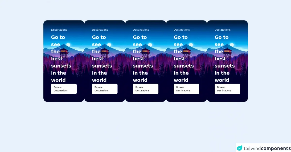
The preview of snap-center ui component
To create a snap-center UI component with Tailwind CSS, we can use a combination of flexbox and positioning classes. The component will have a fixed height and width, and the items will be centered horizontally and vertically within the container.
Free download of the snap-center's source code
The source code of snap-center ui component
To create a snap-center UI component with Tailwind CSS, we can use the following HTML and CSS code.
<div class="mt-32 relative ">
  <h1 class="text-5xl font-extrabold tracking-tight text-center"></h1>
  <ul class="mt-10 pb-8 px-[4rem] w-full flex overflow-x-auto gap-8 snap-x">
    <li class="snap-center">
        <div class="relative flex-shrink-0 max-w-[95vw] overflow-hidden rounded-3xl">
          <img
            src="https://wallpapercave.com/wp/wp4676582.jpg"
            alt=""
            class="absolute inset-0 w-full h-full object-cover object-bottom"
          />
          <div class="absolute inset-0 h-full w-full bg-gradient-to-br from-black/75" ></div>
          <div class="relative h-96 w-[768px] p-12 flex flex-col justify-between items-start">
            <div>
              <p class="font-medium text-white">Destinations</p>
              <h2 class="mt-3 w-2/3 text-3xl font-semibold tracking-tight text-white">
                Go to see the best sunsets in the world
              </h2>
            </div>
            <a href="#" class="px-4 py-3 rounded-lg bg-white text-slate-900 text-sm font-medium">
              Browse Destinations
            </a>
          </div>
        </div>
    </li>
     <li class="snap-center">
        <div class="relative flex-shrink-0 max-w-[95vw] overflow-hidden rounded-3xl">
          <img
            src="https://wallpapercave.com/wp/wp4676582.jpg"
            alt=""
            class="absolute inset-0 w-full h-full object-cover object-bottom"
          />
          <div class="absolute inset-0 h-full w-full bg-gradient-to-br from-black/75" ></div>
          <div class="relative h-96 w-[768px] p-12 flex flex-col justify-between items-start">
            <div>
              <p class="font-medium text-white">Destinations</p>
              <h2 class="mt-3 w-2/3 text-3xl font-semibold tracking-tight text-white">
                Go to see the best sunsets in the world
              </h2>
            </div>
            <a href="#" class="px-4 py-3 rounded-lg bg-white text-slate-900 text-sm font-medium">
              Browse Destinations
            </a>
          </div>
        </div>
    </li>
  </ul>
</div>
How to create a snap-center with Tailwind CSS?
Here are six ideas to help you create a snap-center UI component with Tailwind CSS like a pro:
1. Define the container
The first step in creating a snap-center UI component is to define the container. We can use the flex and items-center classes to center the items within the container.
<div class="flex items-center">
  <!-- Items go here -->
</div>
2. Define the item width
Next, we need to define the width of each item. We can use the w-1/3 class to set the width of each item to one-third of the container width.
<div class="flex items-center">
  <div class="w-1/3"></div>
  <div class="w-1/3"></div>
  <div class="w-1/3"></div>
</div>
3. Define the item height
We also need to define the height of each item. We can use the h-64 class to set the height of each item to 64 pixels.
<div class="flex items-center">
  <div class="w-1/3 h-64"></div>
  <div class="w-1/3 h-64"></div>
  <div class="w-1/3 h-64"></div>
</div>
4. Define the selected item
To indicate which item is currently selected, we can use the border-4 and border-blue-500 classes to add a blue border to the selected item.
<div class="flex items-center">
  <div class="w-1/3 h-64 border-4 border-blue-500"></div>
  <div class="w-1/3 h-64"></div>
  <div class="w-1/3 h-64"></div>
</div>
5. Center the selected item
To center the selected item within the container, we can use the justify-center and relative classes to position the item in the center of the container.
<div class="flex items-center justify-center">
  <div class="w-1/3 h-64 border-4 border-blue-500 relative"></div>
  <div class="w-1/3 h-64"></div>
  <div class="w-1/3 h-64"></div>
</div>
6. Add navigation buttons
Finally, we can add navigation buttons to allow users to scroll through the items. We can use the absolute and inset-y-0 classes to position the buttons on the left and right sides of the container.
<div class="flex items-center justify-center relative">
  <div class="w-1/3 h-64 border-4 border-blue-500 relative"></div>
  <div class="w-1/3 h-64"></div>
  <div class="w-1/3 h-64"></div>
  <button class="absolute inset-y-0 left-0">Previous</button>
  <button class="absolute inset-y-0 right-0">Next</button>
</div>
Conclusion
Creating a snap-center UI component with Tailwind CSS is easy and straightforward. By using a combination of flexbox and positioning classes, we can create a custom design without writing any CSS code. With these six ideas, you can create a snap-center UI component like a pro and enhance the user experience of your web application.