- Published on
6 Incredibly Easy Ways To Build A Image Section With Tailwind CSS Better While Spending Less
- What is Tailwind CSS?
- The description of Image Section UI component
- Why use Tailwind CSS to create an Image Section UI component?
- The preview of Image Section UI component
- The source code of Image Section UI component
- How to create an Image Section with Tailwind CSS?
- Step 1: Create the HTML structure
- Step 2: Style the HTML elements with Tailwind CSS classes
- Step 3: Customize the styles with Tailwind CSS
- Conclusion
As a FrontEnd technology blogger, I am always on the lookout for tools and techniques that can help me build better UI components with less effort. And one tool that has caught my attention recently is Tailwind CSS. It's a utility-first CSS framework that helps you build custom designs without writing any CSS code. In this article, I will show you how to use Tailwind CSS to create a beautiful Image Section UI component in just a few easy steps.
What is Tailwind CSS?
Tailwind CSS is a utility-first CSS framework that provides you with a set of pre-defined classes that you can use to style your HTML elements. It's different from other CSS frameworks like Bootstrap or Foundation, which provide you with pre-built components that you can use in your projects. With Tailwind CSS, you have complete control over the design of your UI components, and you can build custom designs without writing any CSS code.
The description of Image Section UI component
An Image Section is a UI component that is commonly used on websites and web applications to display a large image with some text or other content overlaid on top of it. It's a great way to showcase a product, service, or feature, and it can help you grab the attention of your users.
Why use Tailwind CSS to create an Image Section UI component?
Tailwind CSS is a great tool to use when building an Image Section UI component because it provides you with a set of pre-defined classes that you can use to style your HTML elements. This means that you don't have to write any CSS code from scratch, which can save you a lot of time and effort. Additionally, Tailwind CSS is highly customizable, which means that you can easily tweak the styles of your UI component to match your brand or design requirements.
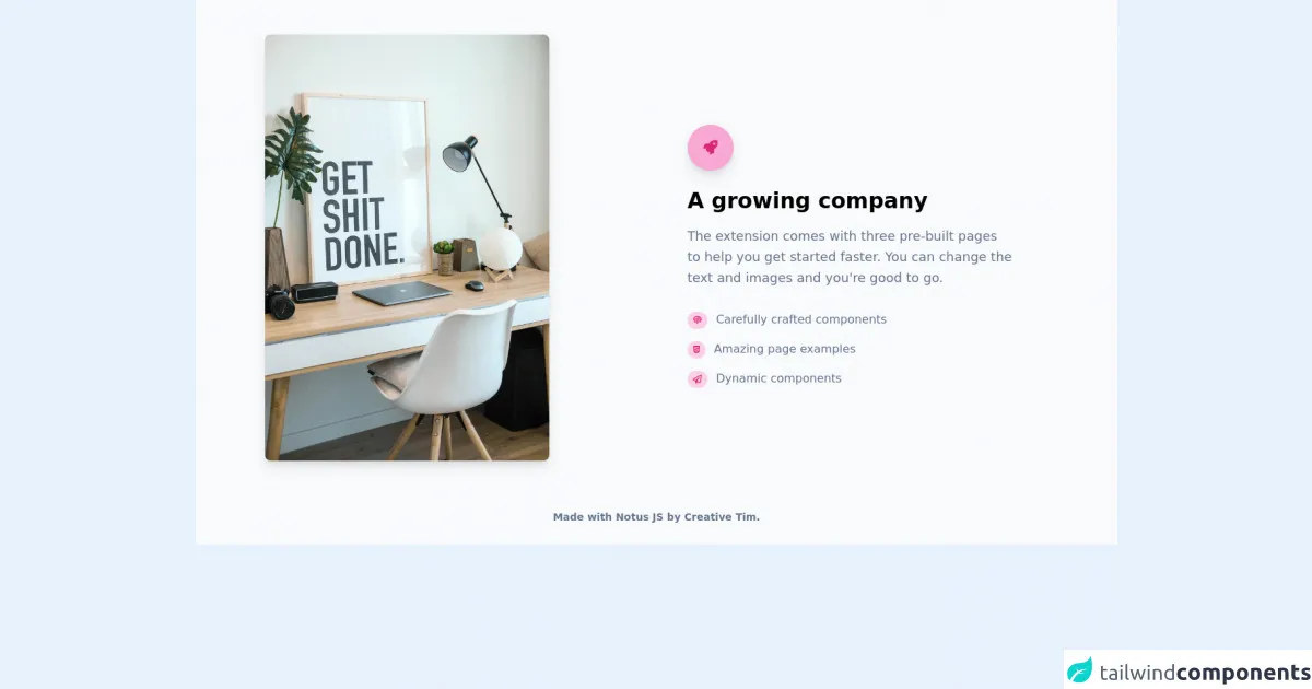
The preview of Image Section UI component
To create an Image Section UI component with Tailwind CSS, we will use a combination of HTML and CSS classes. Here's a preview of what the final UI component will look like:
Free download of the Image Section's source code
The source code of Image Section UI component
To create the Image Section UI component, we will use a combination of HTML and Tailwind CSS classes. Here's the source code for the UI component:
<link rel="stylesheet" href="https://demos.creative-tim.com/notus-js/assets/styles/tailwind.css">
<link rel="stylesheet" href="https://demos.creative-tim.com/notus-js/assets/vendor/@fortawesome/fontawesome-free/css/all.min.css">
<section class="relative pt-12 bg-blueGray-50">
<div class="items-center flex flex-wrap">
<div class="w-full md:w-4/12 ml-auto mr-auto px-4">
<img alt="..." class="max-w-full rounded-lg shadow-lg" src="https://images.unsplash.com/photo-1555212697-194d092e3b8f?ixlib=rb-1.2.1&ixid=eyJhcHBfaWQiOjEyMDd9&auto=format&fit=crop&w=634&q=80">
</div>
<div class="w-full md:w-5/12 ml-auto mr-auto px-4">
<div class="md:pr-12">
<div class="text-pink-600 p-3 text-center inline-flex items-center justify-center w-16 h-16 mb-6 shadow-lg rounded-full bg-pink-300 mt-8">
<i class="fas fa-rocket text-xl"></i>
</div>
<h3 class="text-3xl font-semibold">A growing company</h3>
<p class="mt-4 text-lg leading-relaxed text-blueGray-500">
The extension comes with three pre-built pages to help you get
started faster. You can change the text and images and you're
good to go.
</p>
<ul class="list-none mt-6">
<li class="py-2">
<div class="flex items-center">
<div>
<span class="text-xs font-semibold inline-block py-1 px-2 uppercase rounded-full text-pink-600 bg-pink-200 mr-3"><i class="fas fa-fingerprint"></i></span>
</div>
<div>
<h4 class="text-blueGray-500">
Carefully crafted components
</h4>
</div>
</div>
</li>
<li class="py-2">
<div class="flex items-center">
<div>
<span class="text-xs font-semibold inline-block py-1 px-2 uppercase rounded-full text-pink-600 bg-pink-200 mr-3"><i class="fab fa-html5"></i></span>
</div>
<div>
<h4 class="text-blueGray-500">Amazing page examples</h4>
</div>
</div>
</li>
<li class="py-2">
<div class="flex items-center">
<div>
<span class="text-xs font-semibold inline-block py-1 px-2 uppercase rounded-full text-pink-600 bg-pink-200 mr-3"><i class="far fa-paper-plane"></i></span>
</div>
<div>
<h4 class="text-blueGray-500">Dynamic components</h4>
</div>
</div>
</li>
</ul>
</div>
</div>
</div>
<footer class="relative pt-8 pb-6 mt-8">
<div class="container mx-auto px-4">
<div class="flex flex-wrap items-center md:justify-between justify-center">
<div class="w-full md:w-6/12 px-4 mx-auto text-center">
<div class="text-sm text-blueGray-500 font-semibold py-1">
Made with <a href="https://www.creative-tim.com/product/notus-js" class="text-blueGray-500 hover:text-gray-800" target="_blank">Notus JS</a> by <a href="https://www.creative-tim.com" class="text-blueGray-500 hover:text-blueGray-800" target="_blank"> Creative Tim</a>.
</div>
</div>
</div>
</div>
</footer>
</section>
How to create an Image Section with Tailwind CSS?
Now that we have a preview of what the final UI component will look like and the source code, let's dive into the steps to create an Image Section with Tailwind CSS:
Step 1: Create the HTML structure
The first step is to create the HTML structure for the Image Section UI component. Here's the HTML code:
<div class="relative">
  <img src="https://via.placeholder.com/800x400" alt="Placeholder" class="w-full h-auto">
  <div class="absolute inset-0 bg-black opacity-50"></div>
  <div class="absolute inset-0 flex items-center justify-center">
    <div class="text-center">
      <h1 class="text-4xl font-bold text-white">Title</h1>
      <p class="text-lg text-white">Description</p>
      <a href="#" class="mt-4 px-6 py-3 bg-white text-black rounded-full font-bold">Button</a>
    </div>
  </div>
</div>
In this code, we have a div element that contains an img element with a placeholder image. We also have three div elements that are positioned absolutely on top of the image. One of these div elements is used to create a semi-transparent black overlay, while the other div element contains the text and button content.
Step 2: Style the HTML elements with Tailwind CSS classes
The next step is to style the HTML elements with Tailwind CSS classes. Here's the CSS code:
/* Set the height of the Image Section */
.relative {
  height: 400px;
}

/* Style the overlay */
.absolute {
  z-index: 1;
}

.bg-black {
  /* Set the opacity of the overlay */
  opacity: 0.5;
}

/* Style the text and button content */
.text-center {
  z-index: 2;
}

/* Set the font size and color of the text */
.text-white {
  font-size: 1.5rem;
  color: #fff;
}

/* Style the button */
.bg-white {
  /* Set the background color of the button */
  background-color: #fff;
}

.text-black {
  /* Set the text color of the button */
  color: #000;
}
In this code, we use Tailwind CSS classes to set the height of the Image Section, style the overlay, and style the text and button content.
Step 3: Customize the styles with Tailwind CSS
The final step is to customize the styles of the Image Section UI component to match your brand or design requirements. You can do this by adding or modifying the Tailwind CSS classes that we used in the previous step. For example, you can change the font size, color, or background color of the text and button content.
Conclusion
In this article, we have learned how to use Tailwind CSS to create a beautiful Image Section UI component in just a few easy steps. We started by describing what Tailwind CSS is and why it's a great tool to use when building UI components. We then provided a preview of what the final UI component will look like and the source code. Finally, we walked through the steps to create an Image Section with Tailwind CSS, which included creating the HTML structure, styling the HTML elements with Tailwind CSS classes, and customizing the styles to match your brand or design requirements. With these steps, you can easily create a stunning Image Section UI component that will help you grab the attention of your users.