- Published on
6 Steps To Make A Slackish homepage With Tailwind CSS Like A Pro In Under An Hour
- What is Tailwind CSS?
- The description of Slackish homepage UI component
- Why use Tailwind CSS to create a Slackish homepage UI component?
- The preview of Slackish homepage UI component
- The source code of Slackish homepage UI component
- How to create a Slackish homepage with Tailwind CSS?
- Step 1: Set up your project
- Step 2: Create the navigation bar
- Step 3: Create the hero section
- Step 4: Create the feature list
- Step 5: Style the UI component
- Step 6: Add interactivity
- Conclusion
Are you looking to create a Slackish homepage UI component for your web application? Do you want to do it quickly and efficiently? Look no further than Tailwind CSS. In this article, we will show you how to create a Slackish homepage UI component using Tailwind CSS in just six easy steps.
What is Tailwind CSS?
Tailwind CSS is a utility-first CSS framework that allows you to quickly create custom designs without writing any CSS. It provides a set of pre-defined CSS classes that you can use to style your HTML elements. Tailwind CSS is highly customizable, and you can easily change the look and feel of your website by modifying the configuration file.
The description of Slackish homepage UI component
The Slackish homepage UI component is a simple and elegant design that is similar to the Slack homepage. It consists of a navigation bar, a hero section, and a list of features. The navigation bar contains the logo and links to different sections of the website. The hero section contains a heading, a subheading, and a call-to-action button. The list of features contains icons and descriptions of the main features of the website.
Why use Tailwind CSS to create a Slackish homepage UI component?
Tailwind CSS is an excellent choice for creating a Slackish homepage UI component because it allows you to quickly create custom designs without writing any CSS. It provides a set of pre-defined CSS classes that you can use to style your HTML elements. Tailwind CSS is highly customizable, and you can easily change the look and feel of your website by modifying the configuration file.
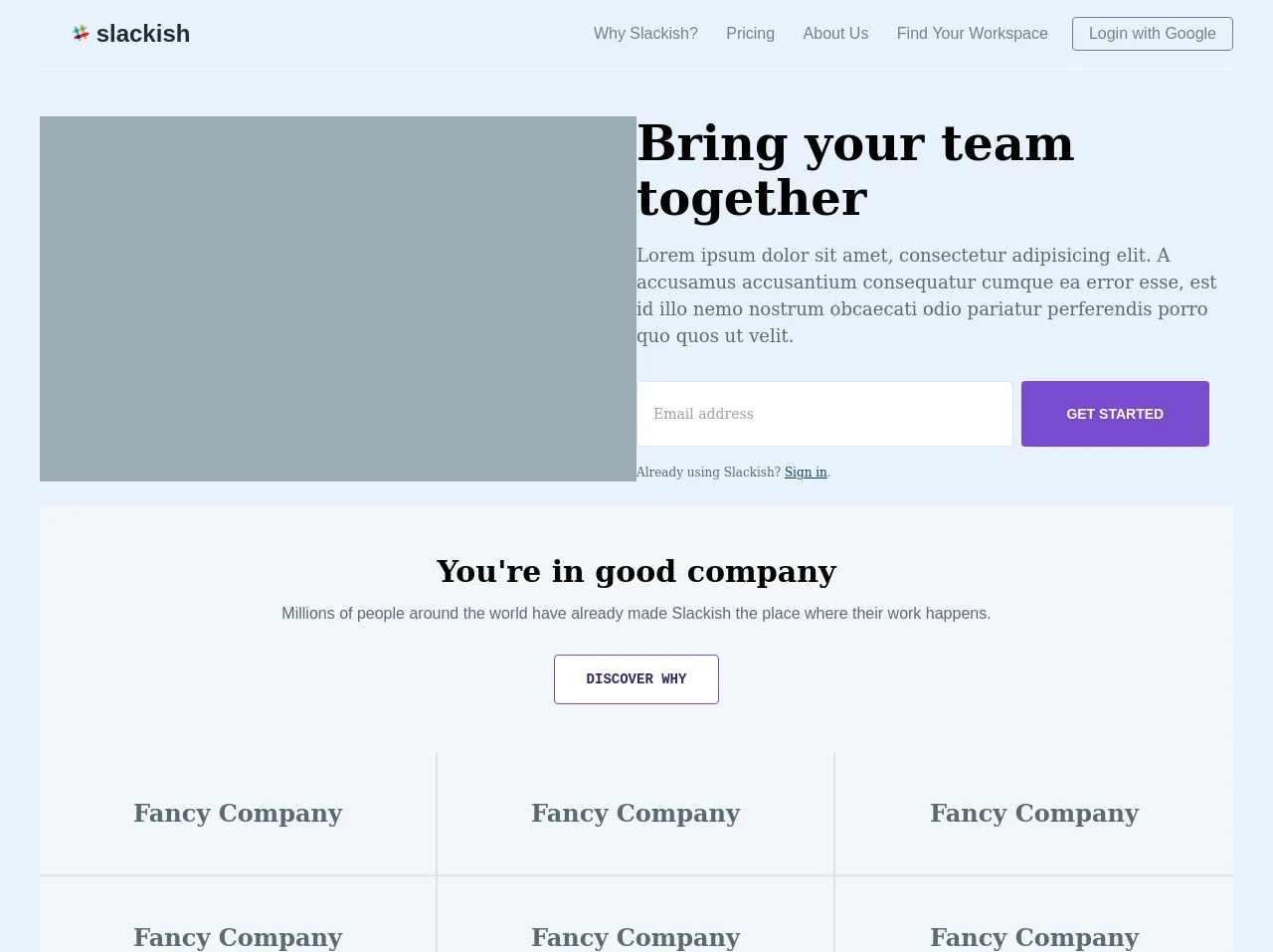
The preview of Slackish homepage UI component
To give you an idea of what the Slackish homepage UI component looks like, here is a preview:
Free download of the Slackish homepage's source code
The source code of Slackish homepage UI component
Here is the source code for the Slackish homepage UI component:
<body>
  <div>
    <header class="w-full font-sans">
        <nav class="container mx-auto flex items-center justify-between flex-wrap py-3">
            <div class="flex items-center flex-no-shrink text-white mr-6">
                <h1 class="text-black text-2xl p-2 align-middle font-sans relative pl-8">
                    <a href class="no-underline text-black">
                        <svg xmlns="http://www.w3.org/2000/svg" viewBox="-101 331 132 132" width="18" height="18" aria-label="Slack" class="c-nav--footer__svgicon c-slackhash svg-replaced" shape-rendering="geometricPrecision"><path d="M-16.7 343.1c-1.9-5.7-8-8.8-13.7-7-5.7 1.9-8.8 8-7 13.7l28.1 86.4c1.9 5.3 7.7 8.3 13.2 6.7 5.8-1.7 9.3-7.8 7.4-13.4 0-.2-28-86.4-28-86.4z" fill="#ECB32D"></path><path d="M-60.2 357.2c-1.9-5.7-8-8.8-13.7-7-5.7 1.9-8.8 8-7 13.7l28.1 86.4c1.9 5.3 7.7 8.3 13.2 6.7 5.8-1.7 9.3-7.8 7.4-13.4 0-.2-28-86.4-28-86.4z" fill="#63C1A0"></path><path d="M18.7 414.6c5.7-1.9 8.8-8 7-13.7-1.9-5.7-8-8.8-13.7-7l-86.5 28.2c-5.3 1.9-8.3 7.7-6.7 13.2 1.7 5.8 7.8 9.3 13.4 7.4.2 0 86.5-28.1 86.5-28.1z" fill="#E01A59"></path><path d="M-56.5 439.1c5.6-1.8 12.9-4.2 20.7-6.7-1.8-5.6-4.2-12.9-6.7-20.7l-20.7 6.7 6.7 20.7z" fill="#331433"></path><path d="M-12.9 424.9c7.8-2.5 15.1-4.9 20.7-6.7-1.8-5.6-4.2-12.9-6.7-20.7l-20.7 6.7 6.7 20.7z" fill="#D62027"></path><path d="M4.5 371.1c5.7-1.9 8.8-8 7-13.7-1.9-5.7-8-8.8-13.7-7l-86.4 28.1c-5.3 1.9-8.3 7.7-6.7 13.2 1.7 5.8 7.8 9.3 13.4 7.4.2 0 86.4-28 86.4-28z" fill="#89D3DF"></path><path d="M-70.6 395.5c5.6-1.8 12.9-4.2 20.7-6.7-2.5-7.8-4.9-15.1-6.7-20.7l-20.7 6.7 6.7 20.7z" fill="#258B74"></path><path d="M-27.1 381.4c7.8-2.5 15.1-4.9 20.7-6.7-2.5-7.8-4.9-15.1-6.7-20.7l-20.7 6.7 6.7 20.7z" fill="#819C3C"></path></svg>
                        slackish
                    </a>
                </h1>
            </div>
            <div class="block lg:hidden">
                <button class="flex items-center px-3 py-2 border rounded text-grey-dark border-grey-darker hover:text-grey hover:border-grey-dark">
                    <svg class="fill-current h-3 w-3" viewBox="0 0 20 20" xmlns="http://www.w3.org/2000/svg"><title>Menu</title><path d="M0 3h20v2H0V3zm0 6h20v2H0V9zm0 6h20v2H0v-2z"/></svg>
                </button>
            </div>
            <div class="w-full block text-right flex-grow lg:flex lg:items-center lg:w-auto">
                <div class="lg:flex-grow">
                    <a href="#responsive-header" class="block mt-4 lg:inline-block lg:mt-0 text-grey-dark hover:text-grey-darker no-underline mr-6">
                        Why Slackish?
                    </a>
                    <a href="#responsive-header" class="block mt-4 lg:inline-block lg:mt-0 text-grey-dark hover:text-grey-darker no-underline mr-6">
                        Pricing
                    </a>
                    <a href="#responsive-header" class="block mt-4 lg:inline-block lg:mt-0 text-grey-dark hover:text-grey-darker no-underline mr-6">
                        About Us
                    </a>
                    <a href="#responsive-header" class="block mt-4 lg:inline-block lg:mt-0 text-grey-dark hover:text-grey-darker no-underline mr-6">
                        Find Your Workspace
                    </a>
                </div>
                <div>
                    <a href="#login" class="inline-block px-4 py-2 leading-none border rounded text-grey-dark border-grey-dark no-underline hover:border-grey hover:text-grey-darker hover:bg-white mt-4 lg:mt-0">Login with Google</a>
                </div>
            </div>
        </nav>
    </header>
    <main class="w-full">
        <div class="border-t-2 border-grey-lighter">
            <div class="container mx-auto py-6">
                <div class="flex mt-6">
                    <div class="w-1/2 bg-grey">

                    </div>
                    <div class="w-1/2 font-serif">
                        <h1 class="text-5xl font-black-darker font-black">Bring your team together</h1>
                        <p class="text-grey-darker py-4 text-lg leading-normal">Lorem ipsum dolor sit amet, consectetur adipisicing elit. A accusamus accusantium consequatur cumque ea error esse, est id illo nemo nostrum obcaecati odio pariatur perferendis porro quo quos ut velit.</p>
                        <div class="block flex py-4 mr-6">
                            <input class="w-2/3 py-6 px-4 mr-2 border border-grey-light rounded text-grey-darkest text-sm" type="email" placeholder="Email address" />
                            <button class="w-1/3 font-sans py-4 px-4 border-transparent bg-purple-dark text-white rounded uppercase font-bold text-sm">get started</button>
                        </div>
                        <span class="text-xs text-grey-darker leading-normal">Already using Slackish? <a href="#" class="text-blue-darker hover:text-blue-dark">Sign in</a>.</span>
                    </div>
                </div>
            </div>
        </div>
        <div class="border-t-2 border-grey-lighter bg-grey-lighter">
            <div class="container mx-auto py-6 text-center">
                <div class="mb-6">
                    <h2 class="font-black-darker font-serif text-3xl pt-6">You're in good company</h2>
                    <p class="text-grey-darker mb-2 font-sans p-4">Millions of people around the world have already made Slackish the place where their work happens.</p>
                    <button class="py-4 px-8 mt-2 text-sm font-black border border-purple-dark hover:border-purple-darkest text-purple-darker bg-white uppercase rounded font-mono">discover why</button>
                </div>

                <div class="flex pt-6 font-serif text-grey-darker">
                    <div class="w-1/3 p-6 border-r-2 border-grey-light">
                        <h1 class="text-2xl mt-6 mb-6">Fancy Company</h1>
                    </div>
                    <div class="w-1/3 p-6 border-r-2 border-grey-light">
                        <h1 class="text-2xl mt-6 mb-6">Fancy Company</h1>
                    </div>
                    <div class="w-1/3 p-6">
                        <h1 class="text-2xl mt-6 mb-6">Fancy Company</h1>
                    </div>
                </div>
                <div class="flex border-t-2 font-serif border-grey-light text-grey-darker text-grey-darker">
                    <div class="w-1/3 p-6 border-r-2 border-grey-light">
                        <h1 class="text-2xl mt-6 mb-6">Fancy Company</h1>
                    </div>
                    <div class="w-1/3 p-6 border-r-2 border-grey-light">
                        <h1 class="text-2xl mt-6 mb-6">Fancy Company</h1>
                    </div>
                    <div class="w-1/3 p-6">
                        <h1 class="text-2xl mt-6 mb-6">Fancy Company</h1>
                    </div>
                </div>
            </div>
        </div>

        <div class="bg-white">
            <div class="container mx-auto py-6">
                <div class="flex">
                    <div class="w-1/2 text-left py-6">
                        <h3 class="text-2xl pb-2 font-serif">Try it for free</h3>
                        <span class="text-sm font-sans text-grey-darker leading-normal">Already using Slackish? <a href="#" class="text-blue-darker hover:text-blue-dark">Sign in</a>.</span>
                    </div>
                    <div class="w-1/2">
                        <div class="block flex py-6 mr-6">
                            <input class="w-2/3 py-6 px-4 mr-2 border border-grey-light rounded text-grey-darkest text-sm" type="email" placeholder="Email address" />
                            <button class="w-1/3 font-sans py-4 px-4 border-transparent bg-purple-dark text-white rounded uppercase font-bold text-sm">get started</button>
                        </div>
                    </div>
                </div>
            </div>
        </div>

        <div class="bg-white border-t-2 border-grey-lighter">
            <div class="container mx-auto py-6 my-6">
                <div class="flex">
                    <div class="w-1/4">
                        <a href="">
                            <svg xmlns="http://www.w3.org/2000/svg" viewBox="-101 331 132 132" width="54" height="54" aria-label="Slack" class="c-nav--footer__svgicon c-slackhash svg-replaced" shape-rendering="geometricPrecision"><path d="M-16.7 343.1c-1.9-5.7-8-8.8-13.7-7-5.7 1.9-8.8 8-7 13.7l28.1 86.4c1.9 5.3 7.7 8.3 13.2 6.7 5.8-1.7 9.3-7.8 7.4-13.4 0-.2-28-86.4-28-86.4z" fill="#ECB32D"></path><path d="M-60.2 357.2c-1.9-5.7-8-8.8-13.7-7-5.7 1.9-8.8 8-7 13.7l28.1 86.4c1.9 5.3 7.7 8.3 13.2 6.7 5.8-1.7 9.3-7.8 7.4-13.4 0-.2-28-86.4-28-86.4z" fill="#63C1A0"></path><path d="M18.7 414.6c5.7-1.9 8.8-8 7-13.7-1.9-5.7-8-8.8-13.7-7l-86.5 28.2c-5.3 1.9-8.3 7.7-6.7 13.2 1.7 5.8 7.8 9.3 13.4 7.4.2 0 86.5-28.1 86.5-28.1z" fill="#E01A59"></path><path d="M-56.5 439.1c5.6-1.8 12.9-4.2 20.7-6.7-1.8-5.6-4.2-12.9-6.7-20.7l-20.7 6.7 6.7 20.7z" fill="#331433"></path><path d="M-12.9 424.9c7.8-2.5 15.1-4.9 20.7-6.7-1.8-5.6-4.2-12.9-6.7-20.7l-20.7 6.7 6.7 20.7z" fill="#D62027"></path><path d="M4.5 371.1c5.7-1.9 8.8-8 7-13.7-1.9-5.7-8-8.8-13.7-7l-86.4 28.1c-5.3 1.9-8.3 7.7-6.7 13.2 1.7 5.8 7.8 9.3 13.4 7.4.2 0 86.4-28 86.4-28z" fill="#89D3DF"></path><path d="M-70.6 395.5c5.6-1.8 12.9-4.2 20.7-6.7-2.5-7.8-4.9-15.1-6.7-20.7l-20.7 6.7 6.7 20.7z" fill="#258B74"></path><path d="M-27.1 381.4c7.8-2.5 15.1-4.9 20.7-6.7-2.5-7.8-4.9-15.1-6.7-20.7l-20.7 6.7 6.7 20.7z" fill="#819C3C"></path></svg>
                        </a>
                    </div>

                    <div class="flex-grow">
                        <div class="flex font-sans text-xs pl-6">
                            <div class="w-1/4">
                                <h4 class="uppercase py-4 text-grey-darker">company</h4>
                                <ul class="list-reset text-grey-dark">
                                    <li class="py-2">About Us</li>
                                    <li class="py-2">Careers</li>
                                    <li class="py-2">Blog</li>
                                    <li class="py-2">Press</li>
                                    <li class="py-2">Brand Guidelines</li>
                                </ul>
                            </div>
                            <div class="w-1/4">
                                <h4 class="uppercase py-4 text-grey-darker">product</h4>
                                <ul class="list-reset text-grey-dark">
                                    <li class="py-2">Why Slackish?</li>
                                    <li class="py-2">Enterprise</li>
                                    <li class="py-2">Customer Stories</li>
                                    <li class="py-2">Pricing</li>
                                    <li class="py-2">Security</li>
                                </ul>
                            </div>
                            <div class="w-1/4">
                                <h4 class="uppercase py-4 text-grey-darker">resources</h4>
                                <ul class="list-reset text-grey-dark">
                                    <li class="py-2">Download</li>
                                    <li class="py-2">Help Center</li>
                                    <li class="py-2">Guides</li>
                                    <li class="py-2">Partners</li>
                                    <li class="py-2">Events</li>
                                    <li class="py-2">App Directory</li>
                                    <li class="py-2">API</li>
                                    <li class="py-2">Gartner Report</li>
                                    <li class="py-2">eBooks</li>
                                </ul>
                            </div>
                            <div class="w-1/4">
                                <h4 class="uppercase py-4 text-grey-darker">extras</h4>
                                <ul class="list-reset font-sans text-grey-dark">
                                    <li class="py-2">Podcast</li>
                                    <li class="py-2">Slackish Shop</li>
                                    <li class="py-2">Slackish at Work</li>
                                    <li class="py-2">Slackish Fund</li>
                                </ul>
                            </div>
                        </div>
                    </div>
                </div>
            </div>
        </div>
    </main>
    <footer class="w-full border-t-2 border-grey-lighter bg-grey-lighter py-6">
        <div class="container mx-auto">
            <div class="flex">
                <div class="w-1/2 font-sans text-grey-darkest font-black text-sm">
                    <ul class="flex flex-row list-reset">
                        <li class="p-2">Status</li>
                        <li class="p-2">Privacy & Terms</li>
                        <li class="p-2">Contact Us</li>
                    </ul>
                </div>
                <div class="w-1/2">
                    <ul class="flex flex-row-reverse list-reset">
                        <li class="p-2"><svg xmlns="http://www.w3.org/2000/svg" version="1" viewBox="0 0 32 32" width="20" height="20" aria-label="YouTube" class="c-nav--footer__svgicon svg-replaced" shape-rendering="geometricPrecision"><path d="M31.67 9.18s-.312-2.354-1.27-3.39c-1.218-1.358-2.58-1.366-3.206-1.443C22.717 4 16.002 4 16.002 4h-.015s-6.715 0-11.19.347c-.626.077-1.988.085-3.206 1.443C.635 6.826.32 9.18.32 9.18S0 11.94 0 14.7v2.59c0 2.762.32 5.522.32 5.522s.312 2.352 1.27 3.386c1.22 1.358 2.816 1.317 3.528 1.46 2.56.26 10.877.342 10.877.342s6.722-.012 11.2-.355c.624-.08 1.987-.088 3.204-1.446.956-1.036 1.27-3.388 1.27-3.388s.32-2.76.32-5.523V14.7c0-2.76-.32-5.522-.32-5.522z"></path><path fill="#FFF" d="M12 10v12l10-6"></path></svg></li>
                        <li class="p-2"><svg xmlns="http://www.w3.org/2000/svg" width="22" height="22" viewBox="126.445 2.281 589 589" aria-label="Facebook" class="c-nav--footer__svgicon svg-replaced" shape-rendering="geometricPrecision"><path d="M516.704 92.677h-65.24c-38.714 0-81.776 16.283-81.776 72.402.19 19.553 0 38.28 0 59.356H324.9v71.27h46.174v205.178h84.847v-206.53h56.003l5.067-70.118h-62.53s.14-31.19 0-40.25c0-22.176 23.075-20.906 24.463-20.906 10.98 0 32.332.032 37.813 0V92.677h-.032z"></path></svg></li>
                        <li class="p-2"><svg xmlns="http://www.w3.org/2000/svg" version="1" viewBox="0 0 32 32" width="20" height="20" aria-label="Twitter" class="c-nav--footer__svgicon svg-replaced" shape-rendering="geometricPrecision"><path d="M31.993 6.077c-1.177.523-2.44.876-3.77 1.033 1.355-.812 2.396-2.098 2.887-3.63-1.27.75-2.673 1.3-4.168 1.592C25.744 3.797 24.038 3 22.15 3c-3.626 0-6.563 2.938-6.563 6.563 0 .514.057 1.016.17 1.496C10.3 10.783 5.464 8.17 2.227 4.2c-.565.97-.89 2.098-.89 3.3 0 2.28 1.16 4.287 2.92 5.465-1.076-.035-2.088-.33-2.973-.82v.08c0 3.182 2.26 5.835 5.264 6.438-.55.15-1.13.23-1.73.23-.423 0-.833-.04-1.233-.117.834 2.606 3.26 4.504 6.13 4.558-2.245 1.76-5.075 2.81-8.15 2.81-.53 0-1.053-.03-1.566-.09C2.905 27.914 6.355 29 10.062 29c12.072 0 18.675-10 18.675-18.675 0-.284-.008-.568-.02-.85 1.283-.925 2.395-2.08 3.276-3.398z"></path></svg></li>
                        <li class="px-2 relative">
                            <select class="block appearance-none w-full bg-grey-lighter border border-grey-light text-grey-darker py-2 px-4 pr-8 rounded">
                                <option>English</option>
                                <option>Português</option>
                                <option>Dutch</option>
                            </select>
                            <div class="pointer-events-none absolute pin-y pin-r flex items-center px-4 text-grey-darker">
                                <svg class="fill-current h-4 w-4" xmlns="http://www.w3.org/2000/svg" viewBox="0 0 20 20"><path d="M9.293 12.95l.707.707L15.657 8l-1.414-1.414L10 10.828 5.757 6.586 4.343 8z"/></svg>
                            </div>
                        </li>
                    </ul>
                </div>
            </div>
        </div>
    </footer>
</div>
</body>
How to create a Slackish homepage with Tailwind CSS?
Now that you have an idea of what the Slackish homepage UI component looks like and what the source code is, let's dive into the six easy steps to create it using Tailwind CSS.
Step 1: Set up your project
The first step is to set up your project. You can do this by creating a new HTML file and linking to the Tailwind CSS stylesheet. You can also create a new Tailwind CSS configuration file to customize the framework to your liking.
Step 2: Create the navigation bar
The second step is to create the navigation bar. You can do this by using the flex and justify-between classes to create a horizontal navigation bar with the logo and links to different sections of the website.
Step 3: Create the hero section
The third step is to create the hero section. You can do this by using the flex and flex-col classes to create a vertical section with a heading, a subheading, and a call-to-action button.
Step 4: Create the feature list
The fourth step is to create the feature list. You can do this by using the grid and grid-cols-3 classes to create a three-column grid with icons and descriptions of the main features of the website.
Step 5: Style the UI component
The fifth step is to style the UI component. You can do this by using the pre-defined Tailwind CSS classes or by creating your own custom classes. You can also modify the Tailwind CSS configuration file to customize the framework to your liking.
Step 6: Add interactivity
The final step is to add interactivity to the UI component. You can do this by using JavaScript or a JavaScript framework like React or Vue.js. You can also use Tailwind CSS to add hover and focus effects to your HTML elements.
Conclusion
In conclusion, creating a Slackish homepage UI component using Tailwind CSS is quick and easy. With just six easy steps, you can create a beautiful and functional UI component for your web application. Tailwind CSS is an excellent choice for creating custom designs without writing any CSS. So, what are you waiting for? Start creating your Slackish homepage UI component today!