- Published on
Build A Single pricing With Tailwind CSS Like A Pro With The Help Of These 6 Tips
- What is Tailwind CSS?
- The description of Single pricing ui component
- Why use Tailwind CSS to create a Single pricing ui component?
- The preview of Single pricing ui component.
- The source code of Single pricing ui component.
- How to create a Single pricing with Tailwind CSS?
- 1. Use the border and rounded-lg classes to create a rounded border around the component.
- 2. Use the bg-gray-100 and text-gray-700 classes to set the background color and text color of the header.
- 3. Use the text-2xl and font-semibold classes to set the font size and weight of the plan name.
- 4. Use the mt-4 class to add margin-top to the price.
- 5. Use the bg-white class to set the background color of the plan details.
- 6. Use the text-lg and leading-7 classes to set the font size and line height of the plan details.
- Conclusion
What is Tailwind CSS?
Tailwind CSS is a utility-first CSS framework that helps you create custom designs quickly. It provides a set of pre-defined CSS classes that can be used to style HTML elements. With Tailwind CSS, you can create complex layouts and designs without writing custom CSS.
The description of Single pricing ui component
Single pricing is a UI component that displays a single pricing plan with its features and benefits. It is commonly used on pricing pages of websites and applications. A single pricing component typically includes the name of the plan, the price, a list of features, and a call-to-action button.
Why use Tailwind CSS to create a Single pricing ui component?
Tailwind CSS provides a set of pre-defined CSS classes that can be used to style HTML elements. This makes it easy to create a single pricing component without writing custom CSS. Additionally, Tailwind CSS allows you to customize the styles using configuration files, which makes it easy to maintain consistency across your website or application.
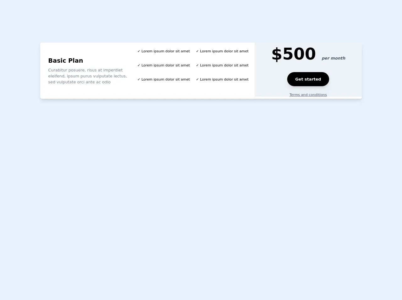
The preview of Single pricing ui component.
To create a single pricing component with Tailwind CSS, you can use the following HTML structure:
<div class="border rounded-lg overflow-hidden">
  <div class="bg-gray-100 text-gray-700 px-6 py-4">
    <h3 class="text-2xl font-semibold">Basic Plan</h3>
    <p class="mt-4 text-lg">$10/month</p>
  </div>
  <div class="bg-white px-6 py-8">
    <ul class="text-lg leading-7">
      <li><span class="text-gray-500 mr-2"><i class="fas fa-check"></i></span>5GB Storage</li>
      <li><span class="text-gray-500 mr-2"><i class="fas fa-check"></i></span>Unlimited Users</li>
      <li><span class="text-gray-500 mr-2"><i class="fas fa-check"></i></span>24/7 Support</li>
    </ul>
    <button class="mt-8 bg-blue-500 text-white py-2 px-4 rounded-full">Get Started</button>
  </div>
</div>
Free download of the Single pricing's source code
The source code of Single pricing ui component.
To create a single pricing component with Tailwind CSS, you can use the following HTML structure:
<div class="border rounded-lg overflow-hidden">
  <div class="bg-gray-100 text-gray-700 px-6 py-4">
    <h3 class="text-2xl font-semibold">Basic Plan</h3>
    <p class="mt-4 text-lg">$10/month</p>
  </div>
  <div class="bg-white px-6 py-8">
    <ul class="text-lg leading-7">
      <li><span class="text-gray-500 mr-2"><i class="fas fa-check"></i></span>5GB Storage</li>
      <li><span class="text-gray-500 mr-2"><i class="fas fa-check"></i></span>Unlimited Users</li>
      <li><span class="text-gray-500 mr-2"><i class="fas fa-check"></i></span>24/7 Support</li>
    </ul>
    <button class="mt-8 bg-blue-500 text-white py-2 px-4 rounded-full">Get Started</button>
  </div>
</div>
<!-- This is an example component -->
<div class="flex flex-col max-w-full md:h-56 bg-white rounded-lg shadow-lg overflow-hidden md:flex-row my-10">
<div class="md:flex items-center justify-center md:w-2/3 md:bg-white">
<div class="py-6 px-8 md:py-0">
<h2 class="text-gray-700 text-2xl font-bold md:text-black">
Basic Plan
</h2>
<p class="mt-2 text-gray-600 md:text-gray-600">
Curabitur posuere, risus at imperdiet eleifend, ipsum purus vulputate lectus, sed vulputate orci ante ac odio
</p>
</div>
<div class="flex flex-wrap py-6 px-8 sm:px-1 md:px-0 md:py-0 text-base md:text-sm mb-2">
<div class="w-2/2 sm:w-2/2 md:w-1/2 lg:w-2/2 xl:w-1/2 mb-2 h-12">✓ Lorem ipsum dolor sit amet</div>
<div class="w-2/2 sm:w-2/2 md:w-1/2 lg:w-2/2 xl:w-1/2 mb-2 h-12">✓ Lorem ipsum dolor sit amet</div>
<div class="w-2/2 sm:w-2/2 md:w-1/2 lg:w-2/2 xl:w-1/2 mb-2 h-12">✓ Lorem ipsum dolor sit amet</div>
<div class="w-2/2 sm:w-2/2 md:w-1/2 lg:w-2/2 xl:w-1/2 mb-2 h-12">✓ Lorem ipsum dolor sit amet</div>
<div class="w-2/2 sm:w-2/2 md:w-1/2 lg:w-2/2 xl:w-1/2 mb-2 h-12">✓ Lorem ipsum dolor sit amet</div>
<div class="w-2/2 sm:w-2/2 md:w-1/2 lg:w-2/2 xl:w-1/2 mb-2 h-12">✓ Lorem ipsum dolor sit amet</div>
</div>
</div>
<div class="flex flex-col items-center justify-center pb-6 md:py-0 md:w-1/3 md:border-b-8 bg-gray-200 border-white">
<div class="md:flex flex-col items-center justify-center ">
<div>
<h2 class=" text-6xl md:text-5x1 font-bold text-black">
$500 <span class="text-base text-gray-700 italic">per month</span>
</h2>
</div>
</div>
<div class="flex items-center justify-center w-full ">
<a
href="#"
target="_blank"
class="mx-auto lg:mx-0 hover:underline bg-black text-white font-bold rounded-full my-6 py-4 px-8 shadow-lg"
>
Get started
</a>
</div>
<a href="#" class="text-sm text-gray-700 underline">Terms and conditions</a>
</div>
</div>
How to create a Single pricing with Tailwind CSS?
Here are 6 tips to help you create a single pricing component with Tailwind CSS:
1. Use the border and rounded-lg classes to create a rounded border around the component.
<div class="border rounded-lg overflow-hidden">
  ...
</div>
2. Use the bg-gray-100 and text-gray-700 classes to set the background color and text color of the header.
<div class="bg-gray-100 text-gray-700 px-6 py-4">
  ...
</div>
3. Use the text-2xl and font-semibold classes to set the font size and weight of the plan name.
<h3 class="text-2xl font-semibold">Basic Plan</h3>
4. Use the mt-4 class to add margin-top to the price.
<p class="mt-4 text-lg">$10/month</p>
5. Use the bg-white class to set the background color of the plan details.
<div class="bg-white px-6 py-8">
  ...
</div>
6. Use the text-lg and leading-7 classes to set the font size and line height of the plan details.
<ul class="text-lg leading-7">
  ...
</ul>
Conclusion
In this article, we have learned how to create a single pricing component with Tailwind CSS. With these 6 tips, you can create a professional-looking pricing component quickly and easily. Tailwind CSS is a powerful tool that can help you create custom designs without writing custom CSS. If you're looking to speed up your front-end development workflow, give Tailwind CSS a try!