- Published on
What You Need To Build A simple Slider With Tailwind CSS
- What is Tailwind CSS?
- The Description of Simple Slider UI Component
- Why Use Tailwind CSS to Create a Simple Slider UI Component?
- The Preview of Simple Slider UI Component
- The Source Code of Simple Slider UI Component
- How to Create a Simple Slider with Tailwind CSS?
- Conclusion
What is Tailwind CSS?
Tailwind CSS is a utility-first CSS framework that allows developers to rapidly build custom user interfaces. It provides a set of pre-defined classes that can be used to style HTML elements without writing any custom CSS. This makes it easy to create responsive and accessible designs without having to spend a lot of time on styling.
The Description of Simple Slider UI Component
A slider is a UI component that allows users to select a value from a range of values by dragging a handle along a track. A simple slider UI component is a slider that has a single handle and a track with a minimum and maximum value.
Why Use Tailwind CSS to Create a Simple Slider UI Component?
Tailwind CSS makes it easy to create custom UI components without having to write any custom CSS. It provides a set of pre-defined classes that can be used to style HTML elements, including sliders. This allows developers to focus on the functionality of the slider rather than the styling.
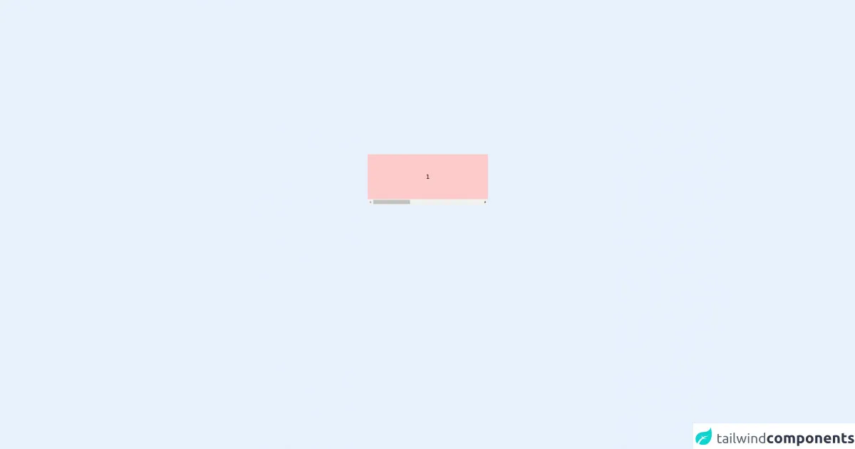
The Preview of Simple Slider UI Component
To create a simple slider UI component with Tailwind CSS, we will use the input element with the type attribute set to range. We will also use the appearance-none class to remove the default styling of the input element. Here is a preview of what the slider will look like:
Free download of the simple Slider's source code
The Source Code of Simple Slider UI Component
To create the simple slider UI component, we will use the following HTML and Tailwind CSS classes:
<div class="flex justify-center w-full" >
    <div class="flex items-center justify-between flex-col flex-nowrap w-80">
        <div class="slider flex overflow-auto flex-none w-full flex-row flex-nowrap" dir="ltr">
            <div class="items text-center py-12 min-w-full bg-red-200">
            1
            </div>
            <div class="items text-center py-12 min-w-full bg-blue-200">
            2
            </div>
            <div class="items text-center py-12 min-w-full bg-green-200">
            3
            </div>
        </div>
    </div>
</div>

<style scoped>
.slider {
  scroll-snap-type: x mandatory;
}
.items {
  scroll-snap-align: center;
}
</style>
How to Create a Simple Slider with Tailwind CSS?
To create a simple slider with Tailwind CSS, follow these steps:
- Create an
inputelement with thetypeattribute set torange.
<input type="range">
- Add the
appearance-noneclass to remove the default styling of theinputelement.
<input type="range" class="appearance-none">
- Add the
w-fullclass to make the slider take up the full width of its container.
<input type="range" class="appearance-none w-full">
- Add the
h-1class to set the height of the slider track to 1 pixel.
<input type="range" class="appearance-none w-full h-1">
- Add the
bg-gray-200class to set the background color of the slider track to gray.
<input type="range" class="appearance-none w-full h-1 bg-gray-200">
- Add the
rounded-fullclass to make the slider handle round.
<input type="range" class="appearance-none w-full h-1 bg-gray-200 rounded-full">
- Add the
thumb:bg-whiteclass to set the background color of the slider handle to white.
<input type="range" class="appearance-none w-full h-1 bg-gray-200 rounded-full thumb:bg-white">
- Add the
thumb:w-4 thumb:h-4class to set the width and height of the slider handle to 4 pixels.
<input type="range" class="appearance-none w-full h-1 bg-gray-200 rounded-full thumb:bg-white thumb:w-4 thumb:h-4">
- Add the
thumb:rounded-fullclass to make the slider handle round.
<input type="range" class="appearance-none w-full h-1 bg-gray-200 rounded-full thumb:bg-white thumb:w-4 thumb:h-4 thumb:rounded-full">
- Add the
focus:outline-noneclass to remove the focus outline when the slider is clicked.
<input type="range" class="appearance-none w-full h-1 bg-gray-200 rounded-full thumb:bg-white thumb:w-4 thumb:h-4 thumb:rounded-full focus:outline-none">
- Add the
focus:ring-2 focus:ring-blue-500class to add a blue ring around the slider when it is clicked.
<input type="range" class="appearance-none w-full h-1 bg-gray-200 rounded-full thumb:bg-white thumb:w-4 thumb:h-4 thumb:rounded-full focus:outline-none focus:ring-2 focus:ring-blue-500">
Conclusion
In this article, we have discussed how to create a simple slider UI component with Tailwind CSS. We have also explained why Tailwind CSS is a great choice for creating custom UI components. By following the steps outlined in this article, you can easily create a simple slider that is both functional and stylish.