- Published on
Advanced Guide: Make A Simple rounded button With Tailwind CSS
- What is Tailwind CSS?
- The Description of Simple Rounded Button UI Component
- Why Use Tailwind CSS to Create a Simple Rounded Button UI Component?
- The Preview of Simple Rounded Button UI Component
- The Source Code of Simple Rounded Button UI Component
- How to Create a Simple Rounded Button with Tailwind CSS?
- Step 1: Install Tailwind CSS
- Step 2: Create a Configuration File
- Step 3: Include Tailwind CSS in Your Project
- Step 4: Create a Simple Rounded Button
- Conclusion
What is Tailwind CSS?
Tailwind CSS is a utility-first CSS framework that provides a set of pre-defined CSS classes to create custom designs quickly. It allows you to build responsive and modern user interfaces without writing any custom CSS code. Tailwind CSS is gaining popularity among developers due to its flexibility and ease of use.
The Description of Simple Rounded Button UI Component
Buttons are one of the most commonly used UI components in web development. A simple rounded button is a UI component with a circular shape and rounded corners. It is used to trigger an action or navigate to a different page.
Why Use Tailwind CSS to Create a Simple Rounded Button UI Component?
Tailwind CSS provides a set of pre-defined CSS classes that can be used to create a simple rounded button UI component quickly. It eliminates the need to write custom CSS code, which saves time and effort. Additionally, Tailwind CSS provides a responsive design that adapts to different screen sizes, making it easier to create a mobile-friendly UI.
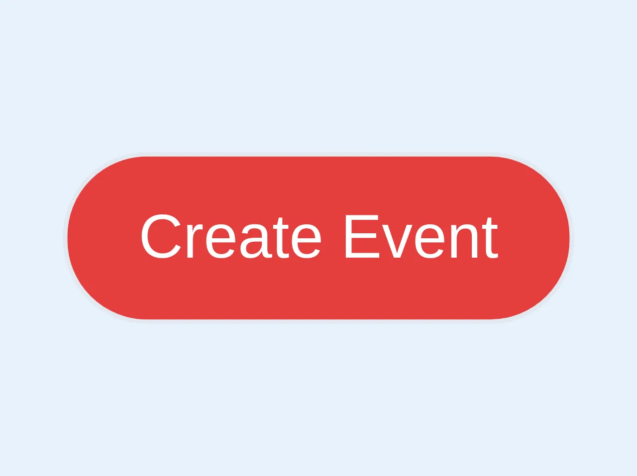
The Preview of Simple Rounded Button UI Component
To create a simple rounded button UI component with Tailwind CSS, we will use the following classes:
bg-blue-500 hover:bg-blue-700 text-white font-bold py-2 px-4 rounded-full
Free download of the Simple rounded button's source code
The Source Code of Simple Rounded Button UI Component
To create a simple rounded button UI component with Tailwind CSS, we will use the following HTML code:
<button class="bg-blue-500 hover:bg-blue-700 text-white font-bold py-2 px-4 rounded-full">
  Click Me
</button>
<a role="button" class="bg-red-600 hover:bg-red-700 text-white text-sm px-4 py-2  border rounded-full">
            Create Event
 </a>
How to Create a Simple Rounded Button with Tailwind CSS?
To create a simple rounded button UI component with Tailwind CSS, follow these steps:
Step 1: Install Tailwind CSS
To use Tailwind CSS, you need to install it in your project. You can install it using npm or yarn.
npm install tailwindcss
Step 2: Create a Configuration File
After installing Tailwind CSS, you need to create a configuration file named tailwind.config.js. This file contains the configuration settings for Tailwind CSS.
npx tailwindcss init
Step 3: Include Tailwind CSS in Your Project
To use Tailwind CSS in your project, you need to include it in your HTML file. You can do this by adding the following link in the head section of your HTML file.
<link rel="stylesheet" href="https://cdn.jsdelivr.net/npm/tailwindcss@latest/dist/tailwind.min.css">
Step 4: Create a Simple Rounded Button
To create a simple rounded button UI component, add the following HTML code to your project.
<button class="bg-blue-500 hover:bg-blue-700 text-white font-bold py-2 px-4 rounded-full">
  Click Me
</button>
This code creates a button with a blue background color, white text, and rounded corners. When you hover over the button, the background color changes to a darker shade of blue.
Conclusion
Tailwind CSS is a powerful CSS framework that allows you to create custom UI components quickly and easily. In this article, we learned how to create a simple rounded button UI component with Tailwind CSS. By using pre-defined CSS classes, we were able to create a responsive and modern UI component without writing any custom CSS code.