- Published on
Ultimate Guide: Build A Simple Responsive Navigation Bar With Tailwind CSS
- What is Tailwind CSS?
- The description of Simple Responsive Navigation Bar ui component
- Why use Tailwind CSS to create a Simple Responsive Navigation Bar ui component?
- The preview of Simple Responsive Navigation Bar ui component
- The source code of Simple Responsive Navigation Bar ui component
- How to create a Simple Responsive Navigation Bar with Tailwind CSS?
- Step 1: Set up your HTML
- Step 2: Add Tailwind CSS
- Step 3: Customize your styles
- Step 4: Test your navigation bar
- Conclusion
In today's digital world, creating a responsive navigation bar is a must for any website or application. A responsive navigation bar adapts to different screen sizes, making it easy for users to navigate through the website or application on any device. In this article, we will be discussing how to build a simple responsive navigation bar with Tailwind CSS.
What is Tailwind CSS?
Tailwind CSS is a utility-first CSS framework that allows you to quickly build custom user interfaces. It provides a set of pre-defined CSS classes that you can use to style your HTML elements. With Tailwind CSS, you can create responsive designs, customize your styles, and speed up your development process.
The description of Simple Responsive Navigation Bar ui component
A simple responsive navigation bar is a user interface component that consists of a menu button and a navigation menu. When the menu button is clicked, the navigation menu appears, allowing users to navigate through the website or application. The navigation bar should be responsive, adapting to different screen sizes, and should be easy to use.
Why use Tailwind CSS to create a Simple Responsive Navigation Bar ui component?
Tailwind CSS provides a set of pre-defined CSS classes that you can use to create a responsive navigation bar quickly. With Tailwind CSS, you can customize your styles, making it easy to create a unique design for your navigation bar. Additionally, Tailwind CSS is easy to use, making it perfect for developers of all skill levels.
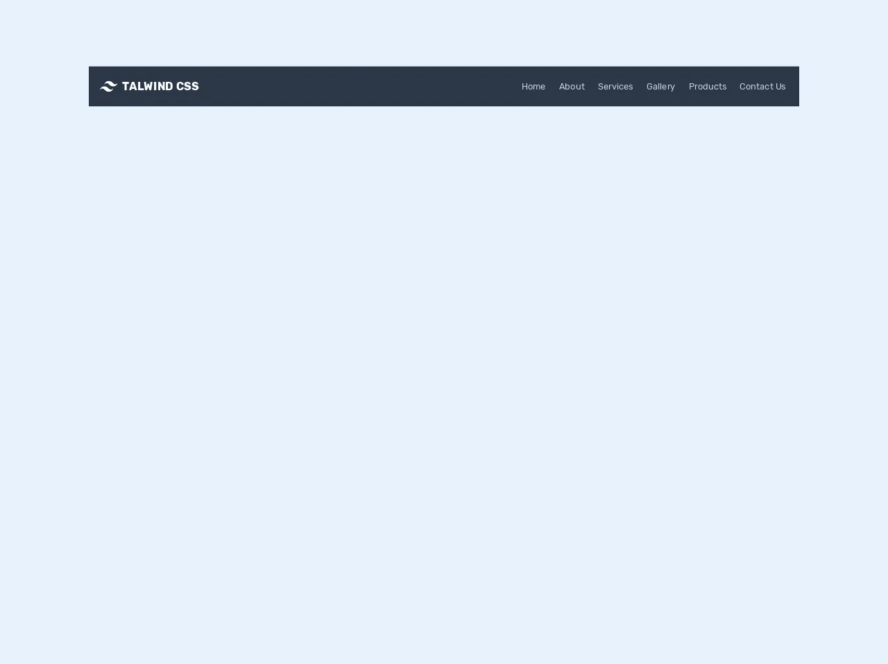
The preview of Simple Responsive Navigation Bar ui component
To give you an idea of what the Simple Responsive Navigation Bar ui component looks like, here is a preview:
Free download of the Simple Responsive Navigation Bar's source code
The source code of Simple Responsive Navigation Bar ui component
To create the Simple Responsive Navigation Bar ui component, we will be using HTML and Tailwind CSS. Here is the source code:
<link rel="stylesheet" href="https://cdnjs.cloudflare.com/ajax/libs/material-design-icons/3.0.1/iconfont/material-icons.min.css" integrity="sha256-x8PYmLKD83R9T/sYmJn1j3is/chhJdySyhet/JuHnfY=" crossorigin="anonymous" />
<link href="https://fonts.googleapis.com/css2?family=Rubik:wght@300;400;500;700;900&display=swap" rel="stylesheet">
<style>
  html,
body {
  font-family: "Rubik", sans-serif;
}

/* navigation
 - show navigation always on the large screen devices with (min-width:1024)
*/

@media (min-width: 1024px) {
  .top-navbar {
    display: inline-flex !important;
  }
</style>
<nav class="flex items-center bg-gray-800 p-3 flex-wrap">
      <a href="#" class="p-2 mr-4 inline-flex items-center">
        <svg
          viewBox="0 0 24 24"
          xmlns="http://www.w3.org/2000/svg"
          class="fill-current text-white h-8 w-8 mr-2"
        >
          <path
            d="M12.001 4.8c-3.2 0-5.2 1.6-6 4.8 1.2-1.6 2.6-2.2 4.2-1.8.913.228 1.565.89 2.288 1.624C13.666 10.618 15.027 12 18.001 12c3.2 0 5.2-1.6 6-4.8-1.2 1.6-2.6 2.2-4.2 1.8-.913-.228-1.565-.89-2.288-1.624C16.337 6.182 14.976 4.8 12.001 4.8zm-6 7.2c-3.2 0-5.2 1.6-6 4.8 1.2-1.6 2.6-2.2 4.2-1.8.913.228 1.565.89 2.288 1.624 1.177 1.194 2.538 2.576 5.512 2.576 3.2 0 5.2-1.6 6-4.8-1.2 1.6-2.6 2.2-4.2 1.8-.913-.228-1.565-.89-2.288-1.624C10.337 13.382 8.976 12 6.001 12z"
          />
        </svg>
        <span class="text-xl text-white font-bold uppercase tracking-wide"
          >Talwind CSS</span
        >
      </a>
      <button
        class="text-white inline-flex p-3 hover:bg-gray-900 rounded lg:hidden ml-auto hover:text-white outline-none nav-toggler"
        data-target="#navigation"
      >
        <i class="material-icons">menu</i>
      </button>
      <div
        class="hidden top-navbar w-full lg:inline-flex lg:flex-grow lg:w-auto"
        id="navigation"
      >
        <div
          class="lg:inline-flex lg:flex-row lg:ml-auto lg:w-auto w-full lg:items-center items-start  flex flex-col lg:h-auto"
        >
          <a
            href="#"
            class="lg:inline-flex lg:w-auto w-full px-3 py-2 rounded text-gray-400 items-center justify-center hover:bg-gray-900 hover:text-white"
          >
            <span>Home</span>
          </a>
          <a
            href="#"
            class="lg:inline-flex lg:w-auto w-full px-3 py-2 rounded text-gray-400 items-center justify-center hover:bg-gray-900 hover:text-white"
          >
            <span>About</span>
          </a>
          <a
            href="#"
            class="lg:inline-flex lg:w-auto w-full px-3 py-2 rounded text-gray-400 items-center justify-center hover:bg-gray-900 hover:text-white"
          >
            <span>Services</span>
          </a>
          <a
            href="#"
            class="lg:inline-flex lg:w-auto w-full px-3 py-2 rounded text-gray-400 items-center justify-center hover:bg-gray-900 hover:text-white"
          >
            <span>Gallery</span>
          </a>
          <a
            href="#"
            class="lg:inline-flex lg:w-auto w-full px-3 py-2 rounded text-gray-400 items-center justify-center hover:bg-gray-900 hover:text-white"
          >
            <span>Products</span>
          </a>
          <a
            href="#"
            class="lg:inline-flex lg:w-auto w-full px-3 py-2 rounded text-gray-400 items-center justify-center hover:bg-gray-900 hover:text-white"
          >
            <span>Contact Us</span>
          </a>
        </div>
      </div>
    </nav>


<script src="https://cdnjs.cloudflare.com/ajax/libs/jquery/3.5.0/jquery.min.js" integrity="sha256-xNzN2a4ltkB44Mc/Jz3pT4iU1cmeR0FkXs4pru/JxaQ=" crossorigin="anonymous"></script>
<script>
  $(document).ready(function() {
  $(".nav-toggler").each(function(_, navToggler) {
    var target = $(navToggler).data("target");
    $(navToggler).on("click", function() {
      $(target).animate({
        height: "toggle"
      });
    });
  });
});

</script>
How to create a Simple Responsive Navigation Bar with Tailwind CSS?
Now that we have an understanding of what the Simple Responsive Navigation Bar ui component is and why we should use Tailwind CSS to create it let's dive into the steps to create it.
Step 1: Set up your HTML
The first step is to set up your HTML. Here is an example:
<nav class="bg-gray-800">
  <div class="max-w-7xl mx-auto px-2 sm:px-6 lg:px-8">
    <div class="relative flex items-center justify-between h-16">
      <div class="absolute inset-y-0 left-0 flex items-center sm:hidden">
        <button type="button" class="inline-flex items-center justify-center p-2 rounded-md text-gray-400 hover:text-white hover:bg-gray-700 focus:outline-none focus:ring-2 focus:ring-inset focus:ring-white" aria-controls="mobile-menu" aria-expanded="false">
          <span class="sr-only">Open main menu</span>
          <!-- Icon when menu is closed. -->
          <!--
            Heroicon name: menu

            Menu open: "hidden", Menu closed: "block"
          -->
          <svg class="block h-6 w-6" xmlns="http://www.w3.org/2000/svg" fill="none" viewBox="0 0 24 24" stroke="currentColor" aria-hidden="true">
            <path stroke-linecap="round" stroke-linejoin="round" stroke-width="2" d="M4 6h16M4 12h16M4 18h16" />
          </svg>
          <!-- Icon when menu is open. -->
          <!--
            Heroicon name: x

            Menu open: "block", Menu closed: "hidden"
          -->
          <svg class="hidden h-6 w-6" xmlns="http://www.w3.org/2000/svg" fill="none" viewBox="0 0 24 24" stroke="currentColor" aria-hidden="true">
            <path stroke-linecap="round" stroke-linejoin="round" stroke-width="2" d="M6 18L18 6M6 6l12 12" />
          </svg>
        </button>
      </div>
      <div class="flex-1 flex items-center justify-center sm:items-stretch sm:justify-start">
        <div class="flex-shrink-0">
          <img class="block lg:hidden h-8 w-auto" src="https://tailwindui.com/img/logos/workflow-mark-indigo-500.svg" alt="Workflow">
          <img class="hidden lg:block h-8 w-auto" src="https://tailwindui.com/img/logos/workflow-logo-indigo-500-mark-white-text.svg" alt="Workflow">
        </div>
        <div class="hidden sm:block sm:ml-6">
          <div class="flex space-x-4">
            <a href="#" class="bg-gray-900 text-white px-3 py-2 rounded-md text-sm font-medium">Dashboard</a>

            <a href="#" class="text-gray-300 hover:bg-gray-700 hover:text-white px-3 py-2 rounded-md text-sm font-medium">Team</a>

            <a href="#" class="text-gray-300 hover:bg-gray-700 hover:text-white px-3 py-2 rounded-md text-sm font-medium">Projects</a>

            <a href="#" class="text-gray-300 hover:bg-gray-700 hover:text-white px-3 py-2 rounded-md text-sm font-medium">Calendar</a>
          </div>
        </div>
      </div>
      <div class="hidden sm:block sm:ml-6">
        <div class="flex space-x-4">
          <a href="#" class="text-gray-300 hover:bg-gray-700 hover:text-white px-3 py-2 rounded-md text-sm font-medium">Settings</a>

          <a href="#" class="text-gray-300 hover:bg-gray-700 hover:text-white px-3 py-2 rounded-md text-sm font-medium">Profile</a>

          <a href="#" class="text-gray-300 hover:bg-gray-700 hover:text-white px-3 py-2 rounded-md text-sm font-medium">Sign out</a>
        </div>
      </div>
    </div>
  </div>

  <!-- Mobile menu, show/hide based on menu state. -->
  <div class="sm:hidden" id="mobile-menu">
    <div class="px-2 pt-2 pb-3 space-y-1">
      <a href="#" class="bg-gray-900 text-white block px-3 py-2 rounded-md text-base font-medium">Dashboard</a>

      <a href="#" class="text-gray-300 hover:bg-gray-700 hover:text-white block px-3 py-2 rounded-md text-base font-medium">Team</a>

      <a href="#" class="text-gray-300 hover:bg-gray-700 hover:text-white block px-3 py-2 rounded-md text-base font-medium">Projects</a>

      <a href="#" class="text-gray-300 hover:bg-gray-700 hover:text-white block px-3 py-2 rounded-md text-base font-medium">Calendar</a>

      <a href="#" class="text-gray-300 hover:bg-gray-700 hover:text-white block px-3 py-2 rounded-md text-base font-medium">Settings</a>

      <a href="#" class="text-gray-300 hover:bg-gray-700 hover:text-white block px-3 py-2 rounded-md text-base font-medium">Profile</a>

      <a href="#" class="text-gray-300 hover:bg-gray-700 hover:text-white block px-3 py-2 rounded-md text-base font-medium">Sign out</a>
    </div>
  </div>
</nav>
Step 2: Add Tailwind CSS
The next step is to add Tailwind CSS to your project. You can do this by including the Tailwind CSS CDN in your HTML file:
<head>
  <link href="https://cdn.jsdelivr.net/npm/tailwindcss@latest/dist/tailwind.min.css" rel="stylesheet">
</head>
Step 3: Customize your styles
The final step is to customize your styles. You can do this by adding your own CSS classes or by modifying the existing Tailwind CSS classes. Here is an example:
<nav class="bg-gray-800">
  <div class="max-w-7xl mx-auto px-2 sm:px-6 lg:px-8">
    <div class="relative flex items-center justify-between h-16">
      <div class="absolute inset-y-0 left-0 flex items-center sm:hidden">
        <button type="button" class="inline-flex items-center justify-center p-2 rounded-md text-gray-400 hover:text-white hover:bg-gray-700 focus:outline-none focus:ring-2 focus:ring-inset focus:ring-white" aria-controls="mobile-menu" aria-expanded="false">
          <span class="sr-only">Open main menu</span>
          <!-- Icon when menu is closed. -->
          <!--
            Heroicon name: menu

            Menu open: "hidden", Menu closed: "block"
          -->
          <svg class="block h-6 w-6" xmlns="http://www.w3.org/2000/svg" fill="none" viewBox="0 0 24 24" stroke="currentColor" aria-hidden="true">
            <path stroke-linecap="round" stroke-linejoin="round" stroke-width="2" d="M4 6h16M4 12h16M4 18h16" />
          </svg>
          <!-- Icon when menu is open. -->
          <!--
            Heroicon name: x

            Menu open: "block", Menu closed: "hidden"
          -->
          <svg class="hidden h-6 w-6" xmlns="http://www.w3.org/2000/svg" fill="none" viewBox="0 0 24 24" stroke="currentColor" aria-hidden="true">
            <path stroke-linecap="round" stroke-linejoin="round" stroke-width="2" d="M6 18L18 6M6 6l12 12" />
          </svg>
        </button>
      </div>
      <div class="flex-1 flex items-center justify-center sm:items-stretch sm:justify-start">
        <div class="flex-shrink-0">
          <img class="block lg:hidden h-8 w-auto" src="https://tailwindui.com/img/logos/workflow-mark-indigo-500.svg" alt="Workflow">
          <img class="hidden lg:block h-8 w-auto" src="https://tailwindui.com/img/logos/workflow-logo-indigo-500-mark-white-text.svg" alt="Workflow">
        </div>
        <div class="hidden sm:block sm:ml-6">
          <div class="flex space-x-4">
            <a href="#" class="text-white px-3 py-2 rounded-md text-sm font-medium hover:bg-gray-700">Dashboard</a>

            <a href="#" class="text-gray-300 hover:bg-gray-700 hover:text-white px-3 py-2 rounded-md text-sm font-medium">Team</a>

            <a href="#" class="text-gray-300 hover:bg-gray-700 hover:text-white px-3 py-2 rounded-md text-sm font-medium">Projects</a>

            <a href="#" class="text-gray-300 hover:bg-gray-700 hover:text-white px-3 py-2 rounded-md text-sm font-medium">Calendar</a>
          </div>
        </div>
      </div>
      <div class="hidden sm:block sm:ml-6">
        <div class="flex space-x-4">
          <a href="#" class="text-gray-300 hover:bg-gray-700 hover:text-white px-3 py-2 rounded-md text-sm font-medium">Settings</a>

          <a href="#" class="text-gray-300 hover:bg-gray-700 hover:text-white px-3 py-2 rounded-md text-sm font-medium">Profile</a>

          <a href="#" class="text-gray-300 hover:bg-gray-700 hover:text-white px-3 py-2 rounded-md text-sm font-medium">Sign out</a>
        </div>
      </div>
    </div>
  </div>

  <!-- Mobile menu, show/hide based on menu state. -->
  <div class="sm:hidden" id="mobile-menu">
    <div class="px-2 pt-2 pb-3 space-y-1">
      <a href="#" class="text-white block px-3 py-2 rounded-md text-base font-medium hover:bg-gray-700">Dashboard</a>

      <a href="#" class="text-gray-300 hover:bg-gray-700 hover:text-white block px-3 py-2 rounded-md text-base font-medium">Team</a>

      <a href="#" class="text-gray-300 hover:bg-gray-700 hover:text-white block px-3 py-2 rounded-md text-base font-medium">Projects</a>

      <a href="#" class="text-gray-300 hover:bg-gray-700 hover:text-white block px-3 py-2 rounded-md text-base font-medium">Calendar</a>

      <a href="#" class="text-gray-300 hover:bg-gray-700 hover:text-white block px-3 py-2 rounded-md text-base font-medium">Settings</a>

      <a href="#" class="text-gray-300 hover:bg-gray-700 hover:text-white block px-3 py-2 rounded-md text-base font-medium">Profile</a>

      <a href="#" class="text-gray-300 hover:bg-gray-700 hover:text-white block px-3 py-2 rounded-md text-base font-medium">Sign out</a>
    </div>
  </div>
</nav>
Step 4: Test your navigation bar
The final step is to test your navigation bar. You can do this by resizing your browser window or by testing it on different devices. Your navigation bar should be responsive and easy to use.
Conclusion
In conclusion, creating a simple responsive navigation bar with Tailwind CSS is easy and straightforward. With Tailwind CSS, you can quickly build custom user interfaces, customize your styles, and speed up your development process. By following the steps outlined in this article, you can create a responsive navigation bar that is easy to use and adapts to different screen sizes.