- Published on
How To Build A Simple responsive footer links With Tailwind CSS From Scratch

- What is Tailwind CSS?
- The Description of Simple Responsive Footer Links UI Component
- Why Use Tailwind CSS to Create a Simple Responsive Footer Links UI Component?
- The Preview of Simple Responsive Footer Links UI Component
- The Source Code of Simple Responsive Footer Links UI Component
- How to Create a Simple Responsive Footer Links with Tailwind CSS?
- Conclusion
What is Tailwind CSS?
Tailwind CSS is a utility-first CSS framework that allows you to quickly build custom designs without writing any CSS. It provides a set of pre-defined classes that you can use to style your HTML elements. With Tailwind CSS, you can create responsive designs, customize your own color palette, and more.
The Description of Simple Responsive Footer Links UI Component
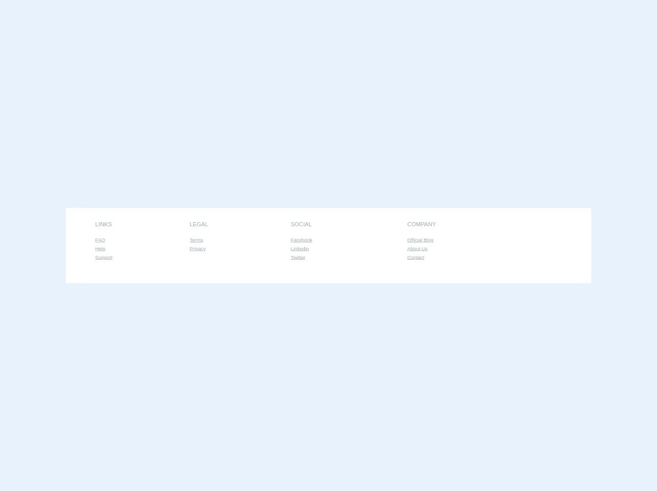
A simple responsive footer links UI component is a common element that you can find on many websites. It usually contains links to important pages such as About Us, Contact, and Terms of Service. The component is placed at the bottom of the page and is visible on all pages of the website.
Why Use Tailwind CSS to Create a Simple Responsive Footer Links UI Component?
Tailwind CSS provides a set of pre-defined classes that you can use to style your HTML elements. This makes it easy to create a responsive footer links UI component without writing any CSS. Additionally, Tailwind CSS allows you to customize your own color palette, which makes it easy to match the component to the rest of your website.
The Preview of Simple Responsive Footer Links UI Component
Free download of the Simple responsive footer links's source code
The Source Code of Simple Responsive Footer Links UI Component
<section class="bg-white py-8 w-full">
    <div class="container mx-auto px-8">
        <div class="table w-full">
            <div class="block sm:table-cell">
                <p class="uppercase text-grey text-sm sm:mb-6">Links</p>
                <ul class="list-reset text-xs mb-6">
                    <li class="mt-2 inline-block mr-2 sm:block sm:mr-0">
                        <a href="#" class="text-grey hover:text-grey-dark">FAQ</a>
                    </li>
                    <li class="mt-2 inline-block mr-2 sm:block sm:mr-0">
                        <a href="#" class="text-grey hover:text-grey-dark">Help</a>
                    </li>
                    <li class="mt-2 inline-block mr-2 sm:block sm:mr-0">
                        <a href="#" class="text-grey hover:text-grey-dark">Support</a>
                    </li>
                </ul>
            </div>
            <div class="block sm:table-cell">
                <p class="uppercase text-grey text-sm sm:mb-6">Legal</p>
                <ul class="list-reset text-xs mb-6">
                    <li class="mt-2 inline-block mr-2 sm:block sm:mr-0">
                        <a href="#" class="text-grey hover:text-grey-dark">Terms</a>
                    </li>
                    <li class="mt-2 inline-block mr-2 sm:block sm:mr-0">
                        <a href="#" class="text-grey hover:text-grey-dark">Privacy</a>
                    </li>
                </ul>
            </div>
            <div class="block sm:table-cell">
                <p class="uppercase text-grey text-sm sm:mb-6">Social</p>
                <ul class="list-reset text-xs mb-6">
                    <li class="mt-2 inline-block mr-2 sm:block sm:mr-0">
                        <a href="#" class="text-grey hover:text-grey-dark">Facebook</a>
                    </li>
                    <li class="mt-2 inline-block mr-2 sm:block sm:mr-0">
                        <a href="#" class="text-grey hover:text-grey-dark">Linkedin</a>
                    </li>
                    <li class="mt-2 inline-block mr-2 sm:block sm:mr-0">
                        <a href="#" class="text-grey hover:text-grey-dark">Twitter</a>
                    </li>
                </ul>
            </div>
            <div class="block sm:table-cell">
                <p class="uppercase text-grey text-sm sm:mb-6">Company</p>
                <ul class="list-reset text-xs mb-6">
                    <li class="mt-2 inline-block mr-2 sm:block sm:mr-0">
                        <a href="#" class="text-grey hover:text-grey-dark">Official Blog</a>
                    </li>
                    <li class="mt-2 inline-block mr-2 sm:block sm:mr-0">
                        <a href="#" class="text-grey hover:text-grey-dark">About Us</a>
                    </li>
                    <li class="mt-2 inline-block mr-2 sm:block sm:mr-0">
                        <a href="#" class="text-grey hover:text-grey-dark">Contact</a>
                    </li>
                </ul>
            </div>
        </div>
    </div>
</section>
How to Create a Simple Responsive Footer Links with Tailwind CSS?
To create a simple responsive footer links UI component with Tailwind CSS, follow these steps:
- Create a new HTML file and add the necessary HTML elements for the footer links component. For example:
<footer class="bg-gray-900">
  <div class="container mx-auto py-4 px-5 flex flex-wrap flex-col sm:flex-row">
    <span class="text-gray-400 text-sm text-center sm:text-left">© 2021 My Website</span>
    <nav class="ml-auto flex flex-wrap items-center text-base justify-center">
      <a href="#" class="mr-5 hover:text-white">About Us</a>
      <a href="#" class="mr-5 hover:text-white">Contact</a>
      <a href="#" class="mr-5 hover:text-white">Terms of Service</a>
    </nav>
  </div>
</footer>
- Add the Tailwind CSS CDN to your HTML file. This will allow you to use Tailwind CSS classes in your HTML elements. For example:
<head>
  <link href="https://cdn.jsdelivr.net/npm/[email protected]/dist/tailwind.min.css" rel="stylesheet">
</head>
- Customize the color palette of the component by adding your own colors to the Tailwind CSS configuration file. For example:
// tailwind.config.js
module.exports = {
  theme: {
    extend: {
      colors: {
        primary: '#FFB900',
        secondary: '#FFD700',
      },
    },
  },
  variants: {},
  plugins: [],
}
- Customize the component by adding Tailwind CSS classes to your HTML elements. For example:
<footer class="bg-gray-900">
  <div class="container mx-auto py-4 px-5 flex flex-wrap flex-col sm:flex-row">
    <span class="text-gray-400 text-sm text-center sm:text-left">© 2021 My Website</span>
    <nav class="ml-auto flex flex-wrap items-center text-base justify-center">
      <a href="#" class="mr-5 hover:text-white">About Us</a>
      <a href="#" class="mr-5 hover:text-white">Contact</a>
      <a href="#" class="mr-5 hover:text-white">Terms of Service</a>
    </nav>
  </div>
</footer>
- Test the component by previewing it in your web browser.
Conclusion
In this article, we learned how to create a simple responsive footer links UI component with Tailwind CSS. We discussed the benefits of using Tailwind CSS and provided a step-by-step guide for creating the component. By following these steps, you can quickly create a professional-looking footer links component for your website.