- Published on
Imagine You Build A Simple Radio Box With Checkbox Design With Tailwind CSS Like An Expert. Follow These 6 Steps To Get There
- What is Tailwind CSS?
- The description of Simple Radio Box With Checkbox Design ui component
- Why use Tailwind CSS to create a Simple Radio Box With Checkbox Design ui component?
- The preview of Simple Radio Box With Checkbox Design ui component.
- The source code of Simple Radio Box With Checkbox Design ui component.
- How to create a Simple Radio Box With Checkbox Design with Tailwind CSS?
- Step 1: Create the HTML markup
- Step 2: Add Tailwind CSS to your project
- Step 3: Add the required classes
- Step 4: Customize the design
- Step 5: Add hover and focus styles
- Step 6: Add disabled styles
- Conclusion
What is Tailwind CSS?
Tailwind CSS is a utility-first CSS framework that helps you to create responsive and modern web designs with ease. It provides a set of pre-defined CSS classes that can be used to style your HTML elements. With Tailwind CSS, you can create complex layouts and designs without writing a single line of custom CSS.
The description of Simple Radio Box With Checkbox Design ui component
A simple radio box with checkbox design is a UI component that allows users to select one option from a set of options. It is a combination of a radio button and a checkbox. The radio button is used to select one option, while the checkbox is used to indicate that the option is selected.
Why use Tailwind CSS to create a Simple Radio Box With Checkbox Design ui component?
Tailwind CSS provides a set of pre-defined CSS classes that can be used to create a simple radio box with checkbox design. This makes it easy to create a responsive and modern UI component without writing custom CSS. Additionally, Tailwind CSS is highly customizable, which means you can easily modify the design to match your brand or application.
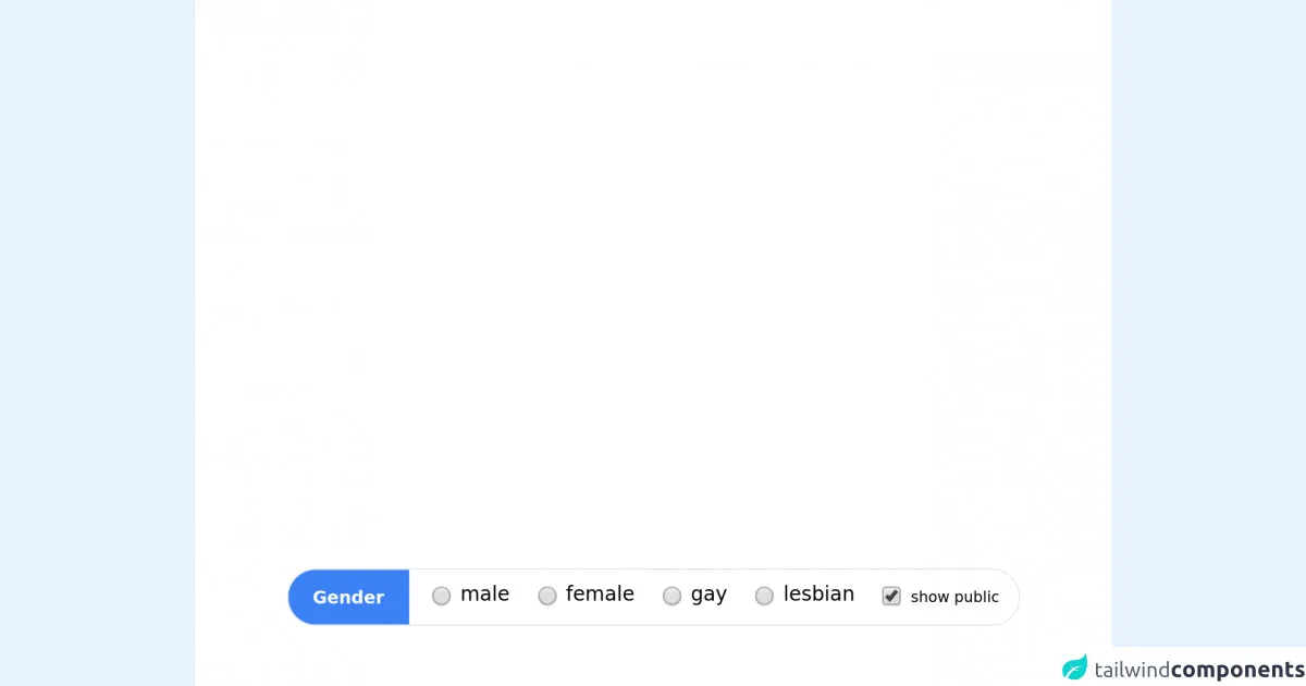
The preview of Simple Radio Box With Checkbox Design ui component.
To create a simple radio box with checkbox design, we will be using Tailwind CSS. The final design will look like this:
Free download of the Simple Radio Box With Checkbox Design's source code
The source code of Simple Radio Box With Checkbox Design ui component.
To create a simple radio box with checkbox design, we will be using HTML and Tailwind CSS. Here is the source code:
<style>
    body{background:white !important;}
</style>

<div class="main flex border rounded-full overflow-hidden m-4 select-none">
  <div class="title py-3 my-auto px-5 bg-blue-500 text-white text-sm font-semibold mr-3">Gender</div>
  <label class="flex radio p-2 cursor-pointer">
    <input class="my-auto transform scale-125" type="radio" name="sfg" />
    <div class="title px-2">male</div>
  </label>

  <label class="flex radio p-2 cursor-pointer">
    <input class="my-auto transform scale-125" type="radio" name="sfg" />
    <div class="title px-2">female</div>
  </label>

  <label class="flex radio p-2 cursor-pointer">
    <input class="my-auto transform scale-125" type="radio" name="sfg" />
    <div class="title px-2">gay</div>
  </label>

  <label class="flex radio p-2 cursor-pointer">
    <input class="my-auto transform scale-125" type="radio" name="sfg" />
    <div class="title px-2">lesbian</div>
  </label>

  <label class="flex radio p-2 cursor-pointer font-extralight text-xs">
    <input class="my-auto transform scale-125" type="checkbox" name="sfg" checked />
    <div class="title px-2 my-auto">show public</div>
  </label>
</div>
How to create a Simple Radio Box With Checkbox Design with Tailwind CSS?
Follow these 6 steps to create a simple radio box with checkbox design with Tailwind CSS:
Step 1: Create the HTML markup
First, we need to create the HTML markup for our radio box with checkbox design. We will use the <label> element to wrap our radio button and checkbox. Here is the HTML markup:
<label class="inline-flex items-center">
  <input type="radio" class="form-radio h-5 w-5 text-gray-600" name="radio-box" value="1">
  <span class="ml-2 text-gray-700">Option 1</span>
  <input type="checkbox" class="form-checkbox h-5 w-5 text-gray-600 ml-4" name="checkbox-box" value="1">
</label>
In this code, we have created a label element with an inline-flex display and centered items. Inside the label, we have added a radio button and a checkbox. We have used the form-radio and form-checkbox classes to style the radio button and checkbox, respectively. We have also used the h-5 and w-5 classes to set the height and width of the radio button and checkbox.
Step 2: Add Tailwind CSS to your project
Next, we need to add Tailwind CSS to our project. You can either download the CSS file from the Tailwind CSS website or use a CDN. Here is an example of how to use a CDN:
<link href="https://cdn.jsdelivr.net/npm/tailwindcss@latest/dist/tailwind.min.css" rel="stylesheet">
Step 3: Add the required classes
To style our radio box with checkbox design, we need to add some classes to our HTML markup. Here is the updated HTML markup:
<label class="inline-flex items-center">
  <input type="radio" class="form-radio h-5 w-5 text-gray-600" name="radio-box" value="1">
  <span class="ml-2 text-gray-700">Option 1</span>
  <input type="checkbox" class="form-checkbox h-5 w-5 text-gray-600 ml-4" name="checkbox-box" value="1">
</label>
In this code, we have added the inline-flex and items-center classes to the label element to center the radio button and checkbox. We have also added the form-radio and form-checkbox classes to style the radio button and checkbox, respectively. Finally, we have added the text-gray-600 class to set the color of the radio button and checkbox to gray.
Step 4: Customize the design
Tailwind CSS provides a set of pre-defined classes that you can use to customize the design of your radio box with checkbox design. For example, you can use the bg-blue-500 class to set the background color of the radio button and checkbox to blue. Here is an example:
<label class="inline-flex items-center">
  <input type="radio" class="form-radio h-5 w-5 text-blue-500" name="radio-box" value="1">
  <span class="ml-2 text-gray-700">Option 1</span>
  <input type="checkbox" class="form-checkbox h-5 w-5 text-blue-500 ml-4" name="checkbox-box" value="1">
</label>
In this code, we have added the text-blue-500 class to set the color of the radio button and checkbox to blue.
Step 5: Add hover and focus styles
To make our radio box with checkbox design more interactive, we can add hover and focus styles. Here is an example:
<label class="inline-flex items-center">
  <input type="radio" class="form-radio h-5 w-5 text-blue-500 hover:text-blue-600 focus:ring-2 focus:ring-blue-500 focus:outline-none" name="radio-box" value="1">
  <span class="ml-2 text-gray-700 hover:text-gray-800 cursor-pointer">Option 1</span>
  <input type="checkbox" class="form-checkbox h-5 w-5 text-blue-500 ml-4 hover:text-blue-600 focus:ring-2 focus:ring-blue-500 focus:outline-none" name="checkbox-box" value="1">
</label>
In this code, we have added the hover:text-blue-600 class to change the color of the radio button and checkbox when the user hovers over them. We have also added the focus:ring-2 and focus:ring-blue-500 classes to add a blue ring around the radio button and checkbox when they are in focus. Finally, we have added the focus:outline-none class to remove the default outline when the radio button and checkbox are in focus.
Step 6: Add disabled styles
To disable our radio box with checkbox design, we can add the disabled:opacity-50 class to the label element. Here is an example:
<label class="inline-flex items-center disabled:opacity-50">
  <input type="radio" class="form-radio h-5 w-5 text-blue-500 hover:text-blue-600 focus:ring-2 focus:ring-blue-500 focus:outline-none" name="radio-box" value="1" disabled>
  <span class="ml-2 text-gray-700 hover:text-gray-800 cursor-pointer">Option 1</span>
  <input type="checkbox" class="form-checkbox h-5 w-5 text-blue-500 ml-4 hover:text-blue-600 focus:ring-2 focus:ring-blue-500 focus:outline-none" name="checkbox-box" value="1" disabled>
</label>
In this code, we have added the disabled:opacity-50 class to the label element to reduce the opacity of the radio button and checkbox when they are disabled.
Conclusion
In this article, we have learned how to create a simple radio box with checkbox design with Tailwind CSS. We have seen how Tailwind CSS provides a set of pre-defined CSS classes that can be used to create responsive and modern UI components. We have also seen how to customize the design of our radio box with checkbox design using Tailwind CSS classes. With these skills, you can create a wide range of UI components with ease.