- Published on
3 Things You Must Know To Make A Simple Product Card With Tailwind CSS
- What is Tailwind CSS?
- The description of Simple Product Card UI component
- Why use Tailwind CSS to create a Simple Product Card UI component?
- The preview of Simple Product Card UI component.
- The source code of Simple Product Card UI component.
- How to create a Simple Product Card with Tailwind CSS?
- Step 1: Set up your project
- Step 2: Configure Tailwind CSS
- Step 3: Create HTML markup
- Step 4: Apply Tailwind CSS classes
- Step 5: Customize the design
- Conclusion
If you are a FrontEnd developer, you must have heard of Tailwind CSS. It is a popular utility-first CSS framework that allows you to create custom designs quickly. In this article, we will discuss how to create a Simple Product Card UI component using Tailwind CSS. We will cover the following topics:
- What is Tailwind CSS?
- The description of Simple Product Card UI component
- Why use Tailwind CSS to create a Simple Product Card UI component?
- The preview of Simple Product Card UI component.
- The source code of Simple Product Card UI component.
- How to create a Simple Product Card with Tailwind CSS?
- Conclusion.
What is Tailwind CSS?
Tailwind CSS is a utility-first CSS framework that provides a set of pre-defined CSS classes. These classes can be used to create custom designs quickly without writing any CSS code. It is a popular choice among developers who want to create custom designs quickly.
The description of Simple Product Card UI component
A product card is a UI component that displays information about a product. It usually contains an image of the product, its name, price, and a short description. A simple product card is a product card that contains only the essential information about the product.
Why use Tailwind CSS to create a Simple Product Card UI component?
Tailwind CSS provides a set of pre-defined CSS classes that can be used to create custom designs quickly. It allows you to create responsive designs without writing any CSS code. It also provides a set of pre-defined color palettes that can be used to create custom color schemes quickly. Using Tailwind CSS to create a Simple Product Card UI component will save you time and effort.
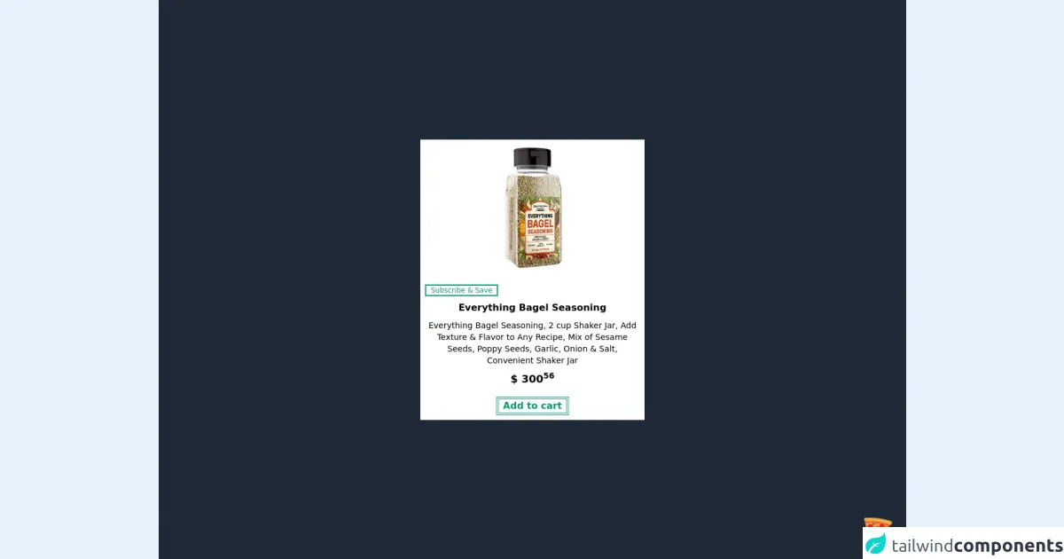
The preview of Simple Product Card UI component.
Here is a preview of what the Simple Product Card UI component will look like:
Free download of the Simple Product Card's source code
The source code of Simple Product Card UI component.
Here is the source code of the Simple Product Card UI component:
<div class="flex justify-center items-center w-screen h-screen bg-gray-800">
	<!-- COMPONENT CODE -->
	<div class="flex m-4 shadow bg-white max-w-sm hover:bg-gray-200">
		<div class="flex flex-col">
			<img
                alt="Unpretentious Baker"
                class="object-scale-down h-60 w-auto"
                src="https://m.media-amazon.com/images/I/819CSxjb+AL._SL1500_.jpg"
            />
			<div class="mx-2">
				<div class="">
					<button class="border-2 border-green-600 text-xs text-green-600 my-2 px-2">
                    Subscribe & Save
                </button>
				</div>
				<h1 class="font-bold text-center">Everything Bagel Seasoning</h1>
                <!-- Install Plugin: Line Clamp | npm install @tailwindcss/line-clamp -->
				<p class="text-sm text-center line-clamp-2 my-2">
					Everything Bagel Seasoning, 2 cup Shaker Jar, Add Texture & Flavor to Any Recipe, Mix of Sesame
					Seeds,
					Poppy Seeds, Garlic, Onion & Salt, Convenient Shaker Jar
				</p>
				<p class="font-bold text-lg text-center my-2">$ 300<sup>56</sup></p>
				<div class="text-center">
					<button class="border-double border-4 border-green-600 text-base text-green-600 font-bold my-2 px-2">
                        Add to cart
                    </button>
				</div>
			</div>
		</div>
	</div>
	<!-- COMPONENT CODE -->
</div>

<!-- BUY ME A PIZZA AND HELP SUPPORT OPEN-SOURCE RESOURCES -->
<div class="flex items-end justify-end fixed bottom-0 right-0 mb-4 mr-4 z-10">
	<div>
		<a title="Buy me a pizza" href="https://www.buymeacoffee.com/Dekartmc" target="_blank"
			class="block w-16 h-16 rounded-full transition-all shadow hover:shadow-lg transform hover:scale-110 hover:rotate-12">
			<img class="object-cover object-center w-full h-full rounded-full" src="https://img.icons8.com/emoji/48/000000/pizza-emoji.png"/>
    </a>
	</div>
</div>
How to create a Simple Product Card with Tailwind CSS?
To create a Simple Product Card UI component with Tailwind CSS, follow these steps:
Step 1: Set up your project
To use Tailwind CSS, you need to install it in your project. You can install it using npm or yarn. Here is how to install it using npm:
npm install tailwindcss
Step 2: Configure Tailwind CSS
After installing Tailwind CSS, you need to configure it. You can do this by creating a configuration file called tailwind.config.js. Here is an example configuration file:
module.exports = {
  theme: {
    extend: {},
  },
  variants: {},
  plugins: [],
}
Step 3: Create HTML markup
To create a Simple Product Card UI component, you need to create HTML markup that contains the essential information about the product. Here is an example HTML markup:
<div class="max-w-sm rounded overflow-hidden shadow-lg">
  <img class="w-full" src="product-image.jpg" alt="Product Image">
  <div class="px-6 py-4">
    <div class="font-bold text-xl mb-2">Product Name</div>
    <p class="text-gray-700 text-base">Product Description</p>
  </div>
  <div class="px-6 py-4">
    <span class="inline-block bg-gray-200 rounded-full px-3 py-1 text-sm font-semibold text-gray-700 mr-2">$19.99</span>
  </div>
</div>
Step 4: Apply Tailwind CSS classes
To apply Tailwind CSS classes to the HTML markup, you need to add the class attribute to the HTML elements. Here is an example of how to apply Tailwind CSS classes to the HTML markup:
<div class="max-w-sm rounded overflow-hidden shadow-lg">
  <img class="w-full" src="product-image.jpg" alt="Product Image">
  <div class="px-6 py-4">
    <div class="font-bold text-xl mb-2">Product Name</div>
    <p class="text-gray-700 text-base">Product Description</p>
  </div>
  <div class="px-6 py-4">
    <span class="inline-block bg-gray-200 rounded-full px-3 py-1 text-sm font-semibold text-gray-700 mr-2">$19.99</span>
  </div>
</div>
Step 5: Customize the design
To customize the design of the Simple Product Card UI component, you can modify the Tailwind CSS classes. For example, you can change the font size, color, or background color. Here is an example of how to customize the design:
<div class="max-w-sm rounded overflow-hidden shadow-lg">
  <img class="w-full" src="product-image.jpg" alt="Product Image">
  <div class="px-6 py-4">
    <div class="font-bold text-2xl mb-2 text-blue-500">Product Name</div>
    <p class="text-gray-700 text-base">Product Description</p>
  </div>
  <div class="px-6 py-4">
    <span class="inline-block bg-blue-200 rounded-full px-3 py-1 text-sm font-semibold text-blue-700 mr-2">$19.99</span>
  </div>
</div>
Conclusion
In this article, we discussed how to create a Simple Product Card UI component using Tailwind CSS. We covered the benefits of using Tailwind CSS, the HTML markup, the Tailwind CSS classes, and how to customize the design. With this knowledge, you can create custom designs quickly and efficiently.