- Published on
Most Effective Ways To Create A Simple Product Card With Tailwind CSS
- What is Tailwind CSS?
- The description of Simple Product Card ui component
- Why use Tailwind CSS to create a Simple Product Card ui component?
- The preview of Simple Product Card ui component
- The source code of Simple Product Card ui component
- How to create a Simple Product Card with Tailwind CSS?
- Conclusion
As a FrontEnd technology blogger, it is essential to keep up with the latest trends and tools in the industry. One such tool that has gained popularity among developers is Tailwind CSS. In this article, we will explore the most effective ways to create a Simple Product Card using Tailwind CSS.
What is Tailwind CSS?
Tailwind CSS is a utility-first CSS framework that provides a set of pre-defined classes to style HTML elements. It allows developers to create responsive and customizable designs without writing any custom CSS. Tailwind CSS provides a comprehensive set of classes that can be used to style any UI component.
The description of Simple Product Card ui component
A Simple Product Card is a UI component that displays information about a product, such as its name, image, price, and description. It is commonly used in e-commerce websites to showcase products to customers. A Simple Product Card typically consists of an image, product name, product description, and price.
Why use Tailwind CSS to create a Simple Product Card ui component?
Tailwind CSS provides a set of pre-defined classes that can be used to style a Simple Product Card quickly. It also provides responsive design classes that make it easy to create a card that looks great on any device. Additionally, Tailwind CSS allows developers to customize the design of the card easily.
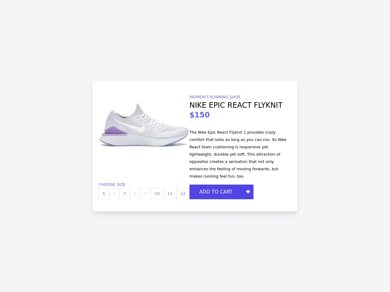
The preview of Simple Product Card ui component
To create a Simple Product Card using Tailwind CSS, we will use the following classes:
bg-white: sets the background color of the card to white.rounded-lg: rounds the corners of the card.shadow-md: adds a shadow to the card.w-full: sets the width of the card to 100%.h-full: sets the height of the card to 100%.object-cover: scales the image to cover the entire card.text-gray-900: sets the text color to gray-900.font-bold: sets the font weight to bold.text-lg: sets the font size to large.p-4: adds padding to the card.flex: sets the display property to flex.flex-col: sets the flex direction to column.justify-between: aligns the items in the card vertically.mt-2: adds margin to the top of the card.
Free download of the Simple Product Card's source code
The source code of Simple Product Card ui component
To create a Simple Product Card using Tailwind CSS, we will use the following HTML code:
<main class="grid place-items-center h-screen bg-gray-100">
  <section class="flex flex-col md:flex-row gap-11 py-10 px-5 bg-white rounded-md shadow-lg w-3/4 md:max-w-2xl">
    <div class="text-indigo-500 flex flex-col justify-between">
      <img src="https://images.stockx.com/Nike-Epic-React-Flyknit-2-White-Pink-Foam-W-Product.jpg?fit=fill&bg=FFFFFF&w=700&h=500&auto=format,compress&q=90&dpr=2&trim=color&updated_at=1603481985" alt="" />
      <div>
        <small class="uppercase">choose size</small>
      <div class="flex flex-wrap md:flex-nowrap gap-1">
        <a href="javascript:void(0);" class="grid place-items-center border px-3 py-2 hover:bg-indigo-500 hover:text-white transition">
          <small>5</small>
        </a>
        <a href="javascript:void(0);" class="grid place-items-center border px-3 py-2 cursor-not-allowed text-gray-300 transition">
          <small>6</small>
        </a>
        <a href="javascript:void(0);" class="grid place-items-center border px-3 py-2 hover:bg-indigo-500 hover:text-white transition">
          <small>7</small>
        </a>
        <a href="javascript:void(0);" class="grid place-items-center border px-3 py-2 cursor-not-allowed text-gray-300 transition">
          <small>8</small>
        </a>
        <a href="javascript:void(0);" class="grid place-items-center border px-3 py-2 cursor-not-allowed text-gray-300 transition">
          <small>9</small>
        </a>
        <a href="javascript:void(0);" class="grid place-items-center border px-3 py-2 hover:bg-indigo-500 hover:text-white transition">
          <small>10</small>
        </a>
        <a href="javascript:void(0);" class="grid place-items-center border px-3 py-2 hover:bg-indigo-500 hover:text-white transition">
          <small>11</small>
        </a>
        <a href="javascript:void(0);" class="grid place-items-center border px-3 py-2 hover:bg-indigo-500 hover:text-white transition">
          <small>12</small>
        </a>
      </div>
      </div>
    </div>
    <div class="text-indigo-500">
      <small class="uppercase">women's running shoe</small>
      <h3 class="uppercase text-black text-2xl font-medium">nike epic react flyknit</h3>
      <h3 class="text-2xl font-semibold mb-7">$150</h3>
      <small class="text-black">The Nike Epic React Flyknit 1 provides crazy comfort that lasts as long as you can run. Its Nike React foam cushioning is responsive yet lightweight, durable yet soft. This attraction of opposites creates a sensation that not only enhances the feeling of moving forwards, but makes running feel fun, too.</small>
      <div class="flex gap-0.5 mt-4">
        <button id="addToCartButton" class="bg-indigo-600 hover:bg-indigo-500 focus:outline-none transition text-white uppercase px-8 py-3">add to cart</button>
        <button id="likeButton" class="bg-indigo-600 hover:bg-indigo-500 focus:outline-none transition text-white uppercase p-3">
          <svg xmlns="http://www.w3.org/2000/svg" width="12" height="12" fill="currentColor" class="bi bi-suit-heart-fill" viewBox="0 0 16 16">
  <path d="M4 1c2.21 0 4 1.755 4 3.92C8 2.755 9.79 1 12 1s4 1.755 4 3.92c0 3.263-3.234 4.414-7.608 9.608a.513.513 0 0 1-.784 0C3.234 9.334 0 8.183 0 4.92 0 2.755 1.79 1 4 1z"/>
</svg>
        </button>
      </div>
    </div>
  </section>
</main>

<script src="https://cdn.jsdelivr.net/npm/sweetalert2@10"></script>
<script>
    const likeButton = document.querySelector("#likeButton");
    const addToCartButton = document.querySelector("#addToCartButton");
    likeButton.addEventListener("click", ()=>{
        likeButton.classList.toggle("text-red-400")
    })
    addToCartButton.addEventListener("click", ()=>{
      const Toast = Swal.mixin({
  toast: true,
  position: 'top-end',
  showConfirmButton: false,
  timer: 3000,
  timerProgressBar: true,
  didOpen: (toast) => {
    toast.addEventListener('mouseenter', Swal.stopTimer)
    toast.addEventListener('mouseleave', Swal.resumeTimer)
  }
})

Toast.fire({
  icon: 'success',
  title: 'Added to cart'
})
    })

</script>
How to create a Simple Product Card with Tailwind CSS?
To create a Simple Product Card using Tailwind CSS, follow these steps:
- Create a new HTML file and add the following code:
<div class="bg-white rounded-lg shadow-md w-full h-full">
  <img src="product-image.jpg" alt="Product Image" class="w-full h-48 object-cover">
  <div class="p-4 flex flex-col justify-between h-full">
    <div>
      <h2 class="text-gray-900 font-bold text-lg">Product Name</h2>
      <p class="text-gray-900 mt-2">Product Description</p>
    </div>
    <div class="text-gray-900 font-bold text-lg">$99.99</div>
  </div>
</div>
- Replace
product-image.jpgwith the URL or path to your product image. - Customize the product name, description, and price by modifying the text inside the
<h2>and<p>tags and the text inside the<div>tag, respectively. - Save the file and open it in a web browser to see the Simple Product Card.
Conclusion
In this article, we have explored the most effective ways to create a Simple Product Card using Tailwind CSS. We have seen how Tailwind CSS provides a set of pre-defined classes that can be used to style a card quickly and easily. We have also seen how to customize the design of the card using Tailwind CSS. With these techniques, you can create beautiful and responsive Simple Product Cards for your e-commerce website.