- Published on
Advanced Guide: Build A Simple Navigation With Tailwind CSS

- What is Tailwind CSS?
- The description of Simple Navigation ui component
- Why use Tailwind CSS to create a Simple Navigation ui component?
- The preview of Simple Navigation ui component
- The source code of Simple Navigation ui component
- How to create a Simple Navigation with Tailwind CSS?
- Conclusion
As a FrontEnd technology blogger, you must have heard of Tailwind CSS. Tailwind CSS is a highly customizable, low-level CSS framework that gives you all of the building blocks you need to build bespoke designs without any annoying opinionated styles you have to fight to override. In this article, we will guide you through building a Simple Navigation ui component with Tailwind CSS.
What is Tailwind CSS?
Tailwind CSS is a utility-first CSS framework that provides a set of pre-defined CSS classes to build your UI components. Instead of writing custom CSS, you can use these classes to style your HTML elements. Tailwind CSS is highly customizable and can be configured to fit your project's specific needs.
The description of Simple Navigation ui component
A Simple Navigation is a UI component that provides a list of links to navigate to different pages of a website. It is usually placed at the top of the website and helps users easily access different pages. It is a basic UI component that is used in almost every website.
Why use Tailwind CSS to create a Simple Navigation ui component?
Tailwind CSS provides a set of pre-defined CSS classes that can be used to build a Simple Navigation ui component. It saves you time and effort by eliminating the need to write custom CSS. Tailwind CSS also provides a responsive design system that makes it easy to build a Simple Navigation ui component that looks good on all devices.
The preview of Simple Navigation ui component
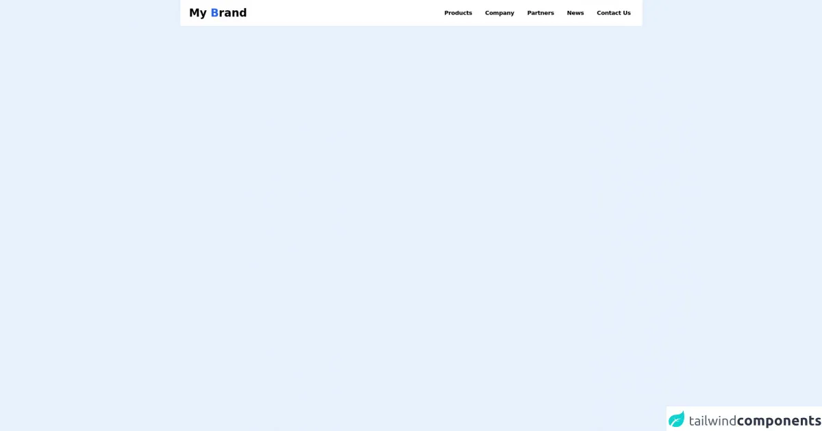
A Simple Navigation ui component typically consists of a list of links. It is usually placed at the top of the website. Here is a preview of what a Simple Navigation ui component built with Tailwind CSS might look like:
Free download of the Simple Navigation's source code
The source code of Simple Navigation ui component
To build a Simple Navigation ui component with Tailwind CSS, you need to use the pre-defined CSS classes provided by Tailwind CSS. Here is the source code for a Simple Navigation ui component built with Tailwind CSS:
<body>
    <nav
      class="bg-white dark:bg-black dark:text-white flex flex-col md:flex-row items-center md:justify-between px-6 py-4 border-b border-b-gray-60 shadow-sm max-w-screen-2xl mx-auto"
    >
      <!-- Logo -->
      <div>
        <h2 class="text-3xl font-bold">
          <a>My <span class="text-blue-600">B</span>rand</a>
        </h2>
      </div>
      <!-- /End Logo -->
      <div class="mt-5 md:mt-0">
        <ul class="flex flex-col md:flex-row md:space-x-5 w-full items-center">
          <li>
            <a
              class="font-semibold tracking-tight block cursor-pointer p-2 hover:text-blue-500 transition-colors duration-300"
              >Products</a
            >
          </li>
          <li>
            <a
              class="font-semibold tracking-tight block cursor-pointer p-2 hover:text-blue-500 transition-colors duration-300"
              >Company</a
            >
          </li>
          <li>
            <a
              class="font-semibold tracking-tight block cursor-pointer p-2 hover:text-blue-500 transition-colors duration-300"
              >Partners</a
            >
          </li>
          <li>
            <a
              class="font-semibold tracking-tight block cursor-pointer p-2 hover:text-blue-500 transition-colors duration-300"
              >News</a
            >
          </li>
          <li>
            <a
              class="font-semibold tracking-tight block cursor-pointer p-2 hover:text-blue-500 transition-colors duration-300"
              >Contact Us</a
            >
          </li>
        </ul>
      </div>
    </nav>
  </body>
How to create a Simple Navigation with Tailwind CSS?
To create a Simple Navigation with Tailwind CSS, follow these steps:
- Create a new HTML file and add a navigation element to it.
<nav class="bg-gray-800">
  <!-- Navigation links go here -->
</nav>
- Add a list element to the navigation element.
<nav class="bg-gray-800">
  <ul>
    <!-- Navigation links go here -->
  </ul>
</nav>
- Add list items to the list element and add links to them.
<nav class="bg-gray-800">
  <ul>
    <li><a href="#" class="text-white hover:bg-gray-700">Home</a></li>
    <li><a href="#" class="text-white hover:bg-gray-700">About</a></li>
    <li><a href="#" class="text-white hover:bg-gray-700">Contact</a></li>
  </ul>
</nav>
- Style the navigation element using Tailwind CSS classes.
<nav class="bg-gray-800">
  <ul class="flex">
    <li><a href="#" class="block px-3 py-2 text-white hover:bg-gray-700">Home</a></li>
    <li><a href="#" class="block px-3 py-2 text-white hover:bg-gray-700">About</a></li>
    <li><a href="#" class="block px-3 py-2 text-white hover:bg-gray-700">Contact</a></li>
  </ul>
</nav>
- Add responsive classes to make the navigation element responsive.
<nav class="bg-gray-800">
  <ul class="flex flex-wrap justify-center lg:justify-end">
    <li><a href="#" class="block px-3 py-2 text-white hover:bg-gray-700">Home</a></li>
    <li><a href="#" class="block px-3 py-2 text-white hover:bg-gray-700">About</a></li>
    <li><a href="#" class="block px-3 py-2 text-white hover:bg-gray-700">Contact</a></li>
  </ul>
</nav>
- Your Simple Navigation ui component is now complete!
Conclusion
In this article, we have guided you through building a Simple Navigation ui component with Tailwind CSS. We have explained what Tailwind CSS is, why you should use it, and how to build a Simple Navigation ui component using pre-defined CSS classes provided by Tailwind CSS. We hope this article has been helpful in your journey to becoming a better FrontEnd developer.