- Published on
The Ultimate Guide To Help You Create A Simple Navigation With Tailwind CSS
- What is Tailwind CSS?
- The description of Simple Navigation ui component
- Why use Tailwind CSS to create a Simple Navigation ui component?
- The preview of Simple Navigation ui component
- The source code of Simple Navigation ui component
- How to create a Simple Navigation with Tailwind CSS?
- Step 1: Create the HTML structure
- Step 2: Add Tailwind CSS classes
- Step 3: Customize the design
- Conclusion
As a FrontEnd technology blogger, you must have heard about Tailwind CSS, one of the most popular CSS frameworks in the market. It is a utility-first CSS framework that gives you complete control over the design of your website or application. In this article, we will guide you on how to create a simple navigation with Tailwind CSS.
What is Tailwind CSS?
Tailwind CSS is a utility-first CSS framework that allows you to create custom designs without writing any CSS code. It provides a set of pre-defined classes that you can use to style your HTML elements. With Tailwind CSS, you can create responsive designs, customize colors, fonts, and much more.
The description of Simple Navigation ui component
A navigation menu is an essential part of any website or application. It helps users navigate through different pages or sections of the website. A simple navigation menu consists of a list of links that are usually placed at the top of the page. It is a basic UI component that is used in almost every website or application.
Why use Tailwind CSS to create a Simple Navigation ui component?
Tailwind CSS is an excellent choice for creating a simple navigation menu. It provides a set of pre-defined classes that you can use to style your navigation menu. With Tailwind CSS, you can create a responsive navigation menu that looks great on all devices. You can also customize the colors, fonts, and other design elements of your navigation menu.
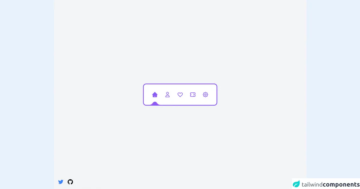
The preview of Simple Navigation ui component
To create a simple navigation menu with Tailwind CSS, you need to use the nav and ul HTML elements. You can use the flex and justify-between classes to align the navigation links to the left and right sides of the menu. You can also use the text-white and hover:text-gray-300 classes to style the links.
Free download of the Simple Navigation's source code
The source code of Simple Navigation ui component
To create a simple navigation menu with Tailwind CSS, you need to add the following HTML and CSS code to your project.
<script src="//unpkg.com/alpinejs" defer></script>
<div
class="flex items-center justify-center min-h-screen antialiased bg-gray-100"
>
<div
class="relative flex items-center px-6 overflow-hidden bg-white border-4 border-purple-500 h-28 rounded-2xl"
x-data="navigation"
>
<nav class="flex items-center justify-center gap-8">
<template x-for="(link, index) in links" x-key="index">
<a
href="#"
@click="setActiveLink($event, link.title, index)"
class="grid w-16 h-16 grid-cols-1 grid-rows-1"
>
<span class="sr-only" x-text="link.title"></span>
<div
class="col-[1/1] row-[1/1] flex items-center justify-center w-16 h-16"
x-html="link.inActiveIcon"
></div>
<div
class="col-[1/1] row-[1/1] flex items-center justify-center w-16 h-16 transition-opacity duration-300"
:class="activeLink == link.title ? 'opacity-100 pointer-events-auto' : 'opacity-0 pointer-events-none'"
x-html="link.activeIcon"
></div>
</a>
</template>
</nav>
<div
id="indicator"
class="absolute w-6 h-8 transition-all duration-300 bg-purple-500 rounded-full -bottom-4 left-11"
>
<div
style="box-shadow: 0 10px 0 #a855f7"
class="absolute w-5 h-5 bg-white -left-4 bottom-1/2 rounded-br-3xl"
></div>
<div
style="box-shadow: 0 10px 0 #a855f7"
class="absolute w-5 h-5 bg-white -right-4 bottom-1/2 rounded-bl-3xl"
></div>
</div>
</div>
</div>
<!-- Author links -->
<div class="fixed flex items-center space-x-4 bottom-5 left-5">
<a href="https://twitter.com/ak_kamona" target="_blank" class="transition-transform transform hover:scale-125">
<span class="sr-only">Twitter</span>
<svg
aria-hidden="true"
class="w-8 h-8 text-blue-500"
fill="currentColor"
xmlns="http://www.w3.org/2000/svg"
viewBox="0 0 24 24"
>
<path
d="M19.633,7.997c0.013,0.175,0.013,0.349,0.013,0.523c0,5.325-4.053,11.461-11.46,11.461c-2.282,0-4.402-0.661-6.186-1.809 c0.324,0.037,0.636,0.05,0.973,0.05c1.883,0,3.616-0.636,5.001-1.721c-1.771-0.037-3.255-1.197-3.767-2.793 c0.249,0.037,0.499,0.062,0.761,0.062c0.361,0,0.724-0.05,1.061-0.137c-1.847-0.374-3.23-1.995-3.23-3.953v-0.05 c0.537,0.299,1.16,0.486,1.82,0.511C3.534,9.419,2.823,8.184,2.823,6.787c0-0.748,0.199-1.434,0.548-2.032 c1.983,2.443,4.964,4.04,8.306,4.215c-0.062-0.3-0.1-0.611-0.1-0.923c0-2.22,1.796-4.028,4.028-4.028 c1.16,0,2.207,0.486,2.943,1.272c0.91-0.175,1.782-0.512,2.556-0.973c-0.299,0.935-0.936,1.721-1.771,2.22 c0.811-0.088,1.597-0.312,2.319-0.624C21.104,6.712,20.419,7.423,19.633,7.997z"
></path>
</svg>
</a>
<a href="https://github.com/Kamona-WD" target="_blank" class="transition-transform transform hover:scale-125">
<span class="sr-only">Github</span>
<svg
aria-hidden="true"
class="w-8 h-8 text-black"
fill="currentColor"
xmlns="http://www.w3.org/2000/svg"
viewBox="0 0 24 24"
>
<path
fill-rule="evenodd"
clip-rule="evenodd"
d="M12.026,2c-5.509,0-9.974,4.465-9.974,9.974c0,4.406,2.857,8.145,6.821,9.465 c0.499,0.09,0.679-0.217,0.679-0.481c0-0.237-0.008-0.865-0.011-1.696c-2.775,0.602-3.361-1.338-3.361-1.338 c-0.452-1.152-1.107-1.459-1.107-1.459c-0.905-0.619,0.069-0.605,0.069-0.605c1.002,0.07,1.527,1.028,1.527,1.028 c0.89,1.524,2.336,1.084,2.902,0.829c0.091-0.645,0.351-1.085,0.635-1.334c-2.214-0.251-4.542-1.107-4.542-4.93 c0-1.087,0.389-1.979,1.024-2.675c-0.101-0.253-0.446-1.268,0.099-2.64c0,0,0.837-0.269,2.742,1.021 c0.798-0.221,1.649-0.332,2.496-0.336c0.849,0.004,1.701,0.115,2.496,0.336c1.906-1.291,2.742-1.021,2.742-1.021 c0.545,1.372,0.203,2.387,0.099,2.64c0.64,0.696,1.024,1.587,1.024,2.675c0,3.833-2.33,4.675-4.552,4.922 c0.355,0.308,0.675,0.916,0.675,1.846c0,1.334-0.012,2.41-0.012,2.737c0,0.267,0.178,0.577,0.687,0.479 C19.146,20.115,22,16.379,22,11.974C22,6.465,17.535,2,12.026,2z"
></path>
</svg>
</a>
</div>
<script>
const navigation = () => {
return {
activeLink: "home",
links: [
{
title: "home",
inActiveIcon: `
<svg
aria-hidden="true"
class="w-8 h-8 text-purple-500"
fill="none"
stroke="currentColor"
viewBox="0 0 24 24"
xmlns="http://www.w3.org/2000/svg"
>
<path
stroke-linecap="round"
stroke-linejoin="round"
stroke-width="2"
d="M3 12l2-2m0 0l7-7 7 7M5 10v10a1 1 0 001 1h3m10-11l2 2m-2-2v10a1 1 0 01-1 1h-3m-6 0a1 1 0 001-1v-4a1 1 0 011-1h2a1 1 0 011 1v4a1 1 0 001 1m-6 0h6"
></path>
</svg>
`,
activeIcon: `
<svg
aria-hidden="true"
class="w-8 h-8 text-purple-500"
fill="currentColor"
viewBox="0 0 20 20"
xmlns="http://www.w3.org/2000/svg"
>
<path
d="M10.707 2.293a1 1 0 00-1.414 0l-7 7a1 1 0 001.414 1.414L4 10.414V17a1 1 0 001 1h2a1 1 0 001-1v-2a1 1 0 011-1h2a1 1 0 011 1v2a1 1 0 001 1h2a1 1 0 001-1v-6.586l.293.293a1 1 0 001.414-1.414l-7-7z"
></path>
</svg>
`,
},
{
title: "user profile",
inActiveIcon: `
<svg
aria-hidden="true"
class="w-8 h-8 text-purple-500"
fill="none"
stroke="currentColor"
viewBox="0 0 24 24"
xmlns="http://www.w3.org/2000/svg"
>
<path
stroke-linecap="round"
stroke-linejoin="round"
stroke-width="2"
d="M16 7a4 4 0 11-8 0 4 4 0 018 0zM12 14a7 7 0 00-7 7h14a7 7 0 00-7-7z"
></path>
</svg>
`,
activeIcon: `
<svg
aria-hidden="true"
class="w-8 h-8 text-purple-500"
fill="currentColor"
viewBox="0 0 20 20"
xmlns="http://www.w3.org/2000/svg"
>
<path
fill-rule="evenodd"
d="M10 9a3 3 0 100-6 3 3 0 000 6zm-7 9a7 7 0 1114 0H3z"
clip-rule="evenodd"
></path>
</svg>
`,
},
{
title: "likes",
inActiveIcon: `
<svg
aria-hidden="true"
class="w-8 h-8 text-purple-500"
fill="none"
stroke="currentColor"
viewBox="0 0 24 24"
xmlns="http://www.w3.org/2000/svg"
>
<path
stroke-linecap="round"
stroke-linejoin="round"
stroke-width="2"
d="M4.318 6.318a4.5 4.5 0 000 6.364L12 20.364l7.682-7.682a4.5 4.5 0 00-6.364-6.364L12 7.636l-1.318-1.318a4.5 4.5 0 00-6.364 0z"
></path>
</svg>
`,
activeIcon: `
<svg
aria-hidden="true"
class="w-8 h-8 text-purple-500"
fill="currentColor"
viewBox="0 0 20 20"
xmlns="http://www.w3.org/2000/svg"
>
<path
fill-rule="evenodd"
d="M3.172 5.172a4 4 0 015.656 0L10 6.343l1.172-1.171a4 4 0 115.656 5.656L10 17.657l-6.828-6.829a4 4 0 010-5.656z"
clip-rule="evenodd"
></path>
</svg>
`,
},
{
title: "tickets",
inActiveIcon: `
<svg
aria-hidden="true"
class="w-8 h-8 text-purple-500"
fill="none"
stroke="currentColor"
viewBox="0 0 24 24"
xmlns="http://www.w3.org/2000/svg"
>
<path
stroke-linecap="round"
stroke-linejoin="round"
stroke-width="2"
d="M15 5v2m0 4v2m0 4v2M5 5a2 2 0 00-2 2v3a2 2 0 110 4v3a2 2 0 002 2h14a2 2 0 002-2v-3a2 2 0 110-4V7a2 2 0 00-2-2H5z"
></path>
</svg>
`,
activeIcon: `
<svg
aria-hidden="true"
class="w-8 h-8 text-purple-500"
fill="currentColor"
viewBox="0 0 20 20"
xmlns="http://www.w3.org/2000/svg"
>
<path
d="M2 6a2 2 0 012-2h12a2 2 0 012 2v2a2 2 0 100 4v2a2 2 0 01-2 2H4a2 2 0 01-2-2v-2a2 2 0 100-4V6z"
></path>
</svg>
`,
},
{
title: "settings",
inActiveIcon: `
<svg
aria-hidden="true"
class="w-8 h-8 text-purple-500"
fill="none"
stroke="currentColor"
viewBox="0 0 24 24"
xmlns="http://www.w3.org/2000/svg"
>
<path
stroke-linecap="round"
stroke-linejoin="round"
stroke-width="2"
d="M10.325 4.317c.426-1.756 2.924-1.756 3.35 0a1.724 1.724 0 002.573 1.066c1.543-.94 3.31.826 2.37 2.37a1.724 1.724 0 001.065 2.572c1.756.426 1.756 2.924 0 3.35a1.724 1.724 0 00-1.066 2.573c.94 1.543-.826 3.31-2.37 2.37a1.724 1.724 0 00-2.572 1.065c-.426 1.756-2.924 1.756-3.35 0a1.724 1.724 0 00-2.573-1.066c-1.543.94-3.31-.826-2.37-2.37a1.724 1.724 0 00-1.065-2.572c-1.756-.426-1.756-2.924 0-3.35a1.724 1.724 0 001.066-2.573c-.94-1.543.826-3.31 2.37-2.37.996.608 2.296.07 2.572-1.065z"
></path>
<path
stroke-linecap="round"
stroke-linejoin="round"
stroke-width="2"
d="M15 12a3 3 0 11-6 0 3 3 0 016 0z"
></path>
</svg>
`,
activeIcon: `
<svg
aria-hidden="true"
class="w-8 h-8 text-purple-500"
fill="currentColor"
viewBox="0 0 20 20"
xmlns="http://www.w3.org/2000/svg"
>
<path
fill-rule="evenodd"
d="M11.49 3.17c-.38-1.56-2.6-1.56-2.98 0a1.532 1.532 0 01-2.286.948c-1.372-.836-2.942.734-2.106 2.106.54.886.061 2.042-.947 2.287-1.561.379-1.561 2.6 0 2.978a1.532 1.532 0 01.947 2.287c-.836 1.372.734 2.942 2.106 2.106a1.532 1.532 0 012.287.947c.379 1.561 2.6 1.561 2.978 0a1.533 1.533 0 012.287-.947c1.372.836 2.942-.734 2.106-2.106a1.533 1.533 0 01.947-2.287c1.561-.379 1.561-2.6 0-2.978a1.532 1.532 0 01-.947-2.287c.836-1.372-.734-2.942-2.106-2.106a1.532 1.532 0 01-2.287-.947zM10 13a3 3 0 100-6 3 3 0 000 6z"
clip-rule="evenodd"
></path>
</svg>
`,
},
],
setActiveLink(e, link, n) {
e.preventDefault();
this.activeLink = link;
document.querySelector(
"#indicator"
).style.transform = `translateX(calc(${96 * n}px))`;
},
};
};
</script>
How to create a Simple Navigation with Tailwind CSS?
Now that you have an idea of what a simple navigation menu is and why Tailwind CSS is the best choice for creating it, let's dive into the steps to create a simple navigation menu with Tailwind CSS.
Step 1: Create the HTML structure
The first step is to create the HTML structure for your navigation menu. You need to use the nav and ul HTML elements to create a list of links. Here is the HTML code for a simple navigation menu:
<nav class="bg-blue-500">
  <ul class="flex justify-between px-4 py-3">
    <li>
      <a href="#" class="text-white hover:text-gray-300">Home</a>
    </li>
    <li>
      <a href="#" class="text-white hover:text-gray-300">About</a>
    </li>
    <li>
      <a href="#" class="text-white hover:text-gray-300">Contact</a>
    </li>
  </ul>
</nav>
In this code, we have used the bg-blue-500 class to set the background color of the navigation menu to blue.
Step 2: Add Tailwind CSS classes
The next step is to add Tailwind CSS classes to style your navigation menu. You can use the flex and justify-between classes to align the navigation links to the left and right sides of the menu. You can also use the text-white and hover:text-gray-300 classes to style the links. Here is the updated HTML code:
<nav class="bg-blue-500">
  <ul class="flex justify-between px-4 py-3">
    <li>
      <a href="#" class="text-white hover:text-gray-300">Home</a>
    </li>
    <li>
      <a href="#" class="text-white hover:text-gray-300">About</a>
    </li>
    <li>
      <a href="#" class="text-white hover:text-gray-300">Contact</a>
    </li>
  </ul>
</nav>
Step 3: Customize the design
The final step is to customize the design of your navigation menu. You can use the Tailwind CSS documentation to find the classes that you need to create your desired design. For example, you can use the text-lg class to increase the font size of your links. Here is the updated HTML code:
<nav class="bg-blue-500">
  <ul class="flex justify-between px-4 py-3">
    <li>
      <a href="#" class="text-white hover:text-gray-300 text-lg">Home</a>
    </li>
    <li>
      <a href="#" class="text-white hover:text-gray-300 text-lg">About</a>
    </li>
    <li>
      <a href="#" class="text-white hover:text-gray-300 text-lg">Contact</a>
    </li>
  </ul>
</nav>
Conclusion
In this article, we have shown you how to create a simple navigation menu with Tailwind CSS. We have explained what Tailwind CSS is, why it is the best choice for creating a simple navigation menu, and how to create a navigation menu step by step. With Tailwind CSS, you can create a custom design for your navigation menu without writing any CSS code. We hope this guide has been helpful to you and that you can use it to create your own navigation menu.