- Published on
6 Ideas To Help You Create A Simple Modern Modals With Tailwind CSS Like A Pro
- What is Tailwind CSS?
- The description of Simple Modern Modals ui component
- Why use Tailwind CSS to create a Simple Modern Modals ui component?
- The preview of Simple Modern Modals ui component.
- The source code of Simple Modern Modals ui component.
- How to create a Simple Modern Modals with Tailwind CSS?
- 1. Use the fixed class to set the position of the modal
- 2. Use the inset-0 class to cover the entire screen
- 3. Use the bg-gray-900 class to set the background color of the modal
- 4. Use the opacity-50 class to set the opacity of the modal
- 5. Use the z-50 class to set the z-index of the modal
- 6. Use the flex class to center the modal content
- Conclusion
What is Tailwind CSS?
Tailwind CSS is a utility-first CSS framework that helps you quickly build custom designs. It provides a set of pre-defined CSS classes that you can use to style your HTML elements. With Tailwind CSS, you don't have to write custom CSS code from scratch, which can save you a lot of time and effort.
The description of Simple Modern Modals ui component
A modal is a UI component that appears on top of the page content and requires user interaction before it can be dismissed. A Simple Modern Modal is a modal that has a clean and modern design that fits well with any website or application.
Why use Tailwind CSS to create a Simple Modern Modals ui component?
Tailwind CSS provides a set of pre-defined CSS classes that you can use to create a Simple Modern Modal quickly and easily. With Tailwind CSS, you don't have to write custom CSS code from scratch. You can use the pre-defined classes to style your modal and make it look modern and professional.
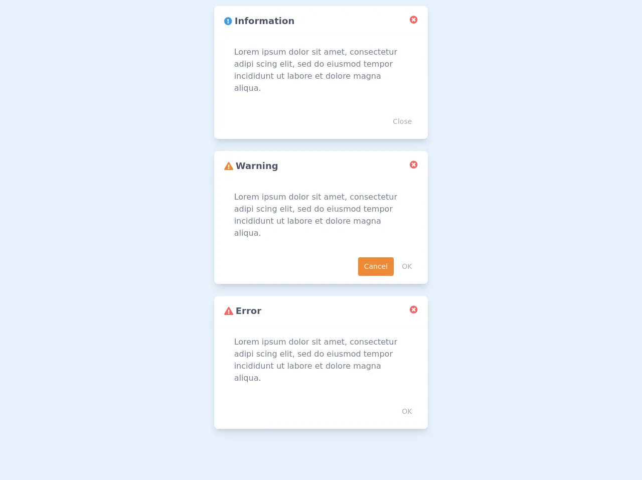
The preview of Simple Modern Modals ui component.
To create a Simple Modern Modal with Tailwind CSS, you can use the following classes:
fixed: This class sets the position of the modal to fixed, so it stays in the same position even when the user scrolls the page.inset-0: This class sets the top, right, bottom, and left positions of the modal to 0, so it covers the entire screen.bg-gray-900: This class sets the background color of the modal to gray.opacity-50: This class sets the opacity of the modal to 50%, so the page content is visible behind the modal.z-50: This class sets the z-index of the modal to 50, so it appears on top of other elements on the page.
Free download of the Simple Modern Modals's source code
The source code of Simple Modern Modals ui component.
To create a Simple Modern Modal with Tailwind CSS, you can use the following HTML code:
<div class="fixed inset-0 bg-gray-900 opacity-50 z-50"></div>
<div class="fixed inset-0 flex items-center justify-center z-50">
  <div class="bg-white p-6 rounded-lg shadow-lg">
    <h2 class="text-lg font-medium mb-4">Modal Title</h2>
    <p class="mb-4">Modal Content</p>
    <button class="bg-blue-500 hover:bg-blue-700 text-white font-bold py-2 px-4 rounded">Close</button>
  </div>
</div>
<link rel="stylesheet" href="https://pro.fontawesome.com/releases/v5.10.0/css/all.css" integrity="sha384-AYmEC3Yw5cVb3ZcuHtOA93w35dYTsvhLPVnYs9eStHfGJvOvKxVfELGroGkvsg+p" crossorigin="anonymous"/>
<div class="flex flex-col justify-center items-center">
  <!-- Information Modal -->
	<div class="md:w-1/3 sm:w-full rounded-lg shadow-lg bg-white my-3">
        <div class="flex justify-between border-b border-gray-100 px-5 py-4">
      		<div>
              <i class="fas fa-exclamation-circle text-blue-500"></i>
              <span class="font-bold text-gray-700 text-lg">Information</span>
          	</div>
          <div>
              <button><i class="fa fa-times-circle text-red-500 hover:text-red-600 transition duration-150"></i></button>
          	</div>
      	</div>

      	<div class="px-10 py-5 text-gray-600">
          Lorem ipsum dolor sit amet, consectetur adipi scing elit, sed do eiusmod tempor incididunt ut labore et dolore magna aliqua.
      	</div>

      	<div class="px-5 py-4 flex justify-end">
          <button class="text-sm py-2 px-3 text-gray-500 hover:text-gray-600 transition duration-150">Close</button>
      	</div>
	</div>

  	<!-- Warning Modal -->
	<div class="md:w-1/3 sm:w-full rounded-lg shadow-lg bg-white my-3">
        <div class="flex justify-between border-b border-gray-100 px-5 py-4">
      		<div>
              <i class="fa fa-exclamation-triangle text-orange-500"></i>
              <span class="font-bold text-gray-700 text-lg">Warning</span>
          	</div>
          	<div>
              <button><i class="fa fa-times-circle text-red-500 hover:text-red-600 transition duration-150"></i></button>
          	</div>
      	</div>

      	<div class="px-10 py-5 text-gray-600">
          Lorem ipsum dolor sit amet, consectetur adipi scing elit, sed do eiusmod tempor incididunt ut labore et dolore magna aliqua.
      	</div>

      	<div class="px-5 py-4 flex justify-end">
          <button class="bg-orange-500 mr-1 rounded text-sm py-2 px-3 text-white hover:bg-orange-600 transition duration-150">Cancel</button>
          <button class="text-sm py-2 px-3 text-gray-500 hover:text-gray-600 transition duration-150">OK</button>
      	</div>
	</div>

  	<!-- Error Modal -->
	<div class="md:w-1/3 sm:w-full rounded-lg shadow-lg bg-white my-3">
        <div class="flex justify-between border-b border-gray-100 px-5 py-4">
      		<div>
              <i class="fa fa-exclamation-triangle text-red-500"></i>
              <span class="font-bold text-gray-700 text-lg">Error</span>
          	</div>
          	<div>
              <button><i class="fa fa-times-circle text-red-500 hover:text-red-600 transition duration-150"></i></button>
          	</div>
      	</div>

      	<div class="px-10 py-5 text-gray-600">
          Lorem ipsum dolor sit amet, consectetur adipi scing elit, sed do eiusmod tempor incididunt ut labore et dolore magna aliqua.
      	</div>

      	<div class="px-5 py-4 flex justify-end">
          <button class="text-sm py-2 px-3 text-gray-500 hover:text-gray-600 transition duration-150">OK</button>
      	</div>
	</div>
</div>
How to create a Simple Modern Modals with Tailwind CSS?
Here are six ideas to help you create a Simple Modern Modal with Tailwind CSS like a pro:
1. Use the fixed class to set the position of the modal
The fixed class sets the position of the modal to fixed, so it stays in the same position even when the user scrolls the page. This is important because you want the modal to stay in the same position on the screen, even if the user scrolls the page.
2. Use the inset-0 class to cover the entire screen
The inset-0 class sets the top, right, bottom, and left positions of the modal to 0, so it covers the entire screen. This is important because you want the modal to cover the entire screen, so the user can't interact with anything else on the page while the modal is open.
3. Use the bg-gray-900 class to set the background color of the modal
The bg-gray-900 class sets the background color of the modal to gray. This is important because you want the modal to have a background color that contrasts with the content on the page, so the user can focus on the modal content.
4. Use the opacity-50 class to set the opacity of the modal
The opacity-50 class sets the opacity of the modal to 50%, so the page content is visible behind the modal. This is important because you want the user to be able to see the page content behind the modal, but you also want the modal to be visible enough that the user can focus on the modal content.
5. Use the z-50 class to set the z-index of the modal
The z-50 class sets the z-index of the modal to 50, so it appears on top of other elements on the page. This is important because you want the modal to appear on top of other elements on the page, so the user can focus on the modal content.
6. Use the flex class to center the modal content
The flex class centers the modal content vertically and horizontally. This is important because you want the modal content to be centered on the screen, so the user can focus on the modal content.
Conclusion
Creating a Simple Modern Modal with Tailwind CSS is easy and straightforward. By using the pre-defined CSS classes that Tailwind CSS provides, you can create a modal that has a clean and modern design that fits well with any website or application. With these six ideas, you can create a Simple Modern Modal with Tailwind CSS like a pro.