- Published on
Learn How To Make A simple menu With Tailwind CSS Like an Expert
- What is Tailwind CSS?
- The description of simple menu UI component
- Why use Tailwind CSS to create a simple menu UI component?
- The preview of simple menu UI component
- The source code of simple menu UI component
- How to create a simple menu with Tailwind CSS?
- Conclusion
As a FrontEnd technology blogger, you are always looking for ways to improve your skills and stay up-to-date with the latest trends in web development. One of the most popular CSS frameworks today is Tailwind CSS. In this article, we will explore how to create a simple menu with Tailwind CSS, and why it is a great choice for building user interfaces.
What is Tailwind CSS?
Tailwind CSS is a utility-first CSS framework that allows you to style your web pages by applying pre-defined classes to HTML elements. It provides a set of pre-designed styles that you can use to quickly build user interfaces without having to write custom CSS code. Tailwind CSS is highly customizable and allows you to create your own styles by configuring its core settings.
The description of simple menu UI component
A simple menu is a user interface component that allows users to navigate through different sections of a website or application. It typically consists of a list of links that are displayed horizontally or vertically, depending on the design. A simple menu can be styled in many ways, depending on the requirements of your project.
Why use Tailwind CSS to create a simple menu UI component?
Tailwind CSS is a great choice for creating a simple menu UI component because it provides a set of pre-designed styles that you can use to quickly build your menu. You can customize the styles to fit your project's requirements by configuring Tailwind's core settings. This saves you time and effort compared to writing custom CSS code from scratch.
Another advantage of using Tailwind CSS is that it is highly responsive. This means that your menu will look great on different screen sizes and devices. Tailwind CSS provides responsive classes that allow you to adjust the layout and styling of your menu based on the screen size.
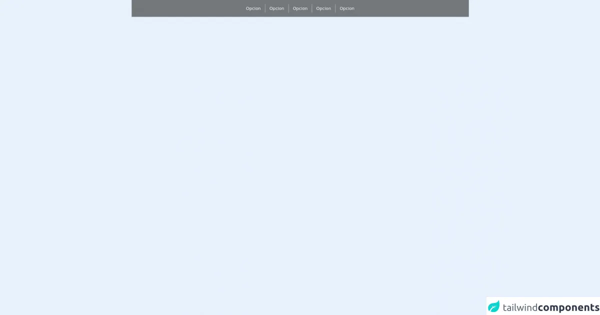
The preview of simple menu UI component
Here is a preview of what our simple menu UI component will look like:
Free download of the simple menu's source code
The source code of simple menu UI component
Here is the source code for our simple menu UI component:
<div class="h-16 w-full bg-black bg-opacity-50">
        <div class="w-full h-full flex justify-center items-center">
            <div
                class="flex h-full items-center  hover:bg-black hover:bg-opacity-50">
                <div class="mx-4 text-white">Opcion</div>
                <div class=" h-8 w-px bg-gray-300"></div>
            </div>
            <div class="flex h-full items-center  hover:bg-black hover:bg-opacity-50">
                <div class="mx-4 text-white">Opcion</div>
                <div class=" h-8 w-px bg-gray-300"></div>
            </div>
            <div class="flex h-full items-center  hover:bg-black hover:bg-opacity-50">
                <div class="mx-4 text-white">Opcion</div>
                <div class=" h-8 w-px bg-gray-300"></div>
            </div>
            <div class="flex h-full items-center  hover:bg-black hover:bg-opacity-50">
                <div class="mx-4 text-white">Opcion</div>
                <div class=" h-8 w-px bg-gray-300"></div>
            </div>
            <div class="flex h-full  items-center hover:bg-black hover:bg-opacity-50">
                <div class="mx-4 text-white">Opcion</div>
            </div>
        </div>
    </div>
How to create a simple menu with Tailwind CSS?
To create a simple menu with Tailwind CSS, follow these steps:
- Create a new HTML file and add the following code:
<nav class="bg-gray-800">
  <div class="max-w-7xl mx-auto px-2 sm:px-6 lg:px-8">
    <div class="flex items-center justify-between h-16">
      <div class="flex items-center">
        <div class="flex-shrink-0">
          <img class="h-8 w-8" src="https://tailwindui.com/img/logos/workflow-mark-indigo-500.svg" alt="Workflow">
        </div>
        <div class="hidden md:block">
          <div class="ml-10 flex items-baseline space-x-4">
            <a href="#" class="text-gray-300 hover:bg-gray-700 hover:text-white px-3 py-2 rounded-md text-sm font-medium">Dashboard</a>
            <a href="#" class="text-gray-300 hover:bg-gray-700 hover:text-white px-3 py-2 rounded-md text-sm font-medium">Team</a>
            <a href="#" class="text-gray-300 hover:bg-gray-700 hover:text-white px-3 py-2 rounded-md text-sm font-medium">Projects</a>
            <a href="#" class="text-gray-300 hover:bg-gray-700 hover:text-white px-3 py-2 rounded-md text-sm font-medium">Calendar</a>
          </div>
        </div>
      </div>
      <div class="-mr-2 flex md:hidden">
        <button type="button" class="bg-gray-800 inline-flex items-center justify-center p-2 rounded-md text-gray-400 hover:text-white hover:bg-gray-700 focus:outline-none focus:ring-2 focus:ring-offset-2 focus:ring-offset-gray-800 focus:ring-white" aria-controls="mobile-menu" aria-expanded="false">
          <span class="sr-only">Open main menu</span>
          <!-- Heroicon name: menu -->
          <svg class="block h-6 w-6" xmlns="http://www.w3.org/2000/svg" fill="none" viewBox="0 0 24 24" stroke="currentColor" aria-hidden="true">
            <path stroke-linecap="round" stroke-linejoin="round" stroke-width="2" d="M4 6h16M4 12h16M4 18h16"></path>
          </svg>
          <!-- Heroicon name: x -->
          <svg class="hidden h-6 w-6" xmlns="http://www.w3.org/2000/svg" fill="none" viewBox="0 0 24 24" stroke="currentColor" aria-hidden="true">
            <path stroke-linecap="round" stroke-linejoin="round" stroke-width="2" d="M6 18L18 6M6 6l12 12"></path>
          </svg>
        </button>
      </div>
    </div>
  </div>

  <div class="md:hidden" id="mobile-menu">
    <div class="px-2 pt-2 pb-3 space-y-1 sm:px-3">
      <a href="#" class="text-gray-300 hover:bg-gray-700 hover:text-white block px-3 py-2 rounded-md text-base font-medium">Dashboard</a>
      <a href="#" class="text-gray-300 hover:bg-gray-700 hover:text-white block px-3 py-2 rounded-md text-base font-medium">Team</a>
      <a href="#" class="text-gray-300 hover:bg-gray-700 hover:text-white block px-3 py-2 rounded-md text-base font-medium">Projects</a>
      <a href="#" class="text-gray-300 hover:bg-gray-700 hover:text-white block px-3 py-2 rounded-md text-base font-medium">Calendar</a>
    </div>
  </div>
</nav>
In the
navelement, we have added thebg-gray-800class to set the background color of the menu to gray. We have also added themax-w-7xlclass to set the maximum width of the menu to 7xl (which is a predefined value in Tailwind CSS).Inside the
navelement, we have added adivelement with theflexclass to create a horizontal layout for the menu. We have also added theitems-centerandjustify-betweenclasses to center the items and create space between them.Inside the
divelement, we have added anotherdivelement with theflexclass to create a block of content that contains the logo and the links. We have also added theitems-centerclass to center the items vertically.Inside the second
divelement, we have added adivelement with theflex-shrink-0class to create a block for the logo. We have also added theh-8andw-8classes to set the height and width of the logo.Inside the second
divelement, we have added anotherdivelement with thehiddenandmd:blockclasses to hide the links on small screens and show them on medium screens and above.Inside the third
divelement, we have added adivelement with theml-10class to create space between the logo and the links. We have also added theflexanditems-baselineclasses to align the links with the baseline of the logo.Inside the fourth
divelement, we have added fouraelements with thetext-gray-300,hover:bg-gray-700,hover:text-white,px-3,py-2,rounded-md,text-sm, andfont-mediumclasses to style the links. We have also added thehrefattribute to specify the destination of each link.Inside the
navelement, we have added anotherdivelement with the-mr-2,flex, andmd:hiddenclasses to create a button for the mobile menu. We have also added thearia-controlsandaria-expandedattributes to specify the target of the mobile menu.Inside the fifth
divelement, we have added abuttonelement with thebg-gray-800,inline-flex,items-center,justify-center,p-2,rounded-md,text-gray-400,hover:text-white,hover:bg-gray-700,focus:outline-none,focus:ring-2,focus:ring-offset-2,focus:ring-offset-gray-800, andfocus:ring-whiteclasses to style the mobile menu button. We have also added thetypeattribute to specify the type of the button.Inside the
buttonelement, we have added twosvgelements with theblockandhiddenclasses to create the menu icon and the close icon. We have also added thexmlns,fill,viewBox,stroke, andaria-hiddenattributes to specify the properties of the icons. We have also added thepathelement inside eachsvgelement to define the shape of the icons.Finally, we have added another
divelement with themd:hiddenandidattributes to create the mobile menu. Inside this element, we have added fouraelements with the same classes as before to style the links.
Conclusion
In this article, we have learned how to create a simple menu with Tailwind CSS. We have seen how Tailwind CSS can save us time and effort by providing pre-designed styles that we can customize to fit our project's requirements. We have also seen how Tailwind CSS provides responsive classes that allow us to create menus that look great on different screen sizes and devices. With this knowledge, you can now create your own menus and user interfaces using Tailwind CSS.