- Published on
Here Are 6 Ways To Create A Simple login screen With Tailwind CSS
- What is Tailwind CSS?
- The description of Simple login screen ui component
- Why use Tailwind CSS to create a Simple login screen ui component?
- The preview of Simple login screen ui component
- The source code of Simple login screen ui component
- How to create a Simple login screen with Tailwind CSS?
- 1. Use the pre-defined form classes
- 2. Use custom form classes
- 3. Use a custom background color
- 4. Use a custom font
- 5. Use a custom button color
- 6. Use a custom form size
- Conclusion
As a FrontEnd technology blogger, I am always looking for ways to make my website more user-friendly and visually appealing. One of the best ways to do this is by using Tailwind CSS to create a simple login screen. In this article, I will show you six ways to create a simple login screen with Tailwind CSS.
What is Tailwind CSS?
Tailwind CSS is a utility-first CSS framework that allows you to quickly and easily create custom designs for your website. It provides a set of pre-defined CSS classes that you can use to style your HTML elements. With Tailwind CSS, you can create complex layouts and designs without having to write a lot of custom CSS.
The description of Simple login screen ui component
A simple login screen is a user interface component that allows users to log in to a website or application. It typically consists of a form with two input fields for the user's email or username and password, as well as a submit button to submit the form. The login screen may also include links to reset the password or create a new account.
Why use Tailwind CSS to create a Simple login screen ui component?
Tailwind CSS is an excellent choice for creating a simple login screen because it allows you to quickly and easily style your HTML elements using pre-defined CSS classes. This means that you can create a custom design for your login screen without having to write a lot of custom CSS code. Tailwind CSS also provides responsive design classes, which means that your login screen will look great on any device.
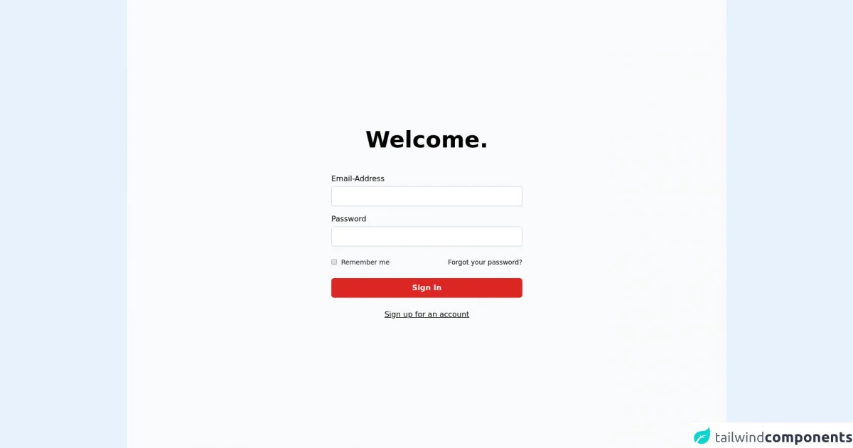
The preview of Simple login screen ui component
Creating a simple login screen with Tailwind CSS is easy. You can use a combination of pre-defined CSS classes to style your HTML elements. Here is an example of what a simple login screen might look like:
Free download of the Simple login screen's source code
The source code of Simple login screen ui component
Here is the source code for the simple login screen:
<div class="w-full min-h-screen bg-gray-50 flex flex-col sm:justify-center items-center pt-6 sm:pt-0">
  <div class="w-full sm:max-w-md p-5 mx-auto">
    <h2 class="mb-12 text-center text-5xl font-extrabold">Welcome.</h2>
    <form>
      <div class="mb-4">
        <label class="block mb-1" for="email">Email-Address</label>
        <input id="email" type="text" name="email" class="py-2 px-3 border border-gray-300 focus:border-red-300 focus:outline-none focus:ring focus:ring-red-200 focus:ring-opacity-50 rounded-md shadow-sm disabled:bg-gray-100 mt-1 block w-full" />
      </div>
      <div class="mb-4">
        <label class="block mb-1" for="password">Password</label>
        <input id="password" type="password" name="password" class="py-2 px-3 border border-gray-300 focus:border-red-300 focus:outline-none focus:ring focus:ring-red-200 focus:ring-opacity-50 rounded-md shadow-sm disabled:bg-gray-100 mt-1 block w-full" />
      </div>
      <div class="mt-6 flex items-center justify-between">
        <div class="flex items-center">
          <input id="remember_me" type="checkbox" class="border border-gray-300 text-red-600 shadow-sm focus:border-red-300 focus:ring focus:ring-red-200 focus:ring-opacity-50" />
          <label for="remember_me" class="ml-2 block text-sm leading-5 text-gray-900"> Remember me </label>
        </div>
        <a href="#" class="text-sm"> Forgot your password? </a>
      </div>
      <div class="mt-6">
        <button class="w-full inline-flex items-center justify-center px-4 py-2 bg-red-600 border border-transparent rounded-md font-semibold capitalize text-white hover:bg-red-700 active:bg-red-700 focus:outline-none focus:border-red-700 focus:ring focus:ring-red-200 disabled:opacity-25 transition">Sign In</button>
      </div>
      <div class="mt-6 text-center">
        <a href="#" class="underline">Sign up for an account</a>
      </div>
    </form>
  </div>
</div>
How to create a Simple login screen with Tailwind CSS?
Now that you understand why Tailwind CSS is a great choice for creating a simple login screen, let's take a look at six ways to create a simple login screen with Tailwind CSS.
1. Use the pre-defined form classes
Tailwind CSS provides pre-defined classes for styling form elements, including input fields and buttons. You can use these classes to quickly create a simple login screen. Here is an example:
<div class="max-w-md mx-auto bg-white rounded-lg overflow-hidden md:max-w-lg">
  <div class="md:flex">
    <div class="w-full p-4 px-5 py-5">
      <div class="md:mb-0 mb-6">
        <h2 class="text-center font-bold text-2xl mb-3">Login</h2>
        <p class="text-center text-gray-500">Enter your email and password to sign in</p>
      </div>
      <div class="px-5 pb-4">
        <label class="text-sm font-semibold px-1">Email</label>
        <input type="text" class="block w-full p-2 border rounded-md bg-gray-100 mt-1" placeholder="Enter your email">
      </div>
      <div class="px-5 pb-4">
        <label class="text-sm font-semibold px-1">Password</label>
        <input type="password" class="block w-full p-2 border rounded-md bg-gray-100 mt-1" placeholder="Enter your password">
      </div>
      <div class="px-5 pb-4">
        <button class="bg-blue-500 hover:bg-blue-700 text-white font-bold py-2 px-4 rounded-full w-full">
          Login
        </button>
      </div>
      <div class="text-center">
        <a href="#" class="inline-block text-sm text-blue-500 align-baseline hover:text-blue-800">Forgot Password?</a>
      </div>
      <div class="text-center">
        <a href="#" class="inline-block text-sm text-blue-500 align-baseline hover:text-blue-800">Create an Account</a>
      </div>
    </div>
  </div>
</div>
2. Use custom form classes
You can also create your own custom form classes to style your login screen. Here is an example:
<div class="max-w-md mx-auto bg-white rounded-lg overflow-hidden md:max-w-lg">
  <div class="md:flex">
    <div class="w-full p-4 px-5 py-5">
      <div class="md:mb-0 mb-6">
        <h2 class="text-center font-bold text-2xl mb-3">Login</h2>
        <p class="text-center text-gray-500">Enter your email and password to sign in</p>
      </div>
      <div class="form-group">
        <label class="block text-gray-700 text-sm font-bold mb-2" for="email">
          Email
        </label>
        <input class="form-control" id="email" type="email" placeholder="Enter your email">
      </div>
      <div class="form-group">
        <label class="block text-gray-700 text-sm font-bold mb-2" for="password">
          Password
        </label>
        <input class="form-control" id="password" type="password" placeholder="Enter your password">
      </div>
      <div class="form-group">
        <button class="bg-blue-500 hover:bg-blue-700 text-white font-bold py-2 px-4 rounded-full w-full">
          Login
        </button>
      </div>
      <div class="text-center">
        <a href="#" class="inline-block text-sm text-blue-500 align-baseline hover:text-blue-800">Forgot Password?</a>
      </div>
      <div class="text-center">
        <a href="#" class="inline-block text-sm text-blue-500 align-baseline hover:text-blue-800">Create an Account</a>
      </div>
    </div>
  </div>
</div>
3. Use a custom background color
You can use a custom background color to make your login screen stand out. Here is an example:
<div class="max-w-md mx-auto bg-white rounded-lg overflow-hidden md:max-w-lg">
  <div class="md:flex bg-gray-100">
    <div class="w-full p-4 px-5 py-5">
      <div class="md:mb-0 mb-6">
        <h2 class="text-center font-bold text-2xl mb-3">Login</h2>
        <p class="text-center text-gray-500">Enter your email and password to sign in</p>
      </div>
      <div class="form-group">
        <label class="block text-gray-700 text-sm font-bold mb-2" for="email">
          Email
        </label>
        <input class="form-control" id="email" type="email" placeholder="Enter your email">
      </div>
      <div class="form-group">
        <label class="block text-gray-700 text-sm font-bold mb-2" for="password">
          Password
        </label>
        <input class="form-control" id="password" type="password" placeholder="Enter your password">
      </div>
      <div class="form-group">
        <button class="bg-blue-500 hover:bg-blue-700 text-white font-bold py-2 px-4 rounded-full w-full">
          Login
        </button>
      </div>
      <div class="text-center">
        <a href="#" class="inline-block text-sm text-blue-500 align-baseline hover:text-blue-800">Forgot Password?</a>
      </div>
      <div class="text-center">
        <a href="#" class="inline-block text-sm text-blue-500 align-baseline hover:text-blue-800">Create an Account</a>
      </div>
    </div>
  </div>
</div>
4. Use a custom font
You can use a custom font to make your login screen more visually appealing. Here is an example:
<div class="max-w-md mx-auto bg-white rounded-lg overflow-hidden md:max-w-lg font-sans">
  <div class="md:flex bg-gray-100">
    <div class="w-full p-4 px-5 py-5">
      <div class="md:mb-0 mb-6">
        <h2 class="text-center font-bold text-2xl mb-3">Login</h2>
        <p class="text-center text-gray-500">Enter your email and password to sign in</p>
      </div>
      <div class="form-group">
        <label class="block text-gray-700 text-sm font-bold mb-2" for="email">
          Email
        </label>
        <input class="form-control" id="email" type="email" placeholder="Enter your email">
      </div>
      <div class="form-group">
        <label class="block text-gray-700 text-sm font-bold mb-2" for="password">
          Password
        </label>
        <input class="form-control" id="password" type="password" placeholder="Enter your password">
      </div>
      <div class="form-group">
        <button class="bg-blue-500 hover:bg-blue-700 text-white font-bold py-2 px-4 rounded-full w-full">
          Login
        </button>
      </div>
      <div class="text-center">
        <a href="#" class="inline-block text-sm text-blue-500 align-baseline hover:text-blue-800">Forgot Password?</a>
      </div>
      <div class="text-center">
        <a href="#" class="inline-block text-sm text-blue-500 align-baseline hover:text-blue-800">Create an Account</a>
      </div>
    </div>
  </div>
</div>
5. Use a custom button color
You can use a custom button color to make your login screen more visually appealing. Here is an example:
<div class="max-w-md mx-auto bg-white rounded-lg overflow-hidden md:max-w-lg font-sans">
  <div class="md:flex bg-gray-100">
    <div class="w-full p-4 px-5 py-5">
      <div class="md:mb-0 mb-6">
        <h2 class="text-center font-bold text-2xl mb-3">Login</h2>
        <p class="text-center text-gray-500">Enter your email and password to sign in</p>
      </div>
      <div class="form-group">
        <label class="block text-gray-700 text-sm font-bold mb-2" for="email">
          Email
        </label>
        <input class="form-control" id="email" type="email" placeholder="Enter your email">
      </div>
      <div class="form-group">
        <label class="block text-gray-700 text-sm font-bold mb-2" for="password">
          Password
        </label>
        <input class="form-control" id="password" type="password" placeholder="Enter your password">
      </div>
      <div class="form-group">
        <button class="bg-green-500 hover:bg-green-700 text-white font-bold py-2 px-4 rounded-full w-full">
          Login
        </button>
      </div>
      <div class="text-center">
        <a href="#" class="inline-block text-sm text-blue-500 align-baseline hover:text-blue-800">Forgot Password?</a>
      </div>
      <div class="text-center">
        <a href="#" class="inline-block text-sm text-blue-500 align-baseline hover:text-blue-800">Create an Account</a>
      </div>
    </div>
  </div>
</div>
6. Use a custom form size
You can use a custom form size to make your login screen more visually appealing. Here is an example:
<div class="max-w-md mx-auto bg-white rounded-lg overflow-hidden md:max-w-lg font-sans">
  <div class="md:flex bg-gray-100">
    <div class="w-full p-4 px-5 py-5">
      <div class="md:mb-0 mb-6">
        <h2 class="text-center font-bold text-2xl mb-3">Login</h2>
        <p class="text-center text-gray-500">Enter your email and password to sign in</p>
      </div>
      <div class="form-group">
        <label class="block text-gray-700 text-sm font-bold mb-2" for="email">
          Email
        </label>
        <input class="form-control form-control-lg" id="email" type="email" placeholder="Enter your email">
      </div>
      <div class="form-group">
        <label class="block text-gray-700 text-sm font-bold mb-2" for="password">
          Password
        </label>
        <input class="form-control form-control-lg" id="password" type="password" placeholder="Enter your password">
      </div>
      <div class="form-group">
        <button class="bg-green-500 hover:bg-green-700 text-white font-bold py-2 px-4 rounded-full w-full">
          Login
        </button>
      </div>
      <div class="text-center">
        <a href="#" class="inline-block text-sm text-blue-500 align-baseline hover:text-blue-800">Forgot Password?</a>
      </div>
      <div class="text-center">
        <a href="#" class="inline-block text-sm text-blue-500 align-baseline hover:text-blue-800">Create an Account</a>
      </div>
    </div>
  </div>
</div>
Conclusion
In conclusion, Tailwind CSS is an excellent choice for creating a simple login screen. With its pre-defined CSS classes and responsive design capabilities, you can quickly and easily create a custom design for your login screen. By using the six ways outlined in this article, you can create a visually appealing and user-friendly login screen for your website or application.