- Published on
The 5 Really Obvious Ways To Create A Simple Login Form With Tailwind CSS Better That You Ever Did
- What is Tailwind CSS?
- The description of Simple Login Form ui component
- Why use Tailwind CSS to create a Simple Login Form ui component?
- The preview of Simple Login Form ui component.
- The source code of Simple Login Form ui component.
- How to create a Simple Login Form with Tailwind CSS?
- Step 1: Set up your project
- Step 2: Create the HTML structure
- Step 3: Style the login form with Tailwind CSS
- Step 4: Add Tailwind CSS to your project
- Step 5: Preview and test the login form
- Conclusion
As a FrontEnd technology blogger, you may have heard of Tailwind CSS, a utility-first CSS framework that helps you create responsive and customizable UI components quickly. In this article, we will explore how to create a simple login form with Tailwind CSS and make it better than ever before.
What is Tailwind CSS?
Tailwind CSS is a utility-first CSS framework that provides a set of pre-defined CSS classes to help you create responsive and customizable UI components quickly. Unlike other CSS frameworks, Tailwind CSS does not come with pre-designed UI components. Instead, it provides a set of low-level utility classes that you can use to build your own custom UI components.
The description of Simple Login Form ui component
A simple login form is a UI component that allows users to enter their credentials to access a website or application. It usually consists of two input fields for the username and password, a submit button to submit the form, and a link to reset the password or create a new account.
Why use Tailwind CSS to create a Simple Login Form ui component?
Tailwind CSS provides a set of pre-defined utility classes that you can use to create a simple login form quickly and easily. With Tailwind CSS, you don't have to write custom CSS code for every UI component you create. Instead, you can use pre-defined utility classes to style your UI components and make them responsive.
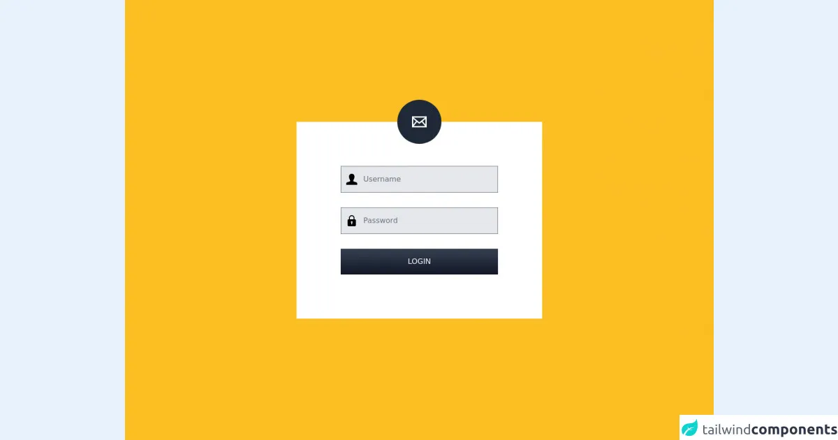
The preview of Simple Login Form ui component.
To give you an idea of what a simple login form created with Tailwind CSS looks like, here's a preview:
Free download of the Simple Login Form's source code
The source code of Simple Login Form ui component.
To create a simple login form with Tailwind CSS, you can use the following HTML and CSS code:
<div class="bg-yellow-400 h-screen overflow-hidden flex items-center justify-center">
  <div class="bg-white lg:w-5/12 md:6/12 w-10/12 shadow-3xl">
    <div class="bg-gray-800 absolute left-1/2 transform -translate-x-1/2 -translate-y-1/2 rounded-full p-4 md:p-8">
      <svg width="32" height="32" viewBox="0 0 24 24" fill="#FFF">
        <path d="M0 3v18h24v-18h-24zm6.623 7.929l-4.623 5.712v-9.458l4.623 3.746zm-4.141-5.929h19.035l-9.517 7.713-9.518-7.713zm5.694 7.188l3.824 3.099 3.83-3.104 5.612 6.817h-18.779l5.513-6.812zm9.208-1.264l4.616-3.741v9.348l-4.616-5.607z"/>
      </svg>
    </div>
    <form class="p-12 md:p-24">
      <div class="flex items-center text-lg mb-6 md:mb-8">
        <svg class="absolute ml-3" width="24" viewBox="0 0 24 24">
          <path d="M20.822 18.096c-3.439-.794-6.64-1.49-5.09-4.418 4.72-8.912 1.251-13.678-3.732-13.678-5.082 0-8.464 4.949-3.732 13.678 1.597 2.945-1.725 3.641-5.09 4.418-3.073.71-3.188 2.236-3.178 4.904l.004 1h23.99l.004-.969c.012-2.688-.092-4.222-3.176-4.935z"/>
        </svg>
        <input type="text" id="username" class="bg-gray-200 pl-12 py-2 md:py-4 focus:outline-none w-full" placeholder="Username" />
      </div>
      <div class="flex items-center text-lg mb-6 md:mb-8">
        <svg class="absolute ml-3" viewBox="0 0 24 24" width="24">
          <path d="m18.75 9h-.75v-3c0-3.309-2.691-6-6-6s-6 2.691-6 6v3h-.75c-1.24 0-2.25 1.009-2.25 2.25v10.5c0 1.241 1.01 2.25 2.25 2.25h13.5c1.24 0 2.25-1.009 2.25-2.25v-10.5c0-1.241-1.01-2.25-2.25-2.25zm-10.75-3c0-2.206 1.794-4 4-4s4 1.794 4 4v3h-8zm5 10.722v2.278c0 .552-.447 1-1 1s-1-.448-1-1v-2.278c-.595-.347-1-.985-1-1.722 0-1.103.897-2 2-2s2 .897 2 2c0 .737-.405 1.375-1 1.722z"/>
        </svg>
        <input type="password" id="password" class="bg-gray-200 pl-12 py-2 md:py-4 focus:outline-none w-full" placeholder="Password" />
      </div>
      <button class="bg-gradient-to-b from-gray-700 to-gray-900 font-medium p-2 md:p-4 text-white uppercase w-full">Login</button>
    </form>
  </div>
 </div>
How to create a Simple Login Form with Tailwind CSS?
Now that you have seen the preview and source code of a simple login form created with Tailwind CSS, let's dive into the steps to create one.
Step 1: Set up your project
To use Tailwind CSS in your project, you need to install it first. You can install Tailwind CSS via npm or yarn. Here's how to install it via npm:
npm install tailwindcss
After installing Tailwind CSS, you need to create a configuration file for it. You can create a configuration file by running the following command:
npx tailwindcss init
This will create a tailwind.config.js file in your project directory.
Step 2: Create the HTML structure
To create a simple login form, you need to create an HTML structure that consists of two input fields for the username and password, a submit button to submit the form, and a link to reset the password or create a new account. Here's an example HTML structure:
<form class="bg-white shadow-md rounded px-8 pt-6 pb-8 mb-4">
  <div class="mb-4">
    <label class="block text-gray-700 font-bold mb-2" for="username">
      Username
    </label>
    <input
      class="shadow appearance-none border rounded w-full py-2 px-3 text-gray-700 leading-tight focus:outline-none focus:shadow-outline"
      id="username"
      type="text"
      placeholder="Username"
    />
  </div>
  <div class="mb-6">
    <label class="block text-gray-700 font-bold mb-2" for="password">
      Password
    </label>
    <input
      class="shadow appearance-none border rounded w-full py-2 px-3 text-gray-700 mb-3 leading-tight focus:outline-none focus:shadow-outline"
      id="password"
      type="password"
      placeholder="******************"
    />
  </div>
  <div class="flex items-center justify-between">
    <button
      class="bg-blue-500 hover:bg-blue-700 text-white font-bold py-2 px-4 rounded focus:outline-none focus:shadow-outline"
      type="button"
    >
      Sign In
    </button>
    <a
      class="inline-block align-baseline font-bold text-sm text-blue-500 hover:text-blue-800"
      href="#"
    >
      Forgot Password?
    </a>
  </div>
</form>
Step 3: Style the login form with Tailwind CSS
To style the login form, you can use Tailwind CSS utility classes. Here's an example CSS code:
/* Set the background color of the form */
.bg-white {
  background-color: #fff;
}

/* Add a shadow to the form */
.shadow-md {
  box-shadow: 0 4px 6px -1px rgba(0, 0, 0, 0.1), 0 2px 4px -1px rgba(0, 0, 0, 0.06);
}

/* Add rounded corners to the form */
.rounded {
  border-radius: 0.25rem;
}

/* Set the padding of the form */
.px-8 {
  padding-left: 2rem;
  padding-right: 2rem;
}

/* Set the margin of the form */
.mb-4 {
  margin-bottom: 1rem;
}

/* Set the font size and weight of the label */
.text-gray-700 {
  color: #4a5568;
  font-size: 0.875rem;
  font-weight: 700;
}

/* Set the margin of the input fields */
.mb-3 {
  margin-bottom: 0.75rem;
}

/* Set the padding and border of the input fields */
.py-2 {
  padding-top: 0.5rem;
  padding-bottom: 0.5rem;
}

.px-3 {
  padding-left: 0.75rem;
  padding-right: 0.75rem;
}

.border {
  border-width: 1px;
}

/* Set the font size and color of the input fields */
.text-gray-700 {
  color: #4a5568;
  font-size: 1rem;
}

/* Set the focus and hover styles of the input fields */
.focus\:outline-none:focus {
  outline: none;
}

.focus\:shadow-outline:focus {
  box-shadow: 0 0 0 3px rgba(66, 153, 225, 0.5);
}

.hover\:bg-blue-700:hover {
  background-color: #1a202c;
}

.hover\:text-blue-800:hover {
  color: #2d3748;
}

/* Set the background color, text color, font weight, padding, and border radius of the sign in button */
.bg-blue-500 {
  background-color: #4299e1;
}

.text-white {
  color: #fff;
}

.font-bold {
  font-weight: 700;
}

.py-2 {
  padding-top: 0.5rem;
  padding-bottom: 0.5rem;
}

.px-4 {
  padding-left: 1rem;
  padding-right: 1rem;
}

.rounded {
  border-radius: 0.25rem;
}

/* Set the focus and hover styles of the sign in button */
.focus\:outline-none:focus {
  outline: none;
}

.focus\:shadow-outline:focus {
  box-shadow: 0 0 0 3px rgba(66, 153, 225, 0.5);
}

.hover\:bg-blue-700:hover {
  background-color: #1a202c;
}

/* Set the text color and hover color of the forgot password link */
.text-blue-500 {
  color: #4299e1;
}

.hover\:text-blue-800:hover {
  color: #2d3748;
}
Step 4: Add Tailwind CSS to your project
To use the Tailwind CSS utility classes in your project, you need to add the CSS file to your HTML file. You can do this by adding the following code to the head section of your HTML file:
<link href="https://cdn.jsdelivr.net/npm/[email protected]/dist/tailwind.min.css" rel="stylesheet">
Step 5: Preview and test the login form
After adding the Tailwind CSS file to your HTML file, you can preview and test the login form in your browser. Here's what the login form should look like:
Conclusion
In this article, we have explored how to create a simple login form with Tailwind CSS and make it better than ever before. We have seen how Tailwind CSS provides a set of pre-defined utility classes that you can use to create responsive and customizable UI components quickly. By following the steps outlined in this article, you can create a simple login form that is both functional and visually appealing.