- Published on
3 Things You Must Know To Build A Simple login With Tailwind CSS
- What is Tailwind CSS?
- The description of Simple login ui component
- Why use Tailwind CSS to create a Simple login ui component?
- The preview of Simple login ui component.
- The source code of Simple login ui component.
- How to create a Simple login with Tailwind CSS?
- Step 1: Set up the HTML structure
- Step 2: Add Tailwind CSS classes
- Step 3: Customize the design
- Conclusion
As a FrontEnd technology blogger, you are probably familiar with Tailwind CSS. It is a utility-first CSS framework that helps developers build responsive and customizable web interfaces quickly. In this article, we will discuss three things you must know to build a simple login with Tailwind CSS.
What is Tailwind CSS?
Tailwind CSS is a CSS framework that provides a set of pre-defined CSS classes that can be used to style HTML elements. It is designed to be highly customizable, allowing developers to create unique designs quickly. Tailwind CSS also comes with a responsive grid system that helps developers build responsive layouts.
The description of Simple login ui component
A simple login UI component is a user interface element that allows users to log in to a web application. It typically consists of two input fields for the user's email address and password, a submit button, and a link to reset the password. The UI component should be easy to use and visually appealing.
Why use Tailwind CSS to create a Simple login ui component?
Tailwind CSS is an excellent choice for creating a simple login UI component for several reasons. First, Tailwind CSS provides a set of pre-defined classes that can be used to style the UI component quickly. Second, Tailwind CSS is highly customizable, allowing developers to create unique designs easily. Finally, Tailwind CSS comes with a responsive grid system that helps developers build responsive layouts.
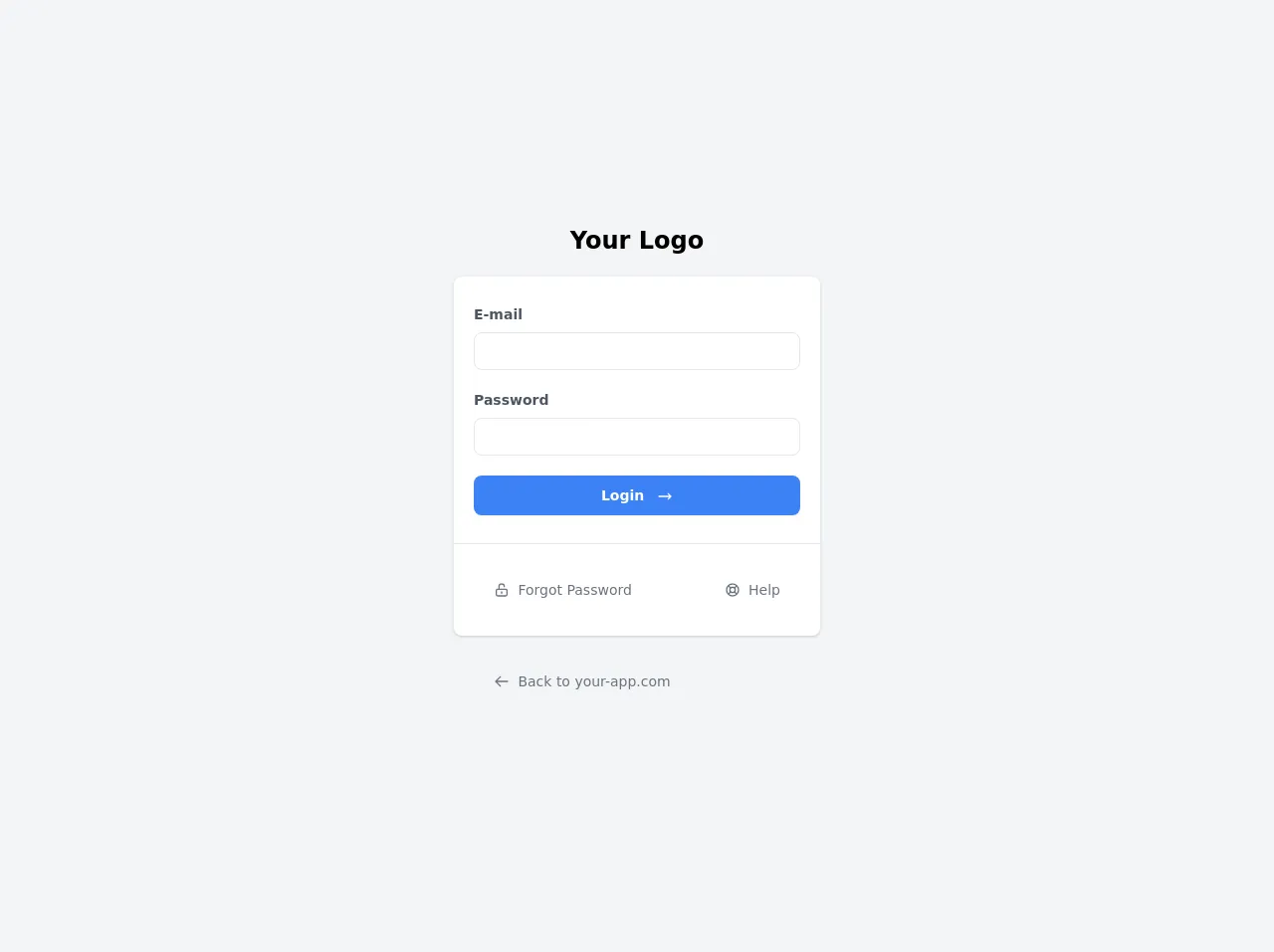
The preview of Simple login ui component.
To create a simple login UI component with Tailwind CSS, we will use a form element with two input fields for the user's email address and password. We will also include a submit button and a link to reset the password.
Free download of the Simple login's source code
The source code of Simple login ui component.
To create a simple login UI component with Tailwind CSS, we will use HTML and CSS. The HTML code will include a form element with two input fields for the user's email address and password. We will also include a submit button and a link to reset the password. The CSS code will use Tailwind CSS classes to style the UI component.
<div class="min-h-screen bg-gray-100 flex flex-col justify-center sm:py-12">
  <div class="p-10 xs:p-0 mx-auto md:w-full md:max-w-md">
    <h1 class="font-bold text-center text-2xl mb-5">Your Logo</h1>
    <div class="bg-white shadow w-full rounded-lg divide-y divide-gray-200">
      <div class="px-5 py-7">
        <label class="font-semibold text-sm text-gray-600 pb-1 block">E-mail</label>
        <input type="text" class="border rounded-lg px-3 py-2 mt-1 mb-5 text-sm w-full" />
        <label class="font-semibold text-sm text-gray-600 pb-1 block">Password</label>
        <input type="text" class="border rounded-lg px-3 py-2 mt-1 mb-5 text-sm w-full" />
        <button type="button" class="transition duration-200 bg-blue-500 hover:bg-blue-600 focus:bg-blue-700 focus:shadow-sm focus:ring-4 focus:ring-blue-500 focus:ring-opacity-50 text-white w-full py-2.5 rounded-lg text-sm shadow-sm hover:shadow-md font-semibold text-center inline-block">
            <span class="inline-block mr-2">Login</span>
            <svg xmlns="http://www.w3.org/2000/svg" fill="none" viewBox="0 0 24 24" stroke="currentColor" class="w-4 h-4 inline-block">
                <path stroke-linecap="round" stroke-linejoin="round" stroke-width="2" d="M17 8l4 4m0 0l-4 4m4-4H3" />
            </svg>
        </button>
      </div>
      <div class="py-5">
        <div class="grid grid-cols-2 gap-1">
          <div class="text-center sm:text-left whitespace-nowrap">
            <button class="transition duration-200 mx-5 px-5 py-4 cursor-pointer font-normal text-sm rounded-lg text-gray-500 hover:bg-gray-100 focus:outline-none focus:bg-gray-200 focus:ring-2 focus:ring-gray-400 focus:ring-opacity-50 ring-inset">
                <svg xmlns="http://www.w3.org/2000/svg" fill="none" viewBox="0 0 24 24" stroke="currentColor" class="w-4 h-4 inline-block align-text-top">
                    <path stroke-linecap="round" stroke-linejoin="round" stroke-width="2" d="M8 11V7a4 4 0 118 0m-4 8v2m-6 4h12a2 2 0 002-2v-6a2 2 0 00-2-2H6a2 2 0 00-2 2v6a2 2 0 002 2z" />
                </svg>
                <span class="inline-block ml-1">Forgot Password</span>
            </button>
          </div>
          <div class="text-center sm:text-right  whitespace-nowrap">
            <button class="transition duration-200 mx-5 px-5 py-4 cursor-pointer font-normal text-sm rounded-lg text-gray-500 hover:bg-gray-100 focus:outline-none focus:bg-gray-200 focus:ring-2 focus:ring-gray-400 focus:ring-opacity-50 ring-inset">
                <svg xmlns="http://www.w3.org/2000/svg" fill="none" viewBox="0 0 24 24" stroke="currentColor" class="w-4 h-4 inline-block align-text-bottom	">
                    <path stroke-linecap="round" stroke-linejoin="round" stroke-width="2" d="M18.364 5.636l-3.536 3.536m0 5.656l3.536 3.536M9.172 9.172L5.636 5.636m3.536 9.192l-3.536 3.536M21 12a9 9 0 11-18 0 9 9 0 0118 0zm-5 0a4 4 0 11-8 0 4 4 0 018 0z" />
                </svg>
                <span class="inline-block ml-1">Help</span>
            </button>
          </div>
        </div>
      </div>
    </div>
    <div class="py-5">
        <div class="grid grid-cols-2 gap-1">
          <div class="text-center sm:text-left whitespace-nowrap">
            <button class="transition duration-200 mx-5 px-5 py-4 cursor-pointer font-normal text-sm rounded-lg text-gray-500 hover:bg-gray-200 focus:outline-none focus:bg-gray-300 focus:ring-2 focus:ring-gray-400 focus:ring-opacity-50 ring-inset">
                <svg xmlns="http://www.w3.org/2000/svg" fill="none" viewBox="0 0 24 24" stroke="currentColor" class="w-4 h-4 inline-block align-text-top">
                    <path stroke-linecap="round" stroke-linejoin="round" stroke-width="2" d="M10 19l-7-7m0 0l7-7m-7 7h18" />
                </svg>
                <span class="inline-block ml-1">Back to your-app.com</span>
            </button>
          </div>
        </div>
      </div>
  </div>
</div>
How to create a Simple login with Tailwind CSS?
To create a simple login with Tailwind CSS, follow these three steps:
Step 1: Set up the HTML structure
The first step is to set up the HTML structure for the login UI component. We will use a form element with two input fields for the user's email address and password. We will also include a submit button and a link to reset the password.
<form class="bg-white shadow-md rounded px-8 pt-6 pb-8 mb-4">
  <div class="mb-4">
    <label class="block text-gray-700 font-bold mb-2" for="email">
      Email
    </label>
    <input
      class="shadow appearance-none border rounded w-full py-2 px-3 text-gray-700 leading-tight focus:outline-none focus:shadow-outline"
      id="email"
      type="text"
      placeholder="Email"
    />
  </div>
  <div class="mb-6">
    <label class="block text-gray-700 font-bold mb-2" for="password">
      Password
    </label>
    <input
      class="shadow appearance-none border rounded w-full py-2 px-3 text-gray-700 leading-tight focus:outline-none focus:shadow-outline"
      id="password"
      type="password"
      placeholder="Password"
    />
  </div>
  <div class="flex items-center justify-between">
    <button
      class="bg-blue-500 hover:bg-blue-700 text-white font-bold py-2 px-4 rounded focus:outline-none focus:shadow-outline"
      type="button"
    >
      Sign In
    </button>
    <a
      class="inline-block align-baseline font-bold text-sm text-blue-500 hover:text-blue-800"
      href="#"
    >
      Forgot Password?
    </a>
  </div>
</form>
Step 2: Add Tailwind CSS classes
The second step is to add Tailwind CSS classes to the HTML elements to style the login UI component. We will use classes such as bg-white, shadow-md, rounded, px-8, pt-6, pb-8, mb-4, mb-6, block, text-gray-700, font-bold, w-full, py-2, px-3, leading-tight, focus:outline-none, focus:shadow-outline, flex, items-center, justify-between, bg-blue-500, hover:bg-blue-700, text-white, text-sm, text-blue-500, and hover:text-blue-800.
<form class="bg-white shadow-md rounded px-8 pt-6 pb-8 mb-4">
  <div class="mb-4">
    <label class="block text-gray-700 font-bold mb-2" for="email">
      Email
    </label>
    <input
      class="shadow appearance-none border rounded w-full py-2 px-3 text-gray-700 leading-tight focus:outline-none focus:shadow-outline"
      id="email"
      type="text"
      placeholder="Email"
    />
  </div>
  <div class="mb-6">
    <label class="block text-gray-700 font-bold mb-2" for="password">
      Password
    </label>
    <input
      class="shadow appearance-none border rounded w-full py-2 px-3 text-gray-700 leading-tight focus:outline-none focus:shadow-outline"
      id="password"
      type="password"
      placeholder="Password"
    />
  </div>
  <div class="flex items-center justify-between">
    <button
      class="bg-blue-500 hover:bg-blue-700 text-white font-bold py-2 px-4 rounded focus:outline-none focus:shadow-outline"
      type="button"
    >
      Sign In
    </button>
    <a
      class="inline-block align-baseline font-bold text-sm text-blue-500 hover:text-blue-800"
      href="#"
    >
      Forgot Password?
    </a>
  </div>
</form>
Step 3: Customize the design
The third step is to customize the design of the login UI component. We can change the background color, font size, border radius, and other properties by modifying the Tailwind CSS classes.
<form class="bg-gray-100 shadow-md rounded-lg px-8 pt-6 pb-8 mb-4">
  <div class="mb-4">
    <label class="block text-gray-700 font-bold mb-2" for="email">
      Email
    </label>
    <input
      class="shadow appearance-none border rounded w-full py-2 px-3 text-gray-700 leading-tight focus:outline-none focus:shadow-outline"
      id="email"
      type="text"
      placeholder="Email"
    />
  </div>
  <div class="mb-6">
    <label class="block text-gray-700 font-bold mb-2" for="password">
      Password
    </label>
    <input
      class="shadow appearance-none border rounded w-full py-2 px-3 text-gray-700 leading-tight focus:outline-none focus:shadow-outline"
      id="password"
      type="password"
      placeholder="Password"
    />
  </div>
  <div class="flex items-center justify-between">
    <button
      class="bg-blue-500 hover:bg-blue-700 text-white font-bold py-2 px-4 rounded focus:outline-none focus:shadow-outline"
      type="button"
    >
      Sign In
    </button>
    <a
      class="inline-block align-baseline font-bold text-sm text-blue-500 hover:text-blue-800"
      href="#"
    >
      Forgot Password?
    </a>
  </div>
</form>
Conclusion
In conclusion, Tailwind CSS is an excellent choice for creating a simple login UI component. It provides a set of pre-defined classes that can be used to style the UI component quickly and is highly customizable. By following the three steps outlined in this article, you can create a visually appealing and easy-to-use login UI component with Tailwind CSS.