- Published on
Most Effective Ways To Create A Simple Image Slider With Tailwind CSS

- What is Tailwind CSS?
- The description of Simple Image Slider UI component
- Why use Tailwind CSS to create a Simple Image Slider UI component?
- The preview of Simple Image Slider UI component
- The source code of Simple Image Slider UI component
- How to create a Simple Image Slider with Tailwind CSS?
- Conclusion
As a FrontEnd technology blogger, you are always looking for the most effective ways to create beautiful and functional user interfaces. One of the most popular UI components is the image slider, which is used to display a series of images in a single container. In this article, we will explore how to create a simple image slider with Tailwind CSS.
What is Tailwind CSS?
Tailwind CSS is a utility-first CSS framework that provides a set of pre-defined classes that can be used to style HTML elements. It is designed to be highly customizable and easy to use, allowing developers to quickly create complex user interfaces without having to write custom CSS code.
The description of Simple Image Slider UI component
A Simple Image Slider is a UI component that allows users to view a series of images in a single container. It typically includes navigation buttons that allow the user to move forward or backward through the images, as well as a set of dots that indicate which image is currently being displayed.
Why use Tailwind CSS to create a Simple Image Slider UI component?
Tailwind CSS is an excellent choice for creating a Simple Image Slider UI component for several reasons:
- Tailwind CSS provides a set of pre-defined classes that can be used to style the slider and its components, making it easy to create a consistent look and feel across different browsers and devices.
- Tailwind CSS is highly customizable, allowing developers to easily modify the appearance of the slider to match the design of their website or application.
- Tailwind CSS is easy to use, even for developers who are new to CSS or who are not familiar with the latest CSS features.
The preview of Simple Image Slider UI component
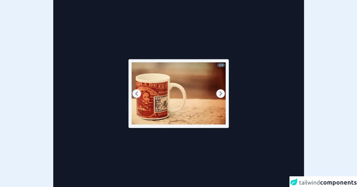
To create a Simple Image Slider with Tailwind CSS, we will use a combination of HTML, CSS, and JavaScript. The final result will look something like this:
Free download of the Simple Image Slider's source code
The source code of Simple Image Slider UI component
The source code for the Simple Image Slider with Tailwind CSS can be found below:
<script defer src="https://unpkg.com/[email protected]/dist/cdn.min.js"></script>

<main class="grid min-h-screen w-full place-content-center bg-gray-900">
  <div
    x-data="imageSlider"
    class="relative mx-auto max-w-2xl overflow-hidden rounded-md bg-gray-100 p-2 sm:p-4"
  >
    <div
      class="absolute top-5 right-5 z-10 rounded-full bg-gray-600 px-2 text-center text-sm text-white"
    >
      <span x-text="currentIndex"></span>/<span x-text="images.length"></span>
    </div>

    <button
      @click="previous()"
      class="absolute left-5 top-1/2 z-10 flex h-11 w-11 -translate-y-1/2 items-center justify-center rounded-full bg-gray-100 shadow-md"
    >
      <svg
        class="h-8 w-8 font-bold text-gray-500"
        fill="none"
        stroke="currentColor"
        viewBox="0 0 24 24"
        xmlns="http://www.w3.org/2000/svg"
      >
        <path
          stroke-linecap="round"
          stroke-linejoin="round"
          stroke-width="2.5"
          d="M15 19l-7-7 7-7"
        ></path>
      </svg>
    </button>

    <button
      @click="forward()"
      class="absolute right-5 top-1/2 z-10 flex h-11 w-11 -translate-y-1/2 items-center justify-center rounded-full bg-gray-100 shadow-md"
    >
      <svg
        class="h-8 w-8 font-bold text-gray-500"
        fill="none"
        stroke="currentColor"
        viewBox="0 0 24 24"
        xmlns="http://www.w3.org/2000/svg"
      >
        <path
          stroke-linecap="round"
          stroke-linejoin="round"
          stroke-width="2.5"
          d="M9 5l7 7-7 7"
        ></path>
      </svg>
    </button>

    <div class="relative h-80" style="width: 30rem">
      <template x-for="(image, index) in images">
        <div
          x-show="currentIndex == index + 1"
          x-transition:enter="transition transform duration-300"
          x-transition:enter-start="opacity-0"
          x-transition:enter-end="opacity-100"
          x-transition:leave="transition transform duration-300"
          x-transition:leave-start="opacity-100"
          x-transition:leave-end="opacity-0"
          class="absolute top-0"
        >
          <img :src="image" alt="image" class="rounded-sm" />
        </div>
      </template>
    </div>
  </div>
</main>

<script>
  document.addEventListener("alpine:init", () => {
    Alpine.data("imageSlider", () => ({
      currentIndex: 1,
      images: [
        "https://unsplash.it/640/425?image=30",
        "https://unsplash.it/640/425?image=40",
        "https://unsplash.it/640/425?image=50",
      ],
      previous() {
        if (this.currentIndex > 1) {
          this.currentIndex = this.currentIndex - 1;
        }
      },
      forward() {
        if (this.currentIndex < this.images.length) {
          this.currentIndex = this.currentIndex + 1;
        }
      },
    }));
  });
</script>
How to create a Simple Image Slider with Tailwind CSS?
To create a Simple Image Slider with Tailwind CSS, follow these steps:
Create the HTML structure for the slider container and its components, including the images, navigation buttons, and dots.
Use Tailwind CSS classes to style the slider and its components, including the size, position, and color of each element.
Add JavaScript code to handle user interactions with the slider, including clicking on the navigation buttons or dots to move to the next or previous image.
Test the slider in different browsers and devices to ensure that it works correctly and looks great on all platforms.
Conclusion
In conclusion, creating a Simple Image Slider with Tailwind CSS is a great way to add a beautiful and functional UI component to your website or application. By using Tailwind CSS, you can easily create a custom slider that matches the design of your site and provides a great user experience. So why not give it a try and see what you can create with Tailwind CSS today!