- Published on
What You Need To Build A Simple dropdown With Tailwind CSS
- What is Tailwind CSS?
- The description of Simple dropdown ui component
- Why use Tailwind CSS to create a Simple dropdown ui component?
- The preview of Simple dropdown ui component.
- The source code of Simple dropdown ui component.
- How to create a Simple dropdown with Tailwind CSS?
- Conclusion
What is Tailwind CSS?
Tailwind CSS is a utility-first CSS framework that provides a set of pre-defined CSS classes that can be used to create custom user interfaces. It is designed to help developers build responsive and scalable web applications quickly and easily.
The description of Simple dropdown ui component
A dropdown is a user interface element that allows users to select one option from a list of options. A simple dropdown is a basic version of the dropdown that does not have any additional features such as search or multi-select.
Why use Tailwind CSS to create a Simple dropdown ui component?
Tailwind CSS provides a set of pre-defined CSS classes that can be used to create a Simple dropdown ui component quickly and easily. By using Tailwind CSS, developers can focus on building the functionality of the dropdown rather than spending time on writing custom CSS.
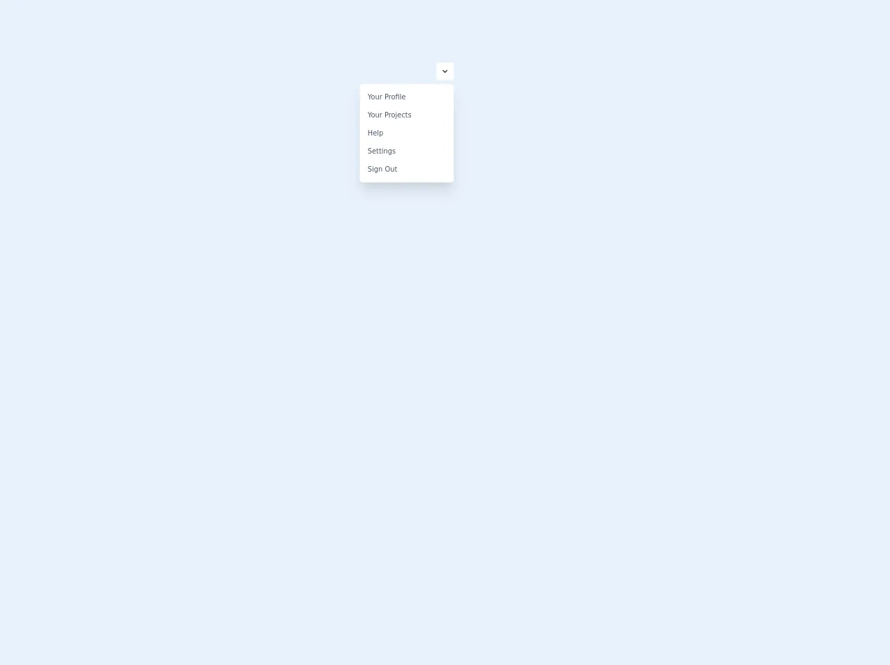
The preview of Simple dropdown ui component.
To create a Simple dropdown ui component, we will use Tailwind CSS classes to style the HTML elements. The preview of the Simple dropdown ui component is shown below.
Free download of the Simple dropdown's source code
The source code of Simple dropdown ui component.
The source code of the Simple dropdown ui component is shown below.
<script src="https://cdn.jsdelivr.net/gh/alpinejs/[email protected]/dist/alpine.min.js" defer></script>
<div class="flex justify-center h-screen">
<div x-data="{ dropdownOpen: true }" class="relative my-32">
  <button @click="dropdownOpen = !dropdownOpen" class="relative z-10 block rounded-md bg-white p-2 focus:outline-none">
    <svg class="h-5 w-5 text-gray-800" xmlns="http://www.w3.org/2000/svg" viewBox="0 0 20 20" fill="currentColor">
      <path fill-rule="evenodd" d="M5.293 7.293a1 1 0 011.414 0L10 10.586l3.293-3.293a1 1 0 111.414 1.414l-4 4a1 1 0 01-1.414 0l-4-4a1 1 0 010-1.414z" clip-rule="evenodd" />
    </svg>
  </button>

  <div x-show="dropdownOpen" @click="dropdownOpen = false" class="fixed inset-0 h-full w-full z-10"></div>

  <div x-show="dropdownOpen" class="absolute right-0 mt-2 py-2 w-48 bg-white rounded-md shadow-xl z-20">
    <a href="#" class="block px-4 py-2 text-sm capitalize text-gray-700 hover:bg-blue-500 hover:text-white">
      your profile
    </a>
    <a href="#" class="block px-4 py-2 text-sm capitalize text-gray-700 hover:bg-blue-500 hover:text-white">
      Your projects
    </a>
    <a href="#" class="block px-4 py-2 text-sm capitalize text-gray-700 hover:bg-blue-500 hover:text-white">
      Help
    </a>
    <a href="#" class="block px-4 py-2 text-sm capitalize text-gray-700 hover:bg-blue-500 hover:text-white">
      Settings
    </a>
    <a href="#" class="block px-4 py-2 text-sm capitalize text-gray-700 hover:bg-blue-500 hover:text-white">
      Sign Out
    </a>
  </div>
</div>
</div>
How to create a Simple dropdown with Tailwind CSS?
To create a Simple dropdown with Tailwind CSS, follow the steps below:
- Create a select element with options.
<select class="block w-full rounded-md bg-gray-100 border-transparent focus:border-gray-500 focus:bg-white focus:ring-0">
  <option>Option 1</option>
  <option>Option 2</option>
  <option>Option 3</option>
</select>
- Add the Tailwind CSS classes to style the select element.
<select class="block w-full rounded-md bg-gray-100 border-transparent focus:border-gray-500 focus:bg-white focus:ring-0">
- The
blockclass makes the select element a block-level element. - The
w-fullclass makes the select element take up the full width of the container. - The
rounded-mdclass adds rounded corners to the select element. - The
bg-gray-100class sets the background color of the select element to gray. - The
border-transparentclass removes the border of the select element. - The
focus:border-gray-500class sets the border color of the select element to gray when it is in focus. - The
focus:bg-whiteclass sets the background color of the select element to white when it is in focus. - The
focus:ring-0class removes the focus ring from the select element.
- Add the Tailwind CSS classes to style the options.
<option class="py-2">Option 1</option>
<option class="py-2">Option 2</option>
<option class="py-2">Option 3</option>
- The
py-2class adds padding to the top and bottom of the options.
- Add the Tailwind CSS classes to style the dropdown arrow.
<svg class="absolute pointer-events-none top-0 right-0 w-5 h-5 text-gray-400 fill-current" viewBox="0 0 20 20">
  <path d="M10 12l-5-5h10z"></path>
</svg>
- The
absoluteclass positions the arrow element absolutely within the container. - The
pointer-events-noneclass makes the arrow element non-clickable. - The
top-0andright-0classes position the arrow element at the top right corner of the container. - The
w-5andh-5classes set the width and height of the arrow element to 5 pixels. - The
text-gray-400class sets the color of the arrow element to gray. - The
fill-currentclass fills the arrow element with the current text color.
- Add the Tailwind CSS classes to style the dropdown when it is open.
<select class="block w-full rounded-md bg-gray-100 border-transparent focus:border-gray-500 focus:bg-white focus:ring-0 appearance-none">
  <option class="py-2">Option 1</option>
  <option class="py-2">Option 2</option>
  <option class="py-2">Option 3</option>
</select>
- The
appearance-noneclass removes the default appearance of the select element. - The
appearance-noneclass is used to remove the default appearance of the select element when it is open.
Conclusion
In this article, we have learned how to create a Simple dropdown ui component using Tailwind CSS. By using Tailwind CSS, developers can create custom user interfaces quickly and easily without having to write custom CSS. With its pre-defined CSS classes, Tailwind CSS is a great choice for building responsive and scalable web applications.