- Published on
Surprisingly Effective Ways To Build A Simple Dashboard Layout With Tailwind CSS
- What is Tailwind CSS?
- The description of Simple Dashboard Layout ui component
- Why use Tailwind CSS to create a Simple Dashboard Layout ui component?
- The preview of Simple Dashboard Layout ui component.
- The source code of Simple Dashboard Layout ui component.
- How to create a Simple Dashboard Layout with Tailwind CSS?
- Step 1: Create the HTML structure of the Simple Dashboard Layout
- Step 2: Apply the pre-defined classes provided by Tailwind CSS
- Step 3: Customize the Simple Dashboard Layout
- Conclusion
As a FrontEnd technology blogger, you may have heard of Tailwind CSS. It's a utility-first CSS framework that provides a set of pre-defined classes to help you style your HTML elements. With Tailwind CSS, you can quickly build responsive and customizable UI components, including a Simple Dashboard Layout.
In this article, we'll explore the surprisingly effective ways to build a Simple Dashboard Layout with Tailwind CSS.
What is Tailwind CSS?
Tailwind CSS is a CSS framework that provides a set of pre-defined classes to help you style your HTML elements. It's a utility-first framework, which means that it focuses on providing small, single-purpose classes that you can combine to create complex styles.
With Tailwind CSS, you don't need to write custom CSS code for every element. Instead, you can use pre-defined classes to style your elements. This approach can save you a lot of time and make your code more maintainable.
The description of Simple Dashboard Layout ui component
A Simple Dashboard Layout is a UI component that displays multiple widgets or charts on a single page. It's a common UI component used in many web applications, including admin dashboards, analytics dashboards, and monitoring dashboards.
A Simple Dashboard Layout typically consists of a header, a sidebar, and a content area. The header contains the logo, user profile, and navigation menu. The sidebar contains the list of widgets or charts, while the content area displays the selected widget or chart.
Why use Tailwind CSS to create a Simple Dashboard Layout ui component?
Tailwind CSS provides a set of pre-defined classes that you can use to style your Simple Dashboard Layout. With Tailwind CSS, you can quickly create a responsive and customizable layout without writing custom CSS code.
Tailwind CSS also provides a set of utility classes for spacing, typography, colors, and more. These utility classes can help you style your Simple Dashboard Layout quickly and consistently.
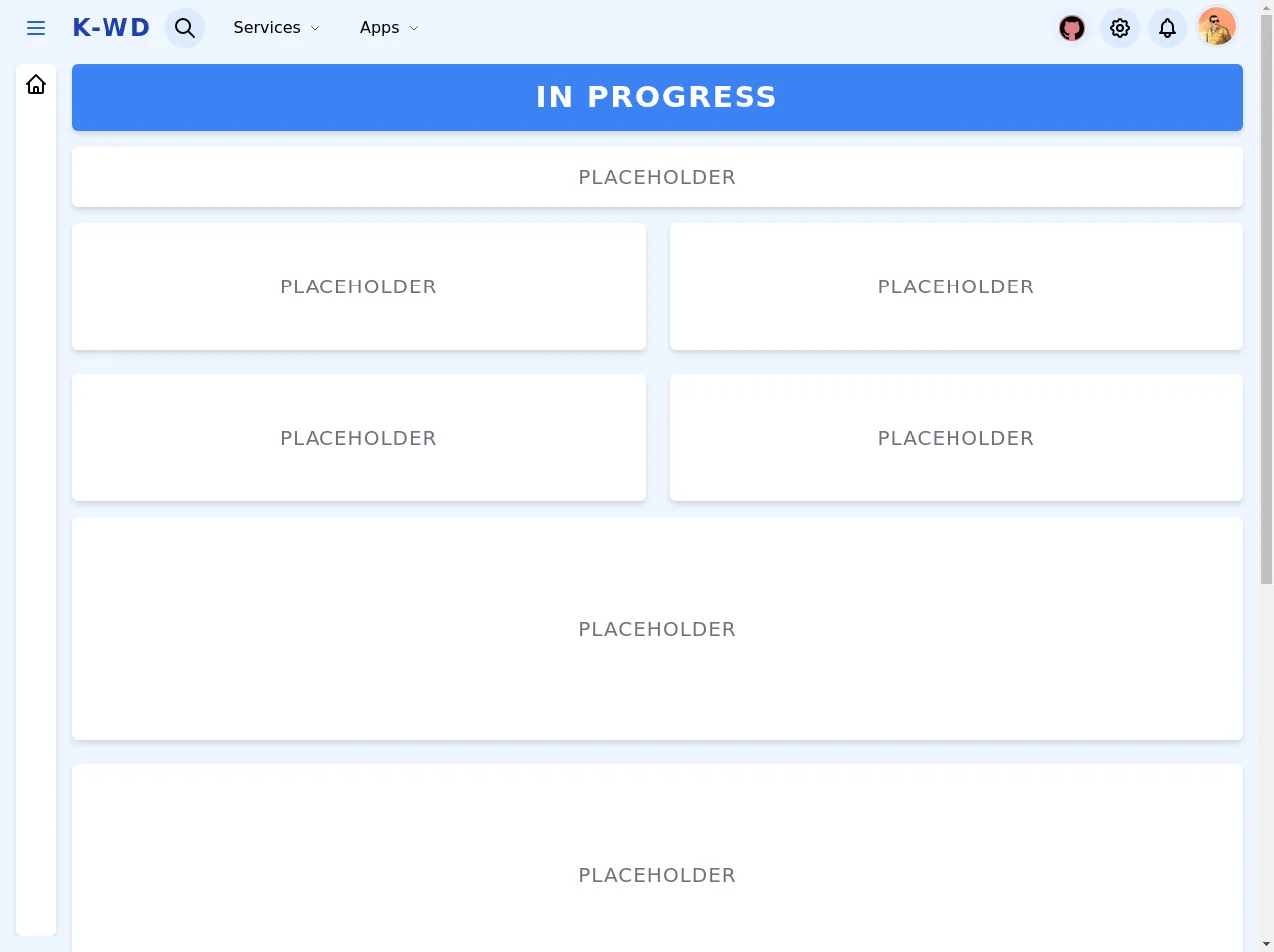
The preview of Simple Dashboard Layout ui component.
To give you an idea of what a Simple Dashboard Layout looks like, here's a preview:
Free download of the Simple Dashboard Layout's source code
The source code of Simple Dashboard Layout ui component.
To create a Simple Dashboard Layout with Tailwind CSS, you can use the pre-defined classes provided by the framework. Here's the source code:
<!-- This is an example component -->
<div>
<div
class="relative flex h-screen bg-blue-50"
x-data="setup()"
x-init="$refs.loadingScreen.classList.add('hidden')"
>
<!-- Loading Screen -->
<div
x-ref="loadingScreen"
class="fixed inset-0 z-50 flex items-center justify-center bg-blue-600 bg-opacity-20"
style="backdrop-filter: blur(14px)"
>
<span class="text-2xl">Loading...</span>
</div>
<!-- Sidebar -->
<aside
class="fixed left-0 right-0 z-10 flex-col flex-shrink-0 h-full overflow-hidden transition-all bg-transparent bottom-10 xl:h-screen top-16 xl:static xl:z-auto"
:class="{'flex xl:w-64': isSidebarOpen, 'hidden xl:flex xl:w-16': !isSidebarOpen}"
>
<!-- Sidebar header -->
<div
class="flex-shrink-0 hidden px-2 max-h-14 xl:items-center xl:justify-start xl:space-x-3 xl:flex xl:max-h-14 xl:h-full xl:px-4"
>
<!-- Sidebar Button -->
<button @click="toggleSidebar" class="p-2 text-blue-600 rounded-full hover:bg-blue-200">
<svg
class="w-6 h-6"
xmlns="http://www.w3.org/2000/svg"
fill="none"
viewBox="0 0 24 24"
stroke="currentColor"
>
<path stroke-linecap="round" stroke-linejoin="round" stroke-width="2" d="M4 6h16M4 12h16M4 18h16" />
</svg>
</button>
<!-- Logo -->
<a
href="#"
:class="{'xl:hidden': !isSidebarOpen}"
class="flex-shrink-0 text-2xl font-bold tracking-widest text-blue-800 uppercase"
>
K-WD
</a>
</div>
<!-- Sidebar Content -->
<div
class="fixed left-0 flex flex-col flex-1 max-h-screen px-2 overflow-hidden right-3 top-16 bottom-10 xl:static xl:pt-2 xl:pl-4 xl:mb-4"
>
<div
:class="{'min-w-full xl:w-14': isSidebarOpen}"
class="flex-1 max-h-full p-2 overflow-y-auto bg-white rounded-md shadow-2xl lg:shadow-md"
>
<nav class="">
<ul class="space-y-2">
<!-- <template x-for="i in 30" :key="i"> -->
<li class="">
<button class="flex items-center space-x-2">
<span>
<svg
class="w-6 h-6"
xmlns="http://www.w3.org/2000/svg"
fill="none"
viewBox="0 0 24 24"
stroke="currentColor"
>
<path
stroke-linecap="round"
stroke-linejoin="round"
stroke-width="2"
d="M3 12l2-2m0 0l7-7 7 7M5 10v10a1 1 0 001 1h3m10-11l2 2m-2-2v10a1 1 0 01-1 1h-3m-6 0a1 1 0 001-1v-4a1 1 0 011-1h2a1 1 0 011 1v4a1 1 0 001 1m-6 0h6"
/>
</svg>
</span>
<span :class="{'xl:hidden': !isSidebarOpen}"> Dashboard </span>
</button>
</li>
<!-- </template> -->
</ul>
</nav>
</div>
</div>
</aside>
<div class="relative flex flex-col flex-1 h-full max-h-full overflow-y-scroll">
<!-- Navbar -->
<header class="sticky top-0 flex items-center flex-shrink-0 w-full h-full bg-opacity-100 bg-blue-50 max-h-14">
<!-- Menu Button -->
<div class="flex items-center flex-shrink-0 xl:hidden">
<button @click="toggleSidebar" class="p-2 text-blue-600 rounded-full hover:bg-blue-200">
<svg
class="w-6 h-6"
xmlns="http://www.w3.org/2000/svg"
fill="none"
viewBox="0 0 24 24"
stroke="currentColor"
>
<path stroke-linecap="round" stroke-linejoin="round" stroke-width="2" d="M4 6h16M4 12h16M4 18h16" />
</svg>
</button>
</div>
<div class="flex items-center justify-between flex-1">
<!-- Logo -->
<a
href="#"
:class="{'xl:hidden ml-2':isSidebarOpen, 'block ml-2':!isSidebarOpen}"
class="flex-shrink-0 text-2xl font-bold tracking-widest text-blue-800 uppercase"
>
K-WD
</a>
<nav class="relative flex items-center justify-end flex-1 ml-3 lg:justify-start">
<!-- Search Button -->
<div x-data="{ searchOpen: false, searchResult: false }">
<button
@click="searchOpen = !searchOpen"
class="inline-block p-2 bg-blue-100 rounded-full hover:bg-blue-200"
>
<svg
class="w-6 h-6"
xmlns="http://www.w3.org/2000/svg"
fill="none"
viewBox="0 0 24 24"
stroke="currentColor"
>
<path
stroke-linecap="round"
stroke-linejoin="round"
stroke-width="2"
d="M21 21l-6-6m2-5a7 7 0 11-14 0 7 7 0 0114 0z"
/>
</svg>
</button>
<!-- Search box -->
<div
@click.away="searchOpen = false"
x-show.transition="searchOpen"
class="fixed left-0 ml-2 right-6 lg:max-w-md lg:-ml-1 lg:absolute"
>
<div class="p-4 mt-4 bg-white shadow-lg rounded-t-md">
<div class="flex items-center">
<input
type="text"
placeholder="Search..."
class="w-full px-4 py-2 bg-blue-100 rounded-l-md focus:outline-none"
@focus="searchResult = true"
@blur="searchResult = false"
/>
<button
class="p-2 text-white bg-blue-500 rounded-r-md focus:outline-none hover:bg-blue-600 focus:bg-blue-700"
>
<svg
class="w-6 h-6"
xmlns="http://www.w3.org/2000/svg"
fill="none"
viewBox="0 0 24 24"
stroke="currentColor"
>
<path
stroke-linecap="round"
stroke-linejoin="round"
stroke-width="2"
d="M21 21l-6-6m2-5a7 7 0 11-14 0 7 7 0 0114 0z"
/>
</svg>
</button>
</div>
</div>
<!-- Search Result -->
<div
x-show.transition="searchResult"
class="p-4 overflow-y-auto bg-white shadow-lg rounded-b-md h-72"
>
<ul>
<template x-for="i in 10" :key="i">
<li>
<a href="#" class="block px-4 py-2 rounded-md hover:bg-blue-100">Result</a>
</li>
</template>
</ul>
</div>
</div>
</div>
<!-- Left Links -->
<ul class="items-center justify-center hidden ml-3 space-x-2 lg:flex">
<!-- Services Menu -->
<li x-data="{ open: false }">
<button
@click="open = !open"
class="inline-flex items-center px-4 py-2 space-x-2 rounded-md hover:bg-blue-100"
>
<span>Services</span>
<span>
<svg
class="w-3 h-3 text-gray-600"
xmlns="http://www.w3.org/2000/svg"
fill="none"
viewBox="0 0 24 24"
stroke="currentColor"
>
<path stroke-linecap="round" stroke-linejoin="round" stroke-width="2" d="M19 9l-7 7-7-7" />
</svg>
</span>
</button>
<div
x-show.transition="open"
@click.away="open = false"
class="absolute w-full max-w-lg p-2 mt-4 bg-white rounded-md shadow-md"
>
<div class="px-2 my-2">Ugly placeholder</div>
<div class="grid grid-cols-3 gap-6">
<template x-for="i in 3">
<ul class="">
<template x-for="x in 5">
<li>
<a
href="#"
class="flex items-center justify-between px-4 py-1 rounded-md hover:bg-blue-100"
>
<span>Placeholder</span>
<span class="p-1 bg-blue-200 rounded-md">20</span>
</a>
</li>
</template>
</ul>
</template>
</div>
</div>
</li>
<!-- Apps Menu -->
<li>
<button class="inline-flex items-center px-4 py-2 space-x-2 rounded-md hover:bg-blue-100">
<span>Apps</span>
<span>
<svg
class="w-3 h-3 text-gray-600"
xmlns="http://www.w3.org/2000/svg"
fill="none"
viewBox="0 0 24 24"
stroke="currentColor"
>
<path stroke-linecap="round" stroke-linejoin="round" stroke-width="2" d="M19 9l-7 7-7-7" />
</svg>
</span>
</button>
</li>
</ul>
<!-- Right Links -->
<ul class="flex items-center justify-center ml-auto mr-2 space-x-2 lg:mr-5">
<!-- Github Link -->
<li class="relative">
<div class="absolute inset-0 flex items-center justify-center" style="z-index: -1">
<span class="block w-5 h-5 bg-red-600 rounded-full animate-ping"></span>
</div>
<a
href="https://github.com/Kamona-WD/simple-dashboard"
target="_blank"
class="inline-flex p-2 bg-blue-200 rounded-full bg-opacity-20 hover:bg-blue-300 hover:bg-opacity-20"
style="backdrop-filter: blur(14px)"
>
<svg class="w-6 h-6" xmlns="http://www.w3.org/2000/svg" viewBox="0 0 24 24">
<path
d="M12 .297c-6.63 0-12 5.373-12 12 0 5.303 3.438 9.8 8.205 11.385.6.113.82-.258.82-.577 0-.285-.01-1.04-.015-2.04-3.338.724-4.042-1.61-4.042-1.61C4.422 18.07 3.633 17.7 3.633 17.7c-1.087-.744.084-.729.084-.729 1.205.084 1.838 1.236 1.838 1.236 1.07 1.835 2.809 1.305 3.495.998.108-.776.417-1.305.76-1.605-2.665-.3-5.466-1.332-5.466-5.93 0-1.31.465-2.38 1.235-3.22-.135-.303-.54-1.523.105-3.176 0 0 1.005-.322 3.3 1.23.96-.267 1.98-.399 3-.405 1.02.006 2.04.138 3 .405 2.28-1.552 3.285-1.23 3.285-1.23.645 1.653.24 2.873.12 3.176.765.84 1.23 1.91 1.23 3.22 0 4.61-2.805 5.625-5.475 5.92.42.36.81 1.096.81 2.22 0 1.606-.015 2.896-.015 3.286 0 .315.21.69.825.57C20.565 22.092 24 17.592 24 12.297c0-6.627-5.373-12-12-12"
/>
</svg>
</a>
</li>
<!-- Settings Button -->
<li>
<button
@click="toggleSettingsPanel"
class="inline-block p-2 bg-blue-100 rounded-full hover:bg-blue-200"
>
<svg
class="w-6 h-6"
xmlns="http://www.w3.org/2000/svg"
fill="none"
viewBox="0 0 24 24"
stroke="currentColor"
>
<path
stroke-linecap="round"
stroke-linejoin="round"
stroke-width="2"
d="M10.325 4.317c.426-1.756 2.924-1.756 3.35 0a1.724 1.724 0 002.573 1.066c1.543-.94 3.31.826 2.37 2.37a1.724 1.724 0 001.065 2.572c1.756.426 1.756 2.924 0 3.35a1.724 1.724 0 00-1.066 2.573c.94 1.543-.826 3.31-2.37 2.37a1.724 1.724 0 00-2.572 1.065c-.426 1.756-2.924 1.756-3.35 0a1.724 1.724 0 00-2.573-1.066c-1.543.94-3.31-.826-2.37-2.37a1.724 1.724 0 00-1.065-2.572c-1.756-.426-1.756-2.924 0-3.35a1.724 1.724 0 001.066-2.573c-.94-1.543.826-3.31 2.37-2.37.996.608 2.296.07 2.572-1.065z"
/>
<path
stroke-linecap="round"
stroke-linejoin="round"
stroke-width="2"
d="M15 12a3 3 0 11-6 0 3 3 0 016 0z"
/>
</svg>
</button>
</li>
<!-- Notifications Button -->
<li>
<button class="inline-block p-2 bg-blue-100 rounded-full hover:bg-blue-200">
<svg
class="w-6 h-6"
xmlns="http://www.w3.org/2000/svg"
fill="none"
viewBox="0 0 24 24"
stroke="currentColor"
>
<path
stroke-linecap="round"
stroke-linejoin="round"
stroke-width="2"
d="M15 17h5l-1.405-1.405A2.032 2.032 0 0118 14.158V11a6.002 6.002 0 00-4-5.659V5a2 2 0 10-4 0v.341C7.67 6.165 6 8.388 6 11v3.159c0 .538-.214 1.055-.595 1.436L4 17h5m6 0v1a3 3 0 11-6 0v-1m6 0H9"
/>
</svg>
</button>
</li>
<!-- Avatar Button -->
<li>
<button class="p-px border-2 border-blue-100 rounded-full w-11 h-11">
<img
class="block object-cover rounded-full"
src="https://avatars0.githubusercontent.com/u/57622665?s=460&u=8f581f4c4acd4c18c33a87b3e6476112325e8b38&v=4"
alt="Ahmed Kamel"
/>
</button>
</li>
</ul>
</nav>
</div>
</header>
<div class="flex flex-col flex-1 max-h-full pl-2 pr-2 rounded-md xl:pr-4">
<!-- Main Content -->
<main class="flex-1 pt-2">
<!-- Placeholder Cards -->
<div class="p-4 text-white bg-blue-500 rounded-md shadow-md">
<div class="flex items-center justify-center">
<span class="text-3xl font-semibold tracking-wider uppercase">In Progress</span>
</div>
</div>
<div class="flex items-center justify-center p-4 mt-4 bg-white rounded-md shadow-md">
<span class="text-xl tracking-wider text-gray-500 uppercase">placeholder</span>
</div>
<div class="grid grid-cols-1 gap-6 mt-4 md:grid-cols-2">
<template x-for="i in 4" :key="i">
<div class="flex items-center justify-center w-full h-32 bg-white rounded-md shadow-md">
<span class="text-xl tracking-wider text-gray-500 uppercase">placeholder</span>
</div>
</template>
</div>
<div class="grid grid-cols-1 gap-6 my-4 mt-4">
<template x-for="i in 4" :key="i">
<div class="flex items-center justify-center w-full h-56 bg-white rounded-md shadow-md">
<span class="text-xl tracking-wider text-gray-500 uppercase">placeholder</span>
</div>
</template>
</div>
</main>
<!-- Main Footer -->
<footer class="flex-shrink-0">
<div class="py-2 mb-2">
Made by
<a class="text-blue-600 underline" href="https://github.com/Kamona-WD" target="_blank">Ahmed Kamel</a>
</div>
</footer>
</div>
</div>
<!-- Settings Panel -->
<div
@click="isSettingsPanelOpen = false"
x-show.transition.opacity.100="isSettingsPanelOpen"
class="fixed inset-0 z-20 bg-blue-400 bg-opacity-20"
style="backdrop-filter: blur(10px)"
></div>
<div
x-show="isSettingsPanelOpen"
x-transition:enter="transform duration-100"
x-transition:enter-start="translate-x-full ease"
x-transition:enter-end="translate-x-0 ease-in"
x-transition:leave="transform duration-200"
x-transition:leave-start="translate-x-0 ease-out"
x-transition:leave-end="translate-x-full ease"
class="fixed inset-y-0 right-0 z-30 w-full max-w-sm p-2 bg-white"
>
<button @click="toggleSettingsPanel" class="p-4 rounded-md">
<svg class="w-6 h-6" xmlns="http://www.w3.org/2000/svg" fill="none" viewBox="0 0 24 24" stroke="currentColor">
<path stroke-linecap="round" stroke-linejoin="round" stroke-width="2" d="M6 18L18 6M6 6l12 12" />
</svg>
</button>
</div>
</div>
<script src="https://cdn.jsdelivr.net/gh/alpinejs/[email protected]/dist/alpine.min.js" defer></script>
<script>
function setup() {
return {
isSidebarOpen: false,
toggleSidebar() {
this.isSidebarOpen = !this.isSidebarOpen
},
isSettingsPanelOpen: false,
toggleSettingsPanel() {
this.isSettingsPanelOpen = !this.isSettingsPanelOpen
},
}
}
</script>
</div>
How to create a Simple Dashboard Layout with Tailwind CSS?
To create a Simple Dashboard Layout with Tailwind CSS, you can follow these steps:
- Create the HTML structure of the Simple Dashboard Layout, including the header, sidebar, and content area.
- Apply the pre-defined classes provided by Tailwind CSS to style the HTML elements.
- Customize the Simple Dashboard Layout by adding your own styles or modifying the pre-defined classes.
Let's go through each step in more detail.
Step 1: Create the HTML structure of the Simple Dashboard Layout
The first step is to create the HTML structure of the Simple Dashboard Layout. Here's an example:
<div class="flex flex-col h-screen">
  <header class="bg-gray-800 text-white py-4 px-6 flex items-center justify-between">
    <div class="flex items-center">
      <img src="logo.png" alt="Logo" class="h-8 mr-2">
      <h1 class="text-lg font-semibold">Dashboard</h1>
    </div>
    <div class="flex items-center">
      <span class="mr-4">John Doe</span>
      <img src="avatar.png" alt="Avatar" class="h-8 w-8 rounded-full">
    </div>
  </header>
  <div class="flex flex-1">
    <aside class="bg-gray-200 w-64 px-4 py-6">
      <ul class="list-reset">
        <li class="mb-4"><a href="#" class="text-gray-700 hover:text-gray-900 font-semibold">Widget 1</a></li>
        <li class="mb-4"><a href="#" class="text-gray-700 hover:text-gray-900 font-semibold">Widget 2</a></li>
        <li class="mb-4"><a href="#" class="text-gray-700 hover:text-gray-900 font-semibold">Widget 3</a></li>
      </ul>
    </aside>
    <main class="flex-1 bg-white px-6 py-4">
      <h2 class="text-lg font-semibold mb-4">Widget 1</h2>
      <div class="bg-gray-100 p-6 rounded-lg shadow-md">
        <p>Widget content goes here.</p>
      </div>
    </main>
  </div>
</div>
In this example, we've created a div element with the flex and flex-col classes to create a column layout. Inside the div, we've added a header element with the bg-gray-800, text-white, py-4, and px-6 classes to create a dark header with padding.
Inside the header, we've added two div elements with the flex and items-center classes to create a flexible container with centered items. The first div contains the logo and the title, while the second div contains the user profile.
Below the header, we've added a div element with the flex and flex-1 classes to create a row layout. Inside the div, we've added an aside element with the bg-gray-200, w-64, px-4, and py-6 classes to create a gray sidebar with a width of 64 pixels.
Inside the aside, we've added a ul element with the list-reset class to remove the default list styles. We've also added three li elements with the mb-4 class to create a margin between the list items. Each li element contains a link to a widget.
Beside the aside, we've added a main element with the flex-1, bg-white, px-6, and py-4 classes to create a white content area with padding. Inside the main, we've added a h2 element with the text-lg and font-semibold classes to create a title for the selected widget.
Below the h2, we've added a div element with the bg-gray-100, p-6, rounded-lg, and shadow-md classes to create a gray box with padding, rounded corners, and a shadow. This box contains the content of the selected widget.
Step 2: Apply the pre-defined classes provided by Tailwind CSS
The second step is to apply the pre-defined classes provided by Tailwind CSS to style the HTML elements. Here's an example:
<div class="flex flex-col h-screen">
  <header class="bg-gray-800 text-white py-4 px-6 flex items-center justify-between">
    <div class="flex items-center">
      <img src="logo.png" alt="Logo" class="h-8 mr-2">
      <h1 class="text-lg font-semibold">Dashboard</h1>
    </div>
    <div class="flex items-center">
      <span class="mr-4">John Doe</span>
      <img src="avatar.png" alt="Avatar" class="h-8 w-8 rounded-full">
    </div>
  </header>
  <div class="flex flex-1">
    <aside class="bg-gray-200 w-64 px-4 py-6">
      <ul class="list-reset">
        <li class="mb-4"><a href="#" class="text-gray-700 hover:text-gray-900 font-semibold">Widget 1</a></li>
        <li class="mb-4"><a href="#" class="text-gray-700 hover:text-gray-900 font-semibold">Widget 2</a></li>
        <li class="mb-4"><a href="#" class="text-gray-700 hover:text-gray-900 font-semibold">Widget 3</a></li>
      </ul>
    </aside>
    <main class="flex-1 bg-white px-6 py-4">
      <h2 class="text-lg font-semibold mb-4">Widget 1</h2>
      <div class="bg-gray-100 p-6 rounded-lg shadow-md">
        <p>Widget content goes here.</p>
      </div>
    </main>
  </div>
</div>
In this example, we've applied the following classes:
flex,flex-col, andh-screento the outerdivto create a column layout that fills the screen.bg-gray-800,text-white,py-4, andpx-6to theheaderto create a dark header with padding.flex,items-center, andjustify-betweento theheaderto create a flexible container with centered items.flex,items-center, andmr-4to the seconddivinside theheaderto create a flexible container with centered items and a margin.h-8,mr-2,text-lg, andfont-semiboldto theimgandh1elements inside the firstdivto create a small logo, a margin, and a bold title.h-8,w-8, androunded-fullto theimgelement inside the seconddivto create a circular avatar.flex,flex-1, andbg-whiteto themainelement to create a row layout with a white background.px-6,py-4,text-lg, andfont-semiboldto theh2element to create a title with padding and a bold font.bg-gray-100,p-6,rounded-lg, andshadow-mdto thedivelement inside themainto create a gray box with padding, rounded corners, and a shadow.list-reset,mb-4,text-gray-700,hover:text-gray-900, andfont-semiboldto theul,li, andaelements inside theasideto create a list with no bullets, a margin between the items, and bold links that change color on hover.
Step 3: Customize the Simple Dashboard Layout
The third step is to customize the Simple Dashboard Layout by adding your own styles or modifying the pre-defined classes. You can use the utility classes provided by Tailwind CSS to customize the layout quickly and easily.
For example, you can change the colors of the header and sidebar by using the bg- classes. You can also change the font size and weight of the title by using the text- and font- classes.
Here's an example of how to customize the Simple Dashboard Layout:
<div class="flex flex-col h-screen">
  <header class="bg-blue-500 text-white py-4 px-6 flex items-center justify-between">
    <div class="flex items-center">
      <img src="logo.png" alt="Logo" class="h-8 mr-2">
      <h1 class="text-2xl font-bold">Dashboard</h1>
    </div>
    <div class="flex items-center">
      <span class="mr-4">John Doe</span>
      <img src="avatar.png" alt="Avatar" class="h-8 w-8 rounded-full">
    </div>
  </header>
  <div class="flex flex-1">
    <aside class="bg-gray-700 w-64 px-4 py-6">
      <ul class="list-reset">
        <li class="mb-4"><a href="#" class="text-gray-200 hover:text-white font-semibold">Widget 1</a></li>
        <li class="mb-4"><a href="#" class="text-gray-200 hover:text-white font-semibold">Widget 2</a></li>
        <li class="mb-4"><a href="#" class="text-gray-200 hover:text-white font-semibold">Widget 3</a></li>
      </ul>
    </aside>
    <main class="flex-1 bg-gray-100 px-6 py-4">
      <h2 class="text-2xl font-bold mb-4">Widget 1</h2>
      <div class="bg-white p-6 rounded-lg shadow-md">
        <p>Widget content goes here.</p>
      </div>
    </main>
  </div>
</div>
In this example, we've customized the Simple Dashboard Layout by changing the colors of the header and sidebar to blue and gray, respectively. We've also increased the font size and weight of the title and links.
Conclusion
In conclusion, Tailwind CSS is a powerful CSS framework that can help you build a Simple Dashboard Layout quickly and easily. With pre-defined classes for spacing, typography, colors, and more, you can customize your layout without writing custom CSS code.
By following the steps outlined in this article, you can create a Simple Dashboard Layout with Tailwind CSS in no time. So why not give it a try and see how it can improve your web development workflow?