- Published on
How To Create A Simple Card Component With Tailwind CSS In 5 Easy Steps

- What is Tailwind CSS?
- The description of Simple Card Component ui component
- Why use Tailwind CSS to create a Simple Card Component ui component?
- The preview of Simple Card Component ui component.
- The source code of Simple Card Component ui component.
- How to create a Simple Card Component with Tailwind CSS?
- Step 1: Set up your HTML structure
- Step 2: Add Tailwind CSS classes
- Step 3: Customize your card component
- Step 4: Add interactivity
- Step 5: Use your card component
- Conclusion
What is Tailwind CSS?
Tailwind CSS is a utility-first CSS framework that provides a set of pre-defined CSS classes to help you quickly build custom user interfaces. It allows you to create complex layouts and designs without writing any custom CSS code.
The description of Simple Card Component ui component
A card component is a common user interface element used to display information in a structured and visually appealing way. It typically consists of a header, body, and footer section, and can be used to display various types of content such as images, text, and links.
Why use Tailwind CSS to create a Simple Card Component ui component?
Tailwind CSS provides pre-defined classes for creating common user interface elements like cards, making it easy to create a simple card component without writing any custom CSS code. Additionally, Tailwind CSS is highly customizable, allowing you to easily modify the appearance of your card component to match your design requirements.
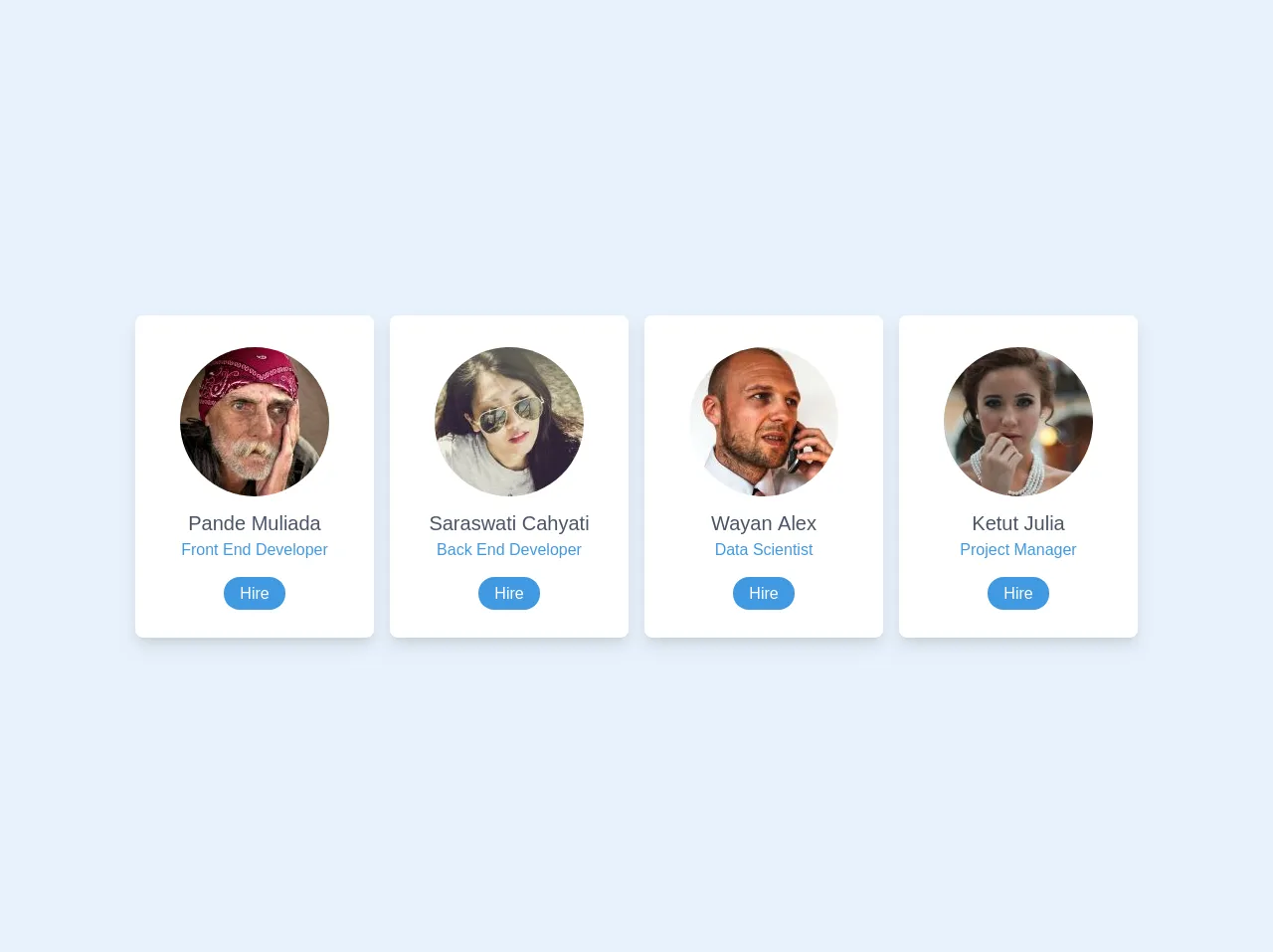
The preview of Simple Card Component ui component.
To give you an idea of what a simple card component looks like, here's a preview:
Free download of the Simple Card Component's source code
The source code of Simple Card Component ui component.
Here's the HTML and CSS code for a simple card component using Tailwind CSS:
<div id="container" class="w-4/5 mx-auto">
    <div class="flex flex-col sm:flex-row">
      <!-- Card 1 -->
      <div class="sm:w-1/4 p-2">
        <div class="bg-white px-6 py-8 rounded-lg shadow-lg text-center">
          <div class="mb-3">
            <img
              class="w-auto mx-auto rounded-full"
              src="https://i.pravatar.cc/150?img=66"
              alt=""
            />
          </div>
          <h2 class="text-xl font-medium text-gray-700">Pande Muliada</h2>
          <span class="text-blue-500 block mb-5">Front End Developer</span>

          <a href="#" class="px-4 py-2 bg-blue-500 text-white rounded-full"
            >Hire</a
          >
        </div>
      </div>

      <!-- Card 2 -->
      <div class="sm:w-1/4 p-2">
        <div class="bg-white px-6 py-8 rounded-lg shadow-lg text-center">
          <div class="mb-3">
            <img
              class="w-auto mx-auto rounded-full"
              src="https://i.pravatar.cc/150?img=31"
              alt=""
            />
          </div>
          <h2 class="text-xl font-medium text-gray-700">Saraswati Cahyati</h2>
          <span class="text-blue-500 block mb-5">Back End Developer</span>

          <a href="#" class="px-4 py-2 bg-blue-500 text-white rounded-full"
            >Hire</a
          >
        </div>
      </div>

      <!-- Card 3 -->
      <div class="sm:w-1/4 p-2">
        <div class="bg-white px-6 py-8 rounded-lg shadow-lg text-center">
          <div class="mb-3">
            <img
              class="w-auto mx-auto rounded-full"
              src="https://i.pravatar.cc/150?img=18"
              alt=""
            />
          </div>
          <h2 class="text-xl font-medium text-gray-700">Wayan Alex</h2>
          <span class="text-blue-500 block mb-5">Data Scientist</span>

          <a href="#" class="px-4 py-2 bg-blue-500 text-white rounded-full"
            >Hire</a
          >
        </div>
      </div>

      <!-- Card 4 -->
      <div class="sm:w-1/4 p-2">
        <div class="bg-white px-6 py-8 rounded-lg shadow-lg text-center">
          <div class="mb-3">
            <img
              class="w-auto mx-auto rounded-full"
              src="https://i.pravatar.cc/150?img=28"
              alt=""
            />
          </div>
          <h2 class="text-xl font-medium text-gray-700">Ketut Julia</h2>
          <span class="text-blue-500 block mb-5">Project Manager</span>

          <a href="#" class="px-4 py-2 bg-blue-500 text-white rounded-full"
            >Hire</a
          >
        </div>
      </div>
    </div>
  </div>
How to create a Simple Card Component with Tailwind CSS?
Now that you have an idea of what a simple card component looks like and have seen the source code, let's walk through the steps to create one using Tailwind CSS.
Step 1: Set up your HTML structure
Start by creating the basic HTML structure for your card component. This will include a div element with a class of "card" that will contain the header, body, and footer sections.
<div class="card">
  <div class="card-header">
    <!-- Header content goes here -->
  </div>
  <div class="card-body">
    <!-- Body content goes here -->
  </div>
  <div class="card-footer">
    <!-- Footer content goes here -->
  </div>
</div>
Step 2: Add Tailwind CSS classes
Next, add the Tailwind CSS classes to your HTML elements to style your card component. You can use the pre-defined classes for cards provided by Tailwind CSS, or create your own custom classes.
<div class="card border rounded-lg shadow-lg">
  <div class="card-header bg-gray-200 p-4">
    <h2 class="font-bold text-lg">Card Title</h2>
  </div>
  <div class="card-body p-4">
    <p class="text-gray-700">Card content goes here.</p>
  </div>
  <div class="card-footer bg-gray-200 p-4">
    <a href="#" class="text-blue-500 font-bold">Read More</a>
  </div>
</div>
Step 3: Customize your card component
Tailwind CSS provides a wide range of customization options that allow you to modify the appearance of your card component to match your design requirements. You can modify the colors, fonts, spacing, and more by adding your own custom classes or modifying the existing ones.
<div class="card border-purple-500 rounded-lg shadow-lg">
  <div class="card-header bg-purple-500 text-white p-4">
    <h2 class="font-bold text-lg">Card Title</h2>
  </div>
  <div class="card-body p-4">
    <p class="text-gray-700">Card content goes here.</p>
  </div>
  <div class="card-footer bg-purple-500 p-4">
    <a href="#" class="text-white font-bold">Read More</a>
  </div>
</div>
Step 4: Add interactivity
You can add interactivity to your card component using JavaScript or CSS animations. For example, you can add hover effects to highlight the card when the user hovers over it.
<div class="card border-purple-500 rounded-lg shadow-lg hover:shadow-xl transition-shadow">
  <div class="card-header bg-purple-500 text-white p-4">
    <h2 class="font-bold text-lg">Card Title</h2>
  </div>
  <div class="card-body p-4">
    <p class="text-gray-700">Card content goes here.</p>
  </div>
  <div class="card-footer bg-purple-500 p-4">
    <a href="#" class="text-white font-bold">Read More</a>
  </div>
</div>
Step 5: Use your card component
Once you've created your simple card component, you can use it in your web application by copying and pasting the HTML code wherever you need it. You can also create multiple card components with different styles and content to suit your needs.
Conclusion
Creating a simple card component with Tailwind CSS is a quick and easy way to add a visually appealing user interface element to your web application. By following the five easy steps outlined in this article, you can create a custom card component that matches your design requirements without writing any custom CSS code.