- Published on
Best Ways To Create A Simple Button Animation Scale With Tailwind CSS
- What is Tailwind CSS?
- The description of Simple Button Animation Scale ui component
- Why use Tailwind CSS to create a Simple Button Animation Scale ui component?
- The preview of Simple Button Animation Scale ui component
- The source code of Simple Button Animation Scale ui component
- How to create a Simple Button Animation Scale with Tailwind CSS?
- Conclusion
What is Tailwind CSS?
Tailwind CSS is a utility-first CSS framework that allows you to quickly create custom designs without writing any CSS. It provides a set of pre-defined classes that you can use to style your HTML elements. With Tailwind CSS, you can easily create responsive designs, customize your colors, and add animations to your UI components.
The description of Simple Button Animation Scale ui component
The Simple Button Animation Scale is a UI component that adds a subtle animation effect to a button when it is clicked. The button scales up and then back down to its original size, giving the user feedback that the button has been clicked. This animation effect can be used to enhance the user experience and make your website or application feel more interactive.
Why use Tailwind CSS to create a Simple Button Animation Scale ui component?
Tailwind CSS provides a set of pre-defined classes that make it easy to create the Simple Button Animation Scale UI component. You don't need to write any custom CSS, which saves you time and effort. Additionally, Tailwind CSS allows you to customize the animation effect by adjusting the duration, delay, and easing of the animation. This gives you complete control over the animation effect and allows you to create a unique user experience.
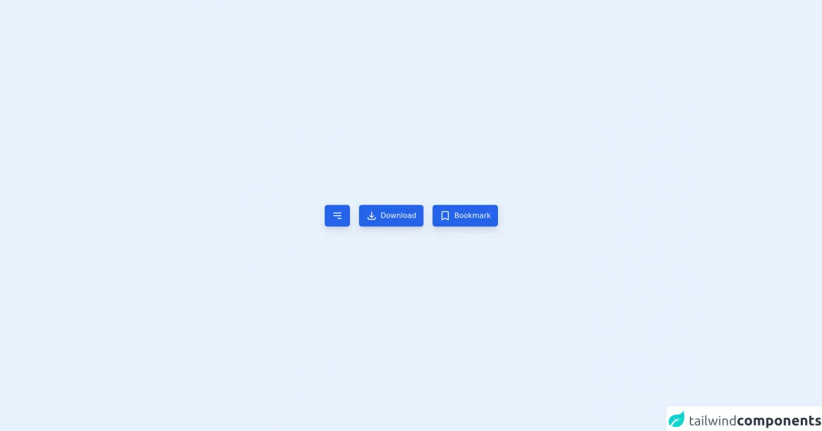
The preview of Simple Button Animation Scale ui component
To create the Simple Button Animation Scale UI component, we will use Tailwind CSS classes to add the animation effect to a button element. The button will scale up and then back down to its original size when it is clicked.
Free download of the Simple Button Animation Scale's source code
The source code of Simple Button Animation Scale ui component
To create the Simple Button Animation Scale UI component, we will use the following HTML and Tailwind CSS classes.
<div class="w-full h-screen flex justify-center items-center">
    <button
        type="button"
        class="px-4 py-3 bg-blue-600 rounded-md text-white outline-none focus:ring-4 shadow-lg transform active:scale-75 transition-transform"
    >
        <svg class="h-6 w-6" fill="none" viewBox="0 0 24 24" stroke="currentColor">
            <path stroke-linecap="round" stroke-linejoin="round" stroke-width="2" d="M4 6h16M4 12h16m-7 6h7" />
        </svg>

    </button>

    <button
        type="button"
        class="px-4 py-3 bg-blue-600 rounded-md text-white outline-none focus:ring-4 shadow-lg transform active:scale-x-75 transition-transform mx-5 flex"
    >
        <svg class="h-6 w-6" fill="none" viewBox="0 0 24 24" stroke="currentColor">
            <path stroke-linecap="round" stroke-linejoin="round" stroke-width="2" d="M4 16v1a3 3 0 003 3h10a3 3 0 003-3v-1m-4-4l-4 4m0 0l-4-4m4 4V4" />
        </svg>

        <span class="ml-2">Download</span>
    </button>

    <button
        type="button"
        class="px-4 py-3 bg-blue-600 rounded-md text-white outline-none focus:ring-4 shadow-lg transform active:scale-y-75 transition-transform flex"
    >
        <svg class="h-6 w-6" fill="none" viewBox="0 0 24 24" stroke="currentColor">
            <path stroke-linecap="round" stroke-linejoin="round" stroke-width="2" d="M5 5a2 2 0 012-2h10a2 2 0 012 2v16l-7-3.5L5 21V5z" />
        </svg>

        <span class="ml-2">Bookmark</span>
    </button>
</div>
How to create a Simple Button Animation Scale with Tailwind CSS?
To create the Simple Button Animation Scale UI component, follow these steps:
- Create a button element in your HTML code.
<button class="bg-blue-500 hover:bg-blue-700 text-white font-bold py-2 px-4 rounded">
  Click me
</button>
- Add the
transformandtransitionclasses to the button element to create the animation effect.
<button class="bg-blue-500 hover:bg-blue-700 text-white font-bold py-2 px-4 rounded transform transition duration-300 ease-in-out">
  Click me
</button>
- Customize the animation effect by adjusting the
duration,delay, andeasingof the animation. For example, you can change the duration of the animation to 500ms and add a delay of 100ms to create a slower animation effect.
<button class="bg-blue-500 hover:bg-blue-700 text-white font-bold py-2 px-4 rounded transform transition duration-500 delay-100 ease-in-out">
  Click me
</button>
- Save your HTML and CSS code and preview the Simple Button Animation Scale UI component in your browser.
Conclusion
In this article, we have discussed how to create a Simple Button Animation Scale UI component with Tailwind CSS. We have seen that Tailwind CSS provides a set of pre-defined classes that make it easy to add animation effects to UI components. By using Tailwind CSS, you can save time and effort and create a unique user experience. I hope this article has been helpful and that you are now able to create your own Simple Button Animation Scale UI component with Tailwind CSS.