- Published on
Imagine You Create A Simple button With Tailwind CSS Like An Expert. Follow These 6 Steps To Get There
- What is Tailwind CSS?
- The description of Simple button ui component
- Why use Tailwind CSS to create a Simple button ui component?
- The preview of Simple button ui component.
- The source code of Simple button ui component.
- How to create a Simple button with Tailwind CSS?
- Step 1: Set up your project
- Step 2: Create a button element
- Step 3: Add Tailwind CSS classes
- Step 4: Add rounded corners
- Step 5: Customize the button
- Step 6: Use the button on your web page
- Conclusion
What is Tailwind CSS?
Tailwind CSS is a utility-first CSS framework that allows you to easily create custom designs without writing any CSS code. It provides a set of pre-defined CSS classes that you can use to style your HTML elements. With Tailwind CSS, you can create responsive and mobile-first designs quickly and easily.
The description of Simple button ui component
A simple button is a basic UI component that is used to trigger an action on a web page. It is one of the most commonly used UI components on the web. A simple button usually has a text label or an icon, and can be styled in different ways to match the design of the web page.
Why use Tailwind CSS to create a Simple button ui component?
Tailwind CSS provides a set of pre-defined CSS classes that can be used to create a simple button quickly and easily. With Tailwind CSS, you don't need to write any CSS code, which saves you time and effort. Additionally, Tailwind CSS is a mobile-first framework, which means that your simple button will be responsive and work well on different screen sizes.
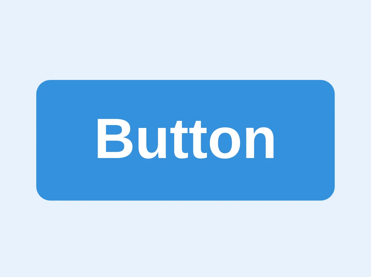
The preview of Simple button ui component.
To create a simple button with Tailwind CSS, you can use the following code:
<button class="bg-blue-500 hover:bg-blue-700 text-white font-bold py-2 px-4 rounded">
  {{__placeholder1__}}
</button>
Free download of the Simple button's source code
The source code of Simple button ui component.
To create a simple button with Tailwind CSS, you can use the following code:
<button class="bg-blue-500 hover:bg-blue-700 text-white font-bold py-2 px-4 rounded">
  Click me
</button>
<button class="bg-blue hover:bg-blue-dark text-white font-bold py-2 px-4 rounded">
    Button
</button>
How to create a Simple button with Tailwind CSS?
Follow these 6 steps to create a simple button with Tailwind CSS:
Step 1: Set up your project
Before you can use Tailwind CSS, you need to set up your project. You can do this by installing Tailwind CSS using npm or by using a CDN.
Step 2: Create a button element
Create a button element in your HTML code. You can use the <button> tag for this.
<button>
  Click me
</button>
Step 3: Add Tailwind CSS classes
Add Tailwind CSS classes to your button element. You can use the bg-blue-500 class to set the background color of the button to blue, the hover:bg-blue-700 class to set the background color of the button to a darker shade of blue when the user hovers over it, the text-white class to set the text color of the button to white, the font-bold class to make the text bold, the py-2 class to set the padding on the top and bottom of the button to 2 units, and the px-4 class to set the padding on the left and right of the button to 4 units.
<button class="bg-blue-500 hover:bg-blue-700 text-white font-bold py-2 px-4">
  Click me
</button>
Step 4: Add rounded corners
Add the rounded class to your button element to give it rounded corners.
<button class="bg-blue-500 hover:bg-blue-700 text-white font-bold py-2 px-4 rounded">
  Click me
</button>
Step 5: Customize the button
You can customize the button further by changing the background color, text color, font size, and other properties. You can use the Tailwind CSS documentation to find the classes you need to achieve the desired look.
Step 6: Use the button on your web page
Once you have created your simple button, you can use it on your web page by copying the HTML code and pasting it where you want the button to appear.
Conclusion
Creating a simple button with Tailwind CSS is easy and quick. By following the 6 steps outlined in this article, you can create a simple button that matches the design of your web page. Tailwind CSS provides a set of pre-defined CSS classes that you can use to style your HTML elements, which saves you time and effort. With Tailwind CSS, you can create responsive and mobile-first designs that work well on different screen sizes.