- Published on
Learn How To Make A Simple Avatar (and initials) With Tailwind CSS Like an Expert
- What is Tailwind CSS?
- The description of Simple Avatar (and initials) UI component
- Why use Tailwind CSS to create a Simple Avatar (and initials) UI component?
- The preview of Simple Avatar (and initials) UI component
- The source code of Simple Avatar (and initials) UI component
- How to create a Simple Avatar (and initials) with Tailwind CSS?
- Step 1: Create the HTML structure
- Step 2: Customize the avatar and the initials
- Step 3: Add an image to the avatar
- Conclusion
As a FrontEnd technology blogger, you must be familiar with Tailwind CSS. It is a utility-first CSS framework that helps you to create responsive and modern user interfaces quickly. In this tutorial, we will learn how to make a simple avatar (and initials) with Tailwind CSS like an expert.
What is Tailwind CSS?
Tailwind CSS is a utility-first CSS framework that provides you with a set of pre-defined classes that you can use to create modern and responsive user interfaces quickly. It is different from other CSS frameworks like Bootstrap or Foundation because it does not come with pre-designed components. Instead, it provides you with a set of low-level utility classes that you can use to create your own custom components.
The description of Simple Avatar (and initials) UI component
A simple avatar (and initials) UI component is a small image or icon that represents a user or a profile. It is commonly used in social media, messaging apps, or user profiles. The avatar can be an image, a letter, or a combination of both. In this tutorial, we will create a simple avatar that consists of a circular image and the user's initials.
Why use Tailwind CSS to create a Simple Avatar (and initials) UI component?
Tailwind CSS provides you with a set of utility classes that can help you to create a simple avatar (and initials) UI component quickly. You can use the bg-* classes to set the background color of the avatar, the text-* classes to set the color of the initials, and the rounded-full class to make the avatar circular.
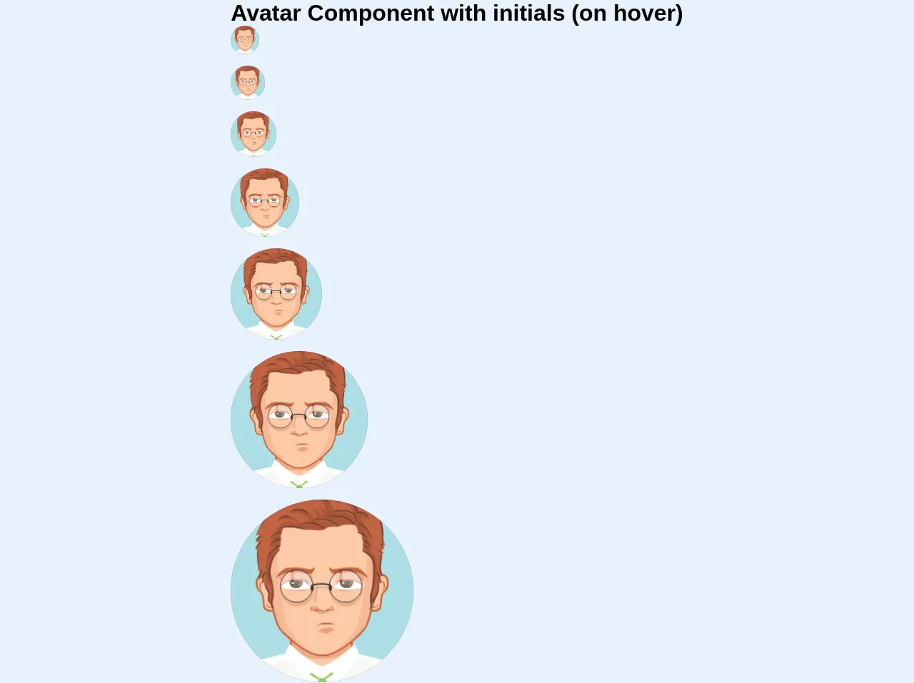
The preview of Simple Avatar (and initials) UI component
To create a simple avatar (and initials) UI component, we will use the bg-gray-400 class to set the background color of the avatar and the text-white class to set the color of the initials. We will also use the rounded-full class to make the avatar circular. Here is a preview of what the final result will look like:
Free download of the Simple Avatar (and initials)'s source code
The source code of Simple Avatar (and initials) UI component
To create a simple avatar (and initials) UI component, we will use HTML and Tailwind CSS. Here is the source code:
<section>
  <h1 class="w-full">Avatar Component with initials (on hover)</h1>
  <div class="w-10 h-10 relative mb-4">
    <div class="group w-full h-full rounded-full overflow-hidden shadow-inner text-center bg-purple table cursor-pointer">
      <span class="hidden group-hover:table-cell text-white font-bold align-middle">KR</span>
      <img src="https://pickaface.net/gallery/avatar/unr_random_180410_1905_z1exb.png" alt="lovely avatar" class="object-cover object-center w-full h-full visible group-hover:hidden" />
    </div>
  </div>

  <div class="w-12 h-12 relative mb-4">
    <div class="group w-full h-full rounded-full overflow-hidden shadow-inner text-center bg-purple table cursor-pointer">
      <span class="hidden group-hover:table-cell text-white font-bold align-middle">KR</span>
      <img src="https://pickaface.net/gallery/avatar/unr_random_180410_1905_z1exb.png" alt="lovely avatar" class="object-cover object-center w-full h-full visible group-hover:hidden" />
    </div>
  </div>

  <div class="w-16 h-16 relative mb-4">
    <div class="group w-full h-full rounded-full overflow-hidden shadow-inner text-center bg-purple table cursor-pointer">
      <span class="hidden group-hover:table-cell text-white font-bold align-middle">KR</span>
      <img src="https://pickaface.net/gallery/avatar/unr_random_180410_1905_z1exb.png" alt="lovely avatar" class="object-cover object-center w-full h-full visible group-hover:hidden" />
    </div>
  </div>

  <div class="w-24 h-24 relative mb-4">
    <div class="group w-full h-full rounded-full overflow-hidden shadow-inner text-center bg-purple table cursor-pointer">
      <span class="hidden group-hover:table-cell text-white font-bold align-middle">KR</span>
      <img src="https://pickaface.net/gallery/avatar/unr_random_180410_1905_z1exb.png" alt="lovely avatar" class="object-cover object-center w-full h-full visible group-hover:hidden" />
    </div>
  </div>

  <div class="w-32 h-32 relative mb-4">
    <div class="group w-full h-full rounded-full overflow-hidden shadow-inner text-center bg-purple table cursor-pointer">
      <span class="hidden group-hover:table-cell text-white font-bold align-middle">KR</span>
      <img src="https://pickaface.net/gallery/avatar/unr_random_180410_1905_z1exb.png" alt="lovely avatar" class="object-cover object-center w-full h-full visible group-hover:hidden" />
    </div>
  </div>

  <div class="w-48 h-48 relative mb-4">
    <div class="group w-full h-full rounded-full overflow-hidden shadow-inner text-center bg-purple table cursor-pointer">
      <span class="hidden group-hover:table-cell text-white font-bold align-middle">KR</span>
      <img src="https://pickaface.net/gallery/avatar/unr_random_180410_1905_z1exb.png" alt="lovely avatar" class="object-cover object-center w-full h-full visible group-hover:hidden" />
    </div>
  </div>

  <div class="w-64 h-64 relative mb-4">
    <div class="group w-full h-full rounded-full overflow-hidden shadow-inner text-center bg-purple table cursor-pointer">
      <span class="hidden group-hover:table-cell text-white font-bold align-middle">KR</span>
      <img src="https://pickaface.net/gallery/avatar/unr_random_180410_1905_z1exb.png" alt="lovely avatar" class="object-cover object-center w-full h-full visible group-hover:hidden" />
    </div>
  </div>
</section>
How to create a Simple Avatar (and initials) with Tailwind CSS?
Now that we have a preview and the source code of the simple avatar (and initials) UI component, let's see how to create it step by step.
Step 1: Create the HTML structure
We will start by creating the HTML structure of the simple avatar (and initials) UI component. We will use a div element to wrap the avatar and the initials. Here is the HTML code:
<div class="flex items-center justify-center w-12 h-12 bg-gray-400 rounded-full">
  <span class="text-white text-lg font-bold">JS</span>
</div>
In this code, we have created a div element with the flex, items-center, justify-center, w-12, h-12, bg-gray-400, and rounded-full classes. This will create a circular avatar with a gray background color. We have also added a span element with the text-white, text-lg, and font-bold classes. This will create the user's initials with white color, large font size, and bold font weight.
Step 2: Customize the avatar and the initials
Now that we have created the HTML structure, we can customize the avatar and the initials using Tailwind CSS utility classes. Here are some examples:
- To change the background color of the avatar, you can use the
bg-*classes. For example,bg-red-500will set the background color to red. - To change the color of the initials, you can use the
text-*classes. For example,text-blue-500will set the color to blue. - To change the font size of the initials, you can use the
text-*classes. For example,text-2xlwill set the font size to 2xl. - To change the font weight of the initials, you can use the
font-*classes. For example,font-boldwill set the font weight to bold.
Step 3: Add an image to the avatar
If you want to add an image to the avatar, you can use the bg-cover and bg-center classes to set the image as the background of the avatar. Here is an example:
<div class="flex items-center justify-center w-12 h-12 bg-cover bg-center rounded-full" style="background-image: url('avatar.jpg')">
  <span class="text-white text-lg font-bold">JS</span>
</div>
In this code, we have added the bg-cover, bg-center, and style attributes to the div element. The bg-cover class will make the image cover the entire avatar, and the bg-center class will center the image. The style attribute will set the image as the background of the avatar using the url() function.
Conclusion
In this tutorial, we have learned how to make a simple avatar (and initials) with Tailwind CSS like an expert. We have seen how to create the HTML structure, customize the avatar and the initials using Tailwind CSS utility classes, and add an image to the avatar. With Tailwind CSS, you can create modern and responsive user interfaces quickly and easily.