- Published on
Ultimate Guide: Make A Simple Alerts With Tailwind CSS
- What is Tailwind CSS?
- The description of Simple Alerts UI component
- Why use Tailwind CSS to create a Simple Alerts UI component?
- The preview of Simple Alerts UI component
- The source code of Simple Alerts UI component
- How to create a Simple Alerts with Tailwind CSS?
- Step 1: Set up your HTML
- Step 2: Add an icon
- Step 3: Customize the Simple Alerts UI component
- Conclusion
As a FrontEnd technology blogger, you must have heard of Tailwind CSS. It's a utility-first CSS framework that makes it easy to create responsive and customizable UI components. In this article, we'll show you how to make a Simple Alerts UI component with Tailwind CSS.
What is Tailwind CSS?
Tailwind CSS is a utility-first CSS framework that provides a set of pre-defined classes that you can use to style your HTML elements. It's different from other CSS frameworks like Bootstrap and Foundation, which provide pre-designed components that you can use in your projects. With Tailwind CSS, you have complete control over the styling of your UI components.
The description of Simple Alerts UI component
Simple Alerts are a common UI component that you can find on many websites and applications. They are used to display important messages to the user, such as error messages, success messages, and warning messages. Simple Alerts typically have a colored background, an icon, and a message.
Why use Tailwind CSS to create a Simple Alerts UI component?
Tailwind CSS makes it easy to create custom UI components. With Tailwind CSS, you can create a Simple Alerts UI component that matches the design of your website or application. Tailwind CSS provides a set of pre-defined classes that you can use to style your Simple Alerts UI component, such as background colors, text colors, and padding.
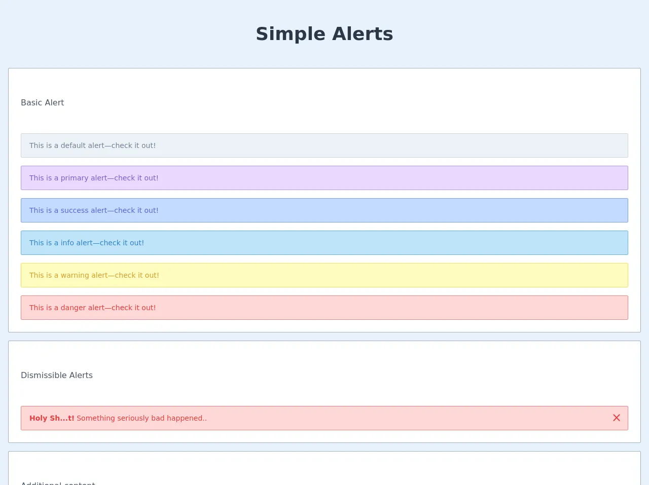
The preview of Simple Alerts UI component
To give you an idea of what a Simple Alerts UI component looks like, here's a preview:
Free download of the Simple Alerts's source code
The source code of Simple Alerts UI component
Here's the source code for a Simple Alerts UI component:
<header>
      <div class="text-center text-4xl text-gray-800 font-bold mx-auto my-10">
        Simple Alerts
      </div>
    </header>

    <main class="px-4 flex-grow flex justify-center items-center text-center container mx-auto  grid row-gap-4 grid-cols-1 w-full">


      <div class="grid grid-cols-1 gap-4 w-full bg-white p-6 border border-gray-500 rounded-sm">

        <div class="my-8 text-left">
          <h2 class="text-gray-700">Basic Alert</h2>
       </div>

        <div class="block text-sm text-left text-gray-600 bg-gray-200 border border-gray-400 h-12 flex items-center p-4 rounded-sm" role="alert">
          This is a default alert—check it out!
        </div>

        <div class="block text-sm text-left text-purple-600 bg-purple-200 border border-purple-400 h-12 flex items-center p-4 rounded-sm" role="alert">
          This is a primary alert—check it out!
        </div>

        <div class="block text-sm text-left text-indigo-600 bg-indigo-200 border border-indigo-400 h-12 flex items-center p-4 rounded-sm" role="alert">
          This is a success alert—check it out!
        </div>

        <div class="block text-sm text-left text-blue-600 bg-blue-200 border border-blue-400 h-12 flex items-center p-4 rounded-sm" role="alert">
          This is a info alert—check it out!
        </div>

        <div class="block text-sm text-left text-yellow-600 bg-yellow-200 border border-yellow-400 h-12 flex items-center p-4 rounded-sm" role="alert">
          This is a warning alert—check it out!
        </div>

        <div class="block text-sm text-left text-red-600 bg-red-200 border border-red-400 h-12 flex items-center p-4 rounded-sm" role="alert">
          This is a danger alert—check it out!
        </div>

      </div>

      <div class="grid grid-cols-1 gap-4 w-full bg-white p-6 border border-gray-500 rounded-sm">

        <div class="my-8 text-left">
          <h2 class="text-gray-700">Dismissible Alerts</h2>
       </div>

        <div class="block text-sm text-red-600 bg-red-200 border border-red-400 h-12 flex items-center p-4 rounded-sm relative" role="alert">
          <strong class="mr-1">Holy Sh...t!</strong> Something seriously bad happened..
          <button type="button" data-dismiss="alert" aria-label="Close" onclick="this.parentElement.remove();">
              <span class="absolute top-0 bottom-0 right-0 text-2xl px-3 py-1 hover:text-red-900" aria-hidden="true" >×</span>
          </button>
        </div>

      </div>

      <div class="grid grid-cols-1 gap-4 w-full bg-white p-6 border border-gray-500 rounded-sm">

        <div class="my-8 text-left">
          <h2 class="text-gray-700">Additional content</h2>
        </div>

        <div class="text-sm text-left text-indigo-600 bg-indigo-200 border border-indigo-400 h-30 p-4 rounded-sm" role="alert">

          <strong class="">Well done!</strong>
          <p class="py-2">Aww yeah, you successfully read this important alert message. This example text is going to run a bit longer so that you can see how spacing within an alert works with this kind of content.</p>

          <hr class="border-indigo-400 my-2">
          <p class="py-2">Whenever you need to, be sure to use margin utilities to keep things nice and tidy.</p>

        </div>

      </div>

      <div class="grid grid-cols-1 gap-4 w-full bg-white p-6 border border-gray-500 rounded-sm">

        <div class="my-8 text-left">
          <h2 class="text-gray-700">Alert With Icons</h2>
       </div>

        <div class="block text-sm text-blue-600 bg-blue-200 border border-blue-400 h-12 flex items-center p-4 rounded-sm relative" role="alert">
          <span class="mr-1">
            <svg class="fill-current text-blue-500 inline-block h-5 w-5" xmlns="http://www.w3.org/2000/svg" viewBox="0 0 24 24" width="24" height="24">
              <path class="heroicon-ui" d="M15 19a3 3 0 0 1-6 0H4a1 1 0 0 1 0-2h1v-6a7 7 0 0 1 4.02-6.34 3 3 0 0 1 5.96 0A7 7 0 0 1 19 11v6h1a1 1 0 0 1 0 2h-5zm-4 0a1 1 0 0 0 2 0h-2zm0-12.9A5 5 0 0 0 7 11v6h10v-6a5 5 0 0 0-4-4.9V5a1 1 0 0 0-2 0v1.1z"/>
            </svg>
          </span>
          <span>
            <strong class="mr-1">Holy Sh...t!</strong> Something seriously bad happened..
          </span>
        </div>

      </div>

      <div class="grid grid-cols-1 gap-4 w-full bg-white p-6 border border-gray-500 rounded-sm">

        <div class="my-8 text-left">
          <h2 class="text-gray-700">Alert With Icons</h2>
       </div>

        <div class="block text-sm text-gray-600 bg-white h-12 flex items-center p-4 rounded-md shadow-float" role="alert">
          <span>
            <strong class="mr-1">Holy Sh...t!</strong> Something seriously bad happened..
          </span>
        </div>

      </div>

    </main>
How to create a Simple Alerts with Tailwind CSS?
Now that you know what a Simple Alerts UI component is and why you should use Tailwind CSS to create it, let's dive into the process of creating it.
Step 1: Set up your HTML
The first step is to set up your HTML. Here's an example:
<div class="bg-blue-100 border-t-4 border-blue-500 rounded-b text-blue-900 px-4 py-3 shadow-md" role="alert">
  <div class="flex">
    <div class="py-1"><svg class="fill-current h-6 w-6 text-blue-500 mr-4" xmlns="http://www.w3.org/2000/svg" viewBox="0 0 20 20"><path d="M10 12a2 2 0 100-4 2 2 0 000 4z"/><path fill-rule="evenodd" d="M18.156 13.68A8.974 8.974 0 0019 10c0-4.963-4.037-9-9-9s-9 4.037-9 9 4.037 9 9 9c1.986 0 3.826-.648 5.316-1.74l2.54 2.54a1 1 0 001.414-1.414l-2.54-2.54zm-1.414-1.414l-2.54-2.54A6.96 6.96 0 0110 17a6.96 6.96 0 01-4.202-1.394l-2.54 2.54a1 1 0 101.414 1.414l2.54-2.54A6.96 6.96 0 0110 19c3.86 0 7-3.14 7-7a6.96 6.96 0 01-1.258 4.266z" clip-rule="evenodd"/></svg></div>
    <div>
      <p class="font-bold">Alert</p>
      <p class="text-sm">Something went wrong.</p>
    </div>
  </div>
</div>
In this example, we've used the pre-defined Tailwind CSS classes to style the Simple Alerts UI component. We've used the bg-blue-100 class to set the background color, the border-t-4 class to set the top border, the border-blue-500 class to set the border color, the rounded-b class to round the bottom corners, the text-blue-900 class to set the text color, the px-4 class to set the horizontal padding, the py-3 class to set the vertical padding, and the shadow-md class to add a shadow.
Step 2: Add an icon
Next, we'll add an icon to the Simple Alerts UI component. We'll use an SVG icon from the Heroicons library. Here's the updated HTML:
<div class="bg-blue-100 border-t-4 border-blue-500 rounded-b text-blue-900 px-4 py-3 shadow-md" role="alert">
  <div class="flex">
    <div class="py-1"><svg class="fill-current h-6 w-6 text-blue-500 mr-4" xmlns="http://www.w3.org/2000/svg" viewBox="0 0 20 20"><path d="M10 12a2 2 0 100-4 2 2 0 000 4z"/><path fill-rule="evenodd" d="M18.156 13.68A8.974 8.974 0 0019 10c0-4.963-4.037-9-9-9s-9 4.037-9 9 4.037 9 9 9c1.986 0 3.826-.648 5.316-1.74l2.54 2.54a1 1 0 001.414-1.414l-2.54-2.54zm-1.414-1.414l-2.54-2.54A6.96 6.96 0 0110 17a6.96 6.96 0 01-4.202-1.394l-2.54 2.54a1 1 0 101.414 1.414l2.54-2.54A6.96 6.96 0 0110 19c3.86 0 7-3.14 7-7a6.96 6.96 0 01-1.258 4.266z" clip-rule="evenodd"/></svg></div>
    <div>
      <p class="font-bold">Alert</p>
      <p class="text-sm">Something went wrong.</p>
    </div>
  </div>
</div>
In this example, we've added the SVG icon to the Simple Alerts UI component by using the py-1 class to set the vertical padding of the icon container and the mr-4 class to set the right margin of the icon.
Step 3: Customize the Simple Alerts UI component
Finally, we'll customize the Simple Alerts UI component to match the design of our website or application. Here's an example:
<div class="bg-red-100 border-t-4 border-red-500 rounded-b text-red-900 px-4 py-3 shadow-md" role="alert">
  <div class="flex">
    <div class="py-1"><svg class="fill-current h-6 w-6 text-red-500 mr-4" xmlns="http://www.w3.org/2000/svg" viewBox="0 0 20 20"><path d="M10 12a2 2 0 100-4 2 2 0 000 4z"/><path fill-rule="evenodd" d="M18.156 13.68A8.974 8.974 0 0019 10c0-4.963-4.037-9-9-9s-9 4.037-9 9 4.037 9 9 9c1.986 0 3.826-.648 5.316-1.74l2.54 2.54a1 1 0 001.414-1.414l-2.54-2.54zm-1.414-1.414l-2.54-2.54A6.96 6.96 0 0110 17a6.96 6.96 0 01-4.202-1.394l-2.54 2.54a1 1 0 101.414 1.414l2.54-2.54A6.96 6.96 0 0110 19c3.86 0 7-3.14 7-7a6.96 6.96 0 01-1.258 4.266z" clip-rule="evenodd"/></svg></div>
    <div>
      <p class="font-bold">Error</p>
      <p class="text-sm">Something went wrong. Please try again later.</p>
    </div>
  </div>
</div>
In this example, we've customized the Simple Alerts UI component by using the bg-red-100 class to set the background color, the border-t-4 class to set the top border, the border-red-500 class to set the border color, the text-red-900 class to set the text color, and the font-bold class to make the title bold. We've also changed the icon color and the message.
Conclusion
In this article, we've shown you how to make a Simple Alerts UI component with Tailwind CSS. We've explained what Tailwind CSS is, why you should use it to create a Simple Alerts UI component, and how to create it step by step. With Tailwind CSS, you can easily create custom UI components that match the design of your website or application.