- Published on
6 Easy Ways To Make A simple Action panel With Tailwind CSS Without Even Thinking About It
- What is Tailwind CSS?
- The Description of Simple Action Panel UI Component
- Why Use Tailwind CSS to Create a Simple Action Panel UI Component?
- The Preview of Simple Action Panel UI Component
- The Source Code of Simple Action Panel UI Component
- How to Create a Simple Action Panel with Tailwind CSS?
- Step 1: Set Up Your HTML
- Step 2: Style Your HTML with Tailwind CSS
- Step 3: Add Interactivity with JavaScript
- Conclusion
As a FrontEnd technology blogger, you are always looking for ways to make your UI components more efficient and visually appealing. One tool that has gained popularity in recent years is Tailwind CSS, a utility-first CSS framework that allows you to quickly create custom designs without writing any CSS code. In this article, we will explore how to create a simple Action panel UI component using Tailwind CSS.
What is Tailwind CSS?
Tailwind CSS is a utility-first CSS framework that provides a set of pre-defined classes that you can use to style your HTML elements. It is designed to be highly customizable and allows you to create custom designs without writing any CSS code. Tailwind CSS is gaining popularity among developers because it allows them to create responsive designs quickly and easily.
The Description of Simple Action Panel UI Component
A simple Action panel is a UI component that allows users to perform specific actions on a page or application. It typically consists of a set of buttons or links that perform specific actions when clicked. The Action panel can be used to provide users with quick access to frequently used features or to guide them through a specific workflow.
Why Use Tailwind CSS to Create a Simple Action Panel UI Component?
Tailwind CSS provides a set of pre-defined classes that you can use to style your UI components. This makes it easy to create custom designs without writing any CSS code. Tailwind CSS also provides a set of responsive classes that allow you to create designs that work well on different screen sizes. This makes it easy to create a responsive Action panel that works well on desktop and mobile devices.
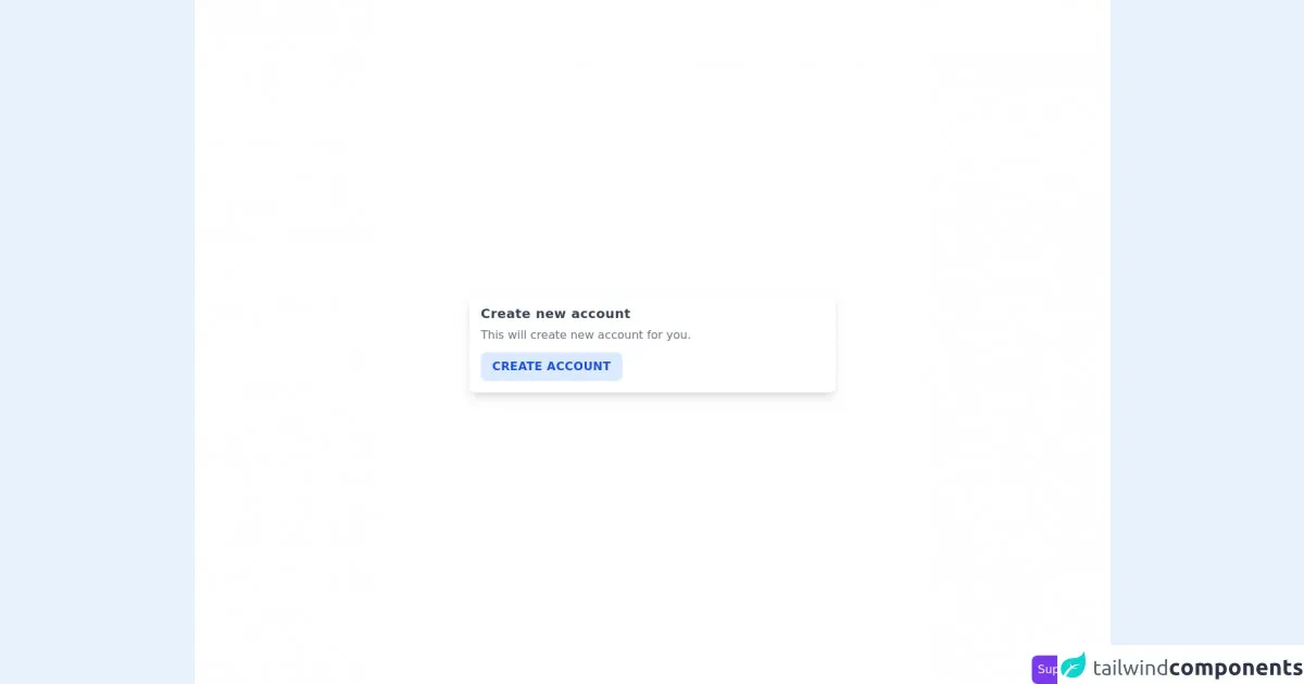
The Preview of Simple Action Panel UI Component
To give you an idea of what a Simple Action panel looks like, here is a preview of what we will be creating:
Free download of the simple Action panel's source code
The Source Code of Simple Action Panel UI Component
Here is the source code for the Simple Action panel UI component that we will be creating:
<section class="min-h-screen flex items-center justify-center px-4 bg-white">
        <div class="max-w-lg w-full rounded-lg shadow-lg p-4">
            <h3 class="font-semibold text-lg text-gray-700 tracking-wide">Create new account</h3>
            <p class="text-gray-500 my-1">
                This will create new account for you.
            </p>
            <div>
                <button class="uppercase font-semibold tracking-wide bg-blue-100 text-blue-700 px-4 py-2 rounded-lg mt-2 focus:outline-none hover:bg-blue-200">Create Account</button>
            </div>
        </div>
    </section>


    <!-- support me by buying a coffee -->
    <a href="https://www.buymeacoffee.com/danimai" target="_blank" class="bg-purple-600 p-2 rounded-lg text-white fixed right-0 bottom-0">
        Support me
    </a>
How to Create a Simple Action Panel with Tailwind CSS?
Now that we have an idea of what a Simple Action panel is and why we should use Tailwind CSS to create it, let's dive into the steps to create it.
Step 1: Set Up Your HTML
The first step is to set up your HTML. In this example, we will create a simple HTML structure that includes a container div and a set of button elements.
<div class="action-panel">
  <button class="action-button">Action 1</button>
  <button class="action-button">Action 2</button>
  <button class="action-button">Action 3</button>
</div>
Step 2: Style Your HTML with Tailwind CSS
Next, we will style our HTML using Tailwind CSS classes. We will use the flexbox utility classes to create a horizontal layout for our buttons and the border and rounded utility classes to create a border around our container.
<div class="border rounded p-2 action-panel flex">
  <button class="bg-blue-500 hover:bg-blue-700 text-white font-bold py-2 px-4 rounded action-button">Action 1</button>
  <button class="bg-blue-500 hover:bg-blue-700 text-white font-bold py-2 px-4 rounded action-button">Action 2</button>
  <button class="bg-blue-500 hover:bg-blue-700 text-white font-bold py-2 px-4 rounded action-button">Action 3</button>
</div>
Step 3: Add Interactivity with JavaScript
Finally, we can add interactivity to our Simple Action panel using JavaScript. In this example, we will add a click event listener to each button that will log a message to the console when clicked.
const buttons = document.querySelectorAll('.action-button');

buttons.forEach(button => {
  button.addEventListener('click', () => {
    console.log(`Button ${button.textContent} was clicked!`);
  });
});
Conclusion
In this article, we explored how to create a Simple Action panel UI component using Tailwind CSS. We learned that Tailwind CSS provides a set of pre-defined classes that allow us to create custom designs without writing any CSS code. We also learned that Tailwind CSS provides a set of responsive classes that allow us to create designs that work well on different screen sizes. By following the steps outlined in this article, you can create a Simple Action panel that is visually appealing and easy to use.