- Published on
How To Build A Sign up / Login boxes With Tailwind CSS From Scratch
- What is Tailwind CSS?
- The description of Sign up / Login boxes UI component
- Why use Tailwind CSS to create a Sign up / Login boxes UI component?
- The preview of Sign up / Login boxes UI component
- The source code of Sign up / Login boxes UI component
- How to create a Sign up / Login boxes with Tailwind CSS?
- Step 1: Create the HTML structure
- Step 2: Add Tailwind CSS classes
- Step 3: Preview the component
- Conclusion
As a FrontEnd technology blogger, you are probably familiar with Tailwind CSS, a popular CSS framework that helps developers create responsive and customizable user interfaces quickly. In this article, we will show you how to build a Sign up / Login boxes UI component with Tailwind CSS from scratch.
What is Tailwind CSS?
Tailwind CSS is a utility-first CSS framework that provides a set of pre-defined classes to style HTML elements. It allows developers to create custom designs without writing any CSS code. Tailwind CSS is easy to use, and it provides a lot of flexibility to create responsive and accessible user interfaces.
The description of Sign up / Login boxes UI component
The Sign up / Login boxes UI component is a common feature in many web applications. It allows users to create an account or log in to an existing account. The component usually consists of two boxes, one for sign up and the other for login. The sign-up box contains a form with input fields for the user's name, email, and password. The login box contains input fields for the user's email and password.
Why use Tailwind CSS to create a Sign up / Login boxes UI component?
Tailwind CSS provides a set of pre-defined classes that can be used to create the Sign up / Login boxes UI component quickly. The framework also provides responsive design classes that allow the component to adapt to different screen sizes. Using Tailwind CSS can save a lot of time and effort in creating the component from scratch.
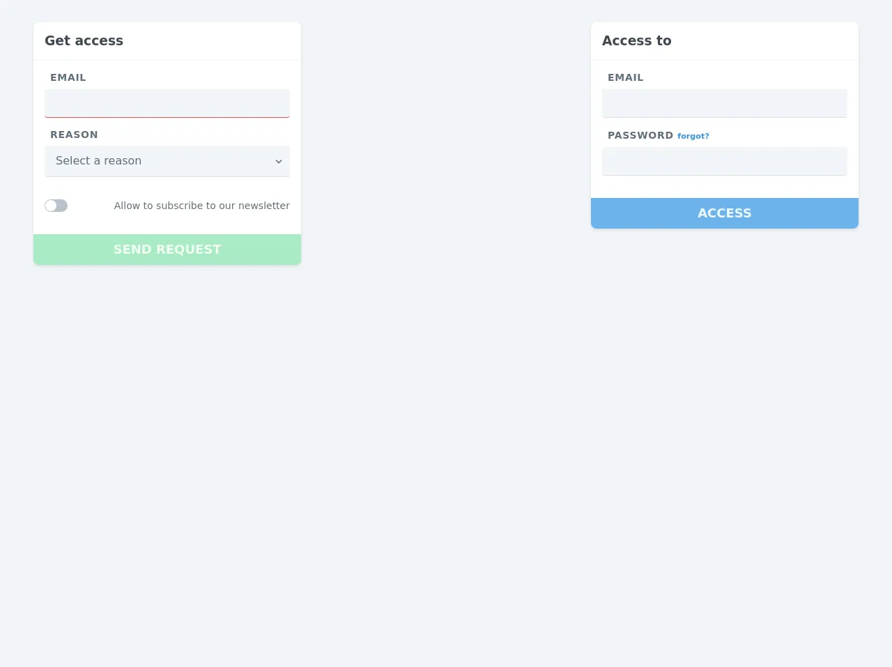
The preview of Sign up / Login boxes UI component
To create the Sign up / Login boxes UI component, we will use Tailwind CSS classes to style the HTML elements. The preview of the component is shown below.
Free download of the Sign up / Login boxes's source code
The source code of Sign up / Login boxes UI component
To create the Sign up / Login boxes UI component, we will use HTML and Tailwind CSS classes. The source code of the component is shown below.
<div class="w-full h-screen bg-grey-lighter">
  <form class="container flex flex-col lg:flex-row justify-center lg:justify-between font-sans mx-auto py-8">
    <div class="w-full lg:w-1/3 px-2 mb-6 lg:mb-0">
      <div class="bg-white shadow rounded-lg">
        <div class="border-b border-grey-lighter p-4">
          <h3 class="text-grey-darkest">
            Get access
          </h3>
        </div>
        <div class="p-4">
          <div class="mb-4">
            <label for="email_2" class="uppercase text-sm tracking-wide font-semibold text-grey-darker px-2">
              Email
            </label>
            <input type="text" id="email_2" class="no-appearance bg-grey-lighter w-full leading-normal py-2 px-3 rounded border-b border-red-light mt-2 focus:outline-none">
          </div>
          <div class="mb-4">
            <div class="flex justify-between items-center px-2">
              <label for="reason" class="uppercase text-sm tracking-wide font-semibold text-grey-darker">
                Reason
              </label>
              <a href="#" class="no-underline text-grey-darker">
                <i class="fas fa-info-circle"></i>
              </a>
            </div>
            <div class="relative mt-2">
              <select class="block appearance-none w-full bg-grey-lighter border-b border-grey-light text-grey-darker py-3 px-4 pr-8 rounded leading-tight focus:outline-none" id="reason">
                <option>Select a reason</option>
                <option>Beta access</option>
                <option>Lorem ipsum</option>
              </select>
              <div class="pointer-events-none absolute pin-y pin-r flex items-center px-2 text-grey-darker">
                <svg class="fill-current h-4 w-4" xmlns="http://www.w3.org/2000/svg" viewBox="0 0 20 20"><path d="M9.293 12.95l.707.707L15.657 8l-1.414-1.414L10 10.828 5.757 6.586 4.343 8z"/></svg>
              </div>
            </div>
          </div>
          <div class="flex justify-between items-center pt-4 mb-4" data-toggle="toggler" data-target="#subscribe">
            <div id="subscribe" class="bg-grey rounded-full pl-px pr-4 py-px cursor-pointer">
              <div class="w-4 h-4 bg-white rounded-full"></div>
            </div>
            <label for="subscribe" class="text-grey-darker text-sm cursor-pointer select-none">
              Allow to subscribe to our newsletter
            </label>
          </div>
        </div>
        <button type="submit" class="uppercase font-bold w-full bg-green-light text-lg text-green-lightest rounded-b-lg p-3 cursor-not-allowed opacity-50" disabled>
          Send request
        </button>
      </div>
    </div>
    <div class="w-full lg:w-1/3 px-2 mb-6 lg:mb-0">
      <div class="bg-white shadow rounded-lg">
        <div class="border-b border-grey-lighter p-4">
          <h3 class="text-grey-darkest">
            Access to
          </h3>
        </div>
        <div class="p-4">
          <div class="mb-4">
            <label for="email" class="uppercase text-sm tracking-wide font-semibold text-grey-darker px-2">
              Email
            </label>
            <input type="email" id="email" class="no-appearance bg-grey-lighter w-full leading-normal py-2 px-3 rounded border-b border-grey-light mt-2 focus:outline-none">
          </div>
          <div class="mb-4">
            <label for="password" class="uppercase text-sm tracking-wide font-semibold text-grey-darker px-2">
              Password
              <small class="lowercase tracking-normal">
                <a href="#" class="no-underline text-blue">
                  forgot?
                </a>
              </small>
            </label>
            <input type="password" id="password" class="no-appearance bg-grey-lighter w-full leading-normal py-2 px-3 rounded border-b border-grey-light mt-2 focus:outline-none">
          </div>
        </div>
        <button type="submit" class="uppercase font-bold w-full bg-blue-light text-lg text-blue-lightest rounded-b-lg p-3">
          Access
        </button>
      </div>
    </div>
  </form>
</div>
How to create a Sign up / Login boxes with Tailwind CSS?
To create the Sign up / Login boxes UI component with Tailwind CSS, follow the steps below.
Step 1: Create the HTML structure
Create a new HTML file and add the following code to create the structure of the Sign up / Login boxes UI component.
<div class="flex justify-center items-center h-screen">
  <div class="w-full max-w-xs">
    <form class="bg-white shadow-md rounded px-8 pt-6 pb-8 mb-4">
      <h2 class="text-center text-xl mb-4">Sign up</h2>
      <div class="mb-4">
        <label class="block text-gray-700 text-sm font-bold mb-2" for="username">
          Username
        </label>
        <input
          class="shadow appearance-none border rounded w-full py-2 px-3 text-gray-700 leading-tight focus:outline-none focus:shadow-outline"
          id="username" type="text" placeholder="Username">
      </div>
      <div class="mb-4">
        <label class="block text-gray-700 text-sm font-bold mb-2" for="email">
          Email
        </label>
        <input
          class="shadow appearance-none border rounded w-full py-2 px-3 text-gray-700 leading-tight focus:outline-none focus:shadow-outline"
          id="email" type="email" placeholder="Email">
      </div>
      <div class="mb-4">
        <label class="block text-gray-700 text-sm font-bold mb-2" for="password">
          Password
        </label>
        <input
          class="shadow appearance-none border rounded w-full py-2 px-3 text-gray-700 leading-tight focus:outline-none focus:shadow-outline"
          id="password" type="password" placeholder="Password">
      </div>
      <div class="mb-6">
        <button
          class="bg-blue-500 hover:bg-blue-700 text-white font-bold py-2 px-4 rounded focus:outline-none focus:shadow-outline"
          type="button">
          Sign up
        </button>
      </div>
      <hr class="mb-4">
      <h2 class="text-center text-xl mb-4">Login</h2>
      <div class="mb-4">
        <label class="block text-gray-700 text-sm font-bold mb-2" for="login-email">
          Email
        </label>
        <input
          class="shadow appearance-none border rounded w-full py-2 px-3 text-gray-700 leading-tight focus:outline-none focus:shadow-outline"
          id="login-email" type="email" placeholder="Email">
      </div>
      <div class="mb-6">
        <label class="block text-gray-700 text-sm font-bold mb-2" for="login-password">
          Password
        </label>
        <input
          class="shadow appearance-none border rounded w-full py-2 px-3 text-gray-700 leading-tight focus:outline-none focus:shadow-outline"
          id="login-password" type="password" placeholder="Password">
      </div>
      <div class="flex items-center justify-between">
        <button
          class="bg-blue-500 hover:bg-blue-700 text-white font-bold py-2 px-4 rounded focus:outline-none focus:shadow-outline"
          type="button">
          Login
        </button>
        <a class="inline-block align-baseline font-bold text-sm text-blue-500 hover:text-blue-800"
          href="#">
          Forgot Password?
        </a>
      </div>
    </form>
  </div>
</div>
The HTML code creates a container div with the flex, justify-center, and items-center classes to center the component on the screen. Inside the container, there is a div with the max-w-xs class to limit the width of the component. The component consists of a form with two sections, one for sign up and the other for login.
Step 2: Add Tailwind CSS classes
Add the Tailwind CSS classes to style the HTML elements. The classes used in the HTML code are explained below.
bg-white,shadow-md, androundedclasses are used to style the form element.px-8,pt-6,pb-8, andmb-4classes are used to add padding and margin to the form element.text-centerandtext-xlclasses are used to style the heading element.mb-4class is used to add margin to the input fields.block,text-gray-700,text-sm,font-bold, andmb-2classes are used to style the label elements.shadow,appearance-none,border,rounded,w-full,py-2,px-3,text-gray-700,leading-tight,focus:outline-none, andfocus:shadow-outlineclasses are used to style the input fields.bg-blue-500,hover:bg-blue-700,text-white,font-bold,py-2,px-4,rounded,focus:outline-none, andfocus:shadow-outlineclasses are used to style the button elements.hrclass is used to add a horizontal line between the sign-up and login sections.flex,items-center, andjustify-betweenclasses are used to style the login button and forgot password link.
Step 3: Preview the component
Open the HTML file in a web browser to preview the Sign up / Login boxes UI component.
Conclusion
In this article, we have shown you how to build a Sign up / Login boxes UI component with Tailwind CSS from scratch. Tailwind CSS provides a set of pre-defined classes that can be used to create custom designs quickly and easily. We hope this article has been helpful in your FrontEnd development journey.