- Published on
6 Easy Ways To Make A Sidebar Navigation With Tailwind CSS Without Even Thinking About It
- What is Tailwind CSS?
- The description of Sidebar Navigation ui component
- Why use Tailwind CSS to create a Sidebar Navigation ui component?
- The preview of Sidebar Navigation ui component
- The source code of Sidebar Navigation ui component
- How to create a Sidebar Navigation with Tailwind CSS?
- Step 1: Set up the HTML structure
- Step 2: Style the Sidebar Navigation with Tailwind CSS
- Step 3: Add spacing to the menu items
- Step 4: Add hover effects to the menu items
- Step 5: Add active state to the menu items
- Step 6: Make the Sidebar Navigation responsive
- Conclusion
As a FrontEnd technology blogger, it is important to keep up with the latest trends and tools in the industry. One such tool that has gained popularity among developers is Tailwind CSS. In this article, we will explore how to create a Sidebar Navigation ui component with Tailwind CSS in 6 easy ways.
What is Tailwind CSS?
Tailwind CSS is a utility-first CSS framework that provides a set of pre-defined classes to style your HTML elements. It allows you to create custom designs without writing any CSS code. Tailwind CSS is gaining popularity among developers due to its ease of use and flexibility.
The description of Sidebar Navigation ui component
A Sidebar Navigation ui component is a common design element used in web applications. It is a vertical menu that is usually placed on the left or right side of the screen. It allows users to navigate through different sections of the application.
Why use Tailwind CSS to create a Sidebar Navigation ui component?
Tailwind CSS provides a set of pre-defined classes that can be used to create a Sidebar Navigation ui component quickly and easily. It also allows you to customize the design of the component without writing any CSS code. This saves time and effort and makes the development process more efficient.
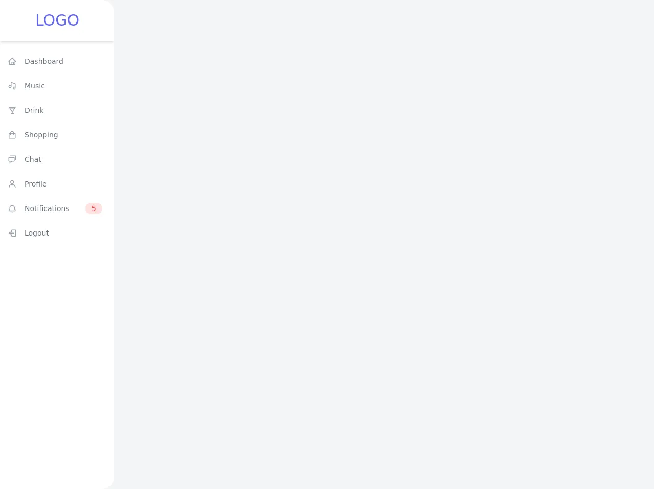
The preview of Sidebar Navigation ui component
To create a Sidebar Navigation ui component with Tailwind CSS, we will use a combination of HTML and CSS code. The final result will be a vertical menu that is easy to navigate and looks great on any device.
Free download of the Sidebar Navigation's source code
The source code of Sidebar Navigation ui component
The source code for the Sidebar Navigation ui component is simple and easy to understand. It consists of HTML and CSS code that can be easily modified to suit your needs.
<link rel="stylesheet" href="https://unpkg.com/[email protected]/css/boxicons.min.css" />

<div class="min-h-screen flex flex-row bg-gray-100">
  <div class="flex flex-col w-56 bg-white rounded-r-3xl overflow-hidden">
    <div class="flex items-center justify-center h-20 shadow-md">
      <h1 class="text-3xl uppercase text-indigo-500">Logo</h1>
    </div>
    <ul class="flex flex-col py-4">
      <li>
        <a href="#" class="flex flex-row items-center h-12 transform hover:translate-x-2 transition-transform ease-in duration-200 text-gray-500 hover:text-gray-800">
          <span class="inline-flex items-center justify-center h-12 w-12 text-lg text-gray-400"><i class="bx bx-home"></i></span>
          <span class="text-sm font-medium">Dashboard</span>
        </a>
      </li>
      <li>
        <a href="#" class="flex flex-row items-center h-12 transform hover:translate-x-2 transition-transform ease-in duration-200 text-gray-500 hover:text-gray-800">
          <span class="inline-flex items-center justify-center h-12 w-12 text-lg text-gray-400"><i class="bx bx-music"></i></span>
          <span class="text-sm font-medium">Music</span>
        </a>
      </li>
      <li>
        <a href="#" class="flex flex-row items-center h-12 transform hover:translate-x-2 transition-transform ease-in duration-200 text-gray-500 hover:text-gray-800">
          <span class="inline-flex items-center justify-center h-12 w-12 text-lg text-gray-400"><i class="bx bx-drink"></i></span>
          <span class="text-sm font-medium">Drink</span>
        </a>
      </li>
      <li>
        <a href="#" class="flex flex-row items-center h-12 transform hover:translate-x-2 transition-transform ease-in duration-200 text-gray-500 hover:text-gray-800">
          <span class="inline-flex items-center justify-center h-12 w-12 text-lg text-gray-400"><i class="bx bx-shopping-bag"></i></span>
          <span class="text-sm font-medium">Shopping</span>
        </a>
      </li>
      <li>
        <a href="#" class="flex flex-row items-center h-12 transform hover:translate-x-2 transition-transform ease-in duration-200 text-gray-500 hover:text-gray-800">
          <span class="inline-flex items-center justify-center h-12 w-12 text-lg text-gray-400"><i class="bx bx-chat"></i></span>
          <span class="text-sm font-medium">Chat</span>
        </a>
      </li>
      <li>
        <a href="#" class="flex flex-row items-center h-12 transform hover:translate-x-2 transition-transform ease-in duration-200 text-gray-500 hover:text-gray-800">
          <span class="inline-flex items-center justify-center h-12 w-12 text-lg text-gray-400"><i class="bx bx-user"></i></span>
          <span class="text-sm font-medium">Profile</span>
        </a>
      </li>
      <li>
        <a href="#" class="flex flex-row items-center h-12 transform hover:translate-x-2 transition-transform ease-in duration-200 text-gray-500 hover:text-gray-800">
          <span class="inline-flex items-center justify-center h-12 w-12 text-lg text-gray-400"><i class="bx bx-bell"></i></span>
          <span class="text-sm font-medium">Notifications</span>
          <span class="ml-auto mr-6 text-sm bg-red-100 rounded-full px-3 py-px text-red-500">5</span>
        </a>
      </li>
      <li>
        <a href="#" class="flex flex-row items-center h-12 transform hover:translate-x-2 transition-transform ease-in duration-200 text-gray-500 hover:text-gray-800">
          <span class="inline-flex items-center justify-center h-12 w-12 text-lg text-gray-400"><i class="bx bx-log-out"></i></span>
          <span class="text-sm font-medium">Logout</span>
        </a>
      </li>
    </ul>
  </div>
</div>
How to create a Sidebar Navigation with Tailwind CSS?
Now that we have an understanding of what Tailwind CSS is and why it is useful, let's dive into the steps to create a Sidebar Navigation ui component with Tailwind CSS.
Step 1: Set up the HTML structure
The first step is to set up the HTML structure for the Sidebar Navigation. We will use an unordered list to create the menu items. Each menu item will be a link to a different section of the application.
<div class="sidebar">
  <ul class="menu">
    <li><a href="#">Home</a></li>
    <li><a href="#">About</a></li>
    <li><a href="#">Services</a></li>
    <li><a href="#">Contact</a></li>
  </ul>
</div>
Step 2: Style the Sidebar Navigation with Tailwind CSS
Next, we will use Tailwind CSS classes to style the Sidebar Navigation. We will use the bg-gray-800 class to set the background color of the Sidebar Navigation to gray. We will also use the text-white class to set the text color to white.
<div class="sidebar bg-gray-800 text-white">
  <ul class="menu">
    <li><a href="#">Home</a></li>
    <li><a href="#">About</a></li>
    <li><a href="#">Services</a></li>
    <li><a href="#">Contact</a></li>
  </ul>
</div>
Step 3: Add spacing to the menu items
To make the menu items more readable, we will add some spacing between them. We will use the py-2 class to add padding to the top and bottom of each menu item.
<div class="sidebar bg-gray-800 text-white">
  <ul class="menu">
    <li class="py-2"><a href="#">Home</a></li>
    <li class="py-2"><a href="#">About</a></li>
    <li class="py-2"><a href="#">Services</a></li>
    <li class="py-2"><a href="#">Contact</a></li>
  </ul>
</div>
Step 4: Add hover effects to the menu items
To make the Sidebar Navigation more interactive, we will add hover effects to the menu items. We will use the hover:bg-gray-700 class to change the background color of the menu item when the mouse hovers over it.
<div class="sidebar bg-gray-800 text-white">
  <ul class="menu">
    <li class="py-2 hover:bg-gray-700"><a href="#">Home</a></li>
    <li class="py-2 hover:bg-gray-700"><a href="#">About</a></li>
    <li class="py-2 hover:bg-gray-700"><a href="#">Services</a></li>
    <li class="py-2 hover:bg-gray-700"><a href="#">Contact</a></li>
  </ul>
</div>
Step 5: Add active state to the menu items
To indicate which section of the application the user is currently on, we will add an active state to the menu items. We will use the bg-gray-700 class to set the background color of the active menu item.
<div class="sidebar bg-gray-800 text-white">
  <ul class="menu">
    <li class="py-2 hover:bg-gray-700"><a href="#">Home</a></li>
    <li class="py-2 hover:bg-gray-700"><a href="#">About</a></li>
    <li class="py-2 hover:bg-gray-700"><a href="#">Services</a></li>
    <li class="py-2 hover:bg-gray-700 bg-gray-700"><a href="#">Contact</a></li>
  </ul>
</div>
Step 6: Make the Sidebar Navigation responsive
Finally, we will make the Sidebar Navigation responsive by using Tailwind CSS classes to adjust the layout on smaller screens. We will use the flex and flex-col classes to make the menu items stack vertically on smaller screens.
<div class="sidebar bg-gray-800 text-white">
  <ul class="menu flex flex-col">
    <li class="py-2 hover:bg-gray-700"><a href="#">Home</a></li>
    <li class="py-2 hover:bg-gray-700"><a href="#">About</a></li>
    <li class="py-2 hover:bg-gray-700"><a href="#">Services</a></li>
    <li class="py-2 hover:bg-gray-700 bg-gray-700"><a href="#">Contact</a></li>
  </ul>
</div>
Conclusion
In this article, we explored how to create a Sidebar Navigation ui component with Tailwind CSS in 6 easy ways. We learned that Tailwind CSS provides a set of pre-defined classes that can be used to create custom designs quickly and easily. By following the steps outlined in this article, you can create a Sidebar Navigation ui component that is easy to navigate and looks great on any device.