- Published on
Ways To Make A Sidebar Component With Tailwind CSS In 60 Minutes
- What is Tailwind CSS?
- The description of Sidebar Component UI component
- Why use Tailwind CSS to create a Sidebar Component UI component?
- The preview of Sidebar Component UI component
- The source code of Sidebar Component UI component
- How to create a Sidebar Component with Tailwind CSS?
- Conclusion
If you're looking to create a sidebar component for your website or web application, Tailwind CSS is a great tool to use. With its pre-built classes and responsive design, you can create a sidebar component in just 60 minutes. In this article, we will discuss what Tailwind CSS is, the description of the sidebar component UI component, why use Tailwind CSS to create a sidebar component UI component, the preview and source code of the sidebar component UI component, and how to create a sidebar component with Tailwind CSS.
What is Tailwind CSS?
Tailwind CSS is a utility-first CSS framework that provides pre-built classes for styling HTML elements. It allows you to create custom designs without writing any CSS code. Tailwind CSS has a large number of pre-built classes for typography, spacing, colors, and more. It also has a responsive design, which means that your website or web application will look great on any device.
The description of Sidebar Component UI component
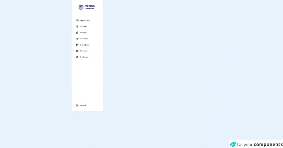
A sidebar component is a UI component that is used to display additional information or navigation on a website or web application. It is typically located on the left or right side of the page and can be collapsed or expanded depending on the user's preference.
Why use Tailwind CSS to create a Sidebar Component UI component?
Tailwind CSS provides pre-built classes for creating a sidebar component quickly and easily. It also has a responsive design, which means that your sidebar component will look great on any device. Additionally, Tailwind CSS allows you to customize your sidebar component by adding your own classes or modifying the pre-built classes.
The preview of Sidebar Component UI component
To create a sidebar component with Tailwind CSS, you can use the following classes:
bg-gray-800: sets the background color of the sidebar to gray.text-white: sets the text color of the sidebar to white.w-64: sets the width of the sidebar to 64 pixels.px-4: adds padding to the left and right sides of the sidebar.py-8: adds padding to the top and bottom of the sidebar.fixed: fixes the position of the sidebar on the page.inset-y-0: positions the sidebar at the top and bottom of the page.left-0: positions the sidebar on the left side of the page.transition: adds a transition effect when the sidebar is collapsed or expanded.
Free download of the Sidebar Component's source code
The source code of Sidebar Component UI component
To create a sidebar component with Tailwind CSS, you can use the following HTML code:
<div class="bg-gray-800 text-white w-64 px-4 py-8 fixed inset-y-0 left-0 transition">
  <h1 class="text-2xl font-bold">Sidebar</h1>
  <nav class="mt-8">
    <a href="#" class="block py-2.5 px-4 rounded hover:bg-gray-700">Link 1</a>
    <a href="#" class="block py-2.5 px-4 rounded hover:bg-gray-700">Link 2</a>
    <a href="#" class="block py-2.5 px-4 rounded hover:bg-gray-700">Link 3</a>
    <a href="#" class="block py-2.5 px-4 rounded hover:bg-gray-700">Link 4</a>
  </nav>
</div>
<nav class=" rounded-md w-72 h-screen flex-col justify-between">
	<div class=" bg-white h-full">
		<div class="flex  justify-center py-10 shadow-sm pr-4">
			<svg xmlns="http://www.w3.org/2000/svg" class="h-14 w-14 text-indigo-600" fill="none" viewBox="0 0 24 24"
				stroke="currentColor">
				<path stroke-linecap="round" stroke-linejoin="round" stroke-width="2"
					d="M9 3v2m6-2v2M9 19v2m6-2v2M5 9H3m2 6H3m18-6h-2m2 6h-2M7 19h10a2 2 0 002-2V7a2 2 0 00-2-2H7a2 2 0 00-2 2v10a2 2 0 002 2zM9 9h6v6H9V9z" />
			</svg>
			<div class="pl-2">

				<p class="text-2xl font-bold text-indigo-600">VENUS</h1>
					<span class="text-xs block text-gray-800">DASHBOARD</span>
			</div>
		</div>
		<div class="pl-10">
			<ul class="space-y-8 pt-10">
				<li class="flex space-x-4 items-center hover:text-indigo-600 cursor-pointer">
					<svg xmlns="http://www.w3.org/2000/svg" class="h-6 w-6" fill="none" viewBox="0 0 24 24"
						stroke="currentColor">
						<path stroke-linecap="round" stroke-linejoin="round" stroke-width="2"
							d="M9 17V7m0 10a2 2 0 01-2 2H5a2 2 0 01-2-2V7a2 2 0 012-2h2a2 2 0 012 2m0 10a2 2 0 002 2h2a2 2 0 002-2M9 7a2 2 0 012-2h2a2 2 0 012 2m0 10V7m0 10a2 2 0 002 2h2a2 2 0 002-2V7a2 2 0 00-2-2h-2a2 2 0 00-2 2" />
					</svg>
					<a href="">Dashboard</a>
				</li>
				<li class="flex space-x-4 items-center hover:text-indigo-600 cursor-pointer">
					<svg xmlns="http://www.w3.org/2000/svg" class="h-6 w-6" fill="none" viewBox="0 0 24 24"
						stroke="currentColor">
						<path stroke-linecap="round" stroke-linejoin="round" stroke-width="2"
							d="M13 10V3L4 14h7v7l9-11h-7z" />
					</svg>
					<a href="">Activity</a>
				</li>
				<li class="flex space-x-4 items-center hover:text-indigo-600 cursor-pointer">
					<svg xmlns="http://www.w3.org/2000/svg" class="h-6 w-6" fill="none" viewBox="0 0 24 24"
						stroke="currentColor">
						<path stroke-linecap="round" stroke-linejoin="round" stroke-width="2"
							d="M8 5H6a2 2 0 00-2 2v12a2 2 0 002 2h10a2 2 0 002-2v-1M8 5a2 2 0 002 2h2a2 2 0 002-2M8 5a2 2 0 012-2h2a2 2 0 012 2m0 0h2a2 2 0 012 2v3m2 4H10m0 0l3-3m-3 3l3 3" />
					</svg>
					<a href="">Library</a>
				</li>
				<li class="flex space-x-4 items-center hover:text-indigo-600 cursor-pointer">
					<svg xmlns="http://www.w3.org/2000/svg" class="h-6 w-6" fill="none" viewBox="0 0 24 24"
						stroke="currentColor">
						<path stroke-linecap="round" stroke-linejoin="round" stroke-width="2"
							d="M9 12l2 2 4-4m5.618-4.016A11.955 11.955 0 0112 2.944a11.955 11.955 0 01-8.618 3.04A12.02 12.02 0 003 9c0 5.591 3.824 10.29 9 11.622 5.176-1.332 9-6.03 9-11.622 0-1.042-.133-2.052-.382-3.016z" />
					</svg>
					<a href="">Security</a>
				</li>
				<li class="flex space-x-4 items-center hover:text-indigo-600 cursor-pointer">
					<svg xmlns="http://www.w3.org/2000/svg" class="h-6 w-6" fill="none" viewBox="0 0 24 24"
						stroke="currentColor">
						<path stroke-linecap="round" stroke-linejoin="round" stroke-width="2"
							d="M5 8h14M5 8a2 2 0 110-4h14a2 2 0 110 4M5 8v10a2 2 0 002 2h10a2 2 0 002-2V8m-9 4h4" />
					</svg>
					<a href="">Schedules</a>
				</li>
				<li class="flex space-x-4 items-center hover:text-indigo-600 cursor-pointer">
					<svg xmlns="http://www.w3.org/2000/svg" class="h-6 w-6" fill="none" viewBox="0 0 24 24"
						stroke="currentColor">
						<path stroke-linecap="round" stroke-linejoin="round" stroke-width="2"
							d="M12 8c-1.657 0-3 .895-3 2s1.343 2 3 2 3 .895 3 2-1.343 2-3 2m0-8c1.11 0 2.08.402 2.599 1M12 8V7m0 1v8m0 0v1m0-1c-1.11 0-2.08-.402-2.599-1M21 12a9 9 0 11-18 0 9 9 0 0118 0z" />
					</svg>
					<a href="">Payouts</a>
				</li>
				<li class="flex space-x-4 items-center hover:text-indigo-600 cursor-pointer">
					<svg xmlns="http://www.w3.org/2000/svg" class="h-6 w-6" fill="none" viewBox="0 0 24 24"
						stroke="currentColor">
						<path stroke-linecap="round" stroke-linejoin="round" stroke-width="2"
							d="M12 6V4m0 2a2 2 0 100 4m0-4a2 2 0 110 4m-6 8a2 2 0 100-4m0 4a2 2 0 110-4m0 4v2m0-6V4m6 6v10m6-2a2 2 0 100-4m0 4a2 2 0 110-4m0 4v2m0-6V4" />
					</svg>
					<a href="">Settings</a>
				</li>
			</ul>
		</div>
	</div>
	<div class="bg-white flex items-center space-x-4 pl-10 pb-10 hover:text-indigo-600 cursor-pointer">
		<svg xmlns="http://www.w3.org/2000/svg" class="h-6 w-6" fill="none" viewBox="0 0 24 24" stroke="currentColor">
			<path stroke-linecap="round" stroke-linejoin="round" stroke-width="2"
				d="M17 16l4-4m0 0l-4-4m4 4H7m6 4v1a3 3 0 01-3 3H6a3 3 0 01-3-3V7a3 3 0 013-3h4a3 3 0 013 3v1" />
		</svg>
		<a href="/loguot">Logout</a>
	</div>
</nav>
How to create a Sidebar Component with Tailwind CSS?
To create a sidebar component with Tailwind CSS, follow these steps:
- Create a new HTML file and add the above HTML code to it.
- Add the Tailwind CSS stylesheet to your HTML file by adding the following code to the head section of your HTML file:
<link href="https://cdn.jsdelivr.net/npm/tailwindcss@latest/dist/tailwind.min.css" rel="stylesheet">
- Save your HTML file and open it in a web browser.
Your sidebar component should now be visible on the left side of the page. You can customize your sidebar component by adding your own classes or modifying the pre-built classes.
Conclusion
In this article, we discussed how to create a sidebar component with Tailwind CSS in just 60 minutes. We covered what Tailwind CSS is, the description of the sidebar component UI component, why use Tailwind CSS to create a sidebar component UI component, the preview and source code of the sidebar component UI component, and how to create a sidebar component with Tailwind CSS. With Tailwind CSS, you can create custom designs quickly and easily without writing any CSS code.