- Published on
The 5 Really Obvious Ways To Make A side nav bar With Tailwind CSS Better That You Ever Did
- What is Tailwind CSS?
- The description of side nav bar ui component
- Why use Tailwind CSS to create a side nav bar ui component?
- The preview of side nav bar ui component
- The source code of side nav bar ui component
- How to create a side nav bar with Tailwind CSS?
- 1. Use flexbox to create the layout
- 2. Use utility classes to style the side nav bar
- 3. Use responsive classes to make the side nav bar mobile-friendly
- 4. Use utility classes to add icons to the navigation links
- 5. Use utility classes to add active states to the navigation links
- Conclusion
What is Tailwind CSS?
Tailwind CSS is a utility-first CSS framework that is rapidly gaining popularity among developers. It provides a set of pre-defined CSS classes that can be used to create responsive and customizable user interfaces quickly. Tailwind CSS is designed to be highly modular and can be used with any front-end framework or library.
The description of side nav bar ui component
A side nav bar is a user interface component that is commonly used in web applications to provide easy navigation to different sections of the application. It is typically placed on the left or right side of the screen and contains links to different pages or sections of the application.
Why use Tailwind CSS to create a side nav bar ui component?
Tailwind CSS provides a set of pre-defined CSS classes that can be used to create a side nav bar quickly and easily. These classes can be customized to match the design of the application and can be used to create responsive and mobile-friendly user interfaces.
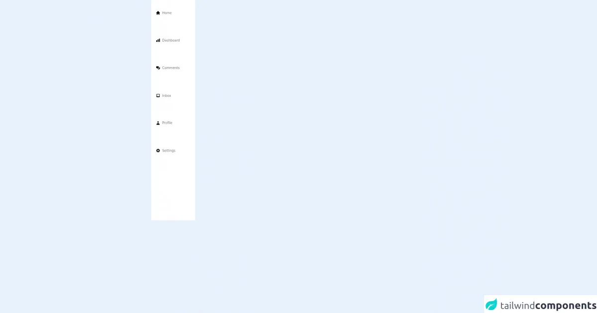
The preview of side nav bar ui component
To create a side nav bar with Tailwind CSS, we will use a combination of flexbox and utility classes. The resulting side nav bar will be responsive and mobile-friendly, and can be customized to match the design of the application.
Free download of the side nav bar's source code
The source code of side nav bar ui component
To create a side nav bar with Tailwind CSS, we will use a combination of HTML and utility classes. The resulting code will be easy to read and understand, and can be customized to match the design of the application.
<div class="h-screen w-48 px-4 border-r bg-white">
   <div class="h-3/4 flex flex-col justify-around text-gray-500">
      <h3 class="pl-1 text-sm flex items-center py-2 mb-2 hover:bg-gray-100 hover:text-gray-700 transition duration-200 ease-in">
         <svg xmlns="http://www.w3.org/2000/svg" class="h-5 w-5 mr-2" viewBox="0 0 20 20" fill="black">
            <path d="M10.707 2.293a1 1 0 00-1.414 0l-7 7a1 1 0 001.414 1.414L4 10.414V17a1 1 0 001 1h2a1 1 0 001-1v-2a1 1 0 011-1h2a1 1 0 011 1v2a1 1 0 001 1h2a1 1 0 001-1v-6.586l.293.293a1 1 0 001.414-1.414l-7-7z" />
         </svg>
         <a class="hover:text-black transition duration-200 ease-linear" href="#">Home</a>
      </h3>
      <h3 class="pl-1 text-sm flex items-center py-2 mb-2 hover:bg-gray-100 hover:text-gray-700 transition duration-200 ease-in">
         <svg xmlns="http://www.w3.org/2000/svg" class="h-5 w-5 mr-2" viewBox="0 0 20 20" fill="black">
            <path d="M2 11a1 1 0 011-1h2a1 1 0 011 1v5a1 1 0 01-1 1H3a1 1 0 01-1-1v-5zM8 7a1 1 0 011-1h2a1 1 0 011 1v9a1 1 0 01-1 1H9a1 1 0 01-1-1V7zM14 4a1 1 0 011-1h2a1 1 0 011 1v12a1 1 0 01-1 1h-2a1 1 0 01-1-1V4z" />
         </svg>
         <a class="hover:text-black transition duration-200 ease-linear" href="#">Dashboard</a>
      </h3>
      <h3 class="pl-1 text-sm flex items-center py-2 mb-2 hover:bg-gray-100 hover:text-gray-700 transition duration-200 ease-in">
         <svg xmlns="http://www.w3.org/2000/svg" class="h-5 w-5 mr-2" viewBox="0 0 20 20" fill="black">
            <path d="M2 5a2 2 0 012-2h7a2 2 0 012 2v4a2 2 0 01-2 2H9l-3 3v-3H4a2 2 0 01-2-2V5z" />
            <path d="M15 7v2a4 4 0 01-4 4H9.828l-1.766 1.767c.28.149.599.233.938.233h2l3 3v-3h2a2 2 0 002-2V9a2 2 0 00-2-2h-1z" />
         </svg>
         <a class="hover:text-black transition duration-200 ease-linear" href="#">Comments</a>
      </h3>
      <h3 class="pl-1 text-sm flex items-center py-2 mb-2 hover:bg-gray-100 hover:text-gray-700 transition duration-200 ease-in">
         <svg xmlns="http://www.w3.org/2000/svg" class="h-5 w-5 mr-2" viewBox="0 0 20 20" fill="black">
            <path fill-rule="evenodd" d="M5 3a2 2 0 00-2 2v10a2 2 0 002 2h10a2 2 0 002-2V5a2 2 0 00-2-2H5zm0 2h10v7h-2l-1 2H8l-1-2H5V5z" clip-rule="evenodd" />
         </svg>
         <a class="hover:text-black transition duration-200 ease-linear" href="#">Inbox</a>
      </h3>
      <h3 class="pl-1 text-sm flex items-center py-2 mb-2 hover:bg-gray-100 hover:text-gray-700 transition duration-200 ease-in">
         <svg xmlns="http://www.w3.org/2000/svg" class="h-5 w-5 mr-2" viewBox="0 0 20 20" fill="black">
            <path fill-rule="evenodd" d="M10 9a3 3 0 100-6 3 3 0 000 6zm-7 9a7 7 0 1114 0H3z" clip-rule="evenodd" />
         </svg>
         <a class="hover:text-black transition duration-200 ease-linear" href="#">Profile</a>
      </h3>
      <h3 class="pl-1 text-sm flex items-center py-2 mb-2 hover:bg-gray-100 hover:text-gray-700 transition duration-200 ease-in">
         <svg xmlns="http://www.w3.org/2000/svg" class="h-5 w-5 mr-2" viewBox="0 0 20 20" fill="black">
            <path fill-rule="evenodd" d="M11.49 3.17c-.38-1.56-2.6-1.56-2.98 0a1.532 1.532 0 01-2.286.948c-1.372-.836-2.942.734-2.106 2.106.54.886.061 2.042-.947 2.287-1.561.379-1.561 2.6 0 2.978a1.532 1.532 0 01.947 2.287c-.836 1.372.734 2.942 2.106 2.106a1.532 1.532 0 012.287.947c.379 1.561 2.6 1.561 2.978 0a1.533 1.533 0 012.287-.947c1.372.836 2.942-.734 2.106-2.106a1.533 1.533 0 01.947-2.287c1.561-.379 1.561-2.6 0-2.978a1.532 1.532 0 01-.947-2.287c.836-1.372-.734-2.942-2.106-2.106a1.532 1.532 0 01-2.287-.947zM10 13a3 3 0 100-6 3 3 0 000 6z" clip-rule="evenodd" />
         </svg>
         <a class="hover:text-black transition duration-200 ease-linear" href="#">Settings</a>
      </h3>
   </div>
</div>
How to create a side nav bar with Tailwind CSS?
Here are the 5 really obvious ways to make a side nav bar with Tailwind CSS better than you ever did:
1. Use flexbox to create the layout
To create a side nav bar with Tailwind CSS, we will use flexbox to create the layout. Flexbox is a powerful layout tool that allows us to create flexible and responsive layouts quickly and easily.
<div class="flex flex-col h-screen">
  <div class="flex-shrink-0 bg-gray-800">
    <!-- Logo and header -->
  </div>
  <div class="flex-1 overflow-y-auto">
    <!-- Content -->
  </div>
</div>
In this example, we are using the flex and flex-col classes to create a vertical layout. The h-screen class sets the height of the container to the height of the screen. The flex-shrink-0 class prevents the header from shrinking when the content is scrolled.
2. Use utility classes to style the side nav bar
Tailwind CSS provides a set of utility classes that can be used to style the side nav bar quickly and easily. We can use classes like bg-gray-800 to set the background color of the side nav bar and text-white to set the color of the text.
<div class="flex-shrink-0 bg-gray-800">
  <div class="px-2 py-4">
    <div class="text-white font-bold text-xl">My App</div>
  </div>
  <nav class="px-2 pb-6">
    <a href="#" class="block text-gray-300 hover:text-white py-2">Dashboard</a>
    <a href="#" class="block text-gray-300 hover:text-white py-2">Projects</a>
    <a href="#" class="block text-gray-300 hover:text-white py-2">Team</a>
    <a href="#" class="block text-gray-300 hover:text-white py-2">Settings</a>
  </nav>
</div>
In this example, we are using the px-2 and py-4 classes to add padding to the header, and the px-2 and pb-6 classes to add padding to the navigation links. We are also using the text-white and text-gray-300 classes to set the color of the text.
3. Use responsive classes to make the side nav bar mobile-friendly
Tailwind CSS provides a set of responsive classes that can be used to make the side nav bar mobile-friendly. We can use classes like hidden md:block to hide the side nav bar on small screens and show it on larger screens.
<div class="flex-shrink-0 bg-gray-800">
  <div class="px-2 py-4">
    <div class="text-white font-bold text-xl">My App</div>
  </div>
  <nav class="px-2 pb-6 hidden md:block">
    <a href="#" class="block text-gray-300 hover:text-white py-2">Dashboard</a>
    <a href="#" class="block text-gray-300 hover:text-white py-2">Projects</a>
    <a href="#" class="block text-gray-300 hover:text-white py-2">Team</a>
    <a href="#" class="block text-gray-300 hover:text-white py-2">Settings</a>
  </nav>
</div>
In this example, we are using the hidden and md:block classes to hide the navigation links on small screens and show them on larger screens.
4. Use utility classes to add icons to the navigation links
Tailwind CSS provides a set of utility classes that can be used to add icons to the navigation links. We can use classes like fas fa-tachometer-alt to add a font-awesome icon to the dashboard link.
<div class="flex-shrink-0 bg-gray-800">
  <div class="px-2 py-4">
    <div class="text-white font-bold text-xl">My App</div>
  </div>
  <nav class="px-2 pb-6 hidden md:block">
    <a href="#" class="block text-gray-300 hover:text-white py-2">
      <i class="fas fa-tachometer-alt mr-2"></i>Dashboard
    </a>
    <a href="#" class="block text-gray-300 hover:text-white py-2">
      <i class="fas fa-project-diagram mr-2"></i>Projects
    </a>
    <a href="#" class="block text-gray-300 hover:text-white py-2">
      <i class="fas fa-users mr-2"></i>Team
    </a>
    <a href="#" class="block text-gray-300 hover:text-white py-2">
      <i class="fas fa-cog mr-2"></i>Settings
    </a>
  </nav>
</div>
In this example, we are using the fas fa-tachometer-alt and mr-2 classes to add a font-awesome icon and margin to the dashboard link.
5. Use utility classes to add active states to the navigation links
Tailwind CSS provides a set of utility classes that can be used to add active states to the navigation links. We can use classes like bg-gray-900 to set the background color of the active link and text-white to set the color of the text.
<div class="flex-shrink-0 bg-gray-800">
  <div class="px-2 py-4">
    <div class="text-white font-bold text-xl">My App</div>
  </div>
  <nav class="px-2 pb-6 hidden md:block">
    <a href="#" class="block text-gray-300 hover:text-white py-2">
      <i class="fas fa-tachometer-alt mr-2"></i>Dashboard
    </a>
    <a href="#" class="block text-gray-300 hover:text-white py-2">
      <i class="fas fa-project-diagram mr-2"></i>Projects
    </a>
    <a href="#" class="block text-gray-300 hover:text-white py-2">
      <i class="fas fa-users mr-2"></i>Team
    </a>
    <a href="#" class="block text-gray-300 hover:text-white py-2 bg-gray-900 text-white">
      <i class="fas fa-cog mr-2"></i>Settings
    </a>
  </nav>
</div>
In this example, we are using the bg-gray-900 and text-white classes to set the background color and color of the active link.
Conclusion
In conclusion, Tailwind CSS provides a powerful set of utility classes that can be used to create responsive and customizable user interfaces quickly and easily. By following these 5 really obvious ways, you can create a side nav bar with Tailwind CSS that is better than you ever did.