- Published on
What You Need To Make A Services Section With Tailwind CSS
- What is Tailwind CSS?
- The description of Services Section ui component
- Why use Tailwind CSS to create a Services Section ui component?
- The preview of Services Section ui component
- The source code of Services Section ui component
- How to create a Services Section with Tailwind CSS?
- Conclusion
In today's digital world, having a visually appealing website is crucial to attract and retain customers. One of the key components of a website is the Services Section, which showcases the services offered by a business. In this article, we will explore how to create a Services Section using Tailwind CSS.
What is Tailwind CSS?
Tailwind CSS is a utility-first CSS framework that allows developers to quickly and easily create custom designs without writing any CSS. It provides a set of pre-defined classes that can be used to style HTML elements. Tailwind CSS is highly customizable and can be easily integrated into any project.
The description of Services Section ui component
A Services Section is a UI component that showcases the services offered by a business. It typically includes a title, a brief description of each service, and an icon or image to represent each service. The Services Section is usually placed on the homepage of a website to attract the attention of visitors.
Why use Tailwind CSS to create a Services Section ui component?
Tailwind CSS is a great choice for creating a Services Section UI component because it provides a wide range of pre-defined classes that can be used to style each element of the section. This makes it easy to customize the design of the Services Section to match the branding of the business. Additionally, Tailwind CSS is highly responsive, ensuring that the Services Section looks great on all devices.
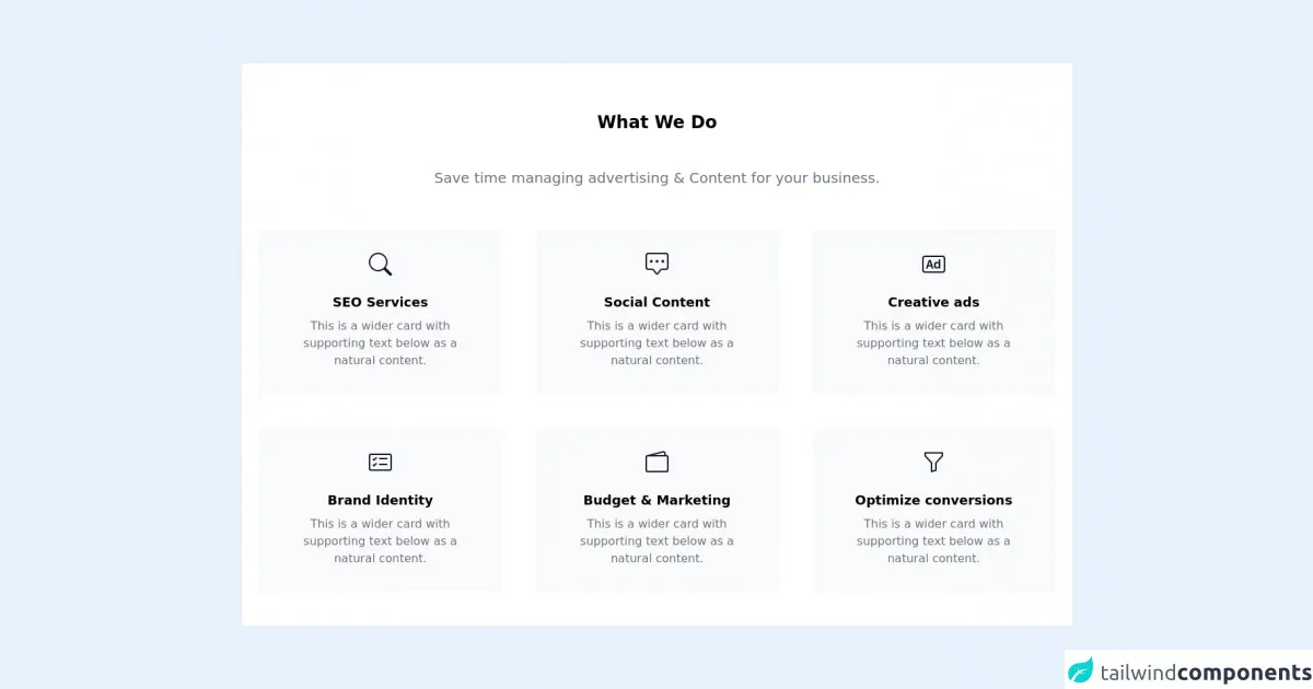
The preview of Services Section ui component
To create a Services Section using Tailwind CSS, we will use a combination of HTML and CSS. The Services Section will include a title, a brief description of each service, and an icon or image to represent each service. Here's a preview of what the Services Section will look like:
Free download of the Services Section's source code
The source code of Services Section ui component
To create the Services Section, we will use HTML and CSS. The HTML will define the structure of the section, while the CSS will style each element. Here's the source code for the Services Section:
<div id="services" class="section relative pt-20 pb-8 md:pt-16 md:pb-0 bg-white">
<div class="container xl:max-w-6xl mx-auto px-4">
<!-- Heading start -->
<header class="text-center mx-auto mb-12 lg:px-20">
<h2 class="text-2xl leading-normal mb-2 font-bold text-black">What We Do</h2>
<svg version="1.1" xmlns="http://www.w3.org/2000/svg" xmlns:xlink="http://www.w3.org/1999/xlink" x="0px" y="0px" viewBox="0 0 100 60" style="margin: 0 auto;height: 35px;" xml:space="preserve">
<circle cx="50.1" cy="30.4" r="5" class="stroke-primary" style="fill: transparent;stroke-width: 2;stroke-miterlimit: 10;"></circle>
<line x1="55.1" y1="30.4" x2="100" y2="30.4" class="stroke-primary" style="stroke-width: 2;stroke-miterlimit: 10;"></line>
<line x1="45.1" y1="30.4" x2="0" y2="30.4" class="stroke-primary" style="stroke-width: 2;stroke-miterlimit: 10;"></line>
</svg>
<p class="text-gray-500 leading-relaxed font-light text-xl mx-auto pb-2">Save time managing advertising & Content for your business.</p>
</header>
<!-- End heading -->
<!-- row -->
<div class="flex flex-wrap flex-row -mx-4 text-center">
<div class="flex-shrink px-4 max-w-full w-full sm:w-1/2 lg:w-1/3 lg:px-6 wow fadeInUp" data-wow-duration="1s" style="visibility: visible; animation-duration: 1s; animation-name: fadeInUp;">
<!-- service block -->
<div class="py-8 px-12 mb-12 bg-gray-50 border-b border-gray-100 transform transition duration-300 ease-in-out hover:-translate-y-2">
<div class="inline-block text-gray-900 mb-4">
<!-- icon -->
<svg xmlns="http://www.w3.org/2000/svg" width="2rem" height="2rem" fill="currentColor" class="bi bi-search" viewBox="0 0 16 16">
<path d="M11.742 10.344a6.5 6.5 0 1 0-1.397 1.398h-.001c.03.04.062.078.098.115l3.85 3.85a1 1 0 0 0 1.415-1.414l-3.85-3.85a1.007 1.007 0 0 0-.115-.1zM12 6.5a5.5 5.5 0 1 1-11 0 5.5 5.5 0 0 1 11 0z"></path>
</svg>
</div>
<h3 class="text-lg leading-normal mb-2 font-semibold text-black">SEO Services</h3>
<p class="text-gray-500">This is a wider card with supporting text below as a natural content.</p>
</div>
<!-- end service block -->
</div>
<div class="flex-shrink px-4 max-w-full w-full sm:w-1/2 lg:w-1/3 lg:px-6 wow fadeInUp" data-wow-duration="1s" data-wow-delay=".1s" style="visibility: visible; animation-duration: 1s; animation-delay: 0.1s; animation-name: fadeInUp;">
<!-- service block -->
<div class="py-8 px-12 mb-12 bg-gray-50 border-b border-gray-100 transform transition duration-300 ease-in-out hover:-translate-y-2">
<div class="inline-block text-gray-900 mb-4">
<!-- icon -->
<svg xmlns="http://www.w3.org/2000/svg" width="2rem" height="2rem" fill="currentColor" class="bi bi-chat-square-dots" viewBox="0 0 16 16">
<path d="M14 1a1 1 0 0 1 1 1v8a1 1 0 0 1-1 1h-2.5a2 2 0 0 0-1.6.8L8 14.333 6.1 11.8a2 2 0 0 0-1.6-.8H2a1 1 0 0 1-1-1V2a1 1 0 0 1 1-1h12zM2 0a2 2 0 0 0-2 2v8a2 2 0 0 0 2 2h2.5a1 1 0 0 1 .8.4l1.9 2.533a1 1 0 0 0 1.6 0l1.9-2.533a1 1 0 0 1 .8-.4H14a2 2 0 0 0 2-2V2a2 2 0 0 0-2-2H2z"></path>
<path d="M5 6a1 1 0 1 1-2 0 1 1 0 0 1 2 0zm4 0a1 1 0 1 1-2 0 1 1 0 0 1 2 0zm4 0a1 1 0 1 1-2 0 1 1 0 0 1 2 0z"></path>
</svg>
</div>
<h3 class="text-lg leading-normal mb-2 font-semibold text-black">Social Content</h3>
<p class="text-gray-500">This is a wider card with supporting text below as a natural content.</p>
</div>
<!-- end service block -->
</div>
<div class="flex-shrink px-4 max-w-full w-full sm:w-1/2 lg:w-1/3 lg:px-6 wow fadeInUp" data-wow-duration="1s" data-wow-delay=".3s" style="visibility: visible; animation-duration: 1s; animation-delay: 0.3s; animation-name: fadeInUp;">
<!-- service block -->
<div class="py-8 px-12 mb-12 bg-gray-50 border-b border-gray-100 transform transition duration-300 ease-in-out hover:-translate-y-2">
<div class="inline-block text-gray-900 mb-4">
<!-- icon -->
<svg xmlns="http://www.w3.org/2000/svg" width="2rem" height="2rem" fill="currentColor" class="bi bi-badge-ad" viewBox="0 0 16 16">
<path d="M3.7 11l.47-1.542h2.004L6.644 11h1.261L5.901 5.001H4.513L2.5 11h1.2zm1.503-4.852l.734 2.426H4.416l.734-2.426h.053zm4.759.128c-1.059 0-1.753.765-1.753 2.043v.695c0 1.279.685 2.043 1.74 2.043.677 0 1.222-.33 1.367-.804h.057V11h1.138V4.685h-1.16v2.36h-.053c-.18-.475-.68-.77-1.336-.77zm.387.923c.58 0 1.002.44 1.002 1.138v.602c0 .76-.396 1.2-.984 1.2-.598 0-.972-.449-.972-1.248v-.453c0-.795.37-1.24.954-1.24z"></path>
<path d="M14 3a1 1 0 0 1 1 1v8a1 1 0 0 1-1 1H2a1 1 0 0 1-1-1V4a1 1 0 0 1 1-1h12zM2 2a2 2 0 0 0-2 2v8a2 2 0 0 0 2 2h12a2 2 0 0 0 2-2V4a2 2 0 0 0-2-2H2z"></path>
</svg>
</div>
<h3 class="text-lg leading-normal mb-2 font-semibold text-black">Creative ads</h3>
<p class="text-gray-500">This is a wider card with supporting text below as a natural content.</p>
</div>
<!-- end service block -->
</div>
<div class="flex-shrink px-4 max-w-full w-full sm:w-1/2 lg:w-1/3 lg:px-6 wow fadeInUp" data-wow-duration="1s" style="visibility: visible; animation-duration: 1s; animation-name: fadeInUp;">
<!-- service block -->
<div class="py-8 px-12 mb-12 bg-gray-50 border-b border-gray-100 transform transition duration-300 ease-in-out hover:-translate-y-2">
<div class="inline-block text-gray-900 mb-4">
<!-- icon -->
<svg xmlns="http://www.w3.org/2000/svg" width="2rem" height="2rem" fill="currentColor" class="bi bi-card-checklist" viewBox="0 0 16 16">
<path d="M14.5 3a.5.5 0 0 1 .5.5v9a.5.5 0 0 1-.5.5h-13a.5.5 0 0 1-.5-.5v-9a.5.5 0 0 1 .5-.5h13zm-13-1A1.5 1.5 0 0 0 0 3.5v9A1.5 1.5 0 0 0 1.5 14h13a1.5 1.5 0 0 0 1.5-1.5v-9A1.5 1.5 0 0 0 14.5 2h-13z"></path>
<path d="M7 5.5a.5.5 0 0 1 .5-.5h5a.5.5 0 0 1 0 1h-5a.5.5 0 0 1-.5-.5zm-1.496-.854a.5.5 0 0 1 0 .708l-1.5 1.5a.5.5 0 0 1-.708 0l-.5-.5a.5.5 0 1 1 .708-.708l.146.147 1.146-1.147a.5.5 0 0 1 .708 0zM7 9.5a.5.5 0 0 1 .5-.5h5a.5.5 0 0 1 0 1h-5a.5.5 0 0 1-.5-.5zm-1.496-.854a.5.5 0 0 1 0 .708l-1.5 1.5a.5.5 0 0 1-.708 0l-.5-.5a.5.5 0 0 1 .708-.708l.146.147 1.146-1.147a.5.5 0 0 1 .708 0z"></path>
</svg>
</div>
<h3 class="text-lg leading-normal mb-2 font-semibold text-black">Brand Identity</h3>
<p class="text-gray-500">This is a wider card with supporting text below as a natural content.</p>
</div>
<!-- end service block -->
</div>
<div class="flex-shrink px-4 max-w-full w-full sm:w-1/2 lg:w-1/3 lg:px-6 wow fadeInUp" data-wow-duration="1s" data-wow-delay=".1s" style="visibility: visible; animation-duration: 1s; animation-delay: 0.1s; animation-name: fadeInUp;">
<!-- service block -->
<div class="py-8 px-12 mb-12 bg-gray-50 border-b border-gray-100 transform transition duration-300 ease-in-out hover:-translate-y-2">
<div class="inline-block text-gray-900 mb-4">
<!-- icon -->
<svg xmlns="http://www.w3.org/2000/svg" width="2rem" height="2rem" fill="currentColor" class="bi bi-wallet2" viewBox="0 0 16 16">
<path d="M12.136.326A1.5 1.5 0 0 1 14 1.78V3h.5A1.5 1.5 0 0 1 16 4.5v9a1.5 1.5 0 0 1-1.5 1.5h-13A1.5 1.5 0 0 1 0 13.5v-9a1.5 1.5 0 0 1 1.432-1.499L12.136.326zM5.562 3H13V1.78a.5.5 0 0 0-.621-.484L5.562 3zM1.5 4a.5.5 0 0 0-.5.5v9a.5.5 0 0 0 .5.5h13a.5.5 0 0 0 .5-.5v-9a.5.5 0 0 0-.5-.5h-13z"></path>
</svg>
</div>
<h3 class="text-lg leading-normal mb-2 font-semibold text-black">Budget & Marketing</h3>
<p class="text-gray-500">This is a wider card with supporting text below as a natural content.</p>
</div>
<!-- end service block -->
</div>
<div class="flex-shrink px-4 max-w-full w-full sm:w-1/2 lg:w-1/3 lg:px-6 wow fadeInUp" data-wow-duration="1s" data-wow-delay=".3s" style="visibility: visible; animation-duration: 1s; animation-delay: 0.3s; animation-name: fadeInUp;">
<!-- service block -->
<div class="py-8 px-12 mb-12 bg-gray-50 border-b border-gray-100 transform transition duration-300 ease-in-out hover:-translate-y-2">
<div class="inline-block text-gray-900 mb-4">
<!-- icon -->
<svg xmlns="http://www.w3.org/2000/svg" width="2rem" height="2rem" fill="currentColor" class="bi bi-funnel" viewBox="0 0 16 16">
<path d="M1.5 1.5A.5.5 0 0 1 2 1h12a.5.5 0 0 1 .5.5v2a.5.5 0 0 1-.128.334L10 8.692V13.5a.5.5 0 0 1-.342.474l-3 1A.5.5 0 0 1 6 14.5V8.692L1.628 3.834A.5.5 0 0 1 1.5 3.5v-2zm1 .5v1.308l4.372 4.858A.5.5 0 0 1 7 8.5v5.306l2-.666V8.5a.5.5 0 0 1 .128-.334L13.5 3.308V2h-11z"></path>
</svg>
</div>
<h3 class="text-lg leading-normal mb-2 font-semibold text-black">Optimize conversions</h3>
<p class="text-gray-500">This is a wider card with supporting text below as a natural content.</p>
</div>
<!-- end service block -->
</div>
</div>
<!-- end row -->
</div>
</div>
How to create a Services Section with Tailwind CSS?
To create a Services Section with Tailwind CSS, follow these steps:
Create a new HTML file and add the following code:
<section class="bg-gray-100 py-8">
  <div class="container mx-auto px-2 pt-4 pb-12">
    <h1 class="w-full my-2 text-5xl font-bold leading-tight text-center text-gray-800">
      Our Services
    </h1>
    <div class="w-full mb-4">
      <div class="h-1 mx-auto gradient w-64 opacity-25 my-0 py-0 rounded-t"></div>
    </div>
    <div class="flex flex-wrap">
      <div class="w-5/6 sm:w-1/2 p-6">
        <h3 class="text-3xl text-gray-800 font-bold leading-none mb-3">
          Service 1
        </h3>
        <p class="text-gray-600 mb-8">
          Lorem ipsum dolor sit amet, consectetur adipiscing elit. Aliquam at ipsum eu nunc commodo posuere et sit amet ligula.
        </p>
      </div>
      <div class="w-full sm:w-1/2 p-6">
        <div class="align-middle">
          <img src="https://via.placeholder.com/150" alt="Service 1" class="rounded-full h-64 w-64 flex items-center justify-center bg-gray-100">
        </div>
      </div>
      <div class="w-full sm:w-1/2 p-6">
        <div class="align-middle">
          <img src="https://via.placeholder.com/150" alt="Service 2" class="rounded-full h-64 w-64 flex items-center justify-center bg-gray-100">
        </div>
      </div>
      <div class="w-5/6 sm:w-1/2 p-6">
        <h3 class="text-3xl text-gray-800 font-bold leading-none mb-3">
          Service 2
        </h3>
        <p class="text-gray-600 mb-8">
          Lorem ipsum dolor sit amet, consectetur adipiscing elit. Aliquam at ipsum eu nunc commodo posuere et sit amet ligula.
        </p>
      </div>
      <div class="w-5/6 sm:w-1/2 p-6">
        <h3 class="text-3xl text-gray-800 font-bold leading-none mb-3">
          Service 3
        </h3>
        <p class="text-gray-600 mb-8">
          Lorem ipsum dolor sit amet, consectetur adipiscing elit. Aliquam at ipsum eu nunc commodo posuere et sit amet ligula.
        </p>
      </div>
      <div class="w-full sm:w-1/2 p-6">
        <div class="align-middle">
          <img src="https://via.placeholder.com/150" alt="Service 3" class="rounded-full h-64 w-64 flex items-center justify-center bg-gray-100">
        </div>
      </div>
    </div>
  </div>
</section>
In the HTML code, replace the placeholder text with the title and description of each service.
Replace the placeholder image URLs with the actual images for each service.
Save the HTML file and open it in a web browser to see the Services Section in action.
Conclusion
In this article, we explored how to create a Services Section using Tailwind CSS. We discussed the benefits of using Tailwind CSS and provided a preview and source code for the Services Section. By following the steps outlined in this article, you can easily create a visually appealing Services Section for your website.