- Published on
Practical Guide: Make A Services With Tailwind CSS
- What is Tailwind CSS?
- The description of Services ui component
- Why use Tailwind CSS to create a Services ui component?
- The preview of Services ui component.
- The source code of Services ui component.
- How to create a Services with Tailwind CSS?
- Step 1: Set up your HTML
- Step 2: Add icons
- Step 3: Style your cards
- Step 4: Add more styles
- Conclusion
As a FrontEnd developer, you might have heard of Tailwind CSS, a utility-first CSS framework that helps you quickly build custom designs. In this article, we will guide you through creating a Services ui component with Tailwind CSS.
What is Tailwind CSS?
Tailwind CSS is a utility-first CSS framework that provides a set of pre-defined classes to style your HTML elements. Unlike other CSS frameworks, Tailwind CSS doesn't have pre-built components. Instead, it provides a set of low-level utility classes that you can combine to create custom designs.
The description of Services ui component
A Services ui component is a common design element used on websites to showcase the services offered by a business or organization. It usually consists of a set of cards or boxes, each containing a brief description of a service along with an icon or image.
Why use Tailwind CSS to create a Services ui component?
Tailwind CSS provides a set of utility classes that make it easy to create a Services ui component. With Tailwind CSS, you can quickly style the cards, icons, and text in your Services component without writing custom CSS. This saves you time and makes your code more maintainable.
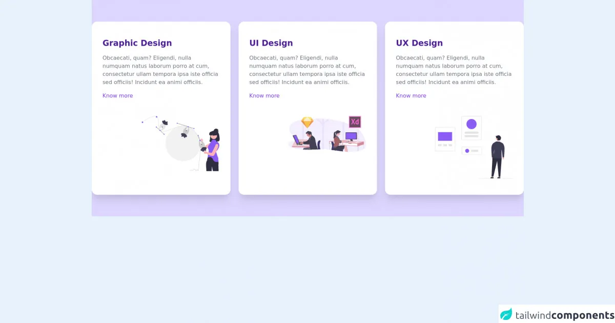
The preview of Services ui component.
To create a Services ui component, we will use Tailwind CSS to style a set of cards. Each card will contain an icon, a title, and a brief description of a service. Here's what the final component will look like:
Free download of the Services's source code
The source code of Services ui component.
To create the Services ui component, we will use HTML and Tailwind CSS. Here's the source code:
<div class="py-16 bg-purple-200">
    <div class="container m-auto px-6 text-gray-500 md:px-12 xl:px-0">
        <div class="mx-auto grid gap-6 md:w-3/4 lg:w-full lg:grid-cols-3">
            <div class="bg-white rounded-2xl shadow-xl px-8 py-12 sm:px-12 lg:px-8">
                <div class="mb-12 space-y-4">
                    <h3 class="text-2xl font-semibold text-purple-900">Graphic Design</h3>
                    <p class="mb-6">Obcaecati, quam? Eligendi, nulla numquam natus laborum porro at cum, consectetur ullam tempora ipsa iste officia sed officiis! Incidunt ea animi officiis.</p>
                    <a href="#" class="block font-medium text-purple-600">Know more</a>
                </div>
                <img src="https://tailus.io/sources/blocks/end-image/preview/images/graphic.svg" class="w-2/3 ml-auto -mb-12" alt="illustration" loading="lazy" width="900" height="600">
            </div>
            <div class="bg-white rounded-2xl shadow-xl px-8 py-12 sm:px-12 lg:px-8">
                <div class="mb-12 space-y-4">
                    <h3 class="text-2xl font-semibold text-purple-900">UI Design</h3>
                    <p class="mb-6">Obcaecati, quam? Eligendi, nulla numquam natus laborum porro at cum, consectetur ullam tempora ipsa iste officia sed officiis! Incidunt ea animi officiis.</p>
                    <a href="#" class="block font-medium text-purple-600">Know more</a>
                </div>
                <img src="https://tailus.io/sources/blocks/end-image/preview/images/ui-design.svg" class="w-2/3 ml-auto" alt="illustration" loading="lazy" width="900" height="600">
            </div>
            <div class="bg-white rounded-2xl shadow-xl px-8 py-12 sm:px-12 lg:px-8">
                <div class="mb-12 space-y-4">
                    <h3 class="text-2xl font-semibold text-purple-900">UX Design</h3>
                    <p class="mb-6">Obcaecati, quam? Eligendi, nulla numquam natus laborum porro at cum, consectetur ullam tempora ipsa iste officia sed officiis! Incidunt ea animi officiis.</p>
                    <a href="#" class="block font-medium text-purple-600">Know more</a>
                </div>
                <img src="https://tailus.io/sources/blocks/end-image/preview/images/ux-design.svg" class="w-2/3 ml-auto " alt="illustration" loading="lazy" width="900" height="600">
            </div>
        </div>
    </div>
</div>
How to create a Services with Tailwind CSS?
To create a Services ui component with Tailwind CSS, follow these steps:
Step 1: Set up your HTML
First, create the HTML structure for your Services component. We will use a set of cards to display the services. Here's the HTML for one card:
<div class="max-w-xs rounded overflow-hidden shadow-lg">
  <div class="px-6 py-4">
    <div class="font-bold text-xl mb-2">Service Title</div>
    <p class="text-gray-700 text-base">Service Description</p>
  </div>
</div>
This HTML creates a card with a title and description.
Step 2: Add icons
To add icons to your Services component, you can use a font icon library like Font Awesome or Material Icons. Here's an example of how to add an icon from Font Awesome:
<div class="max-w-xs rounded overflow-hidden shadow-lg">
  <div class="px-6 py-4">
    <div class="flex items-center mb-4">
      <i class="fas fa-code fa-2x"></i>
      <div class="ml-4 font-bold text-xl">Service Title</div>
    </div>
    <p class="text-gray-700 text-base">Service Description</p>
  </div>
</div>
This HTML adds a Font Awesome icon to the card.
Step 3: Style your cards
Next, use Tailwind CSS utility classes to style your cards. Here's an example of how to add a background color and padding to your cards:
<div class="max-w-xs rounded overflow-hidden shadow-lg bg-white">
  <div class="px-6 py-4">
    <div class="flex items-center mb-4">
      <i class="fas fa-code fa-2x"></i>
      <div class="ml-4 font-bold text-xl">Service Title</div>
    </div>
    <p class="text-gray-700 text-base">Service Description</p>
  </div>
</div>
This HTML adds a white background color and padding to the card.
Step 4: Add more styles
Finally, add more styles to your Services component as needed. You can use Tailwind CSS utility classes to adjust the font size, font weight, and text color of your cards.
Conclusion
In this article, we showed you how to create a Services ui component with Tailwind CSS. With Tailwind CSS, you can quickly style your HTML elements without writing custom CSS. This makes your code more maintainable and saves you time. We hope this practical guide helps you create beautiful and functional Services components for your website.