- Published on
Beginners Guide: Make A Select with search With Tailwind CSS
- What is Tailwind CSS?
- The description of Select with search ui component
- Why use Tailwind CSS to create a Select with search ui component?
- The preview of Select with search ui component
- The source code of Select with search ui component
- How to create a Select with search with Tailwind CSS?
- Step 1: Create the HTML structure
- Step 2: Add the search bar
- Step 3: Add the search functionality
- Conclusion
What is Tailwind CSS?
Tailwind CSS is a utility-first CSS framework that allows developers to quickly and easily create responsive and customizable user interfaces. It provides a set of pre-defined CSS classes that can be used to style HTML elements, making it easier to build complex layouts without having to write custom CSS.
The description of Select with search ui component
A Select with search ui component is a user interface element that allows users to select an option from a drop-down list. It also includes a search bar that allows users to filter the options based on their search query.
Why use Tailwind CSS to create a Select with search ui component?
Tailwind CSS provides a set of pre-defined utility classes that can be used to create a Select with search ui component quickly and easily. It also allows developers to customize the component's appearance and behavior by modifying the CSS classes.
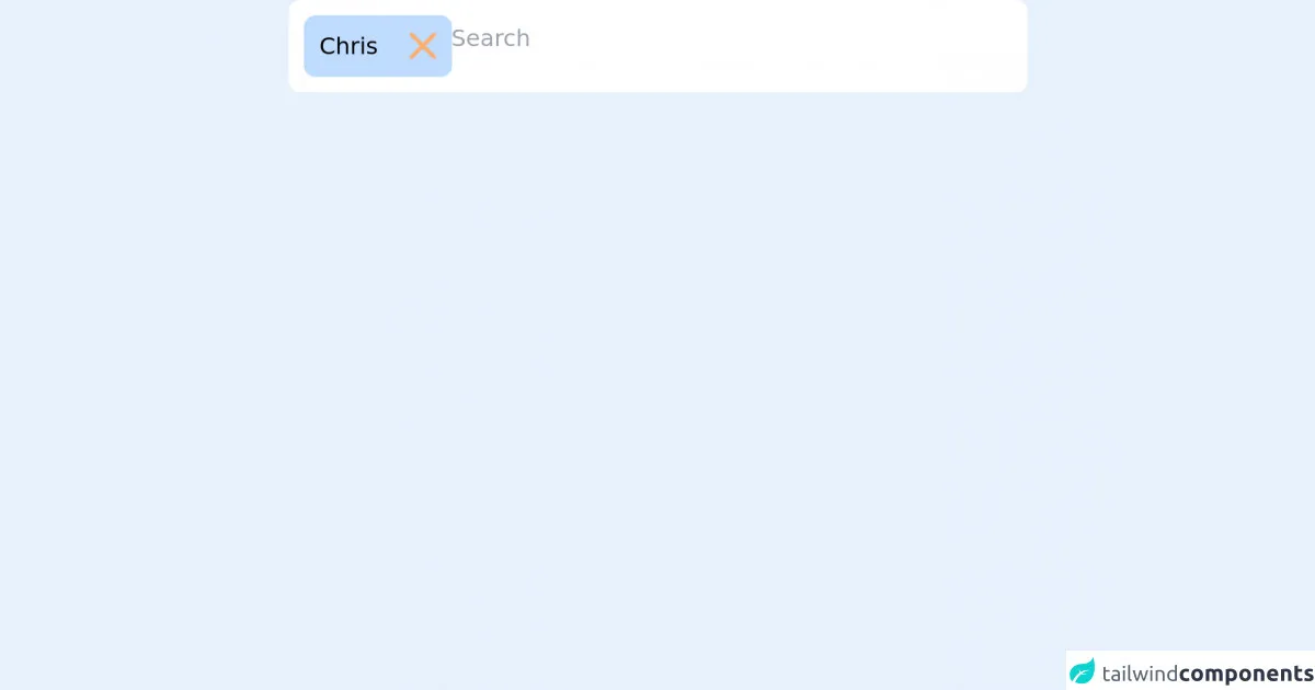
The preview of Select with search ui component
To create a Select with search ui component with Tailwind CSS, we will use a combination of HTML and CSS. The final result will look something like this:
Free download of the Select with search's source code
The source code of Select with search ui component
To create a Select with search ui component with Tailwind CSS, we will use a combination of HTML and CSS. The HTML code will define the structure of the component, while the CSS code will style it. Here is the source code for the component:
<script defer src="https://unpkg.com/[email protected]/dist/cdn.min.js"></script>

<div class="relative max-w-sm mx-auto text-xs"
     x-data="{
            search: '',
            showSelector: false,
            selected: {1:'Chris'},
            options: [],
            clearOpts() {
                this.search = '';
                this.showSelector = false;
                this.options = []
            },
            select(id, name) {
                this.selected[id] = name;
                this.clearOpts();
                $dispatch('selected', Object.keys(this.selected));
            },
            remove(id) {
                delete this.selected[id]
                $dispatch('selected', Object.keys(this.selected));
            },
            goSearch() {
                if (this.search) {
                    this.options = {5: 'Carl', 6: 'Alex', 7: 'Bryan'};
                    this.showSelector = true;
                } else {
                    this.showSelector = false;
                }
            },
        }">
    <div class="bg-white rounded-md p-2 flex gap-1 flex-wrap" @click="$refs.search_input.focus()"
         @click.outside="showSelector=false">
        <template x-for="(name, id) in selected">
            <div class="bg-blue-200 rounded-md flex items-center">
                <div class="p-2" x-text="name"></div>
                <div @click="remove(id)"
                     class="p-2 select-none rounded-r-md cursor-pointer hover:bg-magma-orange-clear">
                    <svg width="14" height="14" viewBox="0 0 14 14" fill="none" xmlns="http://www.w3.org/2000/svg">
                        <path d="M12.5745 1L1 12.5745" stroke="#FEAD69" stroke-width="2" stroke-linecap="round"/>
                        <path d="M1.00024 1L12.5747 12.5745" stroke="#FEAD69" stroke-width="2" stroke-linecap="round"/>
                    </svg>
                </div>
            </div>
        </template>
        <div class="flex-1">
            <input type="text" x-model="search" x-ref="search_input"
                   @input.debounce.400ms="goSearch();" placeholder="Search"
                   class="w-full border-0 focus:border-0 focus:outline-none focus:ring-0 py-1 px-0">
            <div x-show="showSelector" class="absolute left-0 bg-white z-30 w-full rounded-b-md font-medium">
                <div class="p-2 space-y-1">
                    <template x-for="(name, id) in options">
                        <div>
                            <template x-if="!selected[id]">
                                <div @click="select(id, name)"
                                     class="bg-blue-200 border-2 border-blue-200 cursor-pointer rounded-md p-2 hover:border-light-blue-1"
                                     x-text="name"></div>
                            </template>
                        </div>
                    </template>
                    <template x-if="options.length === 0">
                        <div class="text-gray-500">
                            No result
                        </div>
                    </template>
                </div>
            </div>
        </div>
    </div>
</div>
How to create a Select with search with Tailwind CSS?
To create a Select with search ui component with Tailwind CSS, follow these steps:
Step 1: Create the HTML structure
The first step is to create the HTML structure for the component. We will use a combination of HTML tags and Tailwind CSS classes to create the structure. Here is the HTML code:
<div class="relative">
  <select class="block appearance-none w-full bg-white border border-gray-400 hover:border-gray-500 px-4 py-2 pr-8 rounded shadow leading-tight focus:outline-none focus:shadow-outline">
    <option>Option 1</option>
    <option>Option 2</option>
    <option>Option 3</option>
    <option>Option 4</option>
    <option>Option 5</option>
  </select>
  <div class="pointer-events-none absolute inset-y-0 right-0 flex items-center px-2 text-gray-700">
    <svg class="fill-current h-4 w-4" xmlns="http://www.w3.org/2000/svg" viewBox="0 0 20 20"><path d="M9.293 14.707a1 1 0 0 1-1.414 0l-4-4a1 1 0 0 1 1.414-1.414L8 11.586l3.293-3.293a1 1 0 0 1 1.414 1.414l-4 4z"/></svg>
  </div>
</div>
Step 2: Add the search bar
Next, we will add the search bar to the component. We will use a combination of HTML tags and Tailwind CSS classes to create the search bar. Here is the updated HTML code:
<div class="relative">
  <select class="block appearance-none w-full bg-white border border-gray-400 hover:border-gray-500 px-4 py-2 pr-8 rounded shadow leading-tight focus:outline-none focus:shadow-outline">
    <option>Option 1</option>
    <option>Option 2</option>
    <option>Option 3</option>
    <option>Option 4</option>
    <option>Option 5</option>
  </select>
  <div class="pointer-events-none absolute inset-y-0 right-0 flex items-center px-2 text-gray-700">
    <svg class="fill-current h-4 w-4" xmlns="http://www.w3.org/2000/svg" viewBox="0 0 20 20"><path d="M9.293 14.707a1 1 0 0 1-1.414 0l-4-4a1 1 0 0 1 1.414-1.414L8 11.586l3.293-3.293a1 1 0 0 1 1.414 1.414l-4 4z"/></svg>
  </div>
  <div class="absolute inset-y-0 right-0 flex items-center px-2 text-gray-700">
    <input class="appearance-none bg-transparent border-none w-full text-sm text-gray-700 mr-3 py-1 px-2 leading-tight focus:outline-none" type="text" placeholder="Search...">
  </div>
</div>
Step 3: Add the search functionality
Finally, we will add the search functionality to the component. We will use JavaScript to filter the options based on the user's search query. Here is the final HTML code:
<div class="relative">
  <select class="block appearance-none w-full bg-white border border-gray-400 hover:border-gray-500 px-4 py-2 pr-8 rounded shadow leading-tight focus:outline-none focus:shadow-outline" id="select">
    <option>Option 1</option>
    <option>Option 2</option>
    <option>Option 3</option>
    <option>Option 4</option>
    <option>Option 5</option>
  </select>
  <div class="pointer-events-none absolute inset-y-0 right-0 flex items-center px-2 text-gray-700">
    <svg class="fill-current h-4 w-4" xmlns="http://www.w3.org/2000/svg" viewBox="0 0 20 20"><path d="M9.293 14.707a1 1 0 0 1-1.414 0l-4-4a1 1 0 0 1 1.414-1.414L8 11.586l3.293-3.293a1 1 0 0 1 1.414 1.414l-4 4z"/></svg>
  </div>
  <div class="absolute inset-y-0 right-0 flex items-center px-2 text-gray-700">
    <input class="appearance-none bg-transparent border-none w-full text-sm text-gray-700 mr-3 py-1 px-2 leading-tight focus:outline-none" type="text" placeholder="Search..." id="search">
  </div>
</div>

<script>
  const select = document.getElementById('select');
  const search = document.getElementById('search');

  search.addEventListener('keyup', (event) => {
    const query = event.target.value.toLowerCase();
    const options = select.options;

    for (let i = 0; i < options.length; i++) {
      const option = options[i];
      const text = option.text.toLowerCase();

      if (text.indexOf(query) === -1) {
        option.style.display = 'none';
      } else {
        option.style.display = '';
      }
    }
  });
</script>
Conclusion
In this article, we have learned how to create a Select with search ui component using Tailwind CSS. We have seen how Tailwind CSS can be used to quickly and easily create complex user interfaces without having to write custom CSS. We have also seen how JavaScript can be used to add additional functionality to the component. With this knowledge, you should be able to create your own Select with search ui component using Tailwind CSS.