- Published on
3 Things You Must Know To Build A Select input field With Tailwind CSS
- What is Tailwind CSS?
- The description of Select input field ui component
- Why use Tailwind CSS to create a Select input field ui component?
- The preview of Select input field ui component
- The source code of Select input field ui component
- How to create a Select input field with Tailwind CSS?
- Conclusion
If you are a FrontEnd developer, you must have heard about Tailwind CSS. It is a utility-first CSS framework that helps you build custom designs quickly. In this article, we will discuss how to create a Select input field with Tailwind CSS.
What is Tailwind CSS?
Tailwind CSS is a utility-first CSS framework that helps you build custom designs quickly. It provides you with a set of pre-defined CSS classes that you can use to style your HTML elements. You don't need to write any CSS code from scratch. Instead, you can use Tailwind CSS classes to style your elements.
The description of Select input field ui component
A Select input field is a UI component that allows users to choose one option from a list of options. It is commonly used in forms where users need to select a value from a list of options. The Select input field consists of a dropdown list and a text input field. When the user clicks on the dropdown list, it displays a list of options, and the user can select one option from the list.
Why use Tailwind CSS to create a Select input field ui component?
Tailwind CSS provides you with a set of pre-defined classes that you can use to create a Select input field. You don't need to write any CSS code from scratch. Instead, you can use Tailwind CSS classes to style your Select input field. This saves you a lot of time and effort.
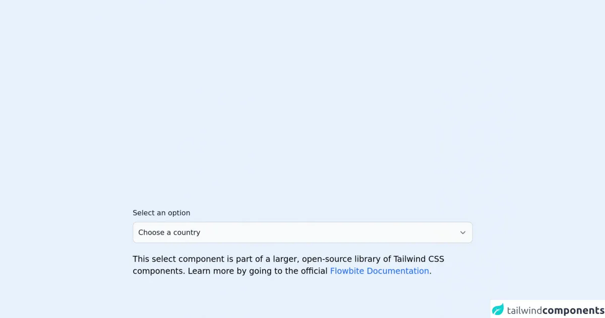
The preview of Select input field ui component
To create a Select input field with Tailwind CSS, you need to use the following classes:
appearance-none: This class removes the default appearance of the Select input field.border: This class adds a border to the Select input field.py-2: This class adds padding to the top and bottom of the Select input field.px-4: This class adds padding to the left and right of the Select input field.pr-8: This class adds padding to the right of the Select input field.rounded: This class adds rounded corners to the Select input field.text-gray-700: This class sets the text color of the Select input field to gray.bg-white: This class sets the background color of the Select input field to white.
Free download of the Select input field's source code
The source code of Select input field ui component
To create a Select input field with Tailwind CSS, you need to use the following HTML code:
<div class="relative inline-block w-full">
  <select class="appearance-none border py-2 px-4 pr-8 rounded text-gray-700 bg-white">
    <option>Option 1</option>
    <option>Option 2</option>
    <option>Option 3</option>
  </select>
  <div class="absolute inset-y-0 right-0 flex items-center px-2 pointer-events-none">
    <svg class="w-4 h-4 fill-current" viewBox="0 0 20 20">
      <path d="M10 12l-5-5 1.41-1.41L10 9.17l3.59-3.58L15 7l-5 5z" />
    </svg>
  </div>
</div>
<link rel="stylesheet" href="https://unpkg.com/[email protected]/dist/flowbite.min.css" />

<!-- This is an example component -->
<div class="max-w-2xl mx-auto">

	<label for="countries" class="block mb-2 text-sm font-medium text-gray-900 dark:text-gray-400">Select an option</label>
        <select id="countries" class="bg-gray-50 border border-gray-300 text-gray-900 text-sm rounded-lg focus:ring-blue-500 focus:border-blue-500 block w-full p-2.5 dark:bg-gray-700 dark:border-gray-600 dark:placeholder-gray-400 dark:text-white dark:focus:ring-blue-500 dark:focus:border-blue-500">
        <option selected>Choose a country</option>
        <option value="US">United States</option>
        <option value="CA">Canada</option>
        <option value="FR">France</option>
        <option value="DE">Germany</option>
    </select>

	<p class="mt-5">This select component is part of a larger, open-source library of Tailwind CSS components.
		Learn
		more
		by going to the official <a class="text-blue-600 hover:underline"
			href="https://flowbite.com/docs/getting-started/introduction/" target="_blank">Flowbite Documentation</a>.
	</p>
	<script src="https://unpkg.com/[email protected]/dist/flowbite.js"></script>
</div>
How to create a Select input field with Tailwind CSS?
To create a Select input field with Tailwind CSS, you need to follow these steps:
- Create a
divelement with the classrelative inline-block w-full. - Create a
selectelement inside thedivelement with the classesappearance-none border py-2 px-4 pr-8 rounded text-gray-700 bg-white. - Add the
optionelements inside theselectelement. - Create a
divelement inside thedivelement with the classesabsolute inset-y-0 right-0 flex items-center px-2 pointer-events-none. - Add an SVG icon inside the
divelement.
Conclusion
In this article, we discussed how to create a Select input field with Tailwind CSS. We learned that Tailwind CSS provides us with a set of pre-defined classes that we can use to style our Select input field. We also learned that creating a Select input field with Tailwind CSS is easy and saves us a lot of time and effort.