- Published on
A Complete Guide To Create A Select Input With Tailwind CSS
- What is Tailwind CSS?
- The description of Select Input ui component
- Why use Tailwind CSS to create a Select Input ui component?
- The preview of Select Input ui component
- The source code of Select Input ui component
- How to create a Select Input with Tailwind CSS?
- Conclusion
What is Tailwind CSS?
Tailwind CSS is a utility-first CSS framework that provides a set of pre-defined CSS classes to create responsive and customizable user interfaces. It allows developers to build complex UI components with ease, without having to write custom CSS code.
The description of Select Input ui component
A select input is a UI component that allows users to choose an option from a list of predefined options. It is commonly used in forms, dropdown menus, and other interactive elements.
Why use Tailwind CSS to create a Select Input ui component?
Tailwind CSS provides a set of pre-defined CSS classes that can be used to create a select input with minimal effort. It also offers a wide range of customization options, making it easy to create a unique and personalized UI component.
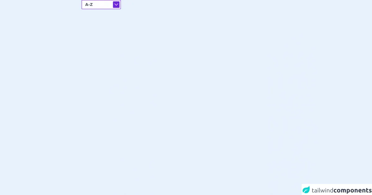
The preview of Select Input ui component
To create a select input with Tailwind CSS, you can use the select and option HTML elements. Here is a preview of what the select input will look like:
Free download of the Select Input's source code
The source code of Select Input ui component
To create the select input, you can use the following HTML and Tailwind CSS classes:
<div>
<div class="relative inline-flex self-center">
<svg class="text-white bg-purple-700 absolute top-0 right-0 m-2 pointer-events-none p-2 rounded" xmlns="http://www.w3.org/2000/svg" xmlns:xlink="http://www.w3.org/1999/xlink" width="40px" height="40px" viewBox="0 0 38 22" version="1.1">
<title>F09B337F-81F6-41AC-8924-EC55BA135736</title>
<g id="ZahnhelferDE—Design" stroke="none" stroke-width="1" fill="none" fill-rule="evenodd">
<g id="ZahnhelferDE–Icon&Asset-Download" transform="translate(-539.000000, -199.000000)" fill="#ffffff" fill-rule="nonzero">
<g id="Icon-/-ArrowRight-Copy-2" transform="translate(538.000000, 183.521208)">
<polygon id="Path-Copy" transform="translate(20.000000, 18.384776) rotate(135.000000) translate(-20.000000, -18.384776) " points="33 5.38477631 33 31.3847763 29 31.3847763 28.999 9.38379168 7 9.38477631 7 5.38477631"/>
</g>
</g>
</g>
</svg>
<select class="text-2xl font-bold rounded border-2 border-purple-700 text-gray-600 h-14 w-60 pl-5 pr-10 bg-white hover:border-gray-400 focus:outline-none appearance-none">
<option>A-Z</option>
<option>Z-A</option>
</select>
</div>
</div>
How to create a Select Input with Tailwind CSS?
To create a select input with Tailwind CSS, follow these steps:
- Create a new HTML file and add the required HTML elements for the select input.
<div class="relative inline-flex">
  <svg class="w-2 h-2 absolute top-0 right-0 m-4 pointer-events-none" xmlns="http://www.w3.org/2000/svg" viewBox="0 0 412 232"><path fill="#FFF" fill-rule="evenodd" d="M412 0L206 232 0 0h412z"/></svg>
  <select class="border border-gray-300 rounded-full text-gray-600 h-10 pl-5 pr-10 bg-white hover:border-gray-400 focus:outline-none appearance-none">
    <option>Option 1</option>
    <option>Option 2</option>
    <option>Option 3</option>
  </select>
</div>
- Add the required Tailwind CSS classes to the HTML elements.
<div class="relative inline-flex">
  <svg class="w-2 h-2 absolute top-0 right-0 m-4 pointer-events-none" xmlns="http://www.w3.org/2000/svg" viewBox="0 0 412 232"><path fill="#FFF" fill-rule="evenodd" d="M412 0L206 232 0 0h412z"/></svg>
  <select class="border border-gray-300 rounded-full text-gray-600 h-10 pl-5 pr-10 bg-white hover:border-gray-400 focus:outline-none appearance-none">
    <option>Option 1</option>
    <option>Option 2</option>
    <option>Option 3</option>
  </select>
</div>
- Customize the select input by modifying the Tailwind CSS classes.
For example, you can change the border color of the select input by modifying the border class:
<select class="border border-blue-500 rounded-full text-gray-600 h-10 pl-5 pr-10 bg-white hover:border-blue-600 focus:outline-none appearance-none">
- Save the HTML file and open it in a web browser to view the select input.
Conclusion
Creating a select input with Tailwind CSS is a simple and easy process that can be done with minimal effort. By using Tailwind CSS, you can create a unique and personalized UI component that is responsive and customizable. With its wide range of pre-defined CSS classes and customization options, Tailwind CSS is a powerful tool for front-end developers who want to create beautiful and functional user interfaces.