- Published on
6 Tips To Make A Select add and remove With Tailwind CSS
- What is Tailwind CSS?
- The description of Select add and remove ui component
- Why use Tailwind CSS to create a Select add and remove ui component?
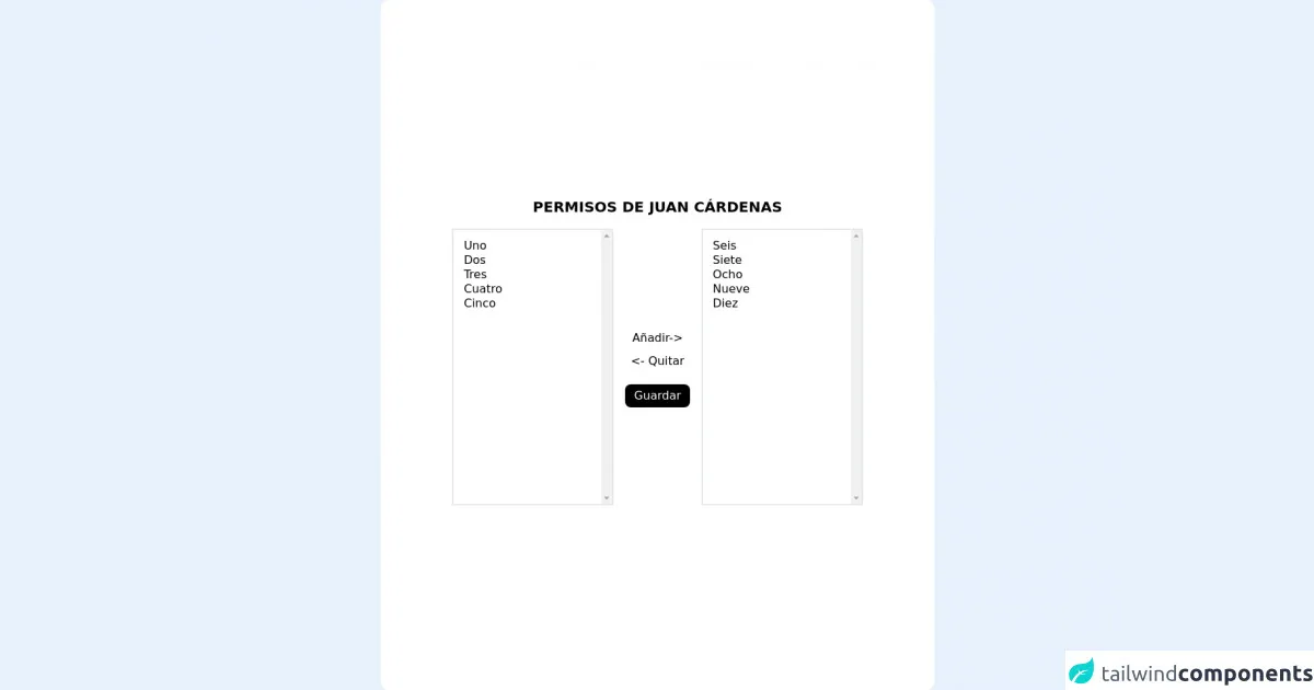
- The preview of Select add and remove ui component.
- The source code of Select add and remove ui component.
- How to create a Select add and remove with Tailwind CSS?
- Step 1: Create the HTML structure
- Step 2: Style the component with Tailwind CSS
- Step 3: Add JavaScript functionality
- Conclusion
What is Tailwind CSS?
Tailwind CSS is a utility-first CSS framework that allows you to rapidly build custom user interfaces. It provides a set of pre-defined CSS classes that you can use to style your HTML elements. With Tailwind CSS, you can create complex layouts and designs without writing any custom CSS code.
The description of Select add and remove ui component
A Select add and remove UI component is a user interface element that allows users to select items from a list and add or remove them from another list. This component is commonly used in forms and applications where users need to select multiple options.
Why use Tailwind CSS to create a Select add and remove ui component?
Tailwind CSS is an excellent choice for creating a Select add and remove UI component because it provides a set of pre-defined utility classes that make it easy to style the component. With Tailwind CSS, you can quickly create a responsive and customizable UI component without writing any custom CSS code.
The preview of Select add and remove ui component.
To create a Select add and remove UI component with Tailwind CSS, you can use the following HTML structure:
<div class="flex flex-wrap">
  <div class="w-full md:w-1/2 px-3 mb-6 md:mb-0">
    <label class="block uppercase tracking-wide text-gray-700 text-xs font-bold mb-2" for="grid-state">
      Select an item
    </label>
    <div class="relative">
      <select class="block appearance-none w-full bg-gray-200 border border-gray-200 text-gray-700 py-3 px-4 pr-8 rounded leading-tight focus:outline-none focus:bg-white focus:border-gray-500" id="grid-state">
        <option>Option 1</option>
        <option>Option 2</option>
        <option>Option 3</option>
      </select>
      <div class="pointer-events-none absolute inset-y-0 right-0 flex items-center px-2 text-gray-700">
        <svg class="fill-current h-4 w-4" xmlns="http://www.w3.org/2000/svg" viewBox="0 0 20 20">
          <path d="M10 12a2 2 0 100-4 2 2 0 000 4z"/>
          <path fill-rule="evenodd" d="M15 3H5a2 2 0 00-2 2v10a2 2 0 002 2h10a2 2 0 002-2V5a2 2 0 00-2-2zM5 5h10v10H5V5z" clip-rule="evenodd"/>
        </svg>
      </div>
    </div>
  </div>
  <div class="w-full md:w-1/2 px-3">
    <label class="block uppercase tracking-wide text-gray-700 text-xs font-bold mb-2" for="grid-state">
      Selected items
    </label>
    <div class="relative">
      <select multiple class="block appearance-none w-full bg-gray-200 border border-gray-200 text-gray-700 py-3 px-4 pr-8 rounded leading-tight focus:outline-none focus:bg-white focus:border-gray-500" id="grid-state">
        <option>Option 1</option>
        <option>Option 2</option>
        <option>Option 3</option>
      </select>
      <div class="pointer-events-none absolute inset-y-0 right-0 flex items-center px-2 text-gray-700">
        <svg class="fill-current h-4 w-4" xmlns="http://www.w3.org/2000/svg" viewBox="0 0 20 20">
          <path d="M10 12a2 2 0 100-4 2 2 0 000 4z"/>
          <path fill-rule="evenodd" d="M15 3H5a2 2 0 00-2 2v10a2 2 0 002 2h10a2 2 0 002-2V5a2 2 0 00-2-2zM5 5h10v10H5V5z" clip-rule="evenodd"/>
        </svg>
      </div>
    </div>
  </div>
</div>
Free download of the Select add and remove's source code
The source code of Select add and remove ui component.
To create a Select add and remove UI component with Tailwind CSS, you can use the following CSS classes:
/* Styles for the select element */
.select {
  display: block;
  width: 100%;
  max-width: 100%;
  height: 2.5rem;
  padding: 0.5rem 1rem;
  font-size: 1rem;
  font-weight: 400;
  line-height: 1.5;
  color: #4a5568;
  background-color: #e2e8f0;
  background-image: none;
  border: 1px solid #cbd5e0;
  border-radius: 0.25rem;
  transition: border-color 0.15s ease-in-out, box-shadow 0.15s ease-in-out;
}

/* Styles for the select element when it is focused */
.select:focus {
  outline: none;
  border-color: #4a5568;
  box-shadow: 0 0 0 0.2rem rgba(74, 85, 104, 0.25);
}

/* Styles for the select element when it is disabled */
.select:disabled {
  opacity: 0.5;
  cursor: not-allowed;
}

/* Styles for the select element when it has an error */
.select.is-invalid {
  border-color: #e53e3e;
}

/* Styles for the select element when it is valid */
.select.is-valid {
  border-color: #38a169;
}

/* Styles for the select element when it is hovered */
.select:hover {
  border-color: #718096;
}

/* Styles for the select element when it is active */
.select:active {
  border-color: #4a5568;
}

/* Styles for the select element when it is open */
.select[aria-expanded="true"] {
  border-bottom-right-radius: 0;
  border-bottom-left-radius: 0;
}

/* Styles for the select element when it is closed */
.select[aria-expanded="false"] {
  border-bottom-right-radius: 0.25rem;
  border-bottom-left-radius: 0.25rem;
}

/* Styles for the select element when it has a placeholder */
.select[placeholder] {
  color: #a0aec0;
}

/* Styles for the select element when it has a selected option */
.select option[selected] {
  background-color: #cbd5e0;
}

/* Styles for the select element when it is multiple */
.select[multiple] {
  height: auto;
  padding: 0.5rem 1rem;
  overflow-y: auto;
}

/* Styles for the select element when it is multiple and has a scrollbar */
.select[multiple]::-webkit-scrollbar {
  width: 0.5rem;
}

/* Styles for the select element when it is multiple and has a scrollbar thumb */
.select[multiple]::-webkit-scrollbar-thumb {
  background-color: #cbd5e0;
  border-radius: 0.25rem;
}

/* Styles for the select element when it is multiple and has a scrollbar track */
.select[multiple]::-webkit-scrollbar-track {
  background-color: #e2e8f0;
  border-radius: 0.25rem;
}
<script src="https://ajax.googleapis.com/ajax/libs/jquery/3.5.1/jquery.min.js"></script>

<div class=" mx-auto h-full flex flex-col max-w-3xl  items-center justify-center bg-white rounded-xl p-4">
        <h1 class="font-bold uppercase text-xl py-4">Permisos de Juan Cárdenas</h1>
        <form action="nombre/ruta" class="flex  flex-row justify-between space-x-4 items-center mx-auto" method="post"
            id="frmadd">

           <!-- Select con los permisos que no tiene el usuario -->
            <select name="perm" id="poragregar" class="p-3 h-96 border-2 border-one w-56 capitalize min-w-full min-w-max" multiple>
              <option value="1">Uno</option>
              <option value="2">Dos</option>
              <option value="3">Tres</option>
              <option value="4">Cuatro</option>
              <option value="5">Cinco</option>
            </select>
            <div class="flex flex-col">
                <!-- Mueve los seleccionados del primer select al segundo -->
                <button type="button" class="h-8" id="add">Añadir-></button>

                <!-- Mueve los seccionados del segundo select al primero -->
                <button type="button" class="h-8" id="remove">
                   <- Quitar </button>

                        <!-- Para enviar el formulario -->
                        <button form="frmadd"
                        data-label="¿Actualizar permisos de usuario?" class="h-8 confirm mt-4 bg-black text-white px-3 py-1 rounded-lg" id="save">Guardar</button>
            </div>
             <!-- Select con los permisos que sí tiene el usuario -->
             <!-- Este es el que se envía a la ruta post en forma de array -->
                <select name="permissions[]" id="agregados" class="p-3 h-96 border-2 border-one w-56 capitalize" multiple>
               <option value="6">Seis</option>
              <option value="7">Siete</option>
              <option value="8">Ocho</option>
              <option value="9">Nueve</option>
              <option value="10">Diez</option>
            </select>


        </form>

    </div>
    <script>
        $(document).ready(function() {
            $('#add').on('click', function() {
                $('#poragregar').find('option:selected').each(function() {
                    $('#agregados').append($('<option>', {
                        value: $(this).val(),
                        text: $(this).text()
                    }));
                    $(this).remove();
                });
            })
            $('#remove').on('click', function() {
                $('#agregados').find('option:selected').each(function() {
                    $('#poragregar').append($('<option>', {
                        value: $(this).val(),
                        text: $(this).text()
                    }));
                    $(this).remove();
                });
            })

            $('#save').on('click', function() {
                /* Selecciona todos los permisos del segundo select antes de enviar el formulario */
                $('#agregados option').prop('selected', true);

                /* En el back, uso $user->synPermissionsTo($request->permissions)
                De esa forma borra todos los permisos del usuario y le asigna sólo los que haya enviado
                por el form.
                */

            })

        })
    </script>
How to create a Select add and remove with Tailwind CSS?
To create a Select add and remove UI component with Tailwind CSS, you can follow these steps:
Step 1: Create the HTML structure
Create an HTML structure for the Select add and remove UI component. Use the following code as a starting point:
<div class="flex flex-wrap">
  <div class="w-full md:w-1/2 px-3 mb-6 md:mb-0">
    <label class="block uppercase tracking-wide text-gray-700 text-xs font-bold mb-2" for="grid-state">
      Select an item
    </label>
    <div class="relative">
      <select class="select" id="grid-state">
        <option>Option 1</option>
        <option>Option 2</option>
        <option>Option 3</option>
      </select>
      <div class="pointer-events-none absolute inset-y-0 right-0 flex items-center px-2 text-gray-700">
        <svg class="fill-current h-4 w-4" xmlns="http://www.w3.org/2000/svg" viewBox="0 0 20 20">
          <path d="M10 12a2 2 0 100-4 2 2 0 000 4z"/>
          <path fill-rule="evenodd" d="M15 3H5a2 2 0 00-2 2v10a2 2 0 002 2h10a2 2 0 002-2V5a2 2 0 00-2-2zM5 5h10v10H5V5z" clip-rule="evenodd"/>
        </svg>
      </div>
    </div>
  </div>
  <div class="w-full md:w-1/2 px-3">
    <label class="block uppercase tracking-wide text-gray-700 text-xs font-bold mb-2" for="grid-state">
      Selected items
    </label>
    <div class="relative">
      <select multiple class="select" id="grid-state">
      </select>
      <div class="pointer-events-none absolute inset-y-0 right-0 flex items-center px-2 text-gray-700">
        <svg class="fill-current h-4 w-4" xmlns="http://www.w3.org/2000/svg" viewBox="0 0 20 20">
          <path d="M10 12a2 2 0 100-4 2 2 0 000 4z"/>
          <path fill-rule="evenodd" d="M15 3H5a2 2 0 00-2 2v10a2 2 0 002 2h10a2 2 0 002-2V5a2 2 0 00-2-2zM5 5h10v10H5V5z" clip-rule="evenodd"/>
        </svg>
      </div>
    </div>
  </div>
</div>
Step 2: Style the component with Tailwind CSS
Use the pre-defined Tailwind CSS classes to style the Select add and remove UI component. You can use the following CSS classes as a starting point:
/* Styles for the select element */
.select {
  display: block;
  width: 100%;
  max-width: 100%;
  height: 2.5rem;
  padding: 0.5rem 1rem;
  font-size: 1rem;
  font-weight: 400;
  line-height: 1.5;
  color: #4a5568;
  background-color: #e2e8f0;
  background-image: none;
  border: 1px solid #cbd5e0;
  border-radius: 0.25rem;
  transition: border-color 0.15s ease-in-out, box-shadow 0.15s ease-in-out;
}

/* Styles for the select element when it is focused */
.select:focus {
  outline: none;
  border-color: #4a5568;
  box-shadow: 0 0 0 0.2rem rgba(74, 85, 104, 0.25);
}

/* Styles for the select element when it is disabled */
.select:disabled {
  opacity: 0.5;
  cursor: not-allowed;
}

/* Styles for the select element when it has an error */
.select.is-invalid {
  border-color: #e53e3e;
}

/* Styles for the select element when it is valid */
.select.is-valid {
  border-color: #38a169;
}

/* Styles for the select element when it is hovered */
.select:hover {
  border-color: #718096;
}

/* Styles for the select element when it is active */
.select:active {
  border-color: #4a5568;
}

/* Styles for the select element when it is open */
.select[aria-expanded="true"] {
  border-bottom-right-radius: 0;
  border-bottom-left-radius: 0;
}

/* Styles for the select element when it is closed */
.select[aria-expanded="false"] {
  border-bottom-right-radius: 0.25rem;
  border-bottom-left-radius: 0.25rem;
}

/* Styles for the select element when it has a placeholder */
.select[placeholder] {
  color: #a0aec0;
}

/* Styles for the select element when it has a selected option */
.select option[selected] {
  background-color: #cbd5e0;
}

/* Styles for the select element when it is multiple */
.select[multiple] {
  height: auto;
  padding: 0.5rem 1rem;
  overflow-y: auto;
}

/* Styles for the select element when it is multiple and has a scrollbar */
.select[multiple]::-webkit-scrollbar {
  width: 0.5rem;
}

/* Styles for the select element when it is multiple and has a scrollbar thumb */
.select[multiple]::-webkit-scrollbar-thumb {
  background-color: #cbd5e0;
  border-radius: 0.25rem;
}

/* Styles for the select element when it is multiple and has a scrollbar track */
.select[multiple]::-webkit-scrollbar-track {
  background-color: #e2e8f0;
  border-radius: 0.25rem;
}
Step 3: Add JavaScript functionality
Add JavaScript functionality to the Select add and remove UI component to allow users to add and remove items from the selected items list. You can use the following JavaScript code as a starting point:
const select = document.querySelector('.select');
const selected = document.querySelector('.selected');

select.addEventListener('change', function() {
  const option = this.options[this.selectedIndex];
  const value = option.value;
  const text = option.text;

  const item = document.createElement('div');
  item.classList.add('selected-item');
  item.setAttribute('data-value', value);
  item.innerHTML = `
    <span>${text}</span>
    <button class="remove-item">
      <svg class="fill-current h-4 w-4" xmlns="http://www.w3.org/2000/svg" viewBox="0 0 20 20">
        <path d="M10 12a2 2 0 100-4 2 2 0 000 4z"/>
        <path fill-rule="evenodd" d="M15 3H5a2 2 0 00-2 2v10a2 2 0 002 2h10a2 2 0 002-2V5a2 2 0 00-2-2zM5 5h10v10H5V5z" clip-rule="evenodd"/>
      </svg>
    </button>
  `;

  selected.appendChild(item);
});

selected.addEventListener('click', function(event) {
  if (event.target.classList.contains('remove-item')) {
    const item = event.target.closest('.selected-item');
    const value = item.getAttribute('data-value');
    const option = select.querySelector(`option[value="${value}"]`);
    option.selected = false;
    item.remove();
  }
});
Conclusion
In conclusion, creating a Select add and remove UI component with Tailwind CSS is a straightforward process that can be accomplished with just a few lines of code. By using the pre-defined Tailwind CSS classes and adding some JavaScript functionality, you can create a responsive and customizable UI component that allows users to select and remove items from a list. With these tips, you can create a Select add and remove UI component that enhances the user experience of your web application or form.