- Published on
A Complete Guide To Build A Search Input Field With Tailwind CSS
- What is Tailwind CSS?
- The description of Search Input Field ui component
- Why use Tailwind CSS to create a Search Input Field ui component?
- The preview of Search Input Field ui component.
- The source code of Search Input Field ui component.
- How to create a Search Input Field with Tailwind CSS?
- Conclusion
What is Tailwind CSS?
Tailwind CSS is a utility-first CSS framework that provides a set of pre-defined CSS classes to help you build custom user interfaces quickly. With Tailwind CSS, you can create complex layouts and designs without writing any custom CSS code.
The description of Search Input Field ui component
A search input field is a common user interface component that allows users to search for specific information on a website or application. It typically consists of a text input field and a search button.
Why use Tailwind CSS to create a Search Input Field ui component?
Tailwind CSS provides a set of pre-defined CSS classes that can be used to create a search input field quickly and easily. These classes can be combined to create custom styles and layouts without writing any custom CSS code.
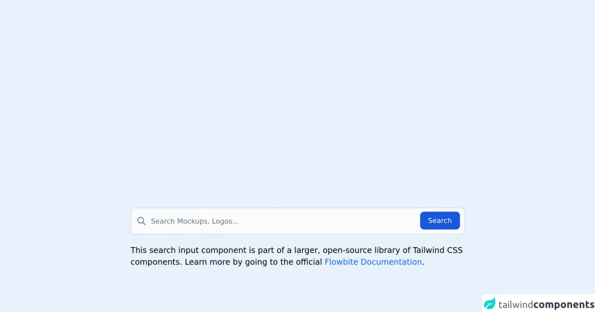
The preview of Search Input Field ui component.
To create a search input field with Tailwind CSS, we can use the following classes:
<div class="relative">
  <input type="text" class="w-full py-2 pr-10 pl-4 text-gray-700 rounded-lg border-2 border-gray-300 focus:outline-none focus:border-blue-500" placeholder="Search...">
  <button type="submit" class="absolute right-0 top-0 mt-2 mr-2">
    <svg class="h-6 w-6 text-gray-400" fill="none" stroke="currentColor" viewBox="0 0 24 24" xmlns="http://www.w3.org/2000/svg">
      <path stroke-linecap="round" stroke-linejoin="round" stroke-width="2" d="M15 15l5.5 5.5M15 9a6 6 0 1 1-6 6 6 6 0 0 1 6-6z"/>
    </svg>
  </button>
</div>
Free download of the Search Input Field's source code
The source code of Search Input Field ui component.
To create a search input field with Tailwind CSS, we can use the following classes:
<div class="relative">
  <input type="text" class="w-full py-2 pr-10 pl-4 text-gray-700 rounded-lg border-2 border-gray-300 focus:outline-none focus:border-blue-500" placeholder="Search...">
  <button type="submit" class="absolute right-0 top-0 mt-2 mr-2">
    <svg class="h-6 w-6 text-gray-400" fill="none" stroke="currentColor" viewBox="0 0 24 24" xmlns="http://www.w3.org/2000/svg">
      <path stroke-linecap="round" stroke-linejoin="round" stroke-width="2" d="M15 15l5.5 5.5M15 9a6 6 0 1 1-6 6 6 6 0 0 1 6-6z"/>
    </svg>
  </button>
</div>
<link rel="stylesheet" href="https://unpkg.com/[email protected]/dist/flowbite.min.css" />

<!-- This is an example component -->
<div class="max-w-2xl mx-auto">

	<form>
        <label for="default-search" class="mb-2 text-sm font-medium text-gray-900 sr-only dark:text-gray-300">Search</label>
        <div class="relative">
            <div class="flex absolute inset-y-0 left-0 items-center pl-3 pointer-events-none">
                <svg class="w-5 h-5 text-gray-500 dark:text-gray-400" fill="none" stroke="currentColor" viewBox="0 0 24 24" xmlns="http://www.w3.org/2000/svg"><path stroke-linecap="round" stroke-linejoin="round" stroke-width="2" d="M21 21l-6-6m2-5a7 7 0 11-14 0 7 7 0 0114 0z"></path></svg>
            </div>
            <input type="search" id="default-search" class="block p-4 pl-10 w-full text-sm text-gray-900 bg-gray-50 rounded-lg border border-gray-300 focus:ring-blue-500 focus:border-blue-500 dark:bg-gray-700 dark:border-gray-600 dark:placeholder-gray-400 dark:text-white dark:focus:ring-blue-500 dark:focus:border-blue-500" placeholder="Search Mockups, Logos..." required>
            <button type="submit" class="text-white absolute right-2.5 bottom-2.5 bg-blue-700 hover:bg-blue-800 focus:ring-4 focus:outline-none focus:ring-blue-300 font-medium rounded-lg text-sm px-4 py-2 dark:bg-blue-600 dark:hover:bg-blue-700 dark:focus:ring-blue-800">Search</button>
        </div>
    </form>

	<p class="mt-5">This search input component is part of a larger, open-source library of Tailwind CSS components. Learn
		more
		by going to the official <a class="text-blue-600 hover:underline"
			href="https://flowbite.com/docs/getting-started/introduction/" target="_blank">Flowbite Documentation</a>.
	</p>
    <script src="https://unpkg.com/[email protected]/dist/flowbite.js"></script>
</div>
How to create a Search Input Field with Tailwind CSS?
To create a search input field with Tailwind CSS, follow these steps:
- Create a container element with the
relativeclass to position the search button.
<div class="relative">
  <!-- Search input field and button will be added here -->
</div>
- Add an input field with the
w-full,py-2,pr-10,pl-4,text-gray-700,rounded-lg,border-2, andborder-gray-300classes to create a text input field that spans the full width of the container.
<div class="relative">
  <input type="text" class="w-full py-2 pr-10 pl-4 text-gray-700 rounded-lg border-2 border-gray-300 focus:outline-none focus:border-blue-500" placeholder="Search...">
</div>
- Add a search button with the
absolute,right-0,top-0,mt-2, andmr-2classes to position it in the top right corner of the container.
<div class="relative">
  <input type="text" class="w-full py-2 pr-10 pl-4 text-gray-700 rounded-lg border-2 border-gray-300 focus:outline-none focus:border-blue-500" placeholder="Search...">
  <button type="submit" class="absolute right-0 top-0 mt-2 mr-2">
    <!-- Search icon will be added here -->
  </button>
</div>
- Add a search icon to the button using SVG.
<div class="relative">
  <input type="text" class="w-full py-2 pr-10 pl-4 text-gray-700 rounded-lg border-2 border-gray-300 focus:outline-none focus:border-blue-500" placeholder="Search...">
  <button type="submit" class="absolute right-0 top-0 mt-2 mr-2">
    <svg class="h-6 w-6 text-gray-400" fill="none" stroke="currentColor" viewBox="0 0 24 24" xmlns="http://www.w3.org/2000/svg">
      <path stroke-linecap="round" stroke-linejoin="round" stroke-width="2" d="M15 15l5.5 5.5M15 9a6 6 0 1 1-6 6 6 6 0 0 1 6-6z"/>
    </svg>
  </button>
</div>
Conclusion
In this article, we have learned how to create a search input field with Tailwind CSS. With the help of pre-defined CSS classes, we can create custom user interfaces quickly and easily. By following the steps outlined in this guide, you can create a search input field that fits your specific needs.