- Published on
Advanced Guide: Build A search input With Tailwind CSS
- What is Tailwind CSS?
- The Description of Search Input UI Component
- Why Use Tailwind CSS to Create a Search Input UI Component?
- The Preview of Search Input UI Component
- The Source Code of Search Input UI Component
- How to Create a Search Input with Tailwind CSS?
- Conclusion
In this advanced guide, we will be exploring how to build a search input UI component with Tailwind CSS. We will be discussing what Tailwind CSS is, the description of a search input UI component, why we should use Tailwind CSS to create a search input UI component, and finally, we will be providing a preview and the source code of the search input UI component.
What is Tailwind CSS?
Tailwind CSS is a utility-first CSS framework that allows you to create custom designs without writing any CSS. It provides a set of pre-defined classes that can be used to style HTML elements. With Tailwind CSS, you can create designs that are consistent, responsive, and easy to maintain.
The Description of Search Input UI Component
A search input UI component is a form element that allows users to search for information on a website or application. It usually consists of an input field and a search button. The input field is where the user enters their search query, and the search button is used to initiate the search.
Why Use Tailwind CSS to Create a Search Input UI Component?
Tailwind CSS provides a set of pre-defined classes that can be used to style a search input UI component. This makes it easy to create a consistent and responsive design. Additionally, Tailwind CSS allows you to customize the design of your search input UI component without writing any CSS.
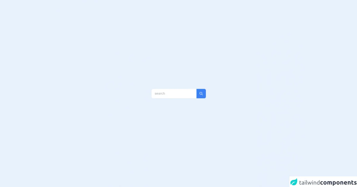
The Preview of Search Input UI Component
To create a search input UI component with Tailwind CSS, we will be using the following classes:
bg-white: sets the background color of the input field to white.border: adds a border to the input field.rounded: rounds the corners of the input field.py-2: adds padding to the top and bottom of the input field.px-4: adds padding to the left and right of the input field.w-full: sets the width of the input field to 100%.outline-none: removes the default outline of the input field.text-gray-700: sets the text color of the input field to gray.focus:bg-white: sets the background color of the input field to white when it is in focus.focus:outline-none: removes the outline of the input field when it is in focus.focus:shadow-outline: adds a shadow outline to the input field when it is in focus.placeholder-gray-600: sets the color of the placeholder text to gray.
Free download of the search input's source code
The Source Code of Search Input UI Component
To create a search input UI component with Tailwind CSS, we will be using the following HTML code:
<div class="flex items-center border rounded-md py-2 px-4 w-full">
  <input type="text" class="bg-white focus:bg-white focus:outline-none focus:shadow-outline border rounded-md py-2 px-4 w-full outline-none text-gray-700 placeholder-gray-600" placeholder="Search...">
  <button class="ml-2 bg-blue-500 hover:bg-blue-700 text-white font-bold py-2 px-4 rounded">
    Search
  </button>
</div>
<div class='flex items-center justify-center min-h-screen from-cyan-100 via-pink-200 to-yellow-200 bg-gradient-to-br'>
    <div class="flex items-center max-w-md mx-auto bg-white rounded-lg " x-data="{ search: '' }">
        <div class="w-full">
            <input type="search" class="w-full px-4 py-1 text-gray-800 rounded-full focus:outline-none"
                placeholder="search" x-model="search">
        </div>
        <div>
            <button type="submit" class="flex items-center bg-blue-500 justify-center w-12 h-12 text-white rounded-r-lg"
                :class="(search.length > 0) ? 'bg-purple-500' : 'bg-gray-500 cursor-not-allowed'"
                :disabled="search.length == 0">
                <svg class="w-5 h-5" fill="none" stroke="currentColor" viewBox="0 0 24 24"
                    xmlns="http://www.w3.org/2000/svg">
                    <path stroke-linecap="round" stroke-linejoin="round" stroke-width="2"
                        d="M21 21l-6-6m2-5a7 7 0 11-14 0 7 7 0 0114 0z"></path>
                </svg>
            </button>
        </div>
    </div>
</div>
How to Create a Search Input with Tailwind CSS?
To create a search input with Tailwind CSS, follow these steps:
- Create a new HTML file and add the following code:
<!DOCTYPE html>
<html lang="en">
<head>
  <meta charset="UTF-8">
  <title>Search Input with Tailwind CSS</title>
  <link rel="stylesheet" href="https://cdn.jsdelivr.net/npm/[email protected]/dist/tailwind.min.css">
</head>
<body>
  <div class="flex items-center border rounded-md py-2 px-4 w-full">
    <input type="text" class="bg-white focus:bg-white focus:outline-none focus:shadow-outline border rounded-md py-2 px-4 w-full outline-none text-gray-700 placeholder-gray-600" placeholder="Search...">
    <button class="ml-2 bg-blue-500 hover:bg-blue-700 text-white font-bold py-2 px-4 rounded">
      Search
    </button>
  </div>
</body>
</html>
Save the file as
index.html.Open the file in your web browser to see the search input UI component.
Conclusion
In this advanced guide, we have explored how to build a search input UI component with Tailwind CSS. We have discussed what Tailwind CSS is, the description of a search input UI component, why we should use Tailwind CSS to create a search input UI component, and finally, we have provided a preview and the source code of the search input UI component. With Tailwind CSS, you can create custom designs that are consistent, responsive, and easy to maintain.