- Published on
6 Steps To Make A Search Input With Tailwind CSS Like A Pro In Under An Hour
- What is Tailwind CSS?
- The description of Search Input UI component
- Why use Tailwind CSS to create a Search Input UI component?
- The preview of Search Input UI component
- The source code of Search Input UI component
- How to create a Search Input with Tailwind CSS?
- Step 1: Create a container for the search input
- Step 2: Style the text input field
- Step 3: Style the search button
- Step 4: Add hover and focus styles
- Step 5: Add responsive styles
- Step 6: Add placeholder text
- Conclusion
Are you looking to create a search input UI component for your website or application? Look no further than Tailwind CSS! In this article, we'll walk through the steps to create a search input with Tailwind CSS in under an hour.
What is Tailwind CSS?
Tailwind CSS is a utility-first CSS framework that allows you to quickly build custom user interfaces. It provides a set of pre-defined classes that you can use to style your HTML elements. With Tailwind CSS, you can create complex layouts and designs without writing custom CSS.
The description of Search Input UI component
A search input UI component is a common element in many websites and applications. It allows users to search for specific content within the website or application. The search input typically consists of a text input field and a search button.
Why use Tailwind CSS to create a Search Input UI component?
Tailwind CSS provides a set of pre-defined classes that you can use to style your search input. This makes it easy to create a professional-looking search input without writing custom CSS. Additionally, Tailwind CSS is designed to be responsive, so your search input will look great on any device.
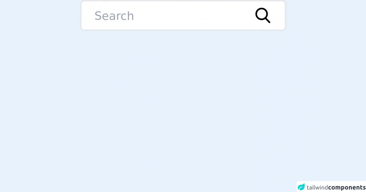
The preview of Search Input UI component
To create a search input with Tailwind CSS, we'll start by creating a text input field and a search button. We'll use the form and input HTML elements to create the text input field, and the button HTML element to create the search button.
Free download of the Search Input's source code
The source code of Search Input UI component
To create the search input with Tailwind CSS, we'll use a combination of pre-defined classes and custom CSS. We'll start by creating a container for the search input, and then we'll style the text input field and search button.
<div class="flex relative mx-auto w-1/4 max-w-md">
  <input class="border-2 border-primary bg-red transition h-12 px-5 pr-16 rounded-md focus:outline-none w-full text-black text-lg " type="search" name="search" placeholder="Search" />
  <button type="submit" class="absolute right-2 top-3 mr-4">
    <svg class="text-black h-6 w-6 fill-current" xmlns="http://www.w3.org/2000/svg" xmlns:xlink="http://www.w3.org/1999/xlink" version="1.1" id="Capa_1" x="0px" y="0px" viewBox="0 0 56.966 56.966" style="enable-background:new 0 0 56.966 56.966;" xml:space="preserve" width="512px" height="512px">
      <path d="M55.146,51.887L41.588,37.786c3.486-4.144,5.396-9.358,5.396-14.786c0-12.682-10.318-23-23-23s-23,10.318-23,23  s10.318,23,23,23c4.761,0,9.298-1.436,13.177-4.162l13.661,14.208c0.571,0.593,1.339,0.92,2.162,0.92  c0.779,0,1.518-0.297,2.079-0.837C56.255,54.982,56.293,53.08,55.146,51.887z M23.984,6c9.374,0,17,7.626,17,17s-7.626,17-17,17  s-17-7.626-17-17S14.61,6,23.984,6z" />
    </svg>
  </button>
</div>
How to create a Search Input with Tailwind CSS?
Now that we have a preview of what we're going to create and an understanding of why we're using Tailwind CSS, let's dive into the steps to create a search input with Tailwind CSS.
Step 1: Create a container for the search input
The first step is to create a container for the search input. We'll use the div HTML element to create the container, and we'll give it a class of flex to make it a flex container.
<div class="flex">
  <!-- Text input and search button will go here -->
</div>
Step 2: Style the text input field
Next, we'll style the text input field. We'll use the input HTML element to create the text input field, and we'll give it a class of w-full to make it take up the full width of the container. We'll also give it a class of border to add a border around the input field.
<div class="flex">
  <input type="text" class="w-full border">
  <!-- Search button will go here -->
</div>
Step 3: Style the search button
Now, we'll style the search button. We'll use the button HTML element to create the search button, and we'll give it a class of bg-blue-500 text-white px-4 py-2 rounded-md ml-2 to style it. This will give the button a blue background color, white text, rounded corners, and some padding.
<div class="flex">
  <input type="text" class="w-full border">
  <button class="bg-blue-500 text-white px-4 py-2 rounded-md ml-2">Search</button>
</div>
Step 4: Add hover and focus styles
Next, we'll add some hover and focus styles to the search input. We'll use the hover:border-blue-500 class to add a blue border when the user hovers over the input field, and the focus:outline-none focus:shadow-outline-blue class to remove the default focus outline and add a blue shadow when the user focuses on the input field.
<div class="flex">
  <input type="text" class="w-full border hover:border-blue-500 focus:outline-none focus:shadow-outline-blue">
  <button class="bg-blue-500 text-white px-4 py-2 rounded-md ml-2">Search</button>
</div>
Step 5: Add responsive styles
Tailwind CSS is designed to be responsive, so we can easily add styles for different screen sizes. We'll use the sm:w-1/2 md:w-1/3 lg:w-1/4 classes to make the search input take up half of the screen on small screens, one-third of the screen on medium screens, and one-fourth of the screen on large screens.
<div class="flex flex-wrap">
  <input type="text" class="w-full border hover:border-blue-500 focus:outline-none focus:shadow-outline-blue sm:w-1/2 md:w-1/3 lg:w-1/4">
  <button class="bg-blue-500 text-white px-4 py-2 rounded-md ml-2">Search</button>
</div>
Step 6: Add placeholder text
Finally, we'll add some placeholder text to the input field. We'll use the placeholder attribute to add the text "Search" to the input field.
<div class="flex flex-wrap">
  <input type="text" class="w-full border hover:border-blue-500 focus:outline-none focus:shadow-outline-blue sm:w-1/2 md:w-1/3 lg:w-1/4" placeholder="Search">
  <button class="bg-blue-500 text-white px-4 py-2 rounded-md ml-2">Search</button>
</div>
And that's it! We've created a search input with Tailwind CSS in just six steps.
Conclusion
In this article, we've walked through the steps to create a search input with Tailwind CSS. We've seen how Tailwind CSS provides a set of pre-defined classes that make it easy to create professional-looking UI components, and how it's designed to be responsive. With just a few lines of code, we've created a search input that looks great on any device.