- Published on
How To Build A Search input With Tailwind CSS In 6 Easy Steps?
- What is Tailwind CSS?
- The description of Search input ui component
- Why use Tailwind CSS to create a Search input ui component?
- The preview of Search input ui component.
- The source code of Search input ui component.
- How to create a Search input with Tailwind CSS?
- Conclusion
What is Tailwind CSS?
Tailwind CSS is a utility-first CSS framework that allows you to create custom designs without having to write custom CSS. It provides a set of pre-defined classes that you can use to style your HTML elements. With Tailwind CSS, you can create responsive designs quickly and easily.
The description of Search input ui component
A search input is a common UI component used in many websites and applications. It allows users to search for specific content within a website or application. A search input typically consists of a text input field and a search button.
Why use Tailwind CSS to create a Search input ui component?
Tailwind CSS provides a set of pre-defined classes that you can use to style your HTML elements. This makes it easy to create a search input UI component without having to write custom CSS. With Tailwind CSS, you can create a responsive search input that looks great on all devices.
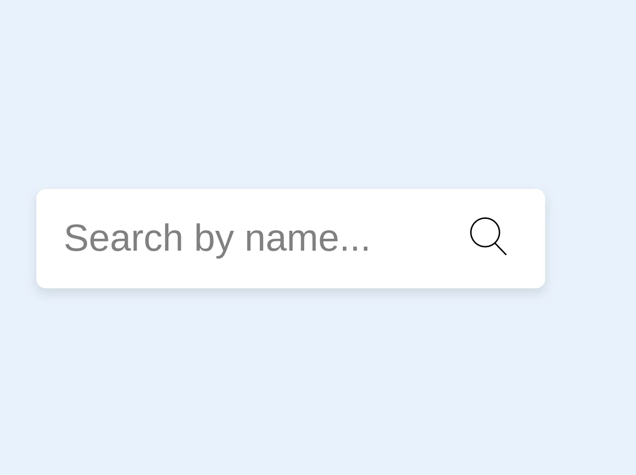
The preview of Search input ui component.
To create a search input UI component with Tailwind CSS, you will need to use the following classes:
bg-white: Sets the background color of the search input to white.rounded-full: Rounds the corners of the search input.py-2: Sets the padding on the top and bottom of the search input to 2.px-4: Sets the padding on the left and right of the search input to 4.border: Adds a border to the search input.outline-none: Removes the outline from the search input when it is focused.text-gray-700: Sets the text color of the search input to gray.focus:shadow-outline: Adds a shadow outline to the search input when it is focused.placeholder-gray-600: Sets the color of the placeholder text to gray.
Free download of the Search input's source code
The source code of Search input ui component.
To create a search input UI component with Tailwind CSS, you can use the following HTML code:
<div class="relative rounded-full bg-white">
  <input type="text" class="w-full px-4 py-2 text-gray-700 border rounded-full outline-none focus:shadow-outline placeholder-gray-600" placeholder="Search">
  <div class="absolute top-0 right-0 mt-3 mr-3">
    <button class="text-gray-600 focus:outline-none">
      <svg class="h-5 w-5" fill="none" stroke-linecap="round" stroke-linejoin="round" stroke-width="2" viewBox="0 0 24 24" stroke="currentColor">
        <path d="M22 22L15.5 15.5M15.5 15.5C17.9853 12.7314 17.9853 8.26863 15.5 5.5C13.0147 2.73137 8.98528 2.73137 6.5 5.5C4.01472 8.26863 4.01472 12.7314 6.5 15.5C8.98528 18.2686 13.0147 18.2686 15.5 15.5L22 22Z"></path>
      </svg>
    </button>
  </div>
</div>
<div class="relative mr-6 my-2">
  <input type="search" class="bg-purple-white shadow rounded border-0 p-3" placeholder="Search by name...">
  <div class="absolute pin-r pin-t mt-3 mr-4 text-purple-lighter">
  	<svg version="1.1" class="h-4 text-dark" xmlns="http://www.w3.org/2000/svg" xmlns:xlink="http://www.w3.org/1999/xlink" x="0px" y="0px"
	 viewBox="0 0 52.966 52.966" style="enable-background:new 0 0 52.966 52.966;" xml:space="preserve">
    	<path d="M51.704,51.273L36.845,35.82c3.79-3.801,6.138-9.041,6.138-14.82c0-11.58-9.42-21-21-21s-21,9.42-21,21s9.42,21,21,21
        c5.083,0,9.748-1.817,13.384-4.832l14.895,15.491c0.196,0.205,0.458,0.307,0.721,0.307c0.25,0,0.499-0.093,0.693-0.279
        C52.074,52.304,52.086,51.671,51.704,51.273z M21.983,40c-10.477,0-19-8.523-19-19s8.523-19,19-19s19,8.523,19,19
        S32.459,40,21.983,40z"/>

	</svg>

  </div>
</div>
How to create a Search input with Tailwind CSS?
Follow these 6 easy steps to create a search input UI component with Tailwind CSS:
Step 1: Create a new HTML file and add the following code:
<!DOCTYPE html>
<html>
  <head>
    <title>Search Input UI Component</title>
    <link rel="stylesheet" href="https://cdn.jsdelivr.net/npm/[email protected]/dist/tailwind.min.css">
  </head>
  <body>
    <div class="container mx-auto mt-8">
      <div class="relative rounded-full bg-white">
        <input type="text" class="w-full px-4 py-2 text-gray-700 border rounded-full outline-none focus:shadow-outline placeholder-gray-600" placeholder="Search">
        <div class="absolute top-0 right-0 mt-3 mr-3">
          <button class="text-gray-600 focus:outline-none">
            <svg class="h-5 w-5" fill="none" stroke-linecap="round" stroke-linejoin="round" stroke-width="2" viewBox="0 0 24 24" stroke="currentColor">
              <path d="M22 22L15.5 15.5M15.5 15.5C17.9853 12.7314 17.9853 8.26863 15.5 5.5C13.0147 2.73137 8.98528 2.73137 6.5 5.5C4.01472 8.26863 4.01472 12.7314 6.5 15.5C8.98528 18.2686 13.0147 18.2686 15.5 15.5L22 22Z"></path>
            </svg>
          </button>
        </div>
      </div>
    </div>
  </body>
</html>
Step 2: Add the Tailwind CSS CDN link to the head of your HTML file.
Step 3: Create a container div with the container and mx-auto classes to center the search input on the page.
Step 4: Create a div with the relative, rounded-full, and bg-white classes to create the search input container.
Step 5: Add an input element with the w-full, px-4, py-2, text-gray-700, border, rounded-full, outline-none, focus:shadow-outline, and placeholder-gray-600 classes to create the search input field.
Step 6: Add a button element with the text-gray-600 and focus:outline-none classes to create the search button.
Conclusion
In this article, we have learned how to create a search input UI component with Tailwind CSS in 6 easy steps. With Tailwind CSS, you can create custom designs quickly and easily without having to write custom CSS. By following the steps outlined in this article, you can create a responsive search input that looks great on all devices.